Fun reading. As an aside, I've grown wary of data visualization tools tied too closely to a particular language. Each one is a little different, and while cranking out simple plots never takes much effort, making them look just so for presentation always involvers learning yet another low-level syntax. I've come back full circle to Gnuplot (http://www.gnuplot.info/), which I originally learned nearly twenty years ago while working on my Ph.D. It forces you to learn a shitty DSL, but you can get at Gnuplot from any environment that supports writing to text files and calling a sub-process. Plots are tweakable to your heart's content, and it does a fair job with 3-D graphics. I've reused a surprising amount of code originally written to plot error-control code statistics from Octave into a Ruby project that analyzes wireless network performance. Pretty cool!
But if you need interactive 3-D plots (e.g., a wire frame that you can rotate), look elsewhere.
gnuplot is fine but one of the best features of visualization is interactivity imho, without interactivity you lose a lot of the power that comes from visualization...
That's why unfortunately I still recommend something like processing, then you can write your own small IPC to send data to your visualization code from any host
Very nice overview. I am just in the final stages of a Masters thesis in data visualization, and this article gives a really good bird's eye view of the field. The visualization field is really too broad that most programmers could be expected to know more than some key points, but given that vision is the highest-bandwidth sense, visual techniques are often given less credit than they deserve. As long as there needs to be a human in the loop, you need good visualizations if your data is more than trivial. D3 is probably good for its domain, but intuition tells me you'll have a problem if you mainly use Javascript to handle a 20GB dataset. (I'm not dismissing this categorically; I am not very familiar with these tools).
Unfortunately, to my knowledge there aren't any comprehensive textbooks that cover visualization from the ground up. We didn't use a single textbook in my 2-year degree; all lectures were heavily based on research papers. Central topics if you want to read up on this is perception (which color scales should you use? how many parameters can you plausibly put in one plot?), different visualization techniques for different data (scatterplots, histograms, treemaps, horizon graphs, volume rendering, graph drawing with edge bundling, +++), interactivity and applications of basic techniques (Visual Analytics, Interactive Visual Analysis).
A multitude of scientific fields use different visualization tools, so it can be tricky to find the relevant material for whatever it is you're working with. But in general, I think the data mining/big data/analytics fields could do very well with a bigger focus on visual techniques. If you get the right visualizations for your data, the truth often just jumps out of the screen. GPUs can let you work with multi-gigabyte datasets at interactive framerates, although I haven't seen a lot of practical applications of this yet. Can also be used for non-spatial data, if you're clever with CUDA or just use the shader data structures creatively. Would be interesting to hear if anyone in the industry uses this yet.
> D3 is probably good for its domain, but intuition tells me you'll have a problem if you mainly use Javascript to handle a 20GB dataset. (I'm not dismissing this categorically; I am not very familiar with these tools).
I use d3 on the client with a 80GB (currently) dataset, by putting the dataset in elasticsearch. It's a pretty fantastic combination. You can do multi-value aggregation from unstructured data, or geo-spacial searches, or lightning-quick full text search.
The server has 8GB of ram and 2 cores, and with about 1.2 million new documents every hour, barely breaks a sweat.
What type of queries do you run on elasticsearch to pull into D3? I'm doing a very similar project (elasticsearch + web data vis) so I'm legitimately curious.
Basically I'm importing logs and system events. I run queries like show me the top 10 events over the last 24 hours from this source that were marked critical. Or for each farm shipping web logs, aggregate on the hosts, and then aggregate on the status code, and then give me the number of documents in each summed for each hour of the day.
At the moment I roll up daily stats and store them in a separate database for longitudinal analysis, but eventually I'd like to ship data that is more than a couple of weeks old to hadoop.
> D3 is probably good for its domain, but intuition tells me you'll have a problem if you mainly use Javascript to handle a 20GB dataset. (I'm not dismissing this categorically; I am not very familiar with these tools).
You can use server side javascript which should handle 20GB dataset without problems.
What I've found is that nowadays most of the resources on datavis are not about scientific/continuous functions but about categorical/statistical visualization.
I've added a few (well many) links at the bottom of the article but if you have any suggestions on resources/software/etc please let me know
I wish this article focused on how to apply these techniques to actual problems a typical developer would have as opposed to, "Here are some ways of visualizing data".
It felt like my typical high school class. They'd teach us how to calculate the circumference of a circle, but they never told us what we'd use it for. "Programming" is not specific enough.
You know that friction between programmers and management in getting managers to understand what you're wanting to do? That's a visualisation problem. The ability to sell your ideas usually boils down to how you present your case to management.
One of the things I've picked up more recently is to take a presentation or whatnot and mentally block all but the top 10-20%. If I can't get the bird's eye summary of what each slide needs to say there, then my manager won't understand the story. They're {busy|lazy} and don't care to read the entire slide - that's all chaff for the underlings to digest so they know the finer details.
So for a programmer, one of the biggest uses of good visualisation skills is the selling of ideas. A good plot goes a long way in convincing someone of something.
I've succumbed to this way of thinking too (permit the manager to underperform) but I feel it's a lowering of standards and the manager is not doing her job. I wish there was push back against this, like there is push back against developers not writing unit tests or fixing bugs, rather than acceptance with a sigh.
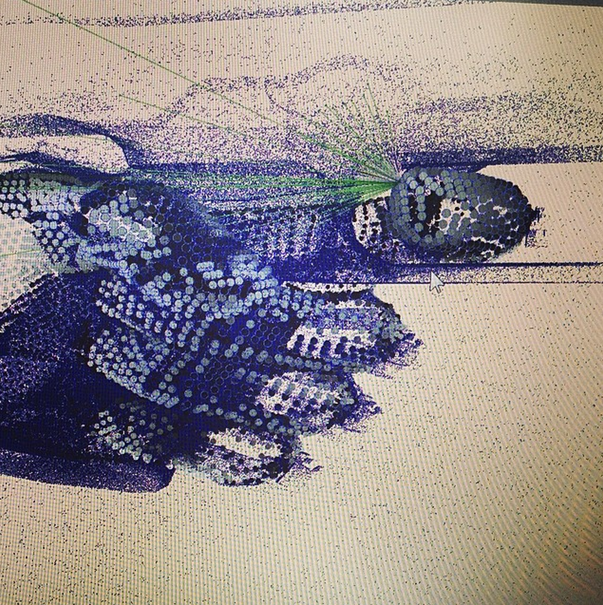
This one was done for debugging, as I do often. The code that I was debugging took some geometry and generated some texturemaps from it, it's really hard to debug why the maps are wrong when they are, what happened to the geometrical calculations. So I just added a std::vector<float> debugStuff and pushed values from various locations, then wrote it as a CSV. In processing I load this bunch of floats I know the meaning of and plot them in 3d as a point cloud. Each point in the cloud is clickable to show more of what happened at that position.
This was for performance. A particular system computes tens of thousands of generated code snippets according to some rules, that will then used in runtime in various ways. Testing in runtime is hard because it's hard to cover all of them and it would take a long time. So I rigged the system to extract statistics about the generated code and save them to a CSV. Then in Mathematica I categorize and plot these datapoints and I can compare what changed between two different runs of the system. When I see in the data that a given change seems promising enough, I do the expensive test in runtime
Data visualization looks intuitive and nice in D3 examples thus be something 'every programmer should know'. It's so simple, just pick it up.
Any production environment data visualization is going to run into a plethora of sticky problems. How do ensure your queries aren't going to overload and crash your visualization client. How do you handle time series and gaps in data? How do you evict data from a vis?
Can you recommend a book or project idea for building intuition on messy data? When it comes up in my hobby projects I compromise on the fly, and a professional approach would be much better.
I have heard good things about the "Bad Data Handbook", though I can't vouch for it personally. Recommended by a co-worker I will get to read it eventually
Well that wasn't really to present to a board, but really a quite straightforward application of the rift. VR is used today for scientific visualization (http://en.wikipedia.org/wiki/Cave_automatic_virtual_environm...) but it's veeery expensive. The rift and companies that will make rift-based products for scientific, medical etc... visualization are going to make money
Yes, it's cool, but this like most sites doesn't have many examples of scientific vis (large dimensional continuous functions). I think scientific visualization is more important for programmers in their job, for debugging/profiling.
But if you need interactive 3-D plots (e.g., a wire frame that you can rotate), look elsewhere.