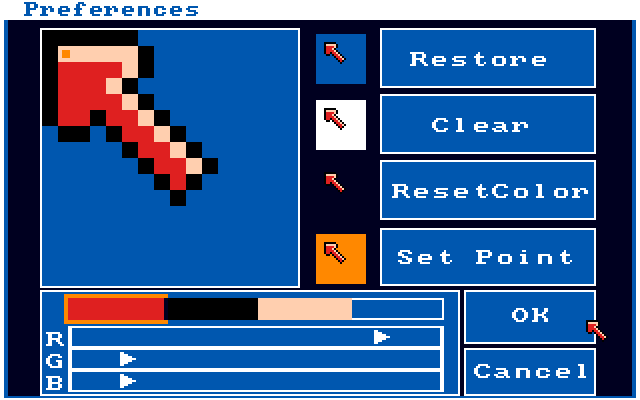
I remember windows 3.1 had a utility for drawing custom cursors. I had great fun making cursors (I was around 10 at the time I guess) and had completed forgotten about it until now!
I think that utility was a 16x16 grid, and indeed the easiest to see arrows utilsed the vertical, although actually a cursor which uses the horizontal and diagonal isn't bad either.
The Commodore Amiga had something similar along with an early 'double 90 degree' cursor [1] and a 1/2 pixel ratio cursor in later versions if the OS [2]. Both are pretty delightful :)
Microsoft Plus! for Windows 95 had lots of fun themes. The cursor of the science theme was a glass tube with some chemical bubbling inside. Unfortunately, I can't even seem to locate pictures of those themes.
I used to drive my dad crazy with this - also adding like those rainbow trails to the mouse or picking random icons for common programs (hey cool, the Word icon can now be a tree!)
In this same vein, I remember spending hours making custom repeating tile pattern backgrounds in Windows 95. Before the modern Web, using a PC was quite a different experience than how they're used the majority of the time now.
Indeed. When i was little, i used to spend hours drawing meticulously detailed landscapes in profile (like in Worms etc), using MacPaint, following a particular method. I'd get a large circular brush and roughly bash out some terrain (hills and valleys, cliffs and overhangs, maybe some flat bits). Then go along the ground with the pencil tool and flip individual pixels to shape buildings, plant trees, park vehicles, build fortifications, dig tunnels, excavate secret bases, etc.
EDIT: It's possible i was inspired by the (lack of) landscape in Airborne, which i also played a lot:
Indeed! For years I had a custom cursor, it was a mouse point with additional rays on the -x and +y axes. Hard to describe, if you picture the 'crosshatch' style cursor with an ordinary mouse pointer instead of two of the lines, you've got it.
I still feel it combines the precision of a crosshatch with the visibility of an ordinary mouse arrow. Perhaps I should recreate it for the Mac...
iirc it's really a 32x32 grid, but the "point" for the cursor is the center position, so the lower-right quadrand is used for a regular cursor, where say the text cursor is centered.
Nobody seems to mention a pretty good reason also: standard western text (and content in general) is oriented right-to-left; therefore covering only one side seems to me intuitively less obstructing (we can read perfectly up to the click spot, instead of being confused by what's underneath it)
In addition, it mimics what a right-handed person already does with their hand when pointing at something on a page or on a screen right in front of them, especially left-to-right text (using the right hand so it doesn't block the text). Pointing at something off to the side (outside the width of your shoulders) makes your hand tilt outwards; pointing at something directly in front makes your hand tilt inwards.
Strictly speaking (after observing myself pointing) it's "outside your elbow", right? Which coincides roughly with "width of your shoulders" when your elbow is at your side or your elbow is straight, but can differ by up to the length of your upper arm...
Some of the Linux GUIs used to have a feature that, if you set the mouse to left-handed, the cursor would tilt the other way. It was very ergonomic and seemed natural (and I would like it back :)
FWIW on KDE there are several cursor sets available via the "download new content" system with left-handed primary cursors; but yes it seems you have to select them yourself rather than them being automatically applied.
Most older computers had at least some utility to do this too. I used it a lot on my Atari ST's since I was having troubles with my right hand and had to switch left/right quite a lot.
Yep: a better reason (than those given on SO) is that it's designed for minimal UX annoyance - it is least likely to cover up what you need to see while still serving its purpose; the asymmetry allows you to more quickly understand which point is important.
It's instructive to observe the circumstances when the cursor changes: there is some indication of context change, but also the design of the cursor in each context is important.
A better reason in hindsight isn't the right answer. Likely they had to do it per limitations of the computers of the time. Trying to tie it to UX like a modern day designer is just wrong.
It's probably not a good idea to underestimate the depth of the deliberations that actually took place at the time, based on a necessarily pragmatic justification for the accepted decision.
As discussed in the accepted answer, vertical line cursors predate the slanted shape.
Changing to a different style only makes sense as a design decision.
Nobody mentions it because there's no evidence for that fact being an influence on the design. There's historical evidence for the other reasons. Yours is a just-so story.
Take the oldest, crudest mouse you can find. Place your right hand on it and position it to the right of your keyboard. Put your finger on its primary (or single) button. Look at that finger from your head's natural perspective.
Your pointing/clicking finger will appear to be pointing in an upper-left direction, somewhere between 0' and 45' – exactly like the classic arrow-cursor.
Even if a designer with contemporaneous experience explicitly denied that was n influence in choosing the orientation, I wouldn't believe them. The congruence is too strong.
Oops! Indeed, I mis-perceived your comment as being a response to lotharbot's comment, about the tilt of right-hand pointing being an influence. Sorry.
However, I do think there's something more than "just so" to the darkmighty post you replied to, as well.
Anything that's hand-manipulated, and especially English writing on paper, must face the risk a dominant right-hand will partially obscure it. Thus we've got longstanding design tendencies, echoed on pixel screens, that more primary labels and information tends to be above and/or to the left, and more-ignorable (or even just defer-able) information goes to the bottom/right.
If damaging the visibility of some information for another purpose – as with an overlaid pointing indicator – a designer will thus have good reasons for allocating that damage in the down-right direction. (That is, tend towards obscuring the later/lesser information.) People immersed in our culture's visual design will even make that tradeoff subconsciously. So a "this makes intuitive sense" story, when reasoning about long-ago design decisions, is perfectly worthy of mention alongside other "historical evidence".
This is also visible in classical office planning. Nowadays people seems to have forgotten it. Look in an old office, on what side of the table is the window in most of the rooms? If the occupant is left-handed, what side is the window now? The desktop lamp? This is not a new problem, lights are supposed to be on the left side of a right-handed person when writing, otherwise you will shadow your paper while writing. Same goes with the mouse cursor, when right-handed, it's natural that it would point to the left.
I always assumed because the point of the diagonal arrow cursor is located at 0,0 in the image, making the origin location of the mouse cursor image and the click point of the arrow the same. Whereas with any vertical arrow cursor, the click point would no longer line up with 0,0.
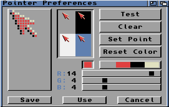
Oh yeah, I remember that. ImgEdit or something? It was great, I spent so much time making the hand/finger cursor into a middle finger rather than an index.
That could have been an issue with the PARC machine that OP claims started the trend, but with any OS after that (including the original Mac), you can specify the cursor hotspot when designing the cursor (look at your I-beam cursor for instance)
This is true for most default cursors, but custom cursor file formats let you change the coordinates of the active pixel (see: 'left-handed' mirrored arrow cursors, or crosshair-type ones.). The link 'finger' cursor on most OSes is a default example where the active pixel isn't the top-left one.
It's funny how as a kid in the 80s, this was something you'd notice, think and feel about. I have no idea what were the computer system I was using[1] but I vividly remember staring at the cursor with interest.
[1] at my father's office, govt agency, something like an early x window system... can't recall
ps: actually, both physical interface mesmerized me, keyboards were curious creatures for me, here's a similar model of what was used http://goo.gl/gyD7R6 ( I love the non flat keys and the 0, 00, 000 series )
It's interesting to see how misinformation propagates.
The second-highest-rated answer on Stack Exchange (46 votes and climbing) claims that another reason for the left arrow cursor in early GUIs was to put the hotspot at (0,0) to save time in the mouse position calculations:
That comment is a direct copy of this Yahoo! Answers comment from 2009, which says that the Xerox Alto worked this way, but cites no source for the claim:
Let's ballpark the CPU overhead. According to this article, the Alto executed about 400,000 instructions per second, with an instruction set modeled after the Data General Nova 1220:
There are four accumulators, with an ADD instruction that adds one accumulator to another (and a similar SUB). There are LDA and STA instructions that load and store memory, addressed with a displacement and an optional accumulator (e.g. to access into a structure using a pointer).
It seems reasonable to assume that at some point in the mouse refresh code, we will have the mouse's X value in one accumulator, and a pointer to the cursor structure (containing the cursor bitmap, hotspot, etc.) in another.
So to adjust our X value using the hotspot X from our cursor structure, we simply need an LDA to load the hotspot X into another accumulator, and an ADD or SUB to do the calculation. Repeat that for Y, and we've added a total of four instructions.
At 400,000 instructions per second, these calculations would add a 1/100,000 second overhead to the mouse calculation.
A worst case might be that we don't have a free accumulator when we need it. So that would be another STA and LDA to spill one temporarily.
If we have to do that for both X and Y, it would put us at eight instructions total, or 1/50,000 second.
Still probably worth doing it to get the flexibility of custom cursor hotspots. :-)
This hit the BS detector for me too, mainly because it goes against some of the rules of thumb I have found useful for optimization. For example, the need for smooth and stutter-free ui notwithstanding, if something only happens in response to user input you are less likely to see important gains from this sort of CPU microoptimization. Even on a very old machine, it should be obvious that the computer adds integers much faster than you can move your finger (otherwise there would be no point of having the computer, am I right?) On the other hand, if you had to compute more on every frame or for a substantial amount of onscreen objects, that's where the real gains are going to live, because the numbers add up much more easily.
When an average right-handed person points at something his hand has a very similar shape. Imaging a large screen with some kind of a presentation and you are explaining something to the public and pointing at some object on the screen. The shape of your hand in this moment is the most natural thing for a pointer, immediately understandable by anyone.
Júlio Turolla Ribeiro's answer is far better. I guess that young people have lost the ability to think outside the computer. Some of us still remember school classes, and business presentations in which presenters pointed at the board with their finger, or with a two meter long stick called a "pointer". The pointing was almost always in the same angle as the photo that Julio included, either from the left or the right. Of course, from the right is more natural for the right-handed majority.
The fact that some engineer tinkered with the computer representation of the pointer for code efficiency reasons, does not change the fact of hundreds of years of history in which teachers pointed at an angle from the right. I'm sure that if you hunt up old movies (black and white ones) where there is a school/university lesson being portrayed, you will see a pointer in use in this pose.
1. On my computer, the pointer arrow is asymmetric, and the left side of the arrow-head is vertical.
2. Forget pre-computers... If you draw an imaginary line from my mouse/hand to the cursor, it is approximately parallel/overlapping with the line of the arrow pointing.
Actually, I'm wrong. Turns out pointer and caret are subclasses of cursor, and "mouse cursor" is perfectly acceptable to refer to the former. You learn something by being a petty smartass :)
...besides, when I hear the word pointer mentioned within the context of computing, I'm more inclined to think of things like stack pointers and instruction pointers.
To a right-handed person it does ...I imagine to a left-handed person it must feel like the cursor/pointer is pointing the "wrong" way. I am wrong on this lefto weirdies? Bonus upvotes for casual slur surely.
My door handle is a knob that turns both ways to open, but turning my right hand (I'm right handed) clockwise is far more comfortable than doing so counterclockwise.
Ha ha ha! Thanks for your advice. I shall now be able to enter my bedroom again.
Seriously, though, I felt it obvious but I'll spell it out. Some doors open only one way. That way is likely more comfortable for right-handers. Having a doorknob which moves both ways, I have been able to observe that there is a difference in the 'feel' of the way it opens depending on the direction. I offered this as information so you could answer your question yourself.
This is why the first thing I do on a new machine is make sure I can switch the arrow to point right for when I'm mousing with my left hand.
Some systems make this easy (click the 'flip cursor' box, done!). Others make you spend an hour trying to figure out where to get custom cursors and how to install them. >:(
I'm right-handed in most respects, but my preference on a desktop is to operate a trackball with my left hand. I've never even thought about this "problem".
I don't know if this went into the decision making process, but with the cursor at an angle the OS can use the x,y coordinates of the cursor to find it's target, instead of having to offset the coordinates to compensate for a straight cursor.
I'm not sure if that's how cursors work.. just a thought.
Macintosh cursors were configurable right back to the beginning; the hot spot could be anywhere in the cursor's 16x16 rectangle. The text insertion point cursor had the hot spot centered and on the baseline, the crosshairs had it in the center, and so on. I have heard that it was the same in Windows, from the beginning. So the location of the arrow cursor's hotspot in the top left is a result of that being the arrow's tip and not a cause of the arrow tip being located there.
It's not really a "historical" reason though. A cursor is still a very small icon. It's pixel art. Choosing angles that look crisp is a foundation of making pixel art and I don't think screen densities are high enough to ignore that.
Yeah, that must have been the reason Xerox chose that pointing direction and that Apple copied it: Redmond is exactly North-West from Palo Alto and Cupertino (clearly, Apple didn't do maps yet in 1984)
I've changed my cursors under OS X for a long time now. Check out /System/Library/Frameworks/ApplicationServices.framework/Versions/A/Frameworks/HiServices.framework/Versions/A/Resources/cursors for the special ones. (People make replacement packs that are drop-in replacements for the cursor image files.)
For the main cursor, use a combination of Cursorcerer and HotMouse.
> I've always been confused as to the success of the computer mouse. It doesn't seem like the ideal solution. Then again, neither do trackpads.
Without meaning to be argumentative, what would be ideal? In the absence of an actual better solution, one can explain the success of an obviously sub-optimal but existing solution by "worse is better" (https://en.wikipedia.org/wiki/Worse_is_better).
Things that would appear ideal would be something like either a Light Pen or a Touch screen. Mainly because they'd appear ideal since that's how we interacted with things before computers, so it should enable us to work with computers the same way that we interact with things of the past 5k years or so. that said it's just appearances.
Touch screens where tried and rejected by the military early on because people hands would get tired after a very short time interacting with a vertically mounted touch screen. Horizontal touch screens have other usability challenges.
Plus, they get dirty, and resolution is much worse - try to make pixel-resolution actions with touch, it's practically impossible. With the mouse, much easier. And, replacing a cheap mouse is much better than replacing an expensive high-resolution screen.
I don't know much about light pens, but it seems from the Wikipedia article https://en.wikipedia.org/wiki/Light_pen that they are primarily intended for use with CRT monitors, which limits their utility nowadays.
Touch screens are obviously very much modern devices, and, though they're far from ideal as the only input device, I can buy that, when used in conjunction with a keyboard, they are a good replacement for a mouse or trackpad; but don't they suck up power in a way that mice and trackpads don't?
Yea light pens were originally a way to add something like a touch screen to CRTs way back in the "old days" long before alternative displays were feasible let alone better. As far as touch screens using power, they don't as I've known, or at least they don't have too. the same tech that makes up touchpads is usable to make touch screens (and in fact it is on your smartphone and tablet). That may not have been true back with the resistive touch sensors such as those on the palm pilot and such.
Not all engineering decisions are based on large complex analysis, they don't always have storied back room drama, not all design decisions are made with hundreds of people sitting around analyzing user feed back polls.
Really often times it just comes to do one guy/gal trying something new flying by the seat of his/her pants. And a few people like it so they keep it, and it propagates.
I think that utility was a 16x16 grid, and indeed the easiest to see arrows utilsed the vertical, although actually a cursor which uses the horizontal and diagonal isn't bad either.