The hamburger menu would be fine, even great, if it was a standard menu that every mobile app had in the same place with the same look [0]. But its purpose, positioning, and look is different in every app, so it’s just one more thing to click on to see what it does. It also doesn’t make sense as soon as you have more than one menu [1], or on the desktop — mostly because a single menu rarely makes sense on the desktop, and because an icon tends to be a much smaller pointer target compared to a regular labeled menu, for such a main entry point.
On that matter, I don't get Android's design trajectory: They used to have exactly that: A standard button in the OS for the app context menu, on some devices even a physical button. For some reason, they got rid of it in newer versions, so every interested app has to implement it itself, which of course causes to UI to become wildly inconsistent between apps. I don't understand why.
They had enough fun getting app developers to support the back button properly, let alone the context menu!
In truth Android has suffered from the fact everyone starts on iOS first and then ports to Android, screen by screen in many cases, meaning accommodation of Android specific UI flows simply doesn't happen.
The removal of physical buttons was largely motivated by OEMs wanting to eliminate moving parts which make things far more expensive to build/test than simply one slightly bigger capacitive touchscreen.
The problem with the old Android menu button was that you never knew whether or not there was a menu, and what would be in the menu. Some apps had navigation, some had actions. Some apps had different things on different screens.
The usual pattern on Android nowadays is that hamburgers go on the left, actions go on the right. And an on-screen button is much more obvious than a hardware key, or something on the never changing bottom bar.
I recently had to resume using Windows extensively after a long hiatus, and the regressions I had already noticed in occasional use remain an infuriating PITA every damned day. It's not a matter of adjustment to something different. It's a matter of incompetent UI.
The elimination of the standard menu bar in one application after another is a huge one. Look at Edge: I wanted to save a PDF I was viewing. Fat chance.
There's no menu. In the toolbar past the URL box there's a jagged Pac-Man that I guess is supposed to be yet another "gear" icon. Then there's a star with lines in it for "favorites" and then your own avatar and then three dots with a tiny upward pink arrow overlapping part of one of them.
In the upper-left corner of the window there are more boxy icons... let's see what those are... "Workspaces" and "Tab actions menu."
So is "save file" under Gear-Man, the three dots, or somewhere else?
And BTW, WHAT APPLICATION IS THIS? You have no idea which window belongs to which one, because the title bars are missing.
What a truly incredible, pathetic mess. The Mac's single menu bar is a UI blunder, but NO menu bar is monumentally stupid.
Open Word/WordPerfect in Win95. Toolbar filled with lots of unique tiny icons that do useful things. Doesn’t take up much space.
Now we have an enormous ribbon with a few gigantic icons, with most of the functionality buried in tiny submenus triggered only by clicking an tiny arrow in a corner that seem to have been inspired from The Net.
Call me crazy - I didn’t dream of high resolution monitors so I can have a toolbar that occupies a bigger percentage of the screen NOW than it did in the days of 640x480 computing. I’d much rather see my document instead.
I know the this isn't the thrust, but the "jagged pac-man" is actually supposed to be a puzzle piece, and symbolizes plugins.
The three dots at the right, for some reason, is the menu. It's labelled "Settings and more", and contains the gear icon you were thinking of, but also all of the normal menu items like new window and print. It also contains "Save page", but befuddlingly that one is hidden under another flyout menu called "More tools".
When opening a PDF file in Edge, it loads up some kind of Acrobat embedding for me, and that one has its very own "save file" button, though with identical iconography to Edge's. Thankfully, the button is visible without any further menu diving, but is also placed at the top right, with an extremely faint border delineating it from the Edge chrome.
Mmmm, thanks. I don't remember finding plug-in-related stuff under there. But I'll take a look tomorrow.
If that's supposed to be a puzzle piece, it's a disgrace. Just another symbol of Microsoft's abject design bankruptcy. They had far better icons than that at 16 x 16 pixels 30 years ago.
Thank you for putting in words what has been subconsciously annoying me about modernized windows applications. It seems like they are consistently worse with no recognizable improvements.
Who is to blame? Is it the UI people wanting a "clean" look or is it misguided UX people?
And then there are the apologists who attack anyone who calls for better, and almost the entire rest of the population... who
1. Don't take time to convey feedback
2. Can't find a way to convey feedback
3. Can't distill exactly why the product sucks and formulate feedback.
I just wasted a good portion of my afternoon trying to activate change-tracking in Word. The Word UI is an even bigger POS than the rest of Windows. I mean... it's a wonderland of baffling rabbit-holes, to the point where I'm laughing while typing this out because it seems like a prank. MS even eschewed their own File dialog in this thing, to replace it with a page that looks like hand-coded HTML without a stylesheet. Truly incredible.
So I took screen shots. I wrote up a detailed explanation as to why this is defective. And then I used MS's "Feedback Hub" (which vanishingly few people are going to find or bother with) to try to file a report. After typing it all out and attaching files...
"Something went wrong. Please try again later."
And of course it deleted all my work. And it has happened on four attempts throughout the day.
So when companies claim, gee, no one has complained before... it's just another mockery of the recipient.
It's cultural. The way things look are more important than they way they work. In fact its way way more important. People will almost always choose pretty and useless over not-as-pretty and functional.
But those are not exclusive. Look at the File "dialog" in Word now. Seriously, take a look at this mess and then see if that is "prettier" than a proper File dialog on ANY platform.
"Look at Edge: I wanted to save a PDF I was viewing. Fat chance."
Relevant: I had to quit using Firefox though, because of the brain-dead bookmarks being buried several levels deep in menus, and worse in the mobile version.
You mean how it defaults to a different folder? Yeah, no idea on that one. Mozilla needs to give bookmarks some love imo, but I think far fewer people use them than one might expect.
Somewhere along the way I have lost title bars to know the title of each tab in my browser, whether firefox or brave. I don't know if I need to set it in the browser, or kde, or kwin, i also tried microsoft windows and the same behavior.
Around 10 years ago I thought they were a terrible practice. A win for graphic designers that wanted simple and nice looking at the expense of usability.
But over time people learn and its standard. And as the NN group article points out: it has become familiar and known today.
My favorite iteration of this was in the This American Life mobile app that used a graphic of an actual hamburger instead of 3 stacked gray lines. This was also about 10 years ago I believe. Unfortunately I can't find any reference or graphic depicting it.
The problem is not only do all text labels have different sizes in one language, they also have completely different unrelated sizes in other languages.
Standardized icons can be laid out easily regardless of language
the RTL languages are also a pain point, and even German can make your UI designing difficult for length of words. Really, the high variability of width for i18n'ed words in general is I think where the icon-heavy approach originated.
Sort of. 上 means both up and previous, 下 means down and next. Maybe there was miscommunication about contexts when the button meant next and when it meant down in the UI.
No it isn't. That's why hieroglyphics became indecipherable for nearly 2000 years, while all the various alphabetic systems invented during that time--and many of those invented long before--remained readable.
Yes, that's the obvious reason for it, but having a reason doesn't make the icons any more comprehensible. Good luck using those appliances if you're a visitor who doesn't have the manuals and hasn't learned each manufacturer's unique iconography.
That's depends very much on age, class, geographic location. Someone could have grown up imprisoned behind the Iron Curtain, hence learning Russian as a second language. Nonetheless they deserve appliances, websites and infrastructure which they can use and understand.
But the designs literally go from bad to good once people know how to use them. Unlike war, which is bad whether people are used to it or not. If you're insisting the hamburger design is bad for some other reason rather than people not knowing how to use it, it's the same mistake the designers made in the first place when they insisted it was good despite people not knowing how to use it.
> go from bad to good once people know how to use them
perhaps, but there is still the issue or cognitive load in certain designs or combination of designs even if people are used to them, which can objectively make them 'better' or 'worse' vs others
When I explained what this icon was called to my ~70yo mother, she said it should be called the pancake menu instead. I agree and have been saying that ever since.
Text requires effort to translate, and might not fit well for some languages and some UIs. So managers don't want to pay for translations & thus want only icons, and designers don't want to make UIs that work for wildly different label widths. This is not unique to hamburger menus, but it does mean that "just replace it with the word 'Menu'" will be rejected.
Hamburger menus are annoying because they add a click. They can save some screen space on small devices by allowing most of the top area which would be covered by a menu bar to be clear, with only a single button in the corner. This is pretty useless on larger displays (laptops, desktops, etc.) but makes sense on phones, and sometimes on smaller tablets.
Hiding options happens even with traditional menus. Do you change application settings under Edit->Preferences, or is it File->Settings, or Tools->Options, or something else? Or worse, do you change some things in Edit->Preferences, others in Tools->Options, and yet more in File->Settings?
Hamburger menus aren't always bad design, but they often allow hiding bad design by making the UX worse. Attempting to unify UI across wildly different interface types (desktops, laptops, tablets, & phones) inevitably leads to bad design & bad UX. Keeping a common color scheme or overall style is fine, but the interaction patterns of the different input schemes (keyboard & mouse, keyboard & touchpad, touchscreen) are different enough that UIs need to vary between device types for a good UX.
> Hamburger menus are annoying because they add a click.
this is probably biggest issue with them ime, i've seen conversion rates drop pretty badly with hamburgers because people tend to just tap it, open it, fail to read everything in there and just close it again; if its not right in front of the user its gonna be used/noticed much less
Localization used to be a massive, expensive undertaking, but with all the cheap translation services we have today, I doubt it still is. I wonder of there will be a shift at some point, where more text-heavy GUIs will make a comeback if translation is cheap.
Which seemingly put out cheap translations. At least in my experience with modern Anime/Movies/Videogames. You can always tell when actual human effort was put into localization and not just machine translation.
with all the cheap translation services we have today, I doubt it still is
My company employs a number of full-time translators, some of whom do translations for my web site.
When I talk with them, they all say that computer translations, while improving, are still terrible. They spend a lot of time fixing Google translations that make it into mockups, and sometimes try to show me why the computers are wrong. I don't speak their languages, so it's usually lost on me, though I've learned that there's about 50 different ways to say certain words in Spanish between Arizona and Tierra del Fuego.
Could they be protecting their jobs? If that's all they did for the company, then maybe. But translation is only about 25% of their work, so they'd still be employed. A few long for good internet-based translation so they can do other things.
I hit a link labeled "reply" to write this comment. A good translation requires context to tell if that is a verb or a noun. Providing that context is the hard and expensive part. Skip it and you get a terrible result.
Yes, I recognize that I can click on it to see a menu.
No, I never have any idea whatsoever what items that menu will contain.
Because there realistically is no way to know.
Which is more than enough reason to hate the concept.
Another reason is that I'm being exposed to them, despite not having a smartphone. I'm being exposed to them in a desktop environment, where the screen space savings are simply irrelevant. Including in applications that target the desktop. Thank you, GNOME.
> With hamburger icons, position has a major impact on interpretation. Users generally understand the icon to mean "categories hidden here" as long as it appears in the expected spot: the top-left corner of the screen.
I think this more likely represents users learning "you can click in the top-left corner of the screen to get a menu", without necessarily even thinking about the graphic rendered there.
Not related to the original post, but I have been visiting your site for 15+ years now, and it's one of my favorite online art sites. Really grateful for your many years of beautiful work.
Wow, I forgot about this place, but 15 years ago it was my favorite source of wallpapers. The art is as beautiful as ever.
So are some of the accompanying texts:
> This picture is dedicated to Kiev (Kyiv), a capital of Ukraine. It is loosely based on a 13-th century map - this is what center of Kyiv looked like ~900 years ago! The original map also included the city wall - however, I decided not to wrap the buildings into the wall, since in my dream world, a city would not need walls.
Given the original study shows quite comprehensively how bad a design pattern it is, it would be far more interesting to see that research repeated rather than a test on hamburger variations.
Our findings show that, across all 3 different metrics, hidden navigation significantly decreases user experience both on mobile and on desktop.
Both on mobile and desktop, the content discoverability was significantly lower when the navigation was hidden. This measure showed a more than 20% drop in discoverability on sites with hidden navigation, compared with sites with visible or combo navigation. In other words, visible or combo navigation made people more likely to complete the task successfully and without relying on search.
It’s just difficult to describe, so instead of “click on the three horizontal lines thing” it’s easier to say “hit the hamburger” and the name stuck. I guess if they were going to just have an abstract meaningless icon they should have picked something easier to describe over the phone, for example.
It was, it's a simplified version of the original that included the border around the lines, similar to one of the examples in the article (imagine a physical restaurant menu). Along the same lines, the three lines have since been further simplified into three dots in a lot of places - no longer looking hamburger-like.
The Gnome team lives in constant terror of the end user customizing absolutely anything. So even when they allow it they make sure it's undiscoverable.
You're never going to get app developers to independently agree on one consistent way to do anything. In fact, many of them will deliberately do the opposite of what everyone else does, for nebulous "brand differentiation" reasons.
The article is wrong on that. Top left is "reserved" for the logo, top right for a menu. That's learned behaviour all across the "left to right" world.
Last year I had two experienced :) people come up to me in person with their phones asking how to open the menu in an app I made that they use at live events, and I had to show them the hamburger icon.
I've since added "show menu" next to the icon in that app.
I'm curious what's cognitively loading about three horizontal bars arranged in a square located in the corner of an app or website.
Screens, somewhat counterintuitively, used to be wider. Because they were not on handheld mobile devices. Then we had the menubar and nested dropdowns, suckerfish, etc. It was an exciting time to see a menu, you were never quite sure what you were going to get - I believe there are positives to learning curves for power users.
But I digress. 三 means 3 in Chinese. It doesn't take cognitive load. Why does a hamburger? I really am curious.
I use to know a gamer who used a phone for something like a decade. He got stuck doing something and I had to point out the burger to him. The thing he was looking for was interestingly enough not there. Apparently all websites he used were perfectly usable without knowing the button exists.
In contrast, some people can't not-read something and it being a button is automatically parsed out. Symbols and icons have to be learned which is a more gradual process. The other day I didn't recognize the flower icon for settings.
Three bars means... the exact same thing the thousands and thousands of times it's been seen before.
People have no inate understanding of 'menu'. We don't even read short words like that letter by letter, it's read as a block and is far more complex than three bars.
People spend years specifically learning how to read starting in early childhood. It's expected in the current era that people above a certain age are literate to at least some degree. People usually don't spend years specifically learning how to interpret icons except when they have to in an app or on a sign they run into.
"Menu" has a consistent meaning (a list of items to choose from) which most people can be assumed to know. Icons aren't as easily parsed and take more of a mental load to reason about them. Or just trial and error to figure them out.
I've seen too many variants of icons for "general" menu. Three bars, three dots, square, square in square, tall rectangle, gear, company logo and probably a few more.
And if we want to focus on just three bars let's not leave out the skeuomorphism trend where three bars meant the "grip" area, something to use to rearrange items or windows.
> Three bars means what, exactly? There’s the cognitive load.
This was true early on when it was not a common convention, or only used in mobile apps. Now, it is nearly universal, though still not nearly standard enough in placement or presentation.
If we were to redo history, it would've been great to see an expanding menu closely positioned by a top-left logo. Sort of like a Windows Start Menu for each website.
I couldn't agree more. The hamburger menu is in my list of the worst UI elements around. It has nothing good to recommend it.
It's barely tolerable in situations where screen space is at a premium, but it's still pretty awful.
> Its growing ubiquity helped standardize its meaning: Through repeated exposure, users learned to recognize and interpret the icon with increasing confidence.
Sure: it's the symbol of the "junk drawer" of the UI. Who knows what random assortment lurks in there? It's a place you go only as a last resort.
It wouldn't be fair to use "MENU", as not everyone speaks English, and regardless, many UIs aesthetically need an icon, so why not have standardized on one?
It's healthy to have decided on an icon, but I agree an ellipsis would've been (and still would be) intuitive too. Maybe designers trying to make their mark will start using ellipses in new designs... who knows.
Judging from the list of languages that have "menu" as a word (with a comparable definition to "menu"), I don't think it's a stretch for people to know what the word "menu" means: https://en.wiktionary.org/wiki/menu , it's not even originally an English word afterall.
You're assuming that it's an agreed and understood standard, which it really isn't. Tech savvy audiences often don't find it easy to understand that there are lots of people who don't understand things like this.
In terms of using MENU, if your audience is not English speaking then you can, and should, consider adding internationalisation and localisation as an alternative. If you have considered it for your content, it makes sense to consider it for your UI as well.
If the designer wants to encourage super-users and quicker access then splaying out all options is better. If they want "clean and tidy", the icon is better.
Heck, even when I have splayed out all the most-important options across the screen... where do I put the /rest/ of the menu options? in an "other" menu, likely drawn with 3 horizontal lines.
its true in many cases, those hold-everything menus end up has junk drawers that users have hard time navigating through, especially on mobile screens where not everything is shown at once AND the scroll indicator is by default hidden so its not obvious there are more items below the screen edge
No sorry - an ellipsis is the meatballs menu, not a hamburger. Different things. There’s also the kebab menu (also a different thing) and the fighting corn dogs menu …
A restaurant menu contains hamburgers, hotdogs, meatballs. A UI menu is represented by abstract icons of the items contained within a restaurant menu.
Now I am starting to like the hamburger menu after all… perhaps more as satire though. :)
For what it’s worth, ellipsis is the best of the bunch, because it means the same thing as in the written language, and is concise enough to use as a button that suggests what the action does.
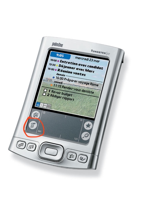
Even the palm pilot with its ridiculously tiny screen and bad touch ditigizer managed CUA-style menus.
Mobile UI design isn't about making things more understandable, it's about getting the user into a helpless and suggestible state so your ad impressions are worth more.
More than anything hamburger menu type design feels to me like an “avoid effort and skill as much as possible” sort of thing more than it does an “optimize ad revenue” sort of thing, as does flat design. It’s about lowering the bar for what’s acceptable to ship as far as you can possibly get away with. Plaster some scrolling flat rounded rectangles and a hamburger menu on the screen and boom you’ve got an app.
There is more than enough room for 4 menus across the top of a typical mobile device. If you expect the user to need to access it regularly, you could even put it across the bottom. This is why the homescreen on most phones has 4 items across the bottom; not a single hamburger menu with "Phone, Messages, Web, ..."
I'm curious, not a UI designer at all here, but what's so taxing about the hamburger? I grew up with it mostly always around and never even thought twice about it..
My problem with it mostly that it hides functionality. Seeing a hamburger menu gives you no insight as to what options exist under it.
The menu itself also tends to be a "grab bag" of multiple otherwise unconnected things, increasing the effort required to figure out how to do something.
I like to refer to them as junk drawers due to their messy nature.
Apps with hamburger menus also tend to have navigation that’s otherwise not well though out, think burying options in chains of modals where the paths to those options change whenever the app’s dev decides it wants to push a different feature/metric.
I like the "junk drawer" analogy. It's perfect. IMO if you as an app developer find yourself reaching for a hamburger menu, that's the time to step back and stop adding junk features, especially if you're writing a mobile app or web page. If you can't fit your application's critical functionality in, say, 4 tabs across the bottom of the app, the app is probably trying to do too much.
That’s often the case, but the other common problem is lack of consideration about hierarchy. It’s fine if every function of the app isn’t accessible with a single tap — that’s probably not necessary except for the app’s most pivotal functions, but most things should be able to be used within two taps and almost everything within three, with the paths being logical and predictable.
It’s plenty doable, but like I said it takes some sitting down and planning and perhaps more importantly, design centered around the user and their needs and less around looking pretty in a slideshow or trying herd the user around.
I know it's only anecdotal, but my mom doesn't get it. She's not super interested in her iPad and basically only uses it when she has to or for FaceTime. She'd be the perfect test subject for stress testing UIs and more interfaces than you'd think are doing a pretty poor job of explaining themselves. Not many icons are intuitive, hiding something in modal windows, muscle memory/dexterity and precision are all problem areas.
The hamburger is basically all of that rolled into one button. It's pretty abstract, you never know what's behind it and when they get fancy with animations and swipe gestures, it's almost always a failure.
I know it's a convenient way to clean up a screen, but the content in that menu needs to be absolutely optional for it to work.
As someone that has been learning new interfaces for the past 50-ish years as they randomly appear and mutate... I had no real idea what the icon might mean. Something that is stacked up that might drop down if I touch it? Could the lines mean a text document of some kind? Could it be a list of things? I got there eventually, but the word "menu" wouldn't have required any guessing on my part, for example. It was easier, though, than figuring out that the three vertical lines at the bottom of my android phone meant switch apps or that the rounded square meant "make the app go away, but don't kill it".
Because when I eat a hamburger, there isn't a whole restaurant inside it.
Nothing about the food suggests its function. And the function varies, it might be a whole rabbit-warren of menus and options. It might be a bunch of actions. It might just be one last item that wouldn't fit on the screen. It's an awful graphic for an awful concept. "We ran out of UI ideas so we just shoveled what was left into this junk drawer" is no way to go through life.
The implication of "load" is not that it's a huge hurdle, but just that it takes longer (even a tiny bit) for most users to visually assess what it means. Add up all those little delays, and you have a frustrated new user.
I regularly use a piece of software from IBM that has (this won't surprise you) an awful UI. There are not one but TWO hamburger menus, hidden amongst a bunch of text menu headings, and figuring out where the one you want is can be noticeably taxing. Explaining to another user where to click is even worse - "No, not that one, the one under the... to the right..."
> but just that it takes longer (even a tiny bit) for most users to visually assess what it means
Also as an example, three horizontal lines also sometimes get used as grips to indicate an element can be click-dragged around. It is less common than it used to be, though.
Any symbolic visual takes time for our brains to decode. When compared to language which we’ve spent our entire lives decoding and which comes much naturally, the cognitive burden is much higher.
In addition the three bars are as mundane of a composition as you can get, so it doesn’t capture the eye well to begin with. Typically the eye gets pulled to more visually complexity.
But ultimately it boils down to the decoding idea—language is the ultimate “codec” of human communication.
Isn't text a "symbolic visual"? I would think that at some point a symbol that's used as frequently as the hamburger icon would/could eventually become equivalent to the word.
> Typically the eye gets pulled to more visually complexity.
Written words have a "voice" - that part of your mind that recognizes something spoken. Hamburger menu icons don't have that, nor do they have the higher contrast or complexity that emoji have.
Absolutely just use the word "MENU" instead, if the button's already in a textual interface. And if not, labeling the hamburger is almost always better than leaving it naked. But I think there are better overall solutions to be found outside of the local maximum, if you will.
Great if you are an English speaker. Do we then translate that to every language we need to support? Do we scale the UI to work for the different length words?
I dont think that is any better at all. If anything I think its solidly worse.
Ideally, the translation needs to happen before the UI design. I've seen a lot of UI designs come straight from the designer with a beautiful pixel-perfect depiction of controls, but assuming English. So the "MENU" button was designed deliberately such that exactly four latin characters fit inside of it horizontally. Or assuming people's names fit in one line of text, or addresses have a certain number of lines and so on. Then when you get around to translating everything, the design has to go back to the drawing board.
> Great if you are an English speaker. Do we then translate that to every language we need to support?
Yes.
If the page isn't in the target language of the person using it, what difference does it make whether or not it says "menu" in English? If the user wouldn't be able to understand the contents of the menu, is it markedly better that they access those options via a hamburger icon vs an inscrutable bit of text?
That Newsweek one would have had me stumped for a little, I think. I like to think I'm pretty tech-savvy, but not knowing Newsweek, that looks a little bit like a logo to me. I think I would assume that was going to take me to the homepage and avoid it.
For people mentioning the need for translations, clicking the button, regardless of label or not will usually show... text. that needs translations. only one more word for a label.
There is a balance to be struck between accessibility (speed sense) and discoverability, which disfavor hamburgers, and cognitive load minimization, which favors hamburgers, if you reserve it for lesser-used items. Perhaps a themed menu icon that indicates what it holds would be better.
Huh, interesting research. I wonder how much more intuitive the firefox hamburger menu on the top right would be if they moved it to the left. I sadly just realized it's the one icon I cannot customize the location of, but now I'm super curious.
God, every time I see a screenshot of Firefox 4 I get hit with a nostalgia blast. I was in highschool and I remember getting hyped up about the UI overhaul from teasers Mozilla was putting out. Felt like Christmas when I hooked up to the dorm wifi at the table in the lounge and got the update notification.
Using the product or vendor logo as a menu icon on desktop is its own trope. The Apple menu and the Start menu aren't even the same kind of menu, nor do they function the same as "hamburger" app or website navigation on mobile.
Was it ever? I honestly think you could have used almost any icon, given the limited screen real estate, and the tendency to put menu buttons at the corners of the interface.
I think we spend too much time pondering "semiotics" when we should just consider the _basic_ "ergonomics."
My assumption is some designer chose the three horizontal lines to suggest a list of choices. Later, for some tiny space where lines didn't fit well, they were crushed into three dots stacked vertically (which also sort of suggests an ellipsis tipped on its side?) Why we decided to use food metaphors... well, who isn't thinking about what's for lunch?
That's exactly it. Android popularized it with its early versions when those phones had physical buttons. One of those buttons was the menu list button which opened the context menu. Eventually that button was removed and was replaced with in-app menu buttons. The remaining buttons became virtual, and then bikeshedded to triangle, circle, and square because usability be damned.
I did not read the article and only half of the comments. I would put a flag for the language’s where the pancake menu was that opens full screen menu to choose the language you want.
Which means I would then have the whole site in one happy scrolling page on mobile. Did the article or the second half of the comments address solutions?
- or, how would you do it without nav except for the footer links …
Mobile German navigation sucks because of the long words when implementing, yes.
Great work by NN/group documenting examples in the wild and providing clear suggestions.
It's amazing just how bad UI/UX professionals are (often due to backgrounds in graphic design instead of human computer interaction). Making changes as small as putting an outline around the hamburger menu (makes it looks like a document) or putting dots in front of the lines (makes it look like a button to add bullets) makes the icon unrecognizable/confusing.
[0] like in Windows 1.0, I guess: https://upload.wikimedia.org/wikipedia/en/4/4e/Windows1.0.pn...
[1] unless it’s a secondary but universal menu like the Windows system menu in [0]