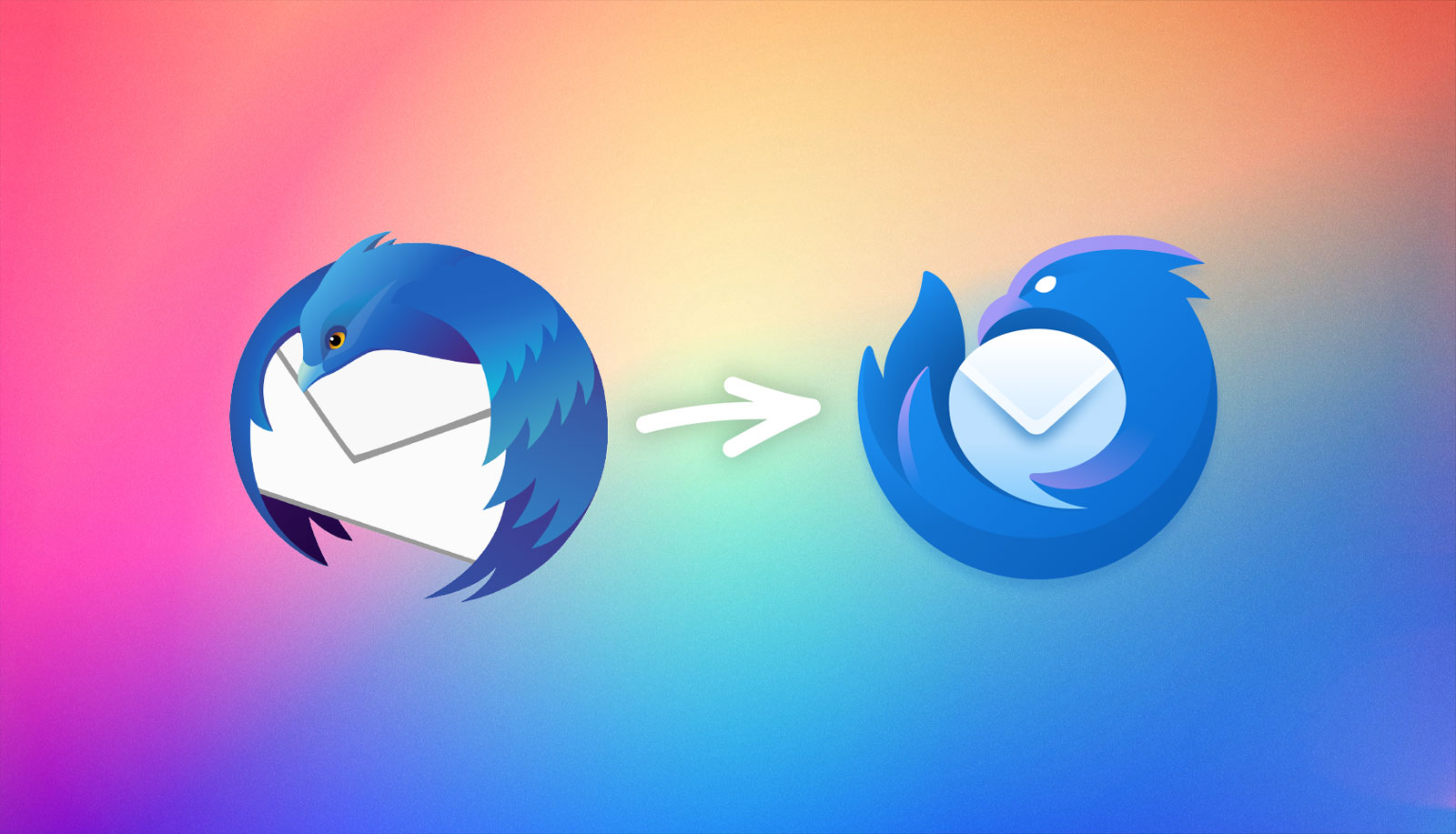
> It's inevitable that throughout my career, I've watched as work gets replaced and updated by others. It's rare to be asked to redesign old work, which is why I leapt at the chance when @thunderbird asked if I could design a contemporary update to the Thunderbird logo. The one I designed 19 years ago!
Ha, interesting points, but it's all a matter of perspective.
I would much rather that the bird delivering my mail is a badass who can protect it at all costs. Perhaps the protective "MINE" body language is aimed at someone trying to intercept my mail, not at me. This is a much better scenario than a fake-ass overly friendly bird.
Also, the old logo always made me a little uncomfortable—it looks like the bird is mid flight, but the moment it flaps its wings up it's dropping that letter!!!
> This is a much better scenario than a fake-ass overly friendly bird.
Well, it's certainly a taste thing, but I dislike the "angry bird". Whatever the meaning that was intended, it looks like a warning that I shouldn't use it. It's also a bit like the fashion for the "angry" look of trucks, but the other way around. Driving trucks styled that way feels like I'm telling the world how much I hate it.
But it's all irrelevant. I'm not going to stop using Thunderbird just because I dislike the logo.
I can see that. It's funny how polarized the reaction to this logo is. Like, everyone gripes about logo changes and then gets over it, but someone in this thread actually jokingly said they might start using it just because the like the logo so much (obviously probably a joke, but that they took the time to say it says something). Personally I immediately liked it and thought of it as "confident" and "serious about mail". Angry or aggressive didn't even occur to me until I read the linked provided by the person I was originally responding to.
It's truly fascinating how different people can derive such different meanings! "Confident and serious about mail" are not things that came to my mind at all until someone mentioned them. (I tend to perceive hostility as signifying insecurity and weakness.)
All I saw was hostility. After the other interpretation was pointed out, I can see that -- but I have to force myself to see it. I still just see hostility by default.
Good points? Whoever made that post reads too much into things that aren't even true:
* Long, sharp beaks are characterestic of nectar feeders, e.g. hummingbird, not "lethal predators".
* Hawk's beak is neither large nor particularly sharp; and while hawk is a deadly predator, and the new logo is hawk-like, I can't see the hawk as a bad thing;
* Everything else is purely subjective, too. "Dead white eyes convey malice"? OK.
Finally, re:"Message is mine, not yours"? Well, that's the entire point of an email client. It keeps the mail, it doesn't live on the server.
If that comes through the logo, then it's a job well done.
haha I'm glad someone said it, it always bothered me
I guess no matter how good the design is, you have to think about how it looks in 16x16 & 32x32 when most people only see the logo when they look at the tiny icon on their desktop
Do you really consider "Wings wrapped possesively around message says 'it's mine, not yours'" a well though-out reason? That's not feedback, and more like just being mean. If that post mentioned an actual reason, I sure missed it.
I'm saying this as a person who likes the old icon better.
Most of the time I see a logo redesign, it's a mess that makes the product more difficult to recognize, and makes things look more generic.
Not so this time! Immediately you feel that the Thunderbird and Firefox belong in the same family, while still immediately recognizing that the new logo is the same Thunderbird you know and love.
It stuck so fast, I had to look app the current logo to remember how it looks like!
> Yes, we have officially added an iOS version of Thunderbird to our future development roadmap. Expect more concrete news about this toward the end of 2023.
So it doesn't exist yet, but they're going to make it, and at least they've got a logo for it.
Wow this is one of the best logo redesigns I’ve seen in a long time. Absolutely keeps the spirit and distinct identity of the old one, but looks a whole lot crisper and fresher. Huge props.
I anxiously clicked, expecting to see an overly simple, flat, gradient filled shape with no character.
But this is perhaps one of the few I’ve seen in a long time that manages to maintain a sense of character while also taking just enough from modern trends to feel fresh and like it belongs next to other current day apps.
I also love that when you click the link the new logo is right there, front and center. No other explanation needed. In most of these announcements you first have to read through pages and pages of design philosophy written by the overpriced design firm that had to somehow justify its hourly rate despite delivering a flat, boring logo.
I think it’s great too. It does an especially good job balancing its cleverness in a way that works well in each context it was designed for.
Somewhat aside: as a long time Mac user, it bums me out how the current macOS/iOS design language distracts from the logo as an icon. The Windows variation is much better, and would’ve fit right in on a Mac just a few years ago.
In all fairness, Thunderbird could have opted to use the windows/Linux logo for macOS and it would look amazing in the dock.
The silly white background squircle trend was set by the chromium/electron apps and it’s the opposite of the Human Interface Guidelines which recommend a distinctive and rich app icon.
I hate to be generous to Electron apps, but this wasn’t a trend set by them. The squircle thing happened directly in lockstep with macOS setting the expectation. Really good icons, even for Electron apps (VSCode is a prominent example), became indistinguishable practically overnight when the macOS design language was announced.
Unfortunately, Cupertino endorsed the squircle and encourages to “embrace simplicity”, so indistinct icons are recommended in the HIG now
“In macOS, app icons share a common set of visual attributes, including a rounded-rectangle shape, front-facing perspective, level position, and uniform drop shadow.“ [1]
Apple's new HIG is an exercise in marketing overriding usability unfortunately. I find it exceedingly hard to distinguish the squared icons on my Mac nowadays, and I also think they look worse than the more free-form ones from before.
At least it is still possible to use custom icons in Mac OS. But don't tell Apple!
I think it is clever how the "negative space" of the rounded envelope plus how the wing is holding it evokes a "speech bubble" of most other messaging apps, while still being visually an envelope. It's subtle, but communicative, and one of those things that once you see it, is always there (like the FedEx arrow).
The old one was bringing you the envelope whereas the new one is protective of it. The old bird had a neutral but confident expression. The new one looks angry and it looks like it's in free fall - no sure footing. I like to imagine it as a goalie who just saved a super fast shot and is now drifting backwards with the ball. It also looks like an infant, it might be because it is not depicted in flight and the way they chose to use the wing like a hand makes it look like underdeveloped wings. Plus the lack of confidence and or discontent communicated with the angry face.
All said, I think visually it's quite nice. I don't mind an angry infant bird doing its best to hold onto my email.
The old logo can be seen as the bird holding the envelope with its wings, hence unable to flap, without dropping the envelope. But if the bird doesn't flap, it'll fall? It's caught between a rock and a hard place.
Yeah, it looks like a bird throwing up an envelope to me. Wish they'd just make it more apparent that the bottom beak is not a beak, because otherwise it's a slick logo...
I love the way the new logo shows the envelope as a speech / chat bubble (notice the tail formed by the wing). Subtle touches like these make a logo a lot more interesting for me.
In both logos, it looks like the bird is protecting the mail, which was a nice touch to hang on to.
It is also interesting that the basic shape is the same between the Thunderbird and Firefox, but it doesn’t really look like the fox is protecting the Earth orb thingy.
Given that the stable, dev, beta, and nightly logos used to basically just be palette swaps, they're supposed to be. PLus, "dev" firefox is literally the same version of Firefox as stable, but with a few about:config flags set differently by default. It's not even a different release version =)
It makes sense that the design converges with Firefox's, but the flame doesn't really translate the same way with Thunderbird. I never thought of the connotation with "firewall" before, though one could say that it's a bit unfortunate that the mail is set on fire. Firefox moved away from depicting a burning planet.
It's hard to get too excited about a logo change. It basically fluff and has zero impact on the functionality of the client, but I'll admit that I do like it over the old one and since I know they're also working on changes that matter as well, I really can't complain.
It communicates to new users that this is a currently maintained project, that it has modern features that they expect, that it works on the latest operating system that they might have installed, etc.
It's obviously important for a commercial project, but even for an open source non-profit it's important, because you want to have an active base of contributors and if you aren't getting new ones they'll slowly diminish over time.
It's weird that actual current maintenance, actual existence of modern features, and actual cross-platform portability doesn't communicate that, but a new logo does.
People work that way. We have several ways to visually communicate that we are current with the general state of the world and we're not slipping away. Logos are one of them for corporations and projects in general.
But these are not necessarily visible for the end-user and guess what, this is what an end-user notices, not if the service is using some of the new state-of-the-art encryption.
> It communicates to new users that this is a currently maintained project
Busywork, which I consider logo change to be, doesn't really make a project seem "maintained". But at least it's not a productivity-disrupting change so... whatever floats their boat.
It's not the regular change of logos that people notice and then think that that must mean that the project is active.
It's more that design trends change with times, and color gradients currently went out of fashion (but will come back, in a later design trend), so it's important to adapt to current design trends once in a while.
If you don't do that, people subconsciously dismiss the software without trying, assuming that it won't run, or won't be able to handle modern workflows.
You've seen benign instances, then. Every time I see a company do this kind of thing it takes one or more engineers nontrivial time to go update everything.
> It's obviously important for a commercial project, but even for an open source non-profit it's important, because you want to have an active base of contributors and if you aren't getting new ones they'll slowly diminish over time.
I feel like many here might disagree that this should be the case, even if realistically it kind of is for most people. To that end, I'm curious whether there are any projects out there that have decided that this is "silly" and instead are alive and doing well, without caring about UI and aesthetics that much, focusing on UX more instead.
I think the logo and look of something like Audacity, Handbrake, ManicTime or KeePass comes to mind.
Perhaps why many have been moving to preferring "Xenia" as the Linux mascot. She's vintage 1996, too, but she has been through quite a few more transformations over the decades.
I'd rather my open source software oppose corporate wankery trends rather than follow them. The notion that you need to change your logo in order to attract new users is absurd - if the old logo looked like an 8-color Windows 3.1 icon then maybe you'd have a point but the previous Thunderbird logo was plenty modern, no need to chase fleeting design trends.
In this case, the new Thunderbird logo is in a similar style to the Firefox logo, which makes it clearer that the two apps are from the same developer. This can help with user acquisition since Firefox has better brand recognition and a larger user base than Thunderbird.
As an aside, when Thunderbird first launched, Firefox was called Firebird, so their names were similar as well. The browser was renamed to Firefox in 2004 to avoid confusion with the Firebird database.
I’ve never seen a more positive response to a logo change.
I honestly can’t think of any positive response to a logo change lately. The flattening of Google’s word mark a decade ago is the most recent that comes to mind. I’m sure there are others, but the point is they’re almost never this well-received, imo.
Are you arguing just against change? Like things should remain the same if there's no technical reason to change them? 2 decades is quite a long time for something visual to remain the same.
“2 decades is quite a long time for something visual to remain the same.”
Which increases my chance of identifying the icon at a glance considerably, since most apps I use have either not existed for 20 years, or have had multiple logo changes in that time.
All this change just means I am effectively icon blind in most computing situations, which is a real annoyance and hindrance to productivity
1. Why does it look aggressive/frowning?
2. It has become so generic it looks almost exactly the same as Firefox logo when the colors have been reduced to just one.
Is it too crass to say that the old design is much better. Gentler and was actually self explanatory.
I have often seen this. Products going through an identity crisis try to reinvent themselves and then fail miserably at it. So they end up doing things like logo change, font change, and more enterprising ones cite a new revolutionary made up design philosophy. I do hope I am wrong about Thunderbolts though.
I think it looks ~shit~ not to my liking. Why? Because the old one looked friendly and the new one looks fierce. This tendency is a disease with many objects nowadays. Cars especially. Everything and everybody wants to look angry and dangerous. And that's not a good thing.
Yeah, I'm surprised most people here are so positive about it. Why would we want an angry logo? Also, the new logo is heavily inspired by the Firefox logo, with the flamey tail. Which doesn't make sense, as Thunderbird has nothing to do with fire.
I like the new logo, but hadn’t thought about the fire theme. Maybe they should’ve went for a more thunder-y, angular shape for the bird’s tail to better reflect the name?
As somebody who has been using TB for many years and still think it's the best mail client for my needs around, I... don't care? I mean, old logo was fine with me. New logo is OK too I guess. Neither is really on the top of my concerns. I'd rather have calendar integration working (still can't see stuff from my Google and Outlook calendars in TB). Or stuff like QuickFolders integrated.
You're not the target audience; at best, they should care about not upsetting you with a bad design, but rebranding is there to keep the product fresh-looking and attract new users.
This is a common misconception. Having basic features like "calendar integration" working "(still can't see stuff from my Google and Outlook calendars in TB)" is actually how you attract users and keep them using your product.
Yes. If I had some other mail client as good as TB but with calendars working, I'd probably switch. But others are worse. So, for me it's definitely the features, I couldn't care less about logos and other fancy stuff.
To be honest, some strange underdeveloped artistic [0] part of me wants the logos to be oriented the same way, but I grudgingly admit that the current position of the thunderbird is probably best for the adaptive icon. I do kinda wish they hadn't included the eyes, which the firefox, of course, lacks.
I should probably just be happy that the logo redesign doesn't look strictly worse, like they usually do.
This is the first time I'm hearing about adaptive icons. According to the docs[0] there is a related concept called "themed icons" [0] and there should be a system setting in Android 13 to enable/disable them but I can't find it? (Running the GrapheneOS version of Android 13.)
I adore adaptive icons, though it's somewhat moot when not all apps implement support. Looks great being able to set a colour theme of my choosing and have it apply to everything
Can't say I'm a fan. The old logo was a bird carrying a letter, delivering it to you. The new one is a bird, but with a big furry tail, playing with a letter like a ball. It's just the Firefox logo but blue. You know just because Google turned all their app icons into the same thing you don't have to copy them, right?
To me, it is good at being simultaneously distinct from and reminscent of Firefox. If I have both of these on my taskbar, I'll know they're related but never get them confused for one another. The old one didn't pair quite as well.
even though resolutions are better the most common platform these days, the smartphone, has a much smaller screen and that is why logos have tended to omit details.
They're catering to the lowest common denominator and only that. Having more details would not make the mobile logo worse and it certainly would not negatively affect mobile users if the desktop logo had more details.
This is a surprisingly good design. After seeing the headline on HN, I was convinced it was going to be terrible and lead to a ton of rants. But mostly positive comments so far.
After seeing the logo itself I was expecting such rants, because it fits so well with the more recent Firefox rebranding which haven’t exactly been well received. I’m pleasantly surprised.
How do you even see a chat bubble in that? It's clearly a mail icon, the new Thunderbird icon is just taking a design cue from the modern Firefox logo.
I almost included in another comment that I was impressed they made this less subtle (so logo nerds aren’t the only ones who can see it) without ruining its subtlety. If you look at the space between the tail and beak you’ll probably see the rest.
I’m genuinely curious! What does the shape look like to you instead? I could see a highly stylized single quote character, which would be just as fitting.
I loved Unibox because it grouped email by contact - this fit my workflow way better than grouping chronologically or by thread. It was not sorted by “from” but rather the main view was just contact names and clicking on the name would show a list of emails. It was so great. Much like other message apps. I only stopped using it - years after the developers stopped updating it - because I was worried about a future OS update breaking it.
Does Thunderbird or any other mail client do this? My memory from a billion internet years ago is that the UI is similar to all other email clients, especially Apple mail.
Well that's cool, personally i wasn't alive in those days :)
On another note, the absolute best mail client i have ever used is FairEmail on android. It even beats Thunderbird on the desktop. If you run android i highly recommend that too.
Ha! My Unix timeline history is vague now but I’ve used SCO, DG/UX and HP/UX in anger. Pretty sure mailx was my client on most of those! :) (not to mention SunOS and Sequent at some point. And DRS/NX. But that’s not one to mention in polite company)
I use Thunderbird on a MacBook Air (Apple Silicon). Just be warned that it seems to use a lot of CPU resources (when seemingly not doing anything) and therefore uses up the battery faster than it should. It's not a deal breaker. I tend to keep it closed until I check my mail, which isn't ideal, but then again, it's not the worst productivity/stay focused habit to have. This is as of May 2023 and earlier. Hoping the update/integration with Firefox may improve this.
High cpu usage has been the case with Thunderbird on MacOS since forever. I've long wanted to switch to apple mail due to battery drain, but I just can't work with a unified accounts. I have multiple accounts and like keeping them separate.
If an email comes from someone you don’t know it created a kind of virtual contact which bubbles up to the top of the contact list.
If you click on the contact it shows a list of their emails. If you then click a button in the top email, that will give you a threaded email view which will show the whole mailing list activity chronologically.
I don’t use mailing lists much so there were probably better ways of doing it. But I actually thought unibox’s threaded view was really great.
That said, there are plenty of email clients that deal with mailing lists. What about one for me? :)
It's okay? I think what bothers me the most about it is that the envelope is smaller, and not front and center anymore. I get that the idea was to make it look more like the Firefox logo, and it succeeds in that regard, but I liked that the envelope was the big, rectangular thing which dominated the logo. That's what my eyes are looking for and expect if I'm searching for 'the mail program' on my desktop or phone or anywhere.
> That's not an envelope, it's an arrow pointing down.
Huh, I guess I can kind of see that? But at the same time, the shading also really makes it look like an envelope, which is more or less what you'd expect from a mail client. I rather like the bird part of the logo, but the envelope/arrow feels not as prominent or obvious as I'd expect. Still an okay logo, though.
I think they were making a joke, namely that it looks like an arrow, even though it's presumably supposed to look like an envelope.
The fact that we're talking about it shows that this is in fact a minor(?) design flaw. Ideally it should be obvious that it is an envelope, not an arrow, so that a user who's never seen the logo before immediately knows what it represents.
Haha yeah, though I could probably also imagine a down arrow logo, for mailbox folders or something. You're right that there's a bit missing for an actually distinctive letter shape, notably the rectangular edges. But those would clash with the circular shape.
Personally, while i like the new logo on its own, it seems too similar to the Firefox logo - enough to create some confusion. Further, since Mozilla has lowered its level of support over the years, I'm not sure it makes sense to commit more to the Mozilla brand, especially since Firefox itself has been steadily losing market share.
That is kind of correct.
There hasn't been a Thunderbird Android client, really. Since last year [1], K-9 became under the umbrella of Thunderbird. But before it was a completely separare and independent project that had nothing to do with Thunderbird.
I think they intend to make a bunch of improvements/changes to the K-9 UI, settle it back down again, and rebrand it Thunderbird. So today, yes, there's just k-9. But at some point we should begin to see Thunderbird branding.
yeah my first reaction was, "hmm, should I switch from K-9 to Thunderbird on my phone?" followed by realizing that my K-9 will turn into Thunderbird. That'll be nice then, using the same e-mail clients and browsers on my phone and my computer...
Well it looks like Betterbird war is having an affect on Thunderbird itself. While not the same logo, it has a similar "feel" to the Betterbird logo.
Now if Thunderbird will finally make it possible to NOT have threading as the default for new accounts or have an easy button to remove threading, rather than the cumbersome way they do it now, (listen to the endusers guys , not the sponsored contributors), we will all feel a little bit more love for the venerable Thunderbird.
I do like the new logo though.
And when you add a new account you have to do that for all the folders individually.
That doesn't apply to a folders sub folder either.
There is a method to copy all settings to a folder and its sub folders but that does not include sub folders of the sub folder.
So you end up for a while with some folders showing up as threaded and some not.
And you have to do it for each account individually. (some of us have multiple accounts for businesses and personal emails)
Nightmare when deleting, because you may delete a thread rather than an individual email.
For most of us it means threading was foisted on us without notice or discussion.
Ever tried to find out what is being considered? Good luck with that.
Surely a global button to remove all threading can't be all that hard.
What is a Thunderbird? According to Wikipedia: "In Algonquian mythology, the thunderbird controls the upper world..." Its wings create thunder, while its eyes shoot lightning. What does this have to do with email, exactly?
So here we have the color purple, an angry (vicious?) creature that looks like it is devouring your communications, and, as usual, a triangle in a circle. Nothing new under the sun.
> This licence allows the licensed fonts to be used, studied, modified and redistributed freely.
That is, you can use them on other distributions (or operating systems), and they can distribute them if they want (I believe for example Mint comes with Ubuntu fonts as default).
Gut feeling when a logo change is usually negative. Remember when Google updated their logo? Man that looked awful. But looking back, their old logo wasn't very good.
The same for Instagram. The old logo might have had more character, but it is also so dated.
I for one have swallowed my pride on those and admitted that, yes, the professional designer was right. They needed an update and the update was better.
My only critique is that the Android Adaptive version looks entirely different to the primary version. I think if they'd gone an outline route - like the Gmail/Photos/Settings icons on Android do - it would've retained more of the spirit of the primary version, rather than the inversion which seems to literally invert the general "feel" of it.
Real question from someone genuinely curious: why would one use Thunderbird, or any third-party email client? What benefits does this offer over using the UI provided by your email provider (assuming that you aren't self-hosting)?
I assume there are benefits -- I guess one I can think of off the top of my head is that your email is accessible offline. Surely there are others though
Because you usually don't have a single email provider. Thunderbird allows you to have a unified interface for all mail accounts instead of having n+1 UIs and apps for each of your accounts.
Having your mails accessible offline is more of a protocol question.
first and most important, is you can keep a copy of all your email, on your own computer both sent and recurved. You can store on a backup drive.
Second you can use it as a collections centre for all your other emails, for example, your account at Microsoft, and or Google, and or Yahoo, etc.
By having a copy on your own device you can delete old emails from the host that your provide. Saves room, and is less secure.
> why would one use Thunderbird, or any third-party email client? What benefits does this offer over using the UI provided by your email provider (assuming that you aren't self-hosting)?
1. Unified single entry-point into all my email accounts. I I can search through all of them even while keeping them isolated from each other (to allow searching individually).
2. Latency: when I want to open an email it does not require a 500ms delay, as in gmail, roundcube, whatever. You may think this is not a problem, but if you perform a search and want to quickly open all 15 of the results, that latency adds up quickly.
3. Slicker UI, in most cases. Especially in searching (which is different from "filtering"). UI for adding rules to kill based on patterns is a lot easier than gmail, for example.
To be honest though, looking at my points above, it basically comes down to "searching is better on local client".
The service becomes a mailbox instead of a filing cabinet. Supposedly mail after sitting in your digital mailbox for so long, is available to law enforcement without a warrant.
Looks good. But personally it reminds me of an angry little baby-bird, because of the stance and the white pupilless eyes. Maybe I've seen just read too many fantasy-comics, where white eyes are a typical sign for an angry animal. And I guess at icon-size it doesn't matter anyway.
Looks great! Evokes "Thunderfox" moreso than "Thunderbird" but that appears to be the point, and it works well.
I especially like how the round envelope fold is contrasted with the background enough to be immediately recognizable as an envelope despite having a very non-envelope shape.
It's not like this is the only thing they're doing with Thunderbird, and it's not like the graphic designers would have been optimizing the SMTP code if they weren't busy with the logo.
Thunderbird has been an independent project for years, Mozilla doesn't develop it. All that Mozilla does is hold the trademark, host the website, and possibly facilitate donations to the developers.
This appears to reinforce what I wrote rather than refuting it. Mozilla graciously performed the legal legwork of forming an entity capable of collecting donations earmarked for the Thunderbird developers. However, as far as I can tell, this does not imply that any Mozilla developers actually work on Thunderbird (as part of their job at Mozilla, anyway), nor does it imply that Mozilla is setting the direction of the project.
It's a subsidiary of Mozilla. They all work at Mozilla.
It'd be like saying no Microsoft developers work on GitHub or LinkedIn. They all work for Microsoft. They're a distinct group within Mozilla/Microsoft, but they're not outside of it.
Gotta say, looks really good! On brand and on-point. I was worried before clicking that this would be similar to the time the Firefox logo almost copied the Gitlab logo. Glad to see that's not the case!
I wonder if someone bothers to do a scientific study about how a more gentle or more aggressive icon affects the style and communication success of the mails written with thunderbird.
The logo is nice. The bigger news is the expected iOS thunderbird version. Would it be new code or based on some existing iOS mail program (like the Android version)?
Completely off topic. On that page we see the following conversation:
> Jason Sneer
> Using a white background and slapping the icon on top of that is just lazy… The adaptive icon exists for Android, which means that you can use a glyph on top of a colored background. Why go with the white background?
> Jason Evangelho
> Read the entire post? There is an Android Adaptive version.
Does it annoy anyone else to see people who write statements and put a question mark in front? "Read the entire post" is not a question, and shouldn't have a question mark.
Honestly this is artistic genius at Escheresque level. The thunderbird outline (better reflecting the mozilla link) gets to shape with its body (suggesting hugging and protecting) both a mail envelope and a chat bubble! The economy of representation is just amazing.
> carrying us forward into the next 20 years
Thats the catch. The new logo sets sky-high expectations :-)
Thunderbird is the natural client to the emerging fediverse. It can offer a consistent interface to help users organize locally and privately the torrent of information they exchange with others, whether that is email, rss or anything exchanged via activitypub servers (toots, events, book reviews etc).
The era of "super-apps" is upon us [1]. Users prefer fewer and better apps that bundle related functions. The question is how the open source and privacy respecting universe will respond to the onslaught of walled-garden super apps.
The browser/firefox is the obvious first super-app. It is powerful enough to be called an OS within an OS. It is invaluable to have a privacy-first window to the Web. But its true character is a sandboxed, stateless window. Users click and scroll and leave a behavioral footprint on somebody else's server.
Which may be ok. Or not. Because you can overload the browser to create (among many others) webmail, but that is not an empowering, user-centric and privacy-first design. This is where thunderbird comes in.
The personal agent/thunderbird super-app is the (largely under-developed) second opportunity for the open source universe. Its character is a stateful window to fediverse (or Web 3), helping to organize the world's subset of information in a way that is intimate to the user. Local information, local intelligence.
Which brings to the natural (and unavoidable these days) conclusion: To realize the full potential of thunderbird as a personal agent it will be quite important to develop a versatile plugin ecosystem that can tap locally-run "AI" services.
> what do people use a desktop e-mail client for.. ie thunderbird ?
I use Apple Mail for reading mail because I have email accounts at a number of different providers and web UIs differ so easier to bring everything into one app. Also, sometimes it’s good to have email offline.
> Mine as start sending hand written messages and licking stamps..
How is it worse than having to use up all my RAM in a few browser tabs with unresponsive PWAs such as Outlook for work? I much rather have Thunderbird or Evolution silently in the background popping up notifications when I get emails - not to mention it’s much easier to compartmentalise within a DE, i.e I know my email is workspace #4 instead of having to flash scroll through all my open tabs
Among other reasons, in built privacy features like ability to not load images or ability to avoid loading css or other trackable files. Reading pure text email or HTML only is very refreshing in today's age where everything is meant to distract your attention.
Most webmail clients aren't great, tied to big tech, out of your control and only manage one email address, don't integrate well with the rest of the desktop. Too name a few.
Desktop e-mail clients integrate well with the operating system, making work much easier. Native desktop apps are also faster to use and lets you access your e-mails if your connection is interrupted.
Designer John Hicks post about this:
https://mastodon.social/@jonhicks/110424132785208582
> It's inevitable that throughout my career, I've watched as work gets replaced and updated by others. It's rare to be asked to redesign old work, which is why I leapt at the chance when @thunderbird asked if I could design a contemporary update to the Thunderbird logo. The one I designed 19 years ago!
More images here: https://drive.google.com/file/d/1lRkSA9YyHduCmDe2Fucv2DK2l9a...
Based on that file being "v7" I'm really hoping John does a post detailing the design process. I always love to see how these things evolve.