A flame graph does not feel like the best visualization for this kind of data. You can't really make anything of the top spikes and there is a lot of blank space that is wasted. I prefer tree maps as they make more efficient use of the available screen space.
On Windows, TreeSize from http://www.jam-software.de is one of the few utilities I'm happy to pay for. Blazingly fast and I found its visualizations more intuitive than the others.
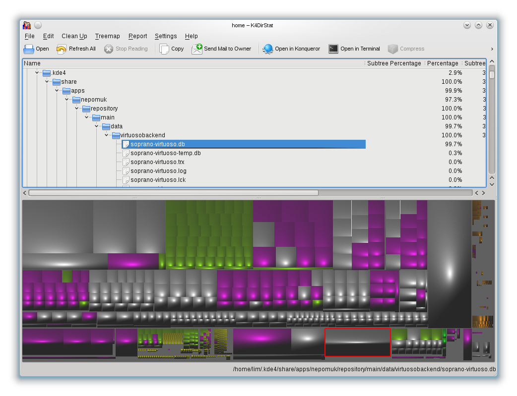
I believe Windirstat is basically a direct port of K4dirstat, though I've found the outdated interface and KDE dependencies frustrating. I discovered Baobab has a similar box visualization available via an easy-to-miss icon at the bottom of the window, in addition to the default pretty-but-not-very-useful ring graph. Unfortunately both have the major shortcoming of not including individual large files.
Tree maps make better use of space, but comparing box sizes vs lengths is a more difficult perceptive task. And harder to label.
Being unable to read thin spikes can be a good thing. There is only enough room to label the biggest boxes -- which are also the ones you care about the most.
If I were seriously building a GUI for this, it would let the user switch between visualizations to see which works best.
The other has nested squares the size of each directory and its children. It sounds decent in theory, but is as bad as the "MyPlate" visualization in practice:
I think ring-style charts are kind of hard to read if you want to compare things, but DD solves this quite nicely with the sizes on the side. All in all I recommend this app highly.
Thanks for the link! I skimmed [10], and assume you are referring to figure 7. I think you've read too much into that result.
Starbursts do indeed use angles as part of the rendering algorithm, but for a given subdirectory, you end up comparing lengths just as you would in a flamegraph.
The key difference is that the screen real estate used to render the "icicles" increases linearly with the number of levels with sunbursts, but is constant for flamegraphs. This greatly reduces the "10 icicles, each 1-10 pixels wide" problem that flamegraphs have.
Also, jumping back to baobab, I find linking the directory tree view widget to the sunburst leads to a much more intuitive/obvious set of navigation primitives -- it makes it easy to jump to a parent or sibling of the current view.
As a side effect, they can (and do) put a bar graph on each entry in the tree view, which brings it to "2d position along common aligned scale" which is two levels better than flamegraph or sunburst (3 levels better than sunburst by your reading).
This doesn't help the tree view's usefulness for navigation, but it nicely complements the readability issues with sunbursts (or flamegraphs)
You aren't comparing lengths in a sunburst -- you're comparing angles. A sunburst is a flame graph using polar coordinates. And that a slice with a smaller angle (value) but a deeper depth (from the root) is printed visually larger than a slice closer to the root is confusing.
A flame graph box at different depths can be compared directly.
>Tree maps make better use of space, but comparing box sizes vs lengths is a more difficult perceptive task.
It's not something people really need to do though at any detail level. You don't compare sameish dirs to see which is slightly bigger, you check what the big consumers of space are.
> You can't really make anything of the top spikes and there is a lot of blank space that is wasted. I prefer tree maps as they make more efficient use of the available screen space.
After having tried both treemaps (windirstats, grand perspective, …) and sunbursts (daisy disk), I've got to say I much prefer the latter. It's not quite as space-efficient but it is much clearer and cleaner, and easier to drill down into.
Now while a flamegraph is equivalent to a sunburst in linear rather than circular shape, I don't think it's as good: the "outer rings" of the sunburst graph means more surface area for the same amount of data, which makes it much easier to evaluate the leaves's relative weight within their rings.
Personally, I like it for the same reasons as you dislike it!
Being unable to read the names of the small spikes is a feature, not a bug - I don't care about any directory too small to see, and hiding them like this (but still giving me an idea of their presence if I want to explore further) is useful.
Perhaps it's just because I spend a lot of time looking at flame graphs, but this for me is perfect. It's just a shame that it requires two steps (run the script, open in browser). Perhaps I'll write a GUI wrapper around it that does everything all in one...
That might be a better idea, actually - a general purpose terminal with SVG support. I guess while one's at it, it could include PGN/JPEG support too...
SpaceMonger is one of the rare pieces of consumer shareware so good that I was compelled to pay for it. Being able to zoom with the mousewheel, google maps style, is incredibly satisfying and useful.
I usually always recommend https://dev.yorhel.nl/ncdu/scr for this purpose. Doesn't look as colorful but the output is basically the same. The SVG output is neat though!
Nice, but the output isn't the same. A flame graph can show multiple levels of subdirectories at the same time, proportionally sized to their total bytes, up to a maximum of the screen hight (say, 24). Looks like ncdu can only show 1 directory level at a time.
The thing with flame graphs, pie charts and all that is that I rarely find it that useful to see multiple directory levels at the same time. Unless it is /var/log/omg-why-dont-you-rotate that occupies hundreds of gigabytes, I always end up navigating through the largest near-the-root folders with baobab just to make room for subdirectories on the screen, which is hardly different from the typical ncdu (or even 'du -hs *, then cd') workflow.
+1 to the ncdu recommendation. Of all the other tricks I've used to reclaim space, this is the most efficient. Found it when an admin of an HPC system I was using complained about my usage on the site-wide Lustre. Turns out, I had core dumps neatly tucked away in a project dir that I hadn't looked at in 3+ years.
I've done this before with awk, but with "find ... -ls". I don't know why you want to use du with xargs (is it really to get du's measure of bytes rather than the stat's count, for when they are different?) -- as that's calling over a thousand du's to walk the linux tree, when find can print bytes built-in with -ls (much more efficient).
Seconded. My initial suspect was Dropbox. Windirstat helped me find it was some Trusted Installer-related bug filling the machine with corrupted cab files.
Nice, but... can these tools have a toggle to do the icicle layout (like the flame graph), not just the sunburst layout? I've commented elsewhere in this thread as to why the sunburst is worse.
For Linux Baobab is a great utility like this. It does the circular equivalent of a flame though, which can be much easier to read as the circumference of deeper directories gets larger by nature.
For a lot of people it might be installed already as part of their distro or Gnome software metapackages, it'll appear in your menus as "Disk Usage Analyzer."
I'd love for this to be true. Do you have a reference for this? Baobab trees are spectacular in their own right. Might the usage in the Little Prince be just a coincidence?
Sorry, that's just my assumption (though I'd be willing to bet on it). The circular graph reminds me of nothing more than the image of baobabs swallowing up a miniature planet.
After all the comments on treemaps and sunburst layouts, I think many readers might enjoy the following article if they haven't seen it already: A "Tour through the Visualization Zoo", by Jeffrey Heer, Michael Bostock, and Vadim Ogievetsky.[1] See the section on Hierarchies.
In that article, the icicle graph (same as the flame graph) has long rectangles suitable for labeling -- although their example has the font rotated 90 degrees and not making the best use of that space.
But as you can see, these are all related. Hierarchy visualizations. If I were serious about building a tool to do disk space visualizations, I'd let the user toggle between all three visualizations.
I should also note that I think both treemaps and sunburst layout have their own cons, which I've mentioned here on HN.
Daisydisk has probably the best representation of file usage that I have seen to date. The circular presentation works better for me than the 'blocks' of other systems.
I also really like the animation as you drill down into bloated folders - Really helps to bring attention to where you need to look in order to free up space. I can find offending files/folders much quicker in DaisyDisk that any other usage reporting tool.
I've always been a big fan of DaisyDisk — I used it just today to free up a whole bunch of space — but I thought I'd give FlameGraph a go. It helped me free up 2.2GB of totally valuable space (this is a 120GB MBP - brutal) with 2 clicks instead of the 6 it would have taken DaisyDisk.
DaisyDisk essentially shows the exact same info as FlameGraph — if you 'unwrap the wheel' it's exactly the same! — but the latter makes the excellent design decision to label many of the bigger directories on the graph, rather than just a single level in a key. Often, when you're looking for big directories, you're really looking for big unnecessary directories, and being able to see way ahead really helps.
I probably should have made more emphasis that it is the "best" that I personally have found.
Mainly in terms of ratios - I think my mind perceives size ratios better on a circular pie style presentation (as DaisyDisk does), rather than stacked blocks as most other utilities use.
I prefer Wiztree (link below), especially on systems with much larger disks. Since Wiztree works by scanning the MFT it's about an order of magnitude faster than Windirstat or Treesize.
Sadly as a consequence of this, it can only report file size, not disk usage. If you have a lot of folders with NTFS compression enabled, Wiztree becomes almost useless.
I like it too but I've found it to be pretty buggy sometimes, especially if the contents of a folder change or the folder itself is deleted while you're viewing it, you get an endless stream of Delphi exceptions.
My favorite of the mac apps is Omni disk sweeper: https://www.omnigroup.com/more. It has no graphical visualization, but does list files sorted by size and color coded so it's easy to see which files in any given place are the largest.
That's all the files and subdirectories, and multiple levels of subdirectories, shown _at the same time_. Without needing to navigate in and out of directories.
If there's a way to do this using ncdu, then I've failed to find it. Screenshot please.
While you're going bananas on the pros of flame graphs, a significant con is that most of the names are unreadable. In your example, the legible information is not much more than what 'du -skh linux-4.9-rc5/*' would give you.
You can click to zoom, but in the default output I wouldn't call it a significant con anyway. It's usually (not always) an advantage.
Take that ncdu output above: "/drivers" is visible in the flame graph, whereas "/virt" is not. It's only printing the names of the largest rectangles -- the ones you care about, helping draw your attention to where it should be drawn.
The height of the flame in this graph does not seem very informative.
In the example, the 3.88% used by the tower of "linux-4.9-rc5/drivers/gpu/drm/amd/include" looks larger than "linux-4.9-rc5/net" over on the right just because the tree is deeper. Similarly, on my Windows machine at work, "C:\Users\LeifCarrotson\AppData\Local\Microsoft\Outlook\Leif@Carrotson.com.pst" (where my email is stored) would take up more screen space than "C:\hiberfil.sys", just because it's taller.
I don't much care about the depth of the filesystem. The various tree views seem more useful.
There exists a 4 year old bug in Ubuntu LTS releases (not sure whether mainline Debian is affected too but it is very likely) in which kernel upgrades fail to remove old headers. Because the way headers are structured it is possible to run out of inodes long before free space is exhausted if you don't pay attention to inode use.
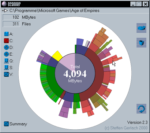
There's a bunch of other tools[1][2] that do this sort of thing already, although all the ones I've seen display file size as a sort of flame graph/pie chart hybrid (imagine a flame graph wrapped around a circle).
This flat representation is probably better because it doesn't exaggerate the size of deeply nested files, but I find the example in the article a bit harder to read.
You're right, the flame graphs (which is really an adjacency diagram with an inverted icicle layout) doesn't exaggerate subdirectories like a sunburst layout does. I wrote about problems with the sunburst layout before in ACMQ[1]:
> The sunburst layout is equivalent to the icicle layout as used by flame graphs, but it uses polar coordinates.7 While this can generate interesting shapes, there are some difficulties: function names are harder to draw and read from sunburst slices than they are in the rectangular flame-graph boxes. Also, comparing two functions becomes a matter of comparing two angles rather than two line lengths, which has been evaluated as a more difficult perceptual task.10
(I should have mentioned that they visually exaggerate deeper slices, too). I think they are pretty, but, more difficult to read.
The other app has a pie chart and trees. Both can't visually show everything at once, all subdirectories.
I agree with that criticism with respect to profiling, but for filesystems I find the increased surfaces of the outer rings makes the evaluation easier as the filesystem reaches smaller amounts of data, especially as FS tend to be relatively shallow in POI terms.
The problem is that humans are not very good at comparing angles, which is one of the reasons why pie and donut charts aren't good (and sunburst is kinda like a donut, so the same criticism applies).
We built Crab so we could run SQL queries over the filesystem. It's for Win and Mac, free for personal use, and lets you slice this anyway you want and plot the data how you like. I like the flexibility.
A bit off topic, but Windows needs this baked in. And Windows needs hard links to update ALL links when the underlying file changes, because right now if you update a file from one hardlinked file the other hardlinked files don't change their metadata.
Quite ridiculous, it's not like this hasn't been something Unix has been doing since almost the beginning!
Right now we have a ridiculous situation where the winsxs folder gets out of sync with the c:\windows\system32 folder. Nothing treeview or any other utility can you daily do about it either. And until recently that winsxs store was holding gigabytes of old and useless updates, because Microsoft's updates never removes these components (recently - last year some time I think- they updated the disk cleanup GUI to delete this stuff from Windows 7 upwards. IMO they recognised a big stuff up caused by their product management team's decision, which in turn caused this unheralded enhancement).
Doesn't Windows still lack the ability to do several basic file-system operations without resorting to goddamn DISKPART? FS management on that platform in general is a disaster.
Can anyone recommend a tool for macOS that monitors disk usage changes over time?
I usually use Disk Inventory X but I'd really like to correlate usage increases to specific dates / app installs, so it'd be nice to see stats over time, e.g:
- Installed Android Studio on Feb 1st: Usage in /Applications increased by 850MB, usage in User folder increased by 10G (450MB for android-studio-2.x.dmg, 8.4GB in /Users/name/.android, largest leaf in /Users/name/.android/sdk etc)
I tried to do this with the 'du' tools once but simply writing the current output to disk would take ages and diffs would need some heavy lifting to make sense of.
Nice - ideal use of flame graphs. When you are running out of disk space, you want to know which parts are using what proportion of disk space and IMHO this visualization is perfect for that. Kudos!
On a side note, when I'm on a server with disk space problems, I usually debug it like this:
    # cd /
    # du -sm | sort -n | tail
      (lists the biggest space users)
    # cd <unusually big subdir>
      (goto step 2: du -sm...)
Works like charm, but can be a bit slow when applied to large and slow disks.
On Windows, I've always used HDGraph[1], but as no one has suggested it I'm wondering if I'm missing something important as to why not? I've never really liked the appearance of WinDirStat, but that's just a personal niggle, I know it works well.
For me a tree map is clearer and more screen-space efficient than a flamegraph.
qcachegrind renders profiling output as tree maps, and for filesystems there are many alternatives, e.g: Baobab (aka Disk usage analyzer) does this, also KDirStat.
I am partial to DaisyDisk on OSX. Nice UI. It comes in very handy on the lower capacity Flash Disks (64GB) on the early generation Macbook Airs. Needs constant housekeeping on those.
Wow - I have an add-on to add "open with k4dirstat" to the right-click menu. Have used KDE5 since it came out and did not know about that. There is no affordance there at all; it doesn't even highlight on mouse-over.
I get a menu with options for not-installed apps - filelight, kdiskfree and two partition tools. 'sudo apt install filelight' and it works, but TBH I'm not keen on filelight, would be nice to have k4dirstat as an option there (sounds like a bug report is due).
Conveniently, I no longer need to delve into any of these visualization tools, because the answer to the question in the title is always "Debian's overly-lax default logrotate.d"
It takes careful inspection to notice the big folders when the units vary. A 25G folder is much larger than both a 43M folder and a 256K folder, but it's not obvious at a glance when you have a big list.
Human-readable units are nice, but without them it's easier to sort by size.
I'd try that first, and if it didn't find my space, then flame graphs.
du's output does the first level of directories, but not subdirectories, and also requires reading of text rather than visually comparing line lengths (easier).
If I'm at the command line already, that may well work.
Or, it may not (the initial problem I had, I already knew the high level breakdowns, and was hunting for wasted 1%'s here and there -- the flame graph made it easy to spy everything at once).
Another use of the flame graph approach is with automated build software. Imagine automatically generating one with every linux version, to keep track of where growth is.
My favorite tool for this is SpaceMonger v1.4.0 (http://www.aplusfreeware.com/categories/LFWV/SpaceMonger.htm...), which has a very neat layout algorithm. It's a Windows app but it works OK using Wine with only a few minor graphic glitches.