Would have been great, except for it suffers from the same problem the existing VA site suffers from. Almost every time I use the VA site, "something goes wrong". I just tried to book tickets for next week, got all the way to the end to pay, hit submit and "something went wrong". They just put a pretty front end on a broken booking system that breaks almost every time I use the site. The only thing I care about is that it works and the VA site consistently fails, this upgrade doesn't fix the core problem I've always had with it.
I've been very frustrated by this as well. I tried changing a booking with Virgin Australia earlier today and got a popup message: "Important information: an unknown error occurred. Try again."
Well we're seeing it more often in UI/UX because "forced creative vision" aka "design dictatorship" is more popular and acceptable for designers these days. Especially new designers who don't want to stick to the tried and true rules of design (nor learn them), nor base their designs off of some kind of metrics or best practices statistics. Steve Jobs culminated this attitude through his "I'll tell the user what they want" philosophy.
Because they're the ones hiring agencies, deciding mood and content based on presented ideas, and then approving and revising design throughout the process.
Maybe. But correlation does not imply causation. Users like beautiful quality products that also function as status symbols. They like when the choices have been made for them so they don't have to walk around Best Buy for 2 hours trying to narrow down which laptop they want out of 30 others. But not necessarily someone ignoring their needs and replacing them with his own.
It is a balance, which is why Steve Jobs got to say what he said and do what he did: with his experience in Zen Buddhism, he understood, above all, balance.
Design is two things: understanding people, and creating. You have to balance a pure empathy and understanding of needs and desires with uninhibited creativity. Only then will you create something that people both want and have never seen before.
It's a multi-page slideshow with vertical transitions, not a single scrollable page. Main benefit is that you can design in full pages, and you don't have to care about how it looks mid-page. Also, it makes animations and 'on page'-interactions possible. It actually works pretty well once (and if) you get used to it. I guess it could be a bit nauseating for people who have become one with the mouse wheel.
> I guess it could be a bit nauseating for people who have become one with the mouse wheel.
Those were my feelings exactly. It feels much more natural to be able to scroll the part of the page you're interested in to whatever part of the monitor is most comfortable for viewing. Also, this prevents you from quickly scrolling down to a lower section of the page.
I really don't like this new UI. Instead of having a sorted drop down, now there's a bunch of boxes I have to look through to find the one I'm searching for. Takes a lot longer than it used to.
I disagree. I prefer the new bigger box UI. It took a mere moment to understand everything is in alphabetical order, and scanning through them was much quicker than trying to pick from a dropdown list.
The tough part is that the design doesn't emphasize the alphabetical ordering. If it did, perhaps by making the box outline lighter and placing emphasis on the first letter of each city, that might work better.
Someone else was wondering if this was a parody, I think they might be right. There is so much funky with this, it does feel only half serious.
For me it started with 'Book from San Francisco'. I clicked on the 'Boston' button, and it shows this weird top status-bar drop down thing which flashes the message: 'Going to "Hahvahd," perchance?'. What?
Then the browser starts, a little bit too slowly, scrolling itself down automatically... Off putting.
A moment later, the mocking message slides up and away, and the top nav has been replaced by mostly broken status bar. Try clicking on some of those links in the status bar if you want to get totally lost.
Then that calendar view... I mean, if it showed 'From $199...' or whatever under each date, I could understand taking up so much space. I thought it was a lot harder to find the right date this way than with their standard date picker.
After picking a date, the flights table is significantly worse than their current design. No way to step forward/backward in dates, no weekly overview, super low contrast, overly spaced out, scroll down forever trying to see all the flights, no sorting,...
Even the seat map is weird, I don't know if it's just due to the super-low contrast, or the weird icons they put in place of seat numbers for the seats which are taken, or maybe the weird way they show the pricing for each seating area, but there was a lot of cognitive dissonance trying to understand what I was looking at.
What it comes down to is an interface which was trying to make things simpler actually introducing a huge amount of cognitive load where there didn't need to be any.
In the end, I zoomed out to 33% to get a birds eye view and while it's interesting to see everything on one page like that, I think they have a LOT of work ahead of them making it actually flow properly, fixing the contrast and layout, removing all the weird and distracting gimmicks, and bring back some of the core functionality that's missing.
I think they took "mobile first" to the extreme, and disregarded desktop. I imagine that giant calendar is pretty cool on an iPad. It's not really responsive design if you optimize only for devices and not for desktop as well.
Except it is just as awful, if not even worse, on Safari on iPad. At least for me, scrolling is broken and it crashes constantly.
I honestly don't understand how website trends can devolve so rapidly and radically. This blunder may well end up costing them millions of dollars in missed sales.
It's very linear and seems to work well only if you have all the dates completely locked down. I really prefer the designs that make it easy to see if travelling a day earlier or later would be much cheaper. I think the other Virgin sites do this.
When I saw their new boarding pass I just had to laugh. Someone awhile back went and redesigned Delta's boarding pass[1] and got a lot of crap over it for not taking into account why the boarding pass was the way it was.[2][3] But apparently someone at Virgin was taking notes.
There's a critical difference here; those redesigns are for boarding passes issued at the airport, while Virgin's are printed at home. You can get away with a lot when your common target equipment is an inkjet rather than a thermal printer.
There are still millions of people who don't have smartphones [1], for one. I'd imagine that there's a nontrivial overlap between that group and people who fly.
This is horrible and broken. Real information replaced with "flat" design and stupid hip made up words like "fun-erer".
No javascript: http://i.imgur.com/8HkKyZx.png
There is a delay of at least 100ms scrolling up and down between pages. I would guess 150ms. I do not see any obvious way of changing this, and the scroll bars are hidden. What if I need to change something at the top of the page? I also managed to break scrolling ending up halfway between pages somehow. The only way to fix this was to painfully scroll all the way to one end to reset things.
No CSS: http://i.imgur.com/u5g0eaS.png
The site appears to scale horribly, and it looks like they are using javascript to generate styles. IANA web developer and have not studied modern web stuff in a long time, but this seems like A Bad Idea.
No CSS or javascript: http://i.imgur.com/Kb2JZAH.png
I do not even want to think about the accessibility issues.
All in all it seems like they are just following the flat design trend, for the sake of following it. I am sure they have good intentions, but just from analyzing this page I am underwhelmed.
This is super slick. Design wise it's ahead of its game, instead of another flat design website.
I love how they put "life" into their brand with those avatars and make it fun in this all too boring process of buying tickets. To be honest, I would be jealous of how innovative Virgin is lately when I'm another airline.
UX wise there are some things I would do differently. There are some rough edges but it's an iterative process and they'll probably track tons of things now. For example, changing prior steps will reset the date selection.
Deep respect for their team, I also love their new logo. Awesome!
With most flat design sites I have the feeling I've seen them before. With the new Virgin site I don't have this feeling. Although it didn't work for you haha.
Most flat design websites currently all use the same flat colors and the Flat UI template.
Flat design websites that are created by excellent designers begin to use gradients with specific color combinations. Like Stripe.
There's also an ongoing trend by using more thin fonts and thin graphs in charts. Looks more elegant. I really like this, but UX wise I hear a lot of signals that people find it hard to read.
Well, I give them respect for trying something new. It has some improvements, but the UX falls short in others.
1. Boarding pass is great.
2. Being able to scroll back up to make changes is wonderful. A lot of airline sites are slow, your session breaks when you use the back button, etc. It's nice being able to scroll up, change a date, scroll back down. Well done.
As for the downside, it uses way too much space. This might work on a tablet or touch screen, but it's awful for the desktop. For example, your typical airline uses something like this...
A couple of autocomplete boxes, and a calendar picker that pops up. Works fine, it's all visible in a little box, and easy to use. The virgin site stretches this across a handful of pages, or if you're picking further off dates, it might be 10+ pages. That's just bad design.
What they should do is keep a more traditional method of selecting all your airports and dates, then scroll down to the prices when you click continue. I think it would be the best of both worlds.
They also need a method of finding the best price over a given time period. Jetstar is one of my favorites when it comes to this...
Pick a flight, say Brisbane to Sydney for a few weeks in June. Click the box to say you want the lowest price. It gives you a nice little graph with all the cheapest flights highlighted, so you can easily choose your days. Actually, the whole Jetstar booking process is decent, and I used it often in Australia.
I can't stand the fonts. Why is it necessary to make the letters on a 120px font what feels like 1 pixel wide :( I can barely make out the characters at all.
Agreed. Maybe it's better on a touchscreen than existing interfaces, but changing the dates for my flight to check price difference was a huge pain. I'll be sticking with google's flight search.
I love this. The boarding pass design is a nice touch, although I still feel like I'm going to fold it in a hurry to get it out of my hands and not in the way they intend.
It looks like I can't book a flight. "BUMMER. NO FLIGHTS ARE AVAILABLE FOR THIS DATE. PLEASE TRY ANOTHER DATE." Am I supposed to keep clicking around until I get something? Can I see a listing of "Available flights on the calendar." I tried booking DCA to SAN.
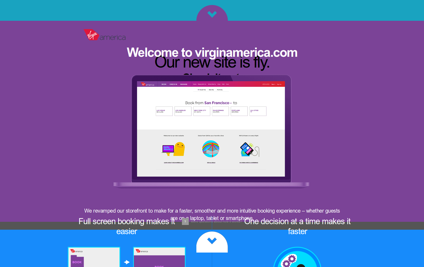
In terms of implementation, it's interesting that they chose ugly URLs which encode everything
/book/rt/a1c1i1/sfo_bos/20140524_20140528
Note the a1c1i1: that's "1 Adult 1 Child 1 Infant" and it changes as you adjust the widgets (without a page refresh).
Also, minor detail, but I'm interested to see that they use PUT as well as POST to update the server with the selections. So that's following modern "REST" guidelines (use verbs properly) but the URLs are anything but!
EDIT: I put "REST" in quotes to refer vaguely to modern API practices. I know REST is strictly something else, please let's not talk about that it's really boring.
It's gotten to the point that whenever I want to post a URL in an article or email a URL to someone, I need to sanitize it. I don't know what information I might be leaking.
If the URL looks like it might have some hidden information, what I usually do nowadays is to navigate to that location from a separate browser (in which I have no passwords, logins, cookies, history), and cut and paste the URL from there.
Flash as a technology is a caveman compared to modern Javascript-based technologies. There is no audience that does not have JS enabled -- other than the fringe who would probably be better off using wget to browse the internet.
We said exactly the same things about Flash not so many years ago, including the pretentious dismissal of anyone who would dare not support the technology we wanted to use. Before that (and to some extent even now) it was operating systems: what kind of hippie doesn't run Windows, after all? It's pretty easy to justify technical decisions by pigeonholing anyone not using our same platform as The Kind Of People who we don't want giving us money anyway.
There are quite a few comments here complaining about the gaudy unusable interface produced by "modern JavaScript-based techniques", which in this case appear to provide virtually nothing that static HTML and CSS can't do. The dev team was lazy and wanted to show off, and screw anyone who doesn't think running gobs of arbitrary code should be a necessity for buying a ticket.
And for what it's worth my non-developer artist girlfriend has been using noscript for longer than I have. I'll let her know what modern devs think of her, though I don't think she's heard of wget.
Very well done. Beautiful and simple to use. Most importantly, everything is kept on the same page and it loads quickly. I can't begin tell you how frustrating it can be using something like Expedia or Continental and having to wait so long for the next page to load.... Sometimes it takes too long and I click 'back' and have to start the process all over (resubmit the form). By keeping it on one page that expands downwards, it easy to tell when the next widget is loading and prevents all of this from happening.
This is really nice, but they haven't solved the following problem: sometimes you need more information from further on in the process in order to choose your dates. For some types of trip, the most important thing is a combination of departure time and price; you want the lowest price as long as the departure/arrival is within your acceptable range, and then you want to work 'backwards' to pick dates based on that.
I don't know of any airline booking process that accommodates that use-case well.
Hipmunk lets you search for flights with a certain date range and pick the best flights from that, and there's also a "pricegraph" that sounds like it does exactly what you want by showing you the cheapest prices within the next 90 days.
It's pretty but it's missing the one feature I love from the old site which is to quickly scrub through dates to figure out if there's a cheaper flight earlier or later than my planned date. My travel plans are usually somewhat flexible so I'm often willing to shift by a day or two to save $100.
From a design perspective this is one of the most beautiful airline booking designs I've ever seen, but from a usability perspective it might just be the worst (save for maybe RyanAir).
The cities being laid out in a grid looks nice but is ultimately far more difficult to understand then just looking at an alphabetical list in a dropdown. Auto-picking your departure city based on your current location is admittedly a nice detail, but it wasn't immediately obvious how I change where I'm starting as the "link" was different than anything else on the page.
The "Who's Flying" section is massive for having so little real information. And why are that the font is 120px (or 12rem) but the "+/-" controls are faded out and tiny by comparison?
The calendar is again completely oversized, low contrast, and difficult to understand. My laptop has a 1440x900 resolution screen and I can barely fit a single full month in the window. If I happen to want to buy a ticket more than a month or so in advance, I need to repeatedly click "More Dates" which then appends another two months to the already crazy long page? Also, the low contrast purple highlight for all the dates inbetween departure/return isn't immediately noticeable.
When I click on a ticket price another window slides up over it - took a few moments to figure out what actually happened there. Overall the "ticket selection" again looks pretty, but when I can only see a few in the window at any given time it's far less usable than a standard clean list. Also, the "Continue" button looks identical to the other addon options, and it isn't immediately obvious how to progress if you don't want to upgrade your ticket.
The seat selection admittedly is admittedly fun looking though why are half the faces looking upset? Also, versions of the seat selection where they actually place the seat INSIDE the plane in it's real physical location are more readable than this abstracted version, though I do like how they clearly broke it up into sections that show the different cabin/seat types. Again though, I can only fit about half the plane on my screen at any given time.
Having the form adjacent to the seat selection is a nice touch as you can then easily track who's sitting where as you enter their information (especially if you're a family with kids), but for some reason they neglected to highlight the seat on the visual map. Also, the form is again overly tall and I can only fit about 2/3 of it at any time.
Overall I think it's a good start but hardly production ready. My gut instinct is that most people will be impressed by how "pretty" it is, but that the overall conversion rates will decrease significantly. The one really well done idea is the fixed header, though realistically it should progressively fill out with information and not show/hide ticket info at different stages in the process (for instance, it did show my takeoff/landing times and price which was extremely useful, but now hiding that to ask me who's sitting in seat 4B, which is already emphasized at the top of the form).
Having tried the new virginamerica.com site just now, I don't really see a big difference between their site and anyone else's. Having booked through a lot of different airline sites over the last 15 years, I want to say that the differences between airline sites were much greater in the early web years.
All the airline sites seemed to have converged to a common model. They all follow exactly the same flow: pick cities and dates, then pricing, then sign in, etc. There was far greater variation in the flow in the early years.
> but from a usability perspective it might just be the worst
Oh, I can cite major airline websites that are much worse from a usability perspective. Trying to book a flight on any Brazilian airline is impossible unless you're Brazilian. That's because every airline in Brazil has inexplicably decided that they want you to enter your Brazilian identity number -- explained in more detail here:
If you're not Brazilian, you don't have such a number of course. Note that this is not any sort of legal requirement; it's just thoughtlessness about usability by the airlines.
I expect a lot of indignation this summer when visitors try to arrange flights inside of Brazil during the World Cup.
As someone currently helping to build an airline website, I'll just point out that the booking process, and other processes concerning the interaction with actual flight data, are controlled by a few organizations (global distribution systems) that have access to this data and our hampered with bureaucratic workflows. The airline itself might be able to hire great designers and developers to build out the informational side of their site, but the actual booking process has to contend with a slew of regulations (and IMO are poorly run and horribly old school) to connect customers to booking and seat picking services. It is very hard to innovate in this area.
Sure, external constraints aren't always apparent to the public. But in this particular case, the Brazilian airlines can't claim that because visitors to Brazil can buy airline tickets through other interfaces (from travel agents or at airline ticket counters [1]). So their back-end systems are perfectly capable of selling tickets without demanding a Brazilian identity number (the CPF number). This problem exists only with their web interface.
Even with a CPF, the document needed (which isn't excessively hard to get if you're a foreigner in Brazil), there's another problem...using a US card to pay. Unless they've changed their ways in the last few years it's still near impossible to pay on any Brazilian airline site or any Kayak-like site in Brazil with an American debit card with Visa or Mastercard symbol.
Last time I had to book at SDU (Rio airport), I needed to take most of my day to go to the airport, wait in long lines and buy the ticket physically, with cash or (get this) by card! This was a 5-6h process including public transport (and I actually lived 10m away by car at the time).
___
At the risk of getting too off-topic (which I may have already done above), here's another recent public transport problem, when bus drivers went on strike in Sao Paulo, this is what happened on the metro. https://www.youtube.com/watch?v=CXycKeyDKXk
I ran into this a few years ago and had to buy tickets at a travel agent. What I never understood was, why all of these sites have English versions available in the first place? They obviously went through the effort to translate the site but then ultimately you can't buy tickets unless you're Brazilian in which case you don't need an English site.
"Trying to book a flight on any Brazilian airline is impossible unless you're Brazilian"
I'm a UK citizen and recently booked and flew on an internal Brazilian flight. I used my UK passport number in the slot for the Brazilian identity number, there were no problems at all.
There may have been updates to the airline sites due to the World Cup but the sentiment many people have expressed as to the difficulty of getting a flight as a foreigner is long-standing.
It has the same functionality as any other site, but many of the ways in which it's presented is far less easy to use (for instance, the calendar select is pretty looking but not nearly as obvious to use as even the standard ugly jQueryUI calendar widget).
The Brazilian airline policy of requiring an identity number is definitely a terrible decision on their part, but that doesn't excuse other airlines from making needlessly flashy and overcomplicated complicated UI's.
Update: The above criticism was from trying it out on my laptop. Having now tested it on my phone I have to say the mobile experience is superb compared to most airline sites, though the ticket selection process is still a bit clunky (mostly that it doesn't fit in the width of an iPhone5 so you end up scrolling individual rows horizontally). Also, the lack of distinction between "Continue" and upgrading your seat is still irksome.
Other than that, great job and hopefully they take a closer look at how to take advantage of desktop screen real estate better before taking it out of beta.
Agreed, I think it's great on mobile, but the unfortunate thing is that for desktop, they just scaled up the mobile experience.
Maybe that's a good thing, maybe that's something people are used to in this day and age, but I personally think the desktop can achieve more density and be more effective for it.
But in the end, it's not that big a fail. Consistency on all platforms is nice.
> the unfortunate thing is that for desktop, they just scaled up the mobile experience.
I wonder if that's a bad thing. The reason I open my laptop to book a flight is because I anticipate it being almost impossible from my phone. Anything I believe will be pleasant to do on my phone I do on my phone.
I think it will take some time to get people to even consider it being easy to book a flight from a website on their phone. But that doesn't mean it's not a step in the right direction.
In the US at least the information presented to the customer for a flight booking is tightly controlled by the DOT. Lawyers fear getting a big fine for irritating the DOT by missing some requirement they just thought of, so generally things get conservative. Sites that pass off booking to someone else can do anything they want, sites that take money have to be DOT aware.
I may be just an old curmudgeon but I will choose functional over pretty every single time. By trying too hard to look hip it becomes a caricature of itself.
When I clicked that I wanted to go from Austin TX to Portland, OR it said "pack your plaid". This is just a poorly done rip-off of hipmonk's messaging. It's just going to confuse people who aren't familiar with silly internet-meme based stereotypes about whatever city it is they're choosing. It's just a bad idea. Portland's message should have said something about roses, or Mount hood, or even make reference to the fact that it rains a lot there, but not some fuzzy stereotype about how a certain age group tend to dress.
I thought the option to select an avatar in the seating layout was an interesting feature: so the gregarious can sit with the gregarious, the droolers with the droolers, and the taciturn with the taciturn. Selecting a female gender would probably guarantee you don't get an empty seat next to you however...
But of course most of these booking sites actually hide pricing information until you tell them exactly when and where you want to fly. You won't find out that you can save some money by taking a two leg obscure routing or flying the day before.
Yet another "made for mobile" site. I hate these. Huge font sizes, massive images, wide margins surrounding all elements, wasted space everywhere, floating header obscuring the content. Ugh.
As a developer myself, I've seen first hand this new trend of scroll-jacking, parallax, animated, full-screen sections come in quicker than a rain storm. I am just glad the whole horizontal layout thing isn't a thing any more, horizontal sites were way worse in my opinion than this new trend of turning websites into Powerpoint presentations.
I do like the aesthetic this new trend has, but accessibility wise, it's a no-go. I feel bad for anyone with eyesight problems in particular who comes across this site and has to read text on rainbow coloured backgrounds. These kinds of sites are not very well accommodating to colour blind visitors and that's no way to run a business.
Then there are screen height issues with the design. People on net-books and iPad's in landscape orientation are probably not going to enjoy this site very much as nothing really fits on the screen properly. The result is undeniably beautiful though, and from an investor/board member perspective, I can definitely feel the enthusiasm from here. This is the kind of site that gets everyone on board, except the developers who have to build it (in most cases).
This is good time to mention that scrolling is the bane of all things usable, and the person who invented it should be shot. If I wanted to lose context of my operations I would hire some guy to scream in my ear every few seconds, it would be less annoying.
Scrolling uis clearly tailored to touch devices like this one really should be an available alternative, not the only interface.
"Scrolling" is the bane of all things usable? Short of clicking on things, scrolling is probably the single most familiar and universal interaction on any computer of any form factor.
Not sure how scrolling necessitates loss of context nor how not-scrolling maintains context. The two are causally unrelated.
I think he/she is referring to the fact that the site scrolls for you (i.e. scroll hijacking), not the action of scrolling (by users).
When a site scrolls for you, it can cause you to lose context (as what you just did is no longer on the page). I feel like a more apt term might be slideshow design?
Somewhat unrelated: I spent the majority of the day on a VA flight and I feel like I'm still recovering from sitting under those colored lights. Really, seriously, what is the benefit? At first I just felt nauseous, and after a while it just turned in to a dull headache.
Usually air travel is great and productive, but that "club" lighting has got to go.
Something is broken. I get grey backgrounds and grey text when scrolling down. Selecting text makes the correct colors show up. The background images further down the site are missing.
After reloading the page, I now get text in the same color as the background. And the down arrows are missing.
This all happens in Safari. WFM in Firefox and even in IE8 it degrades acceptably.
The password length should be limited to something. 16 characters is rather short, though. (Still better than my old webmail, at exactly 6 characters, only uppercase and numbers)
Just booked a flight I'd been putting off; the new experience is worlds better than other airlines, though it still has its issues.
My favorite airline is still United; their website will let you get to the final billing page, and submit your cc, only to find that "that flight isn't available".
Lol. On my mobile out flashes between showing that yellow face an that laptop. Absolutely zero usability. They could show fail or 404 as well. Customer leaves the site in three seconds not even knowing or caring about what this s@@t is.
I think it looks nice, but find certain parts of the UX to be difficult / confusing. I found selecting prices particularly confusing, was not sure where i was supposed to be looking. Sure they will refine and iterate on it tho.
Just one quirk with the home page. Read down to the bottom, and then I tried to scroll back up, and it would stop at each "Section" and would not let me just continue scrolling up.
Why? I find it absolutely horrendous personally and would avoid any webpage that used it (got to the end of the presentation on my second try as I literally rage quit the first time).
Some reasons as to why I severely dislike it:
1) When it scrolls the background changes color. There's multiple transitions going on. It's sort of like going to a different website. I lose my entire concentration and interest.
2) No scroll bar. I can't get to the final slide without painfully going slide by slide.
3) When scrolling with the mouse, I lose control of the webpage for about a second. I can keep spinning the mouse wheel but nothing is happening. It's infuriating.
I should have clarified what I meant by "sites like this". I was referring to sites which have multiple pages that are presented as a scrollable single page. Without a way to jump pages at proper page boundaries it becomes a pain to read through them. I still hope that this becomes the norm for scrolling through sites like this one.
Just did a sample booking, and was very impressed. Some notes:
1) Some elements seem too far apart on a wider screen. Usual victim of responsive design without a max width.
2) The loading between steps is damn snappy, but feels slow sometimes due to the lack of an activity indicator. Slow is a relative term, but I instantly felt like I had done something wrong or the page wasn't responding.
Can anyone tell me the company(ies) that designed and implemented this website? They seem to have negotiated a much freer hand with the client wrt design than is typical.
On a meta note: it seems that design-related posts on HN tend to be pretty controversial. Has there ever been a redesign posted here that garnered universal praise?
I am really liking this design and HTML is so clean. Anyone know what the breakdown of this stack is? A lot of the illustrations are SVG how are they animated?