Every 2 years, a new design trend emerges and a bunch of hipster know-it-alls pop up from the woodwork espousing how the new trend was right all along, and what were all you incorrect designers thinking for the last 50,000 years.
This deck is interesting and mostly a good way to look at many information presentation situations, but it is another instance of the recurring theme of annoying absolute statements from self-important designers.
There is bad design, there is good design, there is no "proper" design, and any designer who claims so needs to check their ego at the door before you hire them. Design and style evolve, and much of it involves fashion, fad, style, and preference. These elements evolve over time, vary between situations, companies, and products, and are part of the character of the statement design makes.
This presentation would be considered boring in some situations, depressing at others, ultrachic in others.
Not everyone wants to sit on purple glowing cubes with a fernet milkshake under mood lighting in tight pants. Some people enjoy sitting on saddles, twirling their mustaches, and line-dancing the cowshit off their boots.
This sort of addresses one of the main conflicts, some people think web design is about fashion, while for others it's more about function. With web pages you're dealing with a flat and limited surface that in most cases has an intended purpose, as opposed to being purely ornamental. Good design will continues to evolve based on culture and not ornamentation, just like good architecture.
I agree with you that the title of the post is a clinging to the trend and keywords of the day, but the message is (dare I say?) a proper one. Design is not (just) trendy fashion ornamentation. At its root, it should be about clear communication. I think the OP, while relating this message to "flat design", is correct in his description of approaching design from the content outwards and only adding embellishments to the content-being-designed as needed to further enhance the clarity of understanding that content.
What I took away from this was that one should be careful with the visual elements one adds, and stop to think about how those additions are helping the primary goal of communicating ideas (this may take the form of reading words, feeling excited about a product, awareness of a brand, or usability of a UI).
I like his example of the screenshots framed by Apple devices (as I've seen on so many websites). Is the goal to communicate that you make Apple devices or that you make content that could work on that type of device? In this case I think (e.g., if this was for a business portfolio showing screenshots of software UIs to potential clients) the goal is more about showcasing the work not the devices; and the more minimalist "flat design" for those device frames would seem more appropriate in communicating the simple idea that "our stuff works on mobile devices".
I think many designers need to keep the OP's points in mind and consider, step by step, why what they're adding to the content in the form of design elements is helping rather than distracting. Do you really need a drop shadow on that image? Does it help make the content's point clearer to make your button look like it's made out of leather? Is that script font you chose for your headings making it easier to read what you're saying? I think these are the sorts of questions the OP wants designers to consider, and I think his points are good to keep in mind.
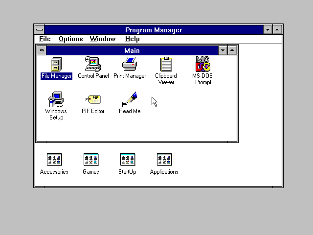
Flat design is just design. It's a type of design like anything else; there's nothing "proper" about it. It's not "proper" when people screw it up because they don't include sufficient visual interface cues which result in a drastic drop in usability (I'm looking at you, Microsoft). It's just design. People can execute it horribly, and other people, like, say, Google, can execute it remarkably well.
What I find is that design is far too polarizing. There's no middle ground between skeuomorphic, three-dimensional, and flat interfaces. Why can't we have something like OS X 10.6, where there were elements of all design trends, and the result was a clean and very usable interface? Why did they have to fuck it up with 10.7 and the awful skeuomorphism? Why can't we have drop shadows? What is so "unproper" about them? Why can't we have gradients? Is it "unproper" to have those too?
This conversation has gone on long enough, and I'm tired of it. Flat design is just design.
remember some posts few days ago about complaining that we are going back to 1999?
well, that's because good designers try to accomplish a goal, they find a way to make a crack in their way and everybody follows. now it's a trend, people with little analytic thought say "yes, this is the correct way of doing things" and exploit the new ideas but without thinking too much about it. this results in flood of poor designs of the current trend that don't serve any goal. later, some new technology emerges, some clever designer find even better way to accomplish a goal and now we have another trend emergeing and all the zombies follow until erode it, miss use the techniques and ideas.
the cycle continues all the time. sometimes a new technology or platform makes possible to take an old idea even further in solving a problem. some clever designer exploits it and now we have a retro. of course, the mass degrades it again:)
no middle ground exist, it's just cycles of progress.
Bullshit. Flat design is a subjective fad just like skeumorphic design.
More amusingly, this very presentation has a (subtle) background gradient, text shadow, a gratuitous fading animation between different background colors for different sections, and a 3D flip animation when you hover over a link, none of which are exactly hallmarks of "flat design".
Totally agree about the backgrounds. There are even slight changes in the gradient between slides of the same color, which made it look like the whole slideshow was doing some weird wiggly thing every time I went to a new slide. Looking at some of the featured decks, it's totally possible to make a slideshow on slid.es without having wiggly, animated, gradient backgrounds that change colors every 5 slides, so this was kind of a weird choice.
I have a feeling a few years from now people are going to be writing stuff like: "Stop designing with a color palette that is appropriate for Fisher-Price. I am not a toddler, and I am sick of your preschool themed apps."
I was just thinking to myself how annoying the typography in this presentation is. Line height changes all over the place and is generally vertically cramped and annoying. The colors he chooses are chosen as if to be actively unpleasant (dark gray on blue?).
I'm not unsympathetic to everything in his presentation, but the broadside of self-importance coupled with the bad design decisions in the document is pretty lame.
>Line break his. Ew. And he's going to chastise other people design aesthetic?
I wish people thought more before making comments like this.
First, there's a slideshow service being used. Most aspects of the slideshow come from the service's engine, not from the guy who did the presentation.
Second, there's no "line-break", much less it is "his". Get a larger monitor/device or enlarge the browser window. If you're seeing one, it's a hyphenation added by the slideshow service's CSS for widths under some size. Definitely not there for everybody, and definitely not "his".
I try to stay out of Design-related posts on HN, especially ones that mention 'Flat' or 'Skeuomorphic'. Everyone suddenly turns into Dieter Rams mixed with Jonny Ive.
Although I don't love/hate this post either way, the comments in here for the most part are just awful, classic HN middlebrow dismissal at its best mixed with a spattering of ad hominem.
"Second, there's no "line-break", much less it is "his". Get a larger monitor/device or enlarge the browser window. If you're seeing one, it's a hyphenation added by the slideshow service's CSS for widths under some size. Definitely not there for everybody, and definitely not "his"."
Nice try. How much wider than 2560px would you suggest my browser window be?
And the service, such as it is, allows you to insert line breaks into text.
>Nice try. How much wider than 2560px would you suggest my browser window be?
Then get a browser that works, and do not assume that any artifact you see on your screen was put there by the original author.
>And the service, such as it is, allows you to insert line breaks into text.
Something which is beside the point. He did not insert any -- which you claimed he did. And it's not even there for us in other systems/browsers, period.
I'm sorry -- while content in this slide deck is mostly correct, the title and conclusion are all wrong.
What the content is describing is good design, particularly:
- The more variations in embellishment contrast you employ, the weaker the content becomes and more complex the document becomes.
- Embellishing content... to enhance context, to enhance contrast, to enhance clarity
However, the criticisms of "flat design" generally run along the lines of not providing enough affordance (is that a label or a button?) and not providing enough contrast/clarity (making all the elements on the page look the same, leading to confusion and lack of hierarchy, instead of sufficiently differentiating them through the use of color, depth, shadows, etc.).
The author then says that "visual interest" is an appropriate thing, but then says to use flat iPhone/iPad outlines, instead of photorealistic ones. Well, generally the photorealistic outline is going to look nicer, as long as your page isn't already too busy. It's a poorly chosen example.
The author is trying to define away "flat design" as "good design", but that simply isn't the case. Flat design is a very specific design trend that is not the same as good design -- it can be used well, or used badly. Good design is good design period, and flat design can sometimes be very bad design.
Good point. The flatness of the design is irrelevant. The clarity of the communication is paramount. I agree that the OP may be favouring that particular design trend in his examples a little too specifically which is distracting from his (I think, good) message. Funny that he's championing "good content" but confuses his argument that way.
I can cope with the amount of cliches and common places this presentation has, but my god, how can you suck at typography so much and speak about "good" and "bad" design.
If the content cannot do its job free from embellishment then it is bad content and/or employs bad hierarchy or contrast.
That is like saying if a product can't sell itself without marketing, then it is a bad product. Such a claim assumes there is some universal definition of 'bad' and that if embellishment is needed to bring attention to an element, that its content must be bad.
If you are going to make the above claim, you might as well make a case for living in a black and white world where the colors and design are mostly used to embellish otherwise bad things.
Not to mention the fact that there are many people in this world who have become millionaires off bad content, so excoriating it isn't necessarily useful, depending on your goals.
Checkout his homepage it's full of embellishment, so he doesn't believe in what he is saying, it's just currently the trendy thing to say and hasn't had time to redesign his homepage to fit in what he's is preaching.
You're right. I checked out his homepage and it seemed like the opposite of what he was saying in his post (irony). But I think he made some good points nonetheless. Not necessarily that "flat design" is good design, but that Design's goal should be to enhance the communication of the content and not distract from it.
Putting too much text in a slide presentation is a sure-fire way to confuse your audience. Are you paying attention to the speaker, or reading the slides?
Yeah, I'm not a fan of the slide-deck medium. Why couldn't this be a simple blog post page that I could scroll through quickly and easily if I wanted to refer to it? Slides are for secondary collateral in presentations, not communicating large chunks of text on the web.
I guess so we don't mistake it for, say, fashion design?
Anyway, it'd be interesting to find out just how far back illustrations for text goes. Who was the first guy to propose adding "illumination" to manuscripts? And then how did that begin a pile-on to the point where the "illumination" was crass ornamentation to impress the higher-ups instead of being actually functional?
If you are talking about magazine pages then I totally agree, flat is preferred. But magazine pages are not interactive. Apps are interactive. Users need visual clues as to what they can manipulate and what they can't. This is where flat design fails. Flat design does not provide adequate perceived affordances.
I doubt that we need to intellectualize this much. Otto Neurath and the Logical Positivists pretty much planned this. Design is now in the age of Visual Statistics: http://www.gerdarntz.org/content/gerd-arntz -- or from another perspective, "Content is King."
The split between content and design is false. It just is. Typographers sometimes need to rewrite copy (or request one) to fit. Photos need to be cropped or scaled, or new ones chosen. Some kinds of writing or art really demand a specific color scheme, or even a specific layout, to have a desired effect.
I'm inclined to agree that most, if not all, binaries are false, and like so I thought I was saying that "Content is King" is another way of saying, but from a different general perspective, "Design is Visual Statistics"; or at least this is my assertion. As unclear as it may be, I'm not sure it says that content and design have a split between them. At the same time, it's not exactly clear to me that you are not attacking a strawman.
- Content can be derivable, re-formatted, re-producible, summarized, re-usable.
- Design can be derivable, re-formattable, re-producible, summarizable, re-usable. (Skeumorphs are obviously noise and prevent us from seeing the inherent content-properties of design itself: like the concept of the "module" as a form of content developers find uniquely interesting. And such aesthetic gestures distract us from the content. Grid design, as one approach, entails less noise; however, incurs the problematic of suffocating content in terms of priority. Flat design designates that the design adapt to the content as a first principle, in some fashion. Whatever the case we are in the age where design is visual statistics. Over time, our designs are more indicative of the way our cognitive systems structure the world rather than the way we project our aesthetic values.)
In fact, I am saying that design and content are the same thing, and not that they are different things...
Only that which is king is worthy of summarization (the sign).
For every vim, there is a Kai's Power Tools. What people need to know about the user interface is that the interface itself doesn't matter. The only thing that matters is what does the user think, and does she: USE IT?
6. [Why Customers Really Buy: Uncovering the Emotional Triggers That Drive Sales](http://www.amazon.com/Why-Customers-Really-Buy-Uncovering/dp...) by Linda Goodman (I've had the pleasure of meeting her and overhearing her office conversation during my daily tasks at the office in Houston, where she worked for a spell. Incredibly sharp, and it is clear that her principles exposed in this book are thorough-going in her interactions with people. I think it would be important to apply her research to Lean methodologies, building Features only around Emotional Triggers. This is what we are aiming at, but I am making this connection right now, I believe, in saying this.)
Simplicity is more important than flat design. Can your interface be used by a five year old child or an eighty year old grandparent without instruction? Terminal does not pass that test.
This deck is interesting and mostly a good way to look at many information presentation situations, but it is another instance of the recurring theme of annoying absolute statements from self-important designers.
There is bad design, there is good design, there is no "proper" design, and any designer who claims so needs to check their ego at the door before you hire them. Design and style evolve, and much of it involves fashion, fad, style, and preference. These elements evolve over time, vary between situations, companies, and products, and are part of the character of the statement design makes.
This presentation would be considered boring in some situations, depressing at others, ultrachic in others.
Not everyone wants to sit on purple glowing cubes with a fernet milkshake under mood lighting in tight pants. Some people enjoy sitting on saddles, twirling their mustaches, and line-dancing the cowshit off their boots.