> What we are seeing more of with flat design and color though is the matching of tone and saturation.
As someone with practically no design skills, how would I accomplish this? For example, let's say I had two or three colors in mind or already picked out. What are the steps I could take to line up their tones and saturation? Is there a formula or algorithm that applies?
I realize design skills are developed through practice, but I very often find myself with something I've put together that looks just OK and just sort of aimlessly tinkering around with it until I've inevitably made it look washed out. So obviously my feel isn't working yet--where else can I turn?
Agreeing with the other reply here, and I'll expand on it a bit. When I just did a big redesign of my company's website, I spent probably far too much time playing with the color palette to get it "just so". I'm not a pro designer btw, but I wanted to get this as right as possible as early as possible so I had a good, well, palette :) to work with.
Agreed that one of the discoveries I made is that HSB feel like the more "technical" way to design a color palette, and it felt more right from an engineering perspective. You define your colors as pure hues -- that's a top-level decision ("I want my colors for this project to be black, gray, yellow and white"). Those are your base H values. Saturation and Brightness are then your derivatives on the base colors -- lighter in some places, darker in others.
This is all self-taught, so my color theory could be way off here, but I also found that you can generate fairly pleasing schemes through regular intervals along the spectrum. Pick a hue, for example, and then look at variations in saturation in steps of 10, 20, 30, etc. It's not an exact harmonic scale (or is it?) but that was enough to give me a good base.
Check out the app "Spectrum" if you have a Mac -- I played with a bunch if similar apps and really loved this one the most -- still use it all the time for color exploring:
It shows a color profile for a specific web site you search for. Obviously, taking a web site's entire color scheme wouldn't be wise. I just use it for getting color scheme ideas - not using the exact color scheme and color hex rip offs.
Usability failures include low contrast, no delineation of borders, and no visual cues for the interactions that are permissible for different parts of the interface (e.g. "clickable" button vs. bare text).
Sigh. I like the aesthetic but fad-monkeys overwhelmingly fail at the engineering part of design. You can be simple and elegant without going backwards on other usability principles.
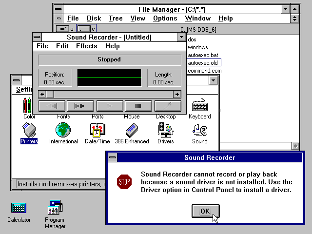
Buttons didn't have gradients or 3D effects or often even colors for nearly 10-15+ years on Macs and PCs and people were able to use them just fine. The did often have highlights and borders, however. A button in Classic Mac OS was unmistakably a button without most of those cues.
It's possible to have a nice, useable flat design. However, great care must be taken to use visual cues and be consistent in the UI. It's also possible to have high contrast. Low contrast is not flat design, it's a poor implementations of colors with a flat aesthetic.
I noticed that facebook backtracked on their search bar. When it first launched it was completely non-obvious that it was a text input. A few weeks later they added a negative emboss effect. I agree, it's a nice style, but I think we'll see it settling on a middle ground regarding 3D effects on UI elements. I also think some of the more extreme proponents of the style may be younger designers that haven't already been through several of these cycles. :)
Generally I'd agree with you, but not in this case. In the case of something like Retina screens, I don't think there's any good reason to name something that is, as far as I know, simply a step up in a metric that is already commonly measured and unnamed.
"Flat design" and "responsive design" (probably better named "responsive functionality") are specifically different in numerous ways than other design trends and consistent within the trend itself. Naming the trends doesn't have to equate to a 'movement'. However, it does provide a much easier way to refer to and discuss them.
I find it rather ironic that with higher resolution screens we are seeing more simple, minimal, and orthogonal designs. Straight lines and solid colors aren't going to have a recognizable difference with a retina screen. And I found that the only place I really recognized the retina-ness of the iPad 3 was with the complex icons that Apple had designed for the device... every other icon and interface that was simply increased to 2x didn't appear to utilize the benefit of the retina display.
So I'm really conflicted with this retina trend and how designers are (not) utilizing it. I don't think information density should increase, but certainly more complex artifacts could be used rather than these simplistic ones.
I think something about the high resolution makes flat design (which is really just a derivative of 20th century modernist design) somehow feel ultra-clean. There's suddenly a new depth to the minimalism. It stands out more against 3D elements. It's much like how Swiss Design feels very different on paper vs. on a screen.
Subtle texture and animation on a retina display can recreate the latter effect to some extent.
I understand where you're coming from but dismissing it as a 'thing' is a bit cynical. I disliked the whole 'web 2.0' look, it was garish and rarely had any relation to things in real life. With more designers embracing the flat aesthetic, I think it shows a deeper development that design is becoming more humanist, and this can only mean users are more aquatinted to digital interfaces and no longer need high gloss buttons to understand an elements can be clicked etc. The move towards flat to me a great thing, a turning point in digital design.
I don't think it is cynical. This is a new trendy style. In 3 years, everyone will be complaining about flat design, hipster mustaches, and wishing we had more gradients and glossy reflections.
I would mostly agree with you that flat design is a new style if we limit the context to only web/application GUI's. No one can really disagree that flat design is an already historically established visual aesthetic in the real world.
So this is digital flat design. With digital there are different metaphors to consider, like user interaction, boundaries, display capabilities etc. This is the web adopting some of the best things about established design aesthetics in the real world (minimalism) and integrating them in an entirely new way to incorporate those considerations.
I agree that it is inevitable there will be some new design trend in a few years time (please hopefully not one that involves monstrous glossy buttons and gradients), however this current flat design feels like it is laying the groundwork, especially in how a design should be technically achieved. The flat design is naturally more vector, which makes it inherently more native to web technology (CSS, HTML). This is very different from previous web design trends I can remember which were essentially hacks, initially involving tables, and later divs compiled from static bitmapped assets exported from Photoshop. This I believe is a new chapter in the evolution of design on the web.
It's totally a thing, the latest in an incredibly long line of the latest thing.
Zeldman wrote this in 1999 and it's still true today:
"The web used to look like a phone book. Now much of it looks like a design portfolio. In fact, it looks like the design portfolio of 20 well-known designers, whose style gets copied again and again by young designers who consider themselves disciples. Distinctions between graphic design and communication design are lost on these designers. As is the distinction between true style, which evolves from the nature of the project, and derivative pastiche, which is grafted onto many projects like a third arm."
Designmodo and the Flat-UI is pretty mediocre to poor at contrast. I forked the project and ended up ripping out a lot of the components which were low contrast and modifying the palette to have high contrast, then modifying the borders to my own inset/outset values to have a more muted level change on the buttons but still have them look somewhere between flat and and normal buttons. I did experiment with an inside white border on buttons for an Classic Mac OS feel (the original monochrome "Flat UI" )
Much of the flat aesthetic is rooted in swiss graphic poster design, however that doesn't translate so well to pages where dense text actually matters, especially with poor color choices. Much of designmodo's color scheme actually fails the contrast algorithm for small text, except at larger text it's generally okay. Bootstrap itself is pretty abysmal as far as this goes as well.
The flat aesthetic is nice, but those who continue on with it with disregard to contrast will not succeed. Accessibility and the flat aesthetic is possible, it takes more work and compromise, however.
Am I the only one that thinks "flat design" looks bland, unengaging and unoriginal? Are we, on the cutting edge of web trends, going to take our design cues from Microsoft's Windows Phone marketing department?
No you're not the only one. UI design suffers from fashion fads as much as any other design-led thing. I think with apps and websites becoming increasingly homogenised and commoditised over the last 15ish years, fashion plays an increasing part.
I happen to think it looks ugly and I find it difficult to use (seriously I find using Windows Server 2012 incredibly difficult to navigate visually). I think these flat UI sites look unsophisticated and badly designed. They remind me of 1990-era user interfaces, and not in a good way.
(With how many creative people there are doing web work nowadays I'm always amazed that design trends seem to stem from the most recent/popular OS.)
What's great about the Metro style is it makes responsive layouts dead-simple and it cuts the design process down considerably. Sure it looks boring, but that's okay for now because I spent years hearing about wet floors and jelly buttons and skeuomorphism and...
It's refreshing to be able to pick a few colors, pick a few fonts, put it on a grid and be done. To me it almost feels like laziness, but it's a nice change of pace from the days when a single button took hours to design/build.
It's still quite easy to mess up a metro UI, you still need a visual/graphics designer that know grid and typography. An undesigned metro UI is actually more obvious than an undesigned iOS UI.
Don't agree with the poke at MS, to me its another area that has deliberately gone backwards, or looped back.
Miracle of TV being broadcast invisible over air, then we start putting cables everywhere. Terminals and servers evolved to desktops, and now we go back to servers, or "Cloud". We had a Space Shuttle which was reusable and was plane like, now we ditch that and go back to olde skool rockets. Now this web design style, which to me throws out everything we were taught about usability, etc in the past.
No, not precise exact parallels, not with out good reason either, but to me its a broad, vague pattern. We seem to eventually loop everything backwards eventually.
Not saying this is wrong or bad, it just seems like what "we" do. Its sort of like music revivals, fashion revivals, or TV show remakes.
Look out for building block sized phones and black and white TVs in the future!!!
Oh, hang on. Phones... Used to get smaller and smaller, now smart phones are huge. There you go, another one!!!!
I notice that these are not in contradiction with adjectives that come to my mind first.. such as sterile, pretentious, mediocre, repetetive, heartless. Though now I think I'm kinda projecting properties into "flat design" it might not have, based on the properties I see becoming real hip in people.
I think you can only conclude that it's popular among trend-following designers... and I guess tech-turned-design-bloggers as well.
I'm really curious what the general public's perception is (not that it really matters) and if there are really any functional implications for the way some of the interfaces have been designed.
Form follows function doesn't have to result in minimalism or flatness.
Gradients, drop shadows, bevels and other 3D effects function as visual cues, and can help a user figure out the hierarchy, order and function of elements in a 2D design. They're not extraneous, at least not when used properly.
The added information (depth, angles, shapes) don't contribute to the information being conveyed beyond a simple color change. Takes a lot more effort (however fast or cheap) to draw and perceive such effects than flat geometry. The audience may have spare mental cycles to throw at processing such info, but don't make them do so.
That's probably true, but a lot of companies put their "creatives" in the marketing department, especially software companies who don't place enough importance on UI/UX.
To be honest, I'm really sick of "flat design." All it seems like is a fad that should (hopefully) boil away soon.
When you make something flat, you make it more aesthetically pleasing, but at the same time, you take away many visual cues that alert the user as to what exactly a specific widget does.
I think the Windows XP interface (Bear with me on this) demonstrates how you can be "matte," so to speak, but still usable. You could tone it down a bit more, but to eliminate gradients completely out of a UI is ugly and a gigantic hit to usability.
I think OS X has a great balance between flat and dynamic. They've toned down the ridiculous levels of gimmicky glossiness, but they've kept in the stuff that is important to the design. For example, the lightening of a shadow behind a window is a visual cue that the window is inactive. The pulsating and glowing water-filled Aqua push-button is an invitation to click on it, while the matte de-focused button is less significant. The Traffic Lights are smaller but the click-point remains the same.
Progress-bars slowly pulsate to indicate activity, and if they've stopped pulsating you know that something is wrong. Borders are clearly defined through shadows and solid lines.
Overall, it's a great UI. Ditto for iOS. Android also puts the flat design to use properly.
Can't say the same about Windows 8, and I also can't say the same about designmodo's flat toolkit either.
“One thing that really makes the flat design trend work is that it is new and fun.”
Not ‘a good idea’ or ‘usable’ or ‘accessible’, just different.
EDIT: Just to take the snarky edge off, I want to mention that whilst this might have been quite a good blog post if you've already decided to use Flat Design™, I'd have appreciated a discussion of the merits. But of course not all blog posts about anything are required to go into such a discussion.
I don't necessarily disagree, but (unfortunately?) there is a well-known result that aesthetics affect perceived usability [1]. Clearly, making your site look better does nothing for the underlying usability, but the perception of usability is arguably just as important. I believe Apple has demonstrated this with each iteration of OS X: aesthetic concerns always seem to trump usability concerns (example include the Dock and the behavior of green window button) but the OS is more popular than ever.
Of course, you're still left with the question of whether choosing a flat design improves or detracts from the aesthetics of site. Here we're venturing into the realm of the subjective, but I'd venture to say that, given the current trends, it hardly seems like the worst thing you could do.
there is a well-known result that aesthetics affect perceived usability
Other things being equal, that is true, but in the case of flat design other things are usually far from equal. The loss of affordance with flat design can be crippling.
Absolutely love the colours that are associated with flat design. I think, we as designers are defining a new set of rules for what we want flat design to be. The applications in the context of mobile sites is obvious where space is limited. As always, once you've learned the rules you then have the ability to break them.
flat design is a fad and will go away , like all trends. It's not bad , but since it is used everywhere even where it should not be used , it is an abused trend.
Heh, the colors remind me of the 80s, TRS-80 Color Computer and the CGA hi-res color palettes... Actually just about every 8-bit color palate from the time:
As someone with practically no design skills, how would I accomplish this? For example, let's say I had two or three colors in mind or already picked out. What are the steps I could take to line up their tones and saturation? Is there a formula or algorithm that applies?
I realize design skills are developed through practice, but I very often find myself with something I've put together that looks just OK and just sort of aimlessly tinkering around with it until I've inevitably made it look washed out. So obviously my feel isn't working yet--where else can I turn?