At the risk of being pedantic, I'll explain it too you in another level of detail. First, lets backup though.
shawnc 19 hours ago | link | parent | flag
These are so amazing. The world wasn't sepia toned a hundred years ago! As silly as that statement is, my brain is actually having a hard time really believing these photos are from 100 years ago. I'm in awe.
OK. This was the original statement. The somewhat minor but technical point I was making is as follows. There is a simple explanation. The world then looked like it does today. And the image itself is modern, so it looks modern. Thats it. The Awe of this? Its called the "uncanney valley". Its kinda-almost-sorta-perfect-but-off-a-bit.
How did they do this then? Easy, the colorwork is done in photoshop, using contemporary techniques. PS allows them to exploit the latent image data, and map it onto one of many "style" outputs. [1]
You can debate this or not. But its cited in the footnotes above. If you havent read them, take a look.
I understand all of that you say?
Ok. You so, you are now in "awe of photoshop".
The technical reasons for this are not hard.
I'll stop here, because I think any more technical is not going to help you.
I've done a fair amount of photography...
Again, I would encourage you to do research on colour theory. If you do your own work, it will help you immensely, to make the most of your images. And if you really are an expert in this already, you know how trivial it is to produce "contemporary" style images from these formats, given the datasets you have to play with.
____________
Edit: For the general reader
[1] Style. In the sense i'm using it here is a mix of overall color, texture, tone, sharpness, saturation, hue, tint, noise, and other basic image editing techniques. Without getting into a discussion about "color" (ie, not "accuracy" but more correctly temp, tint, gamut, etc), its important to understand that the "look" has a lot of potential. Think about instagram. All of those filters are just "style" presets. But they don't look alike. Some are contemporary, some are retro, etc. It only requires a certain base image quaity to "take" the style (ie, good enough to not be ruined at the pixel level). So you might have an image which out of iphone looks "OK" and then in instagram is "Cool" or whatever. But the look of the "instagram" is independent of the landscape (which always looks the same, sepia toned on your phone or not). Now, the question is, what limits the "style"? And thats where the color technicals come in. If your input is messed up, your gamut and balance and tint will not let your image "take" a style. Because the transitions (ie, curves, etc) will destroy your pixel base. The size of your gamut, will determin the range you can execute. Now, with film, the color-setting step is a one-shot deal. There are no 12 instagram settings - you get just one - film/chemistry setting. You gett a little bit of flex at the print (color mix, etc) but not much. If you scan the film, then you are opening up to 12 syles (or whatever). So, now we get to the point. None of the film emulsions (prior to NC portra) really give you a contemporary look. To get that, you have to bring the image into digital. The temp/tint/contrast levels are just not there. Thats why its "odd" seing an old image looking like NC portra film or like a 2000+ PJ photoshop. And you can double check by looking at the details, if your an expert. The monochrome seperations have good tonal information, which is a credit to the guys back 100 years ago. But the modernists of that era were some of the best photogs ever, and among the most technically brilliant in monochrom image capture.
I know something about color theory. I even know some arcania, such as the fact that the X and Y coordinates of the XYZ color space are on the projective plane and that the XYZ color space contains non-existent colors.
Let me be a bit pedantic about psychology, though: shawnc never really believed that the world was sepia-toned a hundred years ago. He was just expressing amazement due the "uncanny valley" of which you speak. I feel confident that he knew why he felt this way, and that he didn't really need an explanation for it. When he said "my brain is having a hard time", this should have been a dead give-away that it was not his rational mind that was having a hard time, but rather his unconscious mind that was rebelling and making this "wow" feeling conscious. If it had been his rational mind that was rebelling, he would have said, "I'm having a hard time", not "my brain is having a hard time".
Or at least that's how I interpreted his comments. Your mileage apparently varies.
My first note was really simple, just highlighting for HN how and why this was going on. Its here for refenence. The notes were just to avoid saying more. =D guess that didn't work out so well...There was a nother thread on these images a couple years ago too, nobody mentioned this.
________________
001sky 16 hours ago | link | parent
these photos are from 100 years ago.
This is the work of 21st century photoshop.[1,2,3]
> None of the film emulsions (prior to NC portra) really give you a contemporary look. To get that, you have to bring the image into digital.
I went back and had a look at the photos, and you do have a point. The ones that are most striking to me, though, have--to my eyes, at least--an HD video look to them, not a Photoshop look. And that's one thing that's striking about them to me: They look so immediate and real, like they were shot yesterday. This property is something we've been trained to associate with video.
On the other hand, I think that these photos would have been nearly as striking if they had been rendered in Kodachrome style or classic Technicolor style. To our modern minds, there is no age-appropriate color style for photographs that are 100 years old, since we never see such a thing.
In fact, whenever I see well-preserved color movies from the any time before the sixties I get the "uncanny valley" feeling, since most everything filmed before then was done so in black and white, or on crappy non-Technicolor film where the color barely survived. It's definitely still a little bit of shock whenever I've seen The Wizard of Oz, just because classic Technicolor weathered so well, and you just don't expect to see something from 1939 with beautiful, saturated, unfaded color.
The ones that are most striking to me, though, have--to my eyes, at least--an HD video look to them.
This is an interesting way to put it.
An HD video look to them, not a Photoshop look. And that's one thing that's striking about them to me: They look so immediate and real, like they were shot yesterday. This property is something we've been trained to associate with video.
So, I think this is the crux of the matter. A trained artist is trained to get the "HD look" without the "Photoshop look".[1] Its like fight club: the first rule of using photoshop, is don't let anyone know you are using photoshop.
Example. Your mind expects certain relationships to hold - an image subject closer to you has more resolvable detail than one farther away - for one. A visual cue for relative depth perception: if i can see it better it must be closer. But, in photoshop, I can differentially sharpen the fore-ground and the back-ground. If I do this to get a "uniform" level of detail,[2] it looks "high-definition" because the background has a higher level of detail [sharpness] than it should (according to your brain). But there is no increase in pixel resolution (ie, definition level) An image like this can be almost difficult to mentally process, you will want to look over every inch to take in all the detail. [Note: how this has nothing to do with color - i can pull this off with neutral colors].
Now, is this a "photoshop look"? Arguably, yes. To someone that is trained in these techniques. The idea that one can make a still image look "cinematic" HD is actually a good way to put it.
So, "looks like photoshop" as I was using it may have been not easy to understand. To many, this might mean "looks like Glamour photography, with airbrush and vivid colour". That is but a tiny subset of cases [popular photography, etc]. Almost all PJ and FA work is heavily (as in 80 layers) photoshopped if its going into a gallery. But it doesn't "look like it", if what you are expecting is something else. But, if you understand how these images are working, you will see they look nothing like the files that come out of RAW or a Digital scan of the negative.
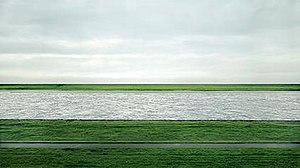
The master of "HD" type looks is Gursky [see footnote 1]. His images have no unnatual colours, but the would be impossible without the powerful colour control you get in photoshop. Ie, the irony is that the more agressive you are with the tonal controls, the more you need color control (and 16bits and large color spaces, etc) to keep the normal part of the look. But its the tonal control that enbale you to create the "definition" that is so distinctive.
shawnc 19 hours ago | link | parent | flag
These are so amazing. The world wasn't sepia toned a hundred years ago! As silly as that statement is, my brain is actually having a hard time really believing these photos are from 100 years ago. I'm in awe.
OK. This was the original statement. The somewhat minor but technical point I was making is as follows. There is a simple explanation. The world then looked like it does today. And the image itself is modern, so it looks modern. Thats it. The Awe of this? Its called the "uncanney valley". Its kinda-almost-sorta-perfect-but-off-a-bit.
How did they do this then? Easy, the colorwork is done in photoshop, using contemporary techniques. PS allows them to exploit the latent image data, and map it onto one of many "style" outputs. [1]
You can debate this or not. But its cited in the footnotes above. If you havent read them, take a look.
I understand all of that you say?
Ok. You so, you are now in "awe of photoshop".
The technical reasons for this are not hard.
I'll stop here, because I think any more technical is not going to help you.
I've done a fair amount of photography...
Again, I would encourage you to do research on colour theory. If you do your own work, it will help you immensely, to make the most of your images. And if you really are an expert in this already, you know how trivial it is to produce "contemporary" style images from these formats, given the datasets you have to play with.
____________
Edit: For the general reader
[1] Style. In the sense i'm using it here is a mix of overall color, texture, tone, sharpness, saturation, hue, tint, noise, and other basic image editing techniques. Without getting into a discussion about "color" (ie, not "accuracy" but more correctly temp, tint, gamut, etc), its important to understand that the "look" has a lot of potential. Think about instagram. All of those filters are just "style" presets. But they don't look alike. Some are contemporary, some are retro, etc. It only requires a certain base image quaity to "take" the style (ie, good enough to not be ruined at the pixel level). So you might have an image which out of iphone looks "OK" and then in instagram is "Cool" or whatever. But the look of the "instagram" is independent of the landscape (which always looks the same, sepia toned on your phone or not). Now, the question is, what limits the "style"? And thats where the color technicals come in. If your input is messed up, your gamut and balance and tint will not let your image "take" a style. Because the transitions (ie, curves, etc) will destroy your pixel base. The size of your gamut, will determin the range you can execute. Now, with film, the color-setting step is a one-shot deal. There are no 12 instagram settings - you get just one - film/chemistry setting. You gett a little bit of flex at the print (color mix, etc) but not much. If you scan the film, then you are opening up to 12 syles (or whatever). So, now we get to the point. None of the film emulsions (prior to NC portra) really give you a contemporary look. To get that, you have to bring the image into digital. The temp/tint/contrast levels are just not there. Thats why its "odd" seing an old image looking like NC portra film or like a 2000+ PJ photoshop. And you can double check by looking at the details, if your an expert. The monochrome seperations have good tonal information, which is a credit to the guys back 100 years ago. But the modernists of that era were some of the best photogs ever, and among the most technically brilliant in monochrom image capture.