Ok and Cancel are the wrong button labels anyway. The Apple HIG say that buttons should be labeled with verbs that signify the action taken.
For example, Cancel/No/Yes becomes "Don't Quit" "Don't Save" "Save". Much more intuitive, and it gives additional reason to put the positive button last: users should be encouraged to read all the options available before deciding—and can get the gist by reading just the buttons and ignoring the message.
Otherwise you get dialog box blindness. If you've ever observed someone doing this, it's maddening. They try something, a dialog pops up, they dismiss it, nothing happens (because the dialog box said "Can't complete this action"). I've seen people repeat this up to 4 times.
bonus: Here is a bug report whose comments includes a long explanation that I wrote, on why we should label the buttons "Save/Don't Save/Cancel" whether the platform standard says to or not: http://sourceforge.net/apps/ideatorrent/notepad-plus/ideator...
    Save this document before quitting?

    <Don't Quit>    <Don't Save> <Save>

     -----------------------------------

    Save this document before quitting?

    <Cancel>                 <No> <Yes>
Although, I've always preferred the Apple system of "Destructive"......"Neutral".."Constructive"
So that destructive operations are on the far left, isolated from non-destructive operations on the far right.
Yielding,
[Don't Save] [Cancel] [Save]
Also, in a window title bar (more classical than OS X now),
[Close] [Minimize/Shade] [Zoom]
Any of the buttons grouped on the left side should be considered "destructive actions", and any actions on the right side should be considered "safe" or "non-destructive actions". However, this isn't the whole story. In cases where the main, intended action is destructive, the primary action verb should still be on the right, but the [Cancel] button should be the default enabled button (what Return key does when pressed)—e.g., emptying the Trash.
I was on the phone troubleshooting a webcam problem with my dad for an hour before he even mentioned the popup he had been clicking through (the one that told us why it wasn't working).
If you are expecting users to read your error messages, you're doing it wrong.
> If you are expecting users to read your error messages, you're doing it wrong.
Hence it's even more important to call for action, not status in the button. If a button reads 'save' it has a much higher chance of being read than then long text before 'Ok'
Actually it becomes "Cancel", "Don't Save", "Save". While there is huge benefits in using descriptive verbs to describe the actions taken, there is also a huge benefit in having a single standard word for "What? No! I didn't want to do that. Stop!"
This is one place where I found myself to differ with Apple's usually brilliant UI norms. Trouble with this particular guideline is that it makes me (as the user) have to read and process the responses in my mind, making response slower. A Cancel/No/Yes with a question "Save and quit?" makes the same sense to me and allows me, to process the known buttons almost reflexively.
The problem with Yes/No/Cancel is it requires the user to look at the question which can often be the opposite of what the user expects. Example
Save? Yes/No
Delete? Yes/No
Overwrite? Yes/No
Those all have very different meanings when answering "Yes" where as when you put the meaning on the button the button has meaning all by itself. No need to look at the description above it.
That's a good point. There's a cash machine near me with a trick question:
'Are you sure you wish to continue without a receipt?' Yes/No
I have several times just seen the word 'receipt' and instinctively hit No (because I don't want a receipt). This cancels the process and spits my card out and I have to start over. Annoying.
But then perhaps that's more an argument against badly worded questions. This is a Santander ATM (Spanish company) so I do wonder if it's a poor translation (or perhaps that is just the standard phrasing for all ATMs in that country).
Generally speaking I'd agree that if you keep your questions simple, then Yes/No buttons are quicker to mentally process. Most cash machines simply ask: 'Would you like a receipt?' and my 'No' instinct is the correct one.
This isn't really surprising. The article claimed he just knew from experience and didn't need to do a test, so the whole article was just bullshit.
I was laughing out loud when he said users read all the options before picking one anyway, since I've seen that not happen in countless tests. Users don't generally give a crap about your interface, won't read instructions or screens fully, and will just scan and grab on to something that matches their current goal.
The lukew eye tracking study is for forms, not dialog boxes. And not just any forms, but it looks only at forms which have a list of left-aligned items which the user is working and scanning down. As stated: "the alignment of actions with a form’s input elements provides a clear path to completion that helps people complete forms faster."
This article is about dialog boxes. They are different. Dialog boxes usually have no form input elements and usually do not have a list of items all aligned on the left like on the lukew tracking study.
I do not think that comes to the opposite result. The only variant they test that has Cancel, OK in that order also is the only one where the rightmost button is far away from the other content. How far way, the report does not state. Being a web study, this could have been dependent on window width.
The study also doesn't go into the consequences of various error rates. It is just about “Please complete the form fully and accurately". It does not test average performance if, say, users want to cancel out of the input in 5% of cases. It does not even ask me whether they feel confident that they can do so if they want.
"...if you’re a knowledgeable and experienced designer ... then you can solve this problem through design analysis [as opposed to user testing]"
But if you're an empirical scientist you will use user testing to confirm or deny your hypothesis rather than assuming your rationalisations hold in the real world.
Exactly. Most of the article was based on some sort of unjustified "innate" knowledge of how users behave. He dismisses platform consistency as being unscientific and then goes on to present his own equally unscientific arguments for ignoring the convention. In the face of these two alternatives, I'd choose platform consistency every single time.
Designers work like this for good reason. Yes it reads like unproven pseudo-science, and it is, but there is reason behind this. When you work with thousands of concepts like this every day you can't empirically test them all across all cultures and environments (it would take forever and a day!) - you just develop a thought of what makes sense for you and have a basic think about why that might be so. This may not hold for all situations, but its going to be on average a better opinon than that of most other people (who will put a dialog box in one order or other without even stopping to think about why).
Even if you don't actually do any empirical tests, a good user experience designer should at least IMPLEMENT their ideas and try them out first hand themselves before declaring them the best for a particular situation. That's why it's sad that so few user experience designers have any competency in actually implementing their designs. Many of them (the bad ones) don't even understand what the technology is capable of, let alone know how to program.
That statement in the article is just wrong. A knowledgeable and experienced designer should be an experienced scientist who uses user testing to confirm rationalizations.
In English anyhow we are used to Positive option first, Negative option second... it's how our language flows and thus how we think. We read Left to Right... we expect the positive option on the Left, i.e. first, and the negative option on the Right, second. Just how I view it anyhow. To me it feels backwards the other way around and I don't feel that's just a learned convention. I will continue to curse Android 4 every time I mis-click on a dialog.
This has nothing to do with English language. As a culminating point of a dialog box, I believe the suggested action should be towards the corner, not hidden between a 'Cancel' button in the right corner and the rest of the dialog box.
This is what I came here to say- one more reason not mentioned for putting the primary action in the corner is that it's easier to find and fix on with your eyes and the mouse.
You don't have to find it. Few people do. People read through the buttons from left to right. The thing is, when dialog buttons use standardized vocabulary (ok, cancel, yes, no) you don't have to read the other button, you just assume it says the opposite of the first button. So I'd like the OP to provide some proof of this three scan pattern. I think that happens on a Mac where the buttons are labeled with verbs. When I was using Windows with the standardized yes/no/ok/cancel, I processed dialog boxes much quicker than on the Mac. I'd simply read the one or two words in the title (usually a verb), read the leftmost button, then decide whether to click it or whether to freak out. It goes like this:
Computer: "Delete?"
Me: Yes.
Computer: "Delete?"
Me: Whoa! Who said anything about delete? Let me read the buttons carefully and find the Cancel button.
The mistakes happen only a small fraction of the time, so the most efficient user flow is "verb?" -> "yes".
    1) Read first couple of words of dialog box
    2) Make decision
    if yes:
    3a) Find OK button
    4a) Click OK button
    if no:
    3b) Find Cancel button
    4b) Click Cancel button
vs.
    1) Read primary action button
    2) Make decision
    if yes:
    3a) Click button
    if no:
    3b) Find Cancel button
    4b) Click Cancel button
If all you're doing is hunting for the verb in the dialog box rather than reading all the text (perfectly legit timesaving tactic) then why not stick that all important verb in a standard position on the dialog box and make it clickable to reduce hunting and scanning?
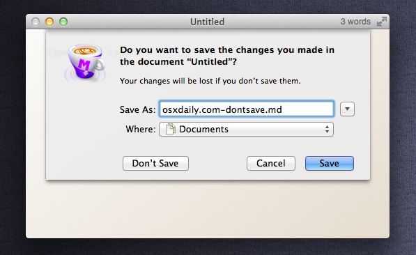
It's not about standardised vocabulary to easily find the primary action and Cancel, it's about standardised positioning. In OS X, far right is the primary action. The one next to it is Cancel. Any other options are placed further over. (http://osxdaily.com/wp-content/uploads/2011/08/dont-save-sho...) Similarly on Windows the left most is the primary action and the right most is Cancel.
Even though people know the primary action is the rightmost button, they can't help but stop on other elements because of that top-down left-right scanning that's ingrained in most people of the world. There's simply no better position that the very top left corner!
Another important distinction here is that I should not receive surprise dialog boxes as often as I currently do! Yet sooooo many apps throw unnecessary dialog boxes at you! Your step 2 "make decision" has happened before the dialog box appeared. It happened when I pressed the delete button on that file.
Whether step 2 is actually step 0 or not doesn't really matter. It has the same impact on both scenarios.
People only read strictly top down left to right (or right to left) if all other things are equal.
I don't know about you, but I've never been able to predict where the top left corner of the dialog will be to start reading. My eye is always instantly drawn to the big blue button that describes what will happen when I press it :)
That just because if you had gas in the middle it would be uncomfortable for long drives.
It's the same reason the clutch is on the side as well, not in them middle.
I suppose you could swap the cluch and gas (leaving brake in the middle) - but clutch comes first, then gas, so the convention of first on the left is realized.
There was a Top Gear episode that looked at the history of the location of the pedals, and tried to find the first auto that laid them out the way we are used to today.
What was shocking is the enormous variety before then. Just about any of our familiar controls (including some others before we really got a good transmission system) could be on any of your 4 limbs.
Possible, but more likely more people are right footed than left so it's more natural to control acceleration with your right foot vs. the more mechanical shift process.
Maybe Android switched it to be "easier" to use for most people. Since most people are right-handed, if they hold the phone one-handed in their dominant hand, putting the positive action puts it closer to the thumb that's being used to navigate.
Platform consistency has to come first, but I agree with the argument that OK/Cancel is backwards.
Apple chose those labels (as Cancel/OK) for the buttons in the original Mac dialogs in 1984. They tested other pairs, but those two labels won. With those two labels, order matters a lot.
"Cancel" is the more meaningful word of the two. You've just told the user that something unexpected will happen if they proceed. "OK" can be construed to mean "OK, well then obviously don't do that!"
So yeah, platform consistency first. But Apple tested that stuff back in the early 80s, those two labels won, and (in addition to all the reasonable arguments in the article), that's the only rational order for those two labels. Microsoft got it backwards and trained millions of people by confusing them until they learned. Gnome aped Microsoft.
"Cancel" is the more meaningful word of the two. You've just told the user that something unexpected will happen if they proceed. "OK" can be construed to mean "OK, well then obviously don't do that!"
Eh, that's rubbish. I did IT support for almost a decade in two countries and not once did I hear anyone express confusion about that.
I think the article's explanations for button-ordering are good but I wish their examples didn't violate other dialog design principles in the process.
One mistake their examples make is to include an "X" (close) button in dialogs that contain button choices. The "X" action is ambiguous in dialogs and is especially bad if all actions are equally probable (e.g. "Don't Save", "Cancel" and "Save" all seem likely to map to "X"). GUI toolkits don't seem to force any consistent interpretation of "X", and in fact the programmer might forget to wire up the "X" to any action at all. It's preferable for the "X" button to not be there so that the user can focus on the action buttons.
Another (admittedly minor) issue is the spelling "Ok". It's not pronounced "awk" or "oke"; it's both spelled and pronounced "OK". It does have a whole-word form and that word is "Okay". So it can either be "OK" or "Okay" but it should not be "Ok". In dialogs it is very conventional to use the short form of "OK".
To me, this seems like a great example of unnecessary optimization. Yes, the number of "visual fixations" is slightly less but in the grand scheme of a person's day, we're talking about a difference of milliseconds, if that. Aren't there far more egregious examples of UI design to spend time agonizing over?
Well, to steal a riff from Steve Jobs, milliseconds per day * days over years of use * tens/hundreds of millions of users (if you're designing the conventions for a big platform) = years or lifetimes. I'm just not convinced by the reasoning.
Yes, I've heard that reasoning over and over again and it just doesn't hold water at all for me. "Time-saving" just doesn't work at that level of minutiae.
Again, it's simply optimization where none is needed.
The author writes "user testing is probably your best bet. But if you’re a knowledgeable and experienced designer who can think about problems from the user’s perspective, then you can solve this problem through design analysis."
This is so wrong. Actually design analysis can turn out to be completely wrong. You need to test it, get some numbers, and then you can claim that conclusions of your analysis are correct. Right now it's just a claim that may or may not hold.
This is the wrong question all together.
Yes/No is the wrong idea. Think about labeling the buttons Save/Reboot/Cancel, This allows the user to be sure they are going to get the expected results.
And if you do that you force the user to read all options, which is completely unnecessary.
If the question is "Reboot?" and you have Yes/No as alternatives I will see that it is a Yes/No-dialogue-box instantly, way before I read the buttons I see the button structure and recognize it as a typical Yes/No-dialogue-box.
I read the question and because I already know my alternatives I have go directly to the option I want, if the buttons change every time I have to read and assess the situation every single time. This is good for critical questions (like, do you want to format this drive?) but bad for common questions (such as Save?).
The author never even considered this, which is exactly why you should follow platform conventions. If you don't people are going to feel weird coming to your application and even if you manage to gain 10% in comprehension by switching to a non-standard layout you are going to loose 80% in comprehension and 10540% in speed just because you are different than what the user expected.
Android ICS changed the place for the Cancel/OK buttons when unlocking the sim-card, my muscle memory still haven't learned this despite using ICS for many months.
The only thing this article managed to get through to me was: follow your platform guidelines.
I know I read somewhere (but I can't remember where now), that it's far superior to put the actual actions you're doing in the buttons, rather than a completely non-descriptive OK/Cancel.
Not "Do you really want to quit? OK / Cancel" but "Do you really want to quit? Quit / Cancel".
Picture 1, "Less Visual Fixation":
I think it is wrong, if I'm processing simple (or repeating) stack of windows I do not read all labels (at least after a few similar tasks), I see OK button and I click it.
Picture 3, "Maps to the expected button functions"
This is also wrong, there are specific labels for actions on the picture - Back/Next, Backward/Forward, Return/Continue.
Picture 4, "Gives users a more efficient task flow"
I agree with eyesight map (left to right, up to down) and this is precisely why OK should be on the left side - so we don't need to read further.
I confess that I'm Windows biased a little. But the author is biased just the same, only he is using Mac :) .
To me the assertion that users read buttons the same direction they read text is bogus.
I'm an OS X user and I'm trained to read the right most button first as it has the description of what will happen (Save, Log Out etc.) Often it means I don't even have to read the rest of the dialog.
As others have pointed out, this indicates the whole idea that users will read all the options is bogus. But even when I do read them all (marginally complex set of options presented, or high risk scenario) I read the right most one first before skipping back to read left to right because I'm trained to skip to the right most button at the bottom of a dialog.
This invalidates much of the analysis on visual fixations and comes to the conclusion that placing the primary action on the left actually makes it easier under certain conditions (it's easier to track back to the left most button than to the right most).
It just goes to show that training can affect behaviour. If you did extensive eye-tracking tests explaining you're looking for high accuracy, with people who are unfamiliar with technology or who are used to the primary action being on the left, placing the primary action on the right will lead to less effort. But as the user is trained, the effort would probably increase.
I disagree that OK/cancel are backwards. Placing OK on the left makes it a more deliberate choice. Thus the system can be more confident the user consciously chose OK, as it takes a smidge more effort to get there. OK/Cancel dialogs are (unfortunately) very common, it's very easy for users to become numb to them and just click whatever it takes for them to go away.
For similar reasons, Mac OS Classic placed the trash can in the lower right corner of the screen. If you had dragged something that far, there was nothing else you could possibly be shooting for. Therefore making the system more confident you were actually dragging that file to the trash. Which is one reason MacOS never asked "are you sure you want to delete that?" like Windows's recycle bin does by default.
Another similar example: MacOS classic placed the close button of Windows on the opposite side, on its own. Again, if you are clicking there, the system is more confident that closing the window is what you're really after. It's interesting to note that OSX did away with many of these well thought out devices.
I don't understand why putting "OK" first makes it a more deliberate choice. Why does it take more effort to get there? If a numb user's objective is to make it go away as quickly as possible they will become trained to where the "OK" button is and click it without reading anything else.
"If you’re an inexperienced designer who doesn’t trust your own judgment, then user testing is probably your best bet. But if you’re a knowledgeable and experienced designer who can think about problems from the user’s perspective, then you can solve this problem through design analysis."
... I really like the `either go with me or your an idiot` push... false dilemma anyone?
I believe studies on this are worthless. Show 2-3 modals to a user and he/she tends to understand where the positive button is & where the negative button is. Its more about habit than of user experience.
I'm surprised Fitts' law hasn't come up. While not exactly the same domain as Fitts (minimize the need for fine motor control for a potentially gross action by placing the active area at the end of a gross movement, e.g. pointing to the edge of the screen) it would seem that gaze would be easier to fix on the edge or corner of a dialog, rather than somewhere in the interior.
How did we end up with OK/Cancel in the first place?
When I run into an OK/Cancel box (usually on a web page using the generic built-in confirm()), it often feels to me like the meaning would be far more clear if the options were "yes" or "no", no matter which order they're displayed.
Is there a UI 'best practice' reason OK/cancel "won" over yes/no?
It's a rational explanation that just happens to be ... wrong.
Cancel/OK suggests Cancelling first, OK'eying second. Whether your eye has already moved on from Cancel is secondary to the fact that you brain got implanted with Cancel as a primary option.
Unless you're trained to start with the right most button (something the article ignores).
Also, positioning isn't the only factor - you can also highlight the primary action with colour and texture, which I would guess is far more effective at implanting a button as the primary option than positioning. Most OS's do this as a part of their keyboard accessibility.
+1 and yet, most arguments will end up toward the direction of "platforms consistency," especially on Facebook-related application since they have it "OK" | "Cancel" order.
I agree that in the long run it would be better for users; yet as a user, I'm used to clicking on the Okay button on the left. Every time I see one isolated application with the Okay button on the right, I'm going to have a slower/harder time knowing which button I need to press.
If one of your users uses 50 applications, and he uses yours once in a week, he's going to be annoyed at your application for being different; even if that "different" is supposedly better, reflexes have taught the user to scan the buttons in a certain way.
I'm not suggesting that the order we have now is better; but until one of the OSs or an application like Facebook moves to the "better" button order, I can't see why a designer might do so for his own application.
Android changed the order of positive/negative buttons in dialogs with 4.0 and it took me ages to get used to the new order. Just stick with the platform default, please: it's what users expect.
I agree, platform consistency is more better for your app than following something which is theoretically better. I'd be reticent to change the Ok -> Cancel order without some harder evidence than this.
For example, Cancel/No/Yes becomes "Don't Quit" "Don't Save" "Save". Much more intuitive, and it gives additional reason to put the positive button last: users should be encouraged to read all the options available before deciding—and can get the gist by reading just the buttons and ignoring the message.
Otherwise you get dialog box blindness. If you've ever observed someone doing this, it's maddening. They try something, a dialog pops up, they dismiss it, nothing happens (because the dialog box said "Can't complete this action"). I've seen people repeat this up to 4 times.