hey this is elan, author of this piece. thanks for sharing and for the discussion
for what it’s worth i do agree with the one or two comments here that say that the line “modularity is inversely correlated with expressiveness” is a bit reductive. i did have a long section of caveats but removed them because i felt like they confused the matter more. ironically i’m butting up against the expressive limits of the english language, its own modular technology :p
html of course is another shared protocol that is so flexible that it does allow for immense expressiveness even while it makes certain core decisions that limit (arguably helpfully) certain
forms of expression
squarespace would be the ur example to me of a frankenstein product whose exceptional modularity makes expressiveness a battle with the machine
which is all to say, i welcome more thoughts on this dynamic!
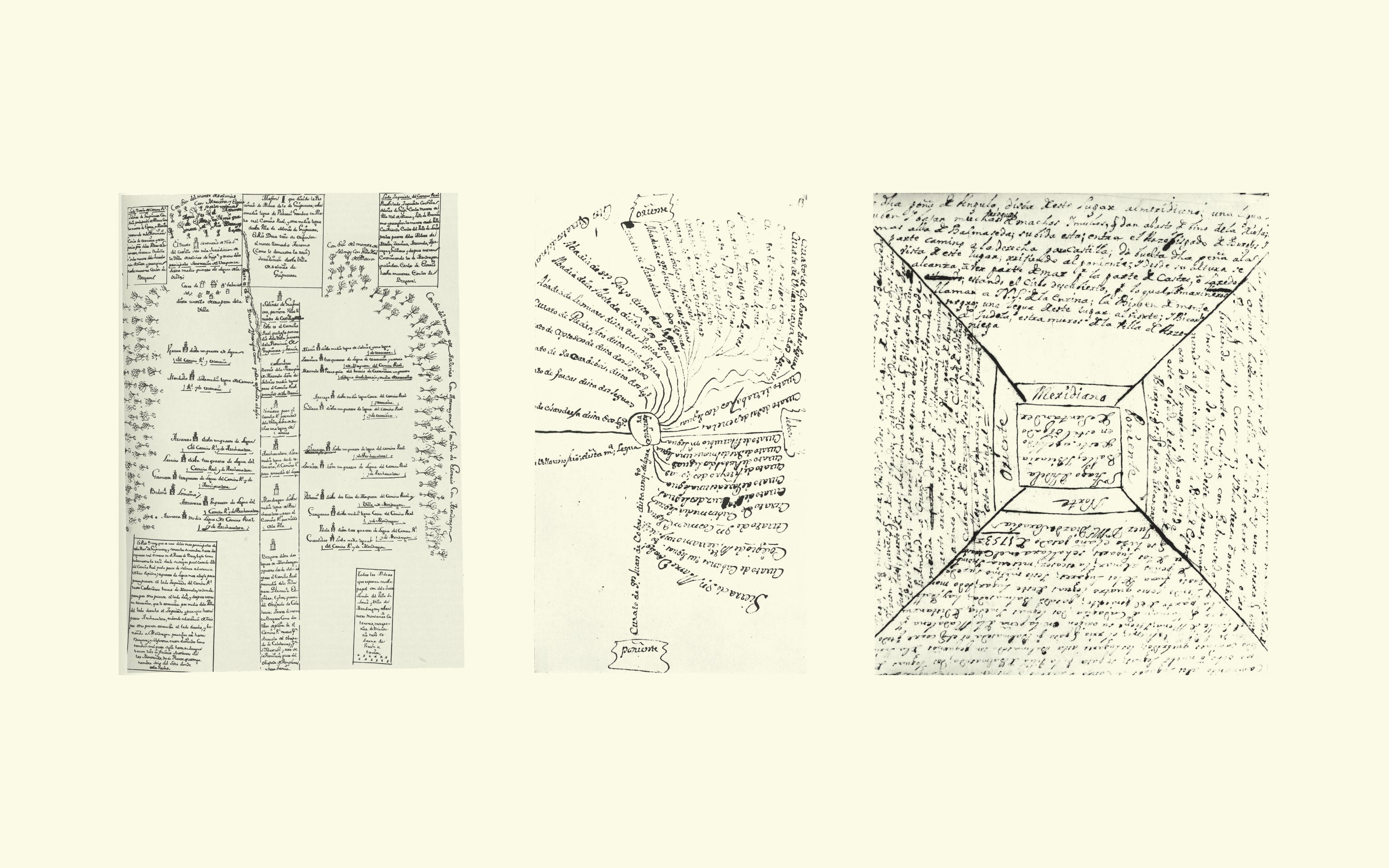
for those asking to see all 500 maps, i wish i could too! unfortunately as far as i can tell they haven’t been digitized. if you find them please (please please) let me know. happy to upload the higher res versions of the maps i do have later.
I loved the phrase “modularity is inversely correlated with expressiveness.”
I don’t think it’s reductive, just incomplete. It’s missing a third dimension of “complexity.” You can increase expressiveness, but only by adding complexity. But even then, you’re just fractalizing into 500 more maps; the complexity is comprised of layers of modularity, each with its own degree of expressiveness.
For example, you could mimic HTML by giving each map maker some standard components for expressing and classifying buildings and their relationships (“church,” “road,” etc). And sure, now you’ve increased expressiveness. But you’ve also added a new layer of modularity. So you’re right back at where you started. The maxim holds.
A thoughtful and interesting rumination! The bit about modularity and expressiveness is spot on. I guess the king was too cheap to hire land surveyors!
I hate overly designed news articles. I want to read the words and maybe see a couple of relevant pictures, thanks.
Similarly I suspect most of these different individual maps are just bad. Whimsy and idiosyncrasy are all very well in theory, but in practice they're mostly just annoying.
The worth here is actually in hindsight as now historians can learn a lot about localities and local perceptions. They don't care as much about aesthetics (or at least perceive them in a different manner)
But in general I assume you're right about the actual quality and it was hinted in the text. And when you take a look at the maps provided as examples, some of them are not accessible[1]. And for news articles, it really depends for me. Most of the time, I want the essence. But sometimes, especially with articles that are not actually news but a deeper analysis of a situation (e.g. ukraine war, palestine), I've read articles where on mobile it helped that they put extra effort in making the media work for the information by interleaving graphics, scrolling text, and so forth.[2] But as always this is also a matter of taste.
[1] e.g.: https://substackcdn.com/image/fetch/f_auto,q_auto:good,fl_pr...
[2] I haven't bookmarked those texts and I am not sure if it is actual useful to pick one random example for this discussion so I just save my time searching for this one example I only vaguely remember.
Well, you've got your wish. Every damned website now looks the same. Whatever creativity the early internet promised has now been snuffed out to appease the user-metrics gods.
I'm all for creativity but laying devil's advocate,..
who is this supposed creativity for? If the majority of people just want to scan headlines efficiently and read/parse.. isn't that a good thing for most people?
Pragmatically speaking, the creativity is not needed for news articles/headlines. We need better reporting / journalism in online news, not more creative frills..
I mean, for most of the twentieth centuries books all looked the same. Same handful of typefaces, sizes, margins, etc.
Newspapers also. Same handful of column layouts, typefaces, styling.
It's not about user metrics. It's that what's important is the content of the text itself, alongside whatever photographs and illustrations are necessary and informative.
Websites are no different from the long tradition of books and newspapers in this regard.
There are plenty of spaces for artistic, aesthetic creativity on the internet. No shortage whatsoever. More art than there's ever been before.
There's no need in also trying to shoehorn it into nonfiction articles everywhere.
The most creative parts of the early internet were on Usenet, I found. Posts all looked the same - better yet, they looked the way I styled them - but the look wasn't what was important.
It would be so much better if every website actually looked the same. Imagine the world if didn’t waste millions of human hours reinventing a date picker.
The early (graphical) Internet was black text on grey background with blue links and no images.
Myspace and Geocieties were already a couple of generation on from that, and ... frankly kind of a mess.
For the most part, I vastly prefer the Reader View rendering of websites over whatever's native. Design gets in the way of many things, including robustness and resilience over time (what happens when all those dependencies and embedded resources go away and/or are replace by pr0n, crypto miners, phishing, and/or surveillance payloads?), and simple legibility.
It's the exceedingly rare instance where "interactive" pages provide any additional information or capabilities, and virtually all of those are specialised one-offs. I'm thinking of several of the xkcd specials, or the work of Bret Victor or Nicky Case. I'm sorely hard pressed to think of any others. Mainstream pubs (notably the NY Times) are far worse for their efforts in this space.
Interestingly, with the fact that the article is digital, surely we can leverage so many more different and interesting ways to present the information, but I feel like most prefer to just read the text.
I think it's because everyone reads a paper article in a different way. If you ask people how they read a magazine, you'll get as many responses as respondents. Some read back to front (I do that for some reason), some read articles from top to bottom, some scan through and look at the pictures and captions, then pulled quotes, then the main text. Some even read the paragraphs out of order and assembles it all afterwards.
Everyone consumes a body of text in a different way, and an article that jacks your scroll and does "fancy" stuff with the way you can access the content makes assumptions about how the reader prefers to consume the content, and this assumption is often very wrong for me personally.
Surveys come to mind as another scenario where standardization is practical but hides a lot of individuality.
For any survey question, asking the participant “why did you choose that answer?” could reveal interesting information. Maybe they interpreted the question in a surprising way?
Interestingly, I have the "opposite" problem. I have many maps that I wish were "one".
I have 7+ mapping apps that I use regularly. Usually I am using several at once and having to swap back and forth to figure out the information I need.
I really wish we had an interoperability protocol that allowed me to combine the data sets locked in each app. I would love to use only one map.
I think there is a strong argument that such a standardized protocol would allow people to currate and combine these datasets in their own way. While in one sense, it would mean there was just "one" map, but in another, there would be a plethora of maps, each tailored to an individual or purpose.
> I don't want this to be mistaken for a story about web design. If you squint, you will find the same set of tradeoffs in all manner of creative work and systems thinking
Lots of comments about literal maps and then web design. This generalization of the idea quoted above made me think of something I believe about technological convergence (putting everything into phones and tablets). We’re losing the way custom made devices for different purposes were able to optimize for one purpose. I was thinking of the alarm-clock/radio (which itself is a converged device, it loses benefits of a wind up alarm clock and the benefits of a dedicated radio) vs just using your phone as an alarm clock and music/news player. For one thing, the alarm clock has the time always visible. For another, the radio is instantly available with a single click. And that’s just one of a hundred things that have been converged into the phone (starting with the actual telephone).
I’ve been working on learning to build my own small computers. Part of it is that each one could be for a unique purpose and designed accordingly. (Circuitry, buttons, etc.) Thinking about it like thus article, one could go further and not limit each application to being “a computer” at all.
I think a great takeaway from this article could be "standardization is not inherently valuable or desirable".
Standardization, like almost anything, has costs and benefits and tradeoffs and so on.
So when you're pushing to standardize something - consider what it is you're gaining and what it is you're losing, and decide whether that's a tradeoff you're ok with.
> modularity is inversely correlated to expressiveness
I would highly mitigate this statement. It’s more like some forms of expressiveness are out of scope once you settle for a set of constraints, be it through modularity requirements in precise specifications sent to people that all passed the same qualifying formation, or vague query to a set of random people who don’t held in common much more than ability to match your query with some mind representation of their own.
There is nothing that was either created by humans out of ontological constraints, even when nothing close to a mere wishlist was present. No one can instantly turns all its inconsistent dreams into shared reality just by turning its attention to whatever desire flows through their mind. And even dreams and desires and constraints by physical ability of brain mixed with psycho-social constraints.
Slightly off topic but when websites disable default touch actions like pinch to zoom it makes for a rough mobile experience, especially when trying to read an article about maps which encourage you to take a close look.
I'm reminded of Seeing Like a State by James C. Scott[0], which is in part about just this sort of thing. Maps were one example presented in the book. And it does apply beyond just that too; I read this blog post a while back relating this tendency to social networks: https://technomancy.us/199
We had a lively discussion about Google Maps in my cycling group. It's very annoying to have a map that is only designed to show the fastest route, and that forcefully reroutes you to it. It doesn't let you avoid a road or favour another. It does not show named bike routes and hiking trails. It doesn't even let you keep the screen on without having directions.
For most people, the entire experience of using a map is constrained to this mediocre one-size-fits-all solution.
Personalisation in general is just gone too. Remember the crazy weird skins for Windows Media Player? Now you're lucky if you can pick the OS-wide highlight colour.
In the quest to build universal products, we ended up with a tech culture designed by committee. As software is eating the world, so does this culture.
A welcome change from this is OsmAnd, an insanely versatile and customizable map that can be adjusted to your exact needs.
The biggest thing for me with maps is the refusal to allow multiple tabs on phone.
If you're the passenger on a road trip and doing the navigation you're unable to use maps to make plans for tonight or tomorrow.
Okay the driver could be nav, but now they also need to be the music, and everytime you the passenger wants to use it to look for petrol on route or change music you have to ask their code or hold it up to their face. Plus now you see all their notifications.
Even without being on a road trip, on a desktop i'd be making plans in multiple tabs before making a decision. On a phone it's a nightmare when it could be so easy.
Install Maps Go for another map, and set up a Work Profile for 2 more maps.
Or use Maps in abBrowser.
Interestingly, when you have public transit navigation running, Maps is able to
run "current trip" in background while you plan an alternate/additional trip.
Maps are meant to help orient yourself and communicate rich information about the area. They're used for planning. Google Maps has long been moving away from this case, focusing instead on just-in-time point-by-point nav and searchable PoI database. This is an entirely different product category to a map, and has opposite goals.
If you don't use it for directions, then that's entirely what it is.
Sure there are a few icons for sponsored businesses, but that's all. They're easy to ignore.
The way you can pan and zoom, it's 1000x more useful than any of the road atlases I used to have to keep in my car. Looking up an address is instant rather than taking a couple of minutes on a paper atlas, and it's simple to pan and zoom the route you want to plan, without having to jump from page 30 to page 65 when you go north and try to re-locate the road you're trying to follow.
It's much more than a map, but it's crazy to say it isn't a map. Along with Apple Maps and OSM, they're basically the best maps ever made by humankind.
(And you can put down markers too, and then remove them later. Paper maps you can draw on, but erasing is hard/impossible.)
> The way you can pan and zoom, it's 1000x more useful than any of the road atlases I used to have to keep in my car.
Except when it cleverly hides the street names, PoIs and other important labels, as you zoom in. The way Google Maps does it is so absurd that it feels it's done on purpose.
A road atlas is a high-density map. Not the most convenient in paper form, and ripe for digitization, but not in the way Google Maps does it - information density is a feature on a map, when you're trying to orient yourself. It's only a problem when the app is optimized for navigating you to points you already know the address of.
> (And you can put down markers too, and then remove them later. Paper maps you can draw on, but erasing is hard/impossible.)
Sorta, kinda. That's another feature Google is going out of their way to make impossible to use. You can't just put markers (multiple) in the middle of a search or normal scrolling, for example.
Erasing from paper maps is easy - buy laminated ones and use dry-erase markers (or permanent markers and have some alcohol handy).
It's usually fine. Sure sometimes I wish it showed more, but that's just a matter of degree. Again, still 1000x more useful than a paper atlas. If it doesn't show the street name, it does when I zoom out or in or pan a little.
> You can't just put markers (multiple) in the middle of a search or normal scrolling, for example.
During normal scrolling? Of course you can. Just click on any building, and tap "save" in the panel that appears. I just checked on desktop, and you can even do it in the middle of a search -- the panel that appears is in addition to your existing search panel. Do it as many times as you want.
> Erasing from paper maps is easy - buy laminated ones and use dry-erase markers
I've never seen a laminated road atlas, and back in the day I worked a job that required driving for hours a day to addresses I'd never been before so I was familiar with all the atlases sold at the gas station and the bookstore. You're talking about the metropolitan atlases that are 100+ pages? I can't even imagine how thick and heavy they'd be if each page was laminated. Maybe they exist.
> Paper maps you can draw on, but erasing is hard/impossible
I am amused when movies show military situations where commanders draw on huge and otherwise pristine rollout maps. Are they going to be discarded after this one engagement? If not, shouldn't there be scribbles from prior uses?
While you are correct, I think they were saying it would be nice to turn on Google Maps directions and then use the same app on the same phone to do research without disrupting the current navigation.
I regularly use Maps as an actual map not just a navigation system. I’d be nice if they included a topographic map view, etc but not every app needs to do everything at the same time.
Many people have serious issues even with how stripped down everything is, so IMO as a default app loaded on every device it’s a decent compromise.
I’m still looking for a map which let me optimize for “stopping as little as possible” which in practice means avoiding traffic jams and traffic lights.
I notice this makes me drive more relax, and especially with a baby it’s way easier to keep the baby asleep
i would rather drive an extra straight 0.25 miles down a major road than to zig-zag through tiny side streets while trying to carefully pay attention to unfamiliar street names and/or constant nav app directions.
i've had google maps instruct me to take four or five additional turns to save a couple hundred yards of driving.
It's frustrating to me that after all these years, I still end up using Google Maps mostly. I haven't really come across a general purpose mapping tool I can use for cycling directions and routing, both on desktop and on my phone, in cities and in the bush.
> It doesn't let you avoid a road or favour another
This might be a computational cost thing. Modern routing algorithms preprocess the graph to find the optimal route orders of magnitude faster than you normally would without preprocessing. If you let each person customize the graph then such queries would be much more costly.
Then again, I'm sure there are lots of other complications already and that most users wouldn't want alternate routes, so maybe the marginal cost here is irrelevant?
Hire some game devs that have worked on path finding in AAA games. They will find a way to partially pre process the map data in such a way that on-device computation can then let the user pick and choose what roads to favor and what roads to exclude.
And as an added bonus they’ll be unrelentingly optimizing your map application to the point where the UI will run at 144 Hz ;)
contraction hierarchies https://en.wikipedia.org/wiki/Contraction_hierarchies made cross-continent route planning practical and practically instant, eg in GraphHopper. A lot of the options listed there work offline.
Game routing is not remotely similar to real world routing. Neither in scale, nor in other aspects like road traffic or incorporation of human preferences.
In any case, I'm not suggesting it's impossible, just costlier than people imagine when they ask for the feature.
I wouldn't be so sure about that. I have seen many different users intentionally deviate from the suggested route because they know more than Google about what is best for them (or at least they think they do).
I wasn't saying this never happens. I myself deviated from Google Maps just yesterday. But, like, this was probably the only one out of my last 10 queries. And I was trying to say this is a minority of the queries.
Those overrides could be stored locally and the maps service could still return the same optimized graph. The client device can then swap out and override it and do the calculation on device.
I’m often struck by how poorly Google and Apple Maps work as substitutes for an atlas. They focus on roadways, and while they can show you the physical appearance of terrain, they do a poor job of putting names to both physical features - mountain ranges, rivers, valleys, seas and bays - as well as human names for regions.
Apple Maps tries a little - I can zoom out over the US and occasionally it tries to write ‘Appalachian Mountains’ along the length of the range, for example - but it pops in and out as you zoom and scroll and actually getting a view where the whole name is visible is difficult. Sometimes it labels the ‘Gulf of Maine’. Sometimes it labels it ‘Fox Islands Thouroughfare’.
Google maps as you zoom out just keeps showing the road networks with no hierarchy of importance (the interstate network doesn’t stand out from the dense grid at all) and at some level just labels states and countries. It has. Interest in labeling large scale geographical features at all.
Try picking out a good view on one of these maps that lets you trace the course of the Mississippi River and pick out the major cities along the route. It’s just not something you can accomplish with these maps.
I feel this a lot cycling in London. Both Apple and Google maps really wants you to cycle along the canals, which can be a huge pain especially on busy weekends. Thankfully I know some areas well enough and I just cycle through the path 10 metres "inland", but the maps constantly want me to do a u-turn and get back on the canal.
This is why I need to have 10 different map apps on my phone. I hate it.
Google maps is good enough for find my way in a city, or getting to a destination by car. And when I get there, I whip out another app to pay the parking. If I forget where I parked, my car has an app with a map. To plan a longer trip with an electric car, ABRP is better. And when I'm just looking for a charge pole where my card will work, Plugsurfing. If I want to use car sharing, another app with another map.
If I want to go for a run or a hike, outdooractive has some routes. Komoot has some others. But if I want to find some rock climbing routes, I need 27crags. Meanwhile, my sports watch also has a map which can show me the route I just ran.
None of these are fundamentally different. All show a very similar map, just with other points of interest, other routes, other layers, other navigation algorithms.
But all of these apps have different UI, different features, and just behave slightly differently.
I wish I could just have a single map app, where I enable the layers I'm interested in.
I feel like if you had all the map apps in one, you'd end up with a Salesforce of maps.
I kind of like having separate apps for different activities. For sure, it's nice that they integrate eg. gas station search into Waze -- it's a car-related thing, and a likely option in the workflow of navigating a trip. I'll use a totally different app for route finding along mountain trails - here I'll be concerned about offline availability, topography data, terrain types, shelters, precise location and orientation, etc.
To OP's point, it would be nice to have a bike-centric app that responds to concerns cyclists have and others pay little attention to - eg, road surface quality, lane widths, grading, wind exposure, general safety rating etc. Google Maps does the token thing of indicating the total climb and descent for a planned route, but it doesn't give an option to optimize for that (eg, longer route with fewer climbs).
There's a castle in France, near Dijon, in which one wall, about eight meters high and five wide, is covered with a detailed map of all the area that belonged to that castle at one point in time. It was so detailed you had to stand close to it, two or three feet, to read it. I have never seen so much information in one map.
I use tools such as Google Maps and Open Street Maps, and I cut/paste, mostly just by eyeball, with the relevant things I might be interested in - the train stations of Rome, for example, and so on. Google Earth is also great for this, but I confess that the last one I made for myself (Berlin), I just screengrabbed and pasted my friends # in place, with the train details, etc.
There's something comforting about knowing how to get around when the power goes out. Since I enjoy roaming adventures requiring navigation, making little maps for myself is basically just how I roll .. got me where I needed to be.
I've personally been using Gaia more and more. OsmAnd is great, but the additional layers available (beyond OSM) in Gaia are really useful in remote areas.
There's a certain (group of) employees/people in Google maps team which prevent things like this because of their self appointed social justice/we know better ego and they are actually proud of it.
The argument made there isn't about "things like this".
To save everyone a click, here's a summary of that argument: you might want Google Maps to let you ask for the "nicest" rather than the "quickest" route; that would systematically tend to send you through the fancier higher-income parts of town, and in the case of walking directions the effect (which would happen across the entire world) would be to shift foot traffic, and hence e.g. custom for shops, from poorer parts of town to richer parts of town, and that would be bad.
Now, for the avoidance of doubt, I think this is a silly argument for many reasons; here are a few of them. For walking directions through commercial parts of a city, practically everyone is going to choose "quickest" rather than "nicest" and they probably aren't going to stop in the shops along the way; for driving directions, moving traffic from poorer to richer parts is probably a net social-justice improvement; most people asking for "nicer" routes are probably more interested in e.g. avoiding major roads outside cities.
(I do think it's reasonable to ask: what would be the consequences for the world if we offered this feature? and sometimes to conclude that it would make things worse. But I can't say I find it very easy to believe that companies like Google do in fact generally make their decisions on this basis, given what most of those decisions look like.)
But, bad argument or not, and genuinely representative of how Google makes decisions or not, it isn't an argument for not letting people make more specific choices like "avoid this particular road" or "prefer this road when possible", nor for not showing cycle routes and hiking trails, nor for letting you keep the screen on without showing directions. It doesn't have anything to do with any of the things the grandparent comment was complaining that Google Maps doesn't let you do.
I guess it's possible that Kasey in fact argues against all forms of user customization in Google Maps on the grounds that users might customize Maps in ways that are socially harmful. It's even possible that she does so and it makes a difference. But there's nothing in her tweets linked above to suggest that she does, and it doesn't seem plausible to me that considerations like hers have much to do with a broad lack of customizability in Google Maps.
I find Organic Maps to be less irritating, but it doesn't always find the address I search for - but once I've found the place and dropped a pin, it's much nicer to work with for walking and cycling.
Even when driving the best Google maps can do is avoid highways. OsmAnd is great but it doesn't solve the routing issue to my knowledge. If you know of something that solves that one please let me know.
I wound up creating a vector data set + formatting that highlights all of the local roads in Ireland, minus ones that are not connected. N level roads are screened back, M dropped out completely.
OsmAnd is great despite being so ugly, but for cycling I would should out Komoot.
It's made for long touring rides, but it works perfectly for shorter rides within the city and its routing is produces routes that are faster, more pleasant, and overall much better than Google Maps.
A crowdsourced map with a collection of "favorite routes" would be an interesting idea, although some people (including me) hate trodding down beaten paths. I suppose these are mostly on websites/specialized apps, eg. for hikers.
Actually you can fit your needs with Openstreetmap. People regularly upload public GPS traces that you can view - thus, get a rough idea of how popular a path is. But OSM also shows all the paths, so you can avoid beaten paths as well.
Strava has a global heat-map for running, cycling etc. although I believe it is a subscription-only feature. There is also your personal heat-map which is cool to see if you use the app enough.
Not subscription-only, but „ Street-level detail is available only to registered Strava athletes“ on https://www.strava.com/heatmap so you need an account.
Most of our software is bland because it is about practicality and functionality. A UI should do a lot more things than to be expressive. Being expressive is very low on the list. Reliability, accessibility and recognisability are very high on that list. Expressiveness also tends to fight accessibility and recognisability.
This also goes for other design fields. As a (stupid) example: I can design all kinds of weird wonderful stairs in public places, that will give the place some charm. But the best one will be with a more boring ramp of with about 5degrees of incline, because that's the wheelchair-accessible one.
Style is not the only form of expression. Adapting a tool to your workflow is also a form of expression. I'm surprised that with all of their resources, tech companies still build software that completely ignore relatively common use cases like hiking.
There are plenty of apps with maps for hiking. Hell, I use QGis when I go in long-paddle boarding expeditions (a general purpose GIS environment). I'm fine with letting the big monopolies handle the 90% case of going from A to B as quickly and efficiently as possible. And I'm very, very grateful for the other 10% which is enjoyable and in the realm of citizen agency.
As you pointed out, there are many other map apps that target specific communities and use cases. It doesn't seem too surprising that google maps is designed primarily for the most common use case (the fastest route from current location to a specific destination).
My frustration with the state of mapping apps as a runner is endless. Almost always, I'm starting at my house and also ending at my house. Clearly, the shortest route, fastest route, route that avoids highways, whatever, is to never leave in the first place. I'm already there.
That isn't the point. I just want to trace out all the different ways I can possibly go and measure them. I don't want the software to find a route for me at all. I can find it myself. I just want the software to record it and measure the distance, not the way "Map My Run" and what not do by recording where you actually go via GPS, but letting me do it on the map before running it. The stupidest thing is this would be so much computationally simpler than what they really do. They wouldn't need GPS or location services at all. They wouldn't need any feed of current route status. A paper map can do this with no computation at all. I'd just like to have it on my phone and not need a ruler and string to do the measurements.
For the inevitable peanut gallery, I'm aware of browser-based web apps that can do this and I use them. I'm also aware of Apple/Google's "choose waypoints" or whatever feature, which does not do what I want because it still finds routes itself between the waypoints.
for what it’s worth i do agree with the one or two comments here that say that the line “modularity is inversely correlated with expressiveness” is a bit reductive. i did have a long section of caveats but removed them because i felt like they confused the matter more. ironically i’m butting up against the expressive limits of the english language, its own modular technology :p
html of course is another shared protocol that is so flexible that it does allow for immense expressiveness even while it makes certain core decisions that limit (arguably helpfully) certain forms of expression
squarespace would be the ur example to me of a frankenstein product whose exceptional modularity makes expressiveness a battle with the machine
which is all to say, i welcome more thoughts on this dynamic!
for those asking to see all 500 maps, i wish i could too! unfortunately as far as i can tell they haven’t been digitized. if you find them please (please please) let me know. happy to upload the higher res versions of the maps i do have later.
reply