I suspect a larger theme at play, whether it be the universally disliked flat UI design that permeates all platforms or how company logo fonts are all converging to a bland sans serif [1], is that UX designers are not only disconnected from the U in UX, the Users, but are encouraged to have a self-image as being superior in sensibilities and thus, free from having to deign to listen to the inferior User. How else can one explain how the Windows UX team supposedly uses Apple Macs, lol? I would fire that bunch and replace them with a more grounded set that actually uses the product they design ("eat your own dog food"). Stop the starving artist impersonation while sipping on $7 lattes and listen to the actual user, IMHO.
This becomes an issue in any field where people are primarily working to impress their colleagues or others in their field, rather than the customer.
Just look at the divide in architecture between houses sold to people, that are actually made to look inviting and high-quality, vs those huge modern buildings in cities that are mostly designed for "prestige" and to show off.
This only happens in markets where there's no real choice. This would never happen for cars for example because people can choose which car they buy. But if a website has a give UI, you can't choose a different one.
> look at the divide in architecture between houses sold to people, that are actually made to look inviting and high-quality
While I agree with your conclusion, I think your example is incorrect. Most houses aren't custom builds, they're built on spec. Think McMansions.
These houses use 2x4 framing, guaranteeing that they can't be adequately insulated. They all use double hung windows instead of high performance options, like tilt turn. They have features that no one actually wants like erratic rooflines, great rooms and oddly places veneer bricks. In short: these are bad houses. They optimize for maximizing square footage, resale value in a Keynesian beauty contest, while throwing all liability concerns to the winds.
Contrast this with actual custom contemporary residential architecture. You get features like insulated wall assemblies, large eaves to reduce weathering and summertime thermal gains, roof lines that won't lead to maintenance nightmares and so on.
Outside residential, I think you're spot on. Look at Boston's city hall. No one with affection for humanity would've built such a thing.
Tilt turns have a single seal that runs along the perimeter. When the window closes the gasket gets compressed all around. Double hung windows have more seams and slide.
I had never seen it before and just looked it up, and I find it quite ironic that it could easily be mistaken for an eastern block administration building from the same era.
This absolutely happens in cars. Modern cars are full of fancy looking controls that are actually far less usable than the controls we had 30 years ago.
> This would never happen for cars for example because people can choose which car they buy.
People have also been complaining that cars are all starting to look the same. Car designs tend to use similar structures to meet safety regulations.
This is most noticeable when you look at the design of a concept car vs the actual production version. When an automaker has to bring a concept to market it has to add larger mirrors, larger lights, bigger bumpers to meet standards. The issue is exacerbated by the need to meet standards globally while minimizing production costs.
In this case the automakers don’t have any real choice because of the constraints they’re given. Much like how software trends to sameness once an optimal design has been discovered.
Then you can select manual download with version 1067000303 (Not sure if this is the latest version before redesign).
Edit: you will need to remove previous version to downgrade and since you probably can´t uninstall go to apps disable it and then select remove updates.
one company i worked for mandated underpowered laptops for frontend engineers and split their wifi so that everyone in that group had poor internet when trying to see/test their own work (the rest of the internet was fast). everyone complained. except for the users. the website (a very complex web app full of graphs, images, videos etc) was super fast and tiny.
there are other ways of doing this, but i found this approach interesting.
Yep, same when handing out reference devices for developing. Don't give out the Samsung galaxy excalibur 10+ super pro, or the Apple iPhone Pro Master 10+ extreme.
Go to walmart and get the budget android on sale. Go get a used and beat up iPhone SE.
If you get your stuff to run on those, it'll run fantastically* on the big devices
Related. If you want the people at your company to have good IT support, make sure that the execs and upper mgmt have a lower tier of support than everyone else. At most places, they get platinum support, and everyone else is bronze, so they never see what people who work for them have to deal with every day.
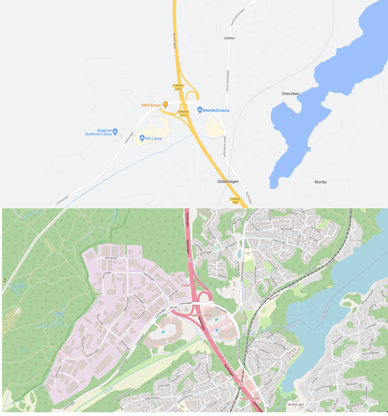
The previous google maps coloring was terrible, too [1] (linked from [2]). At least you can now _see_ the minor roads on the map. It's impressive Google Maps has had terrible coloring for so long, but hopefully this is a step in fixing that.
Don't know at the zoom level it looks like a feature to me when searching for a path, I don't want to cross residential area.
Edit: Looking at Paris with the updated version on a tablet vs previous one my phone, main axes dot not pop as much. Guess it's not optimized to navigate without gps now ...
Google’s new UI refresh has been a step backwards. The biggest crime for me is the now in chrome when you right click you have to sometimes scroll to see the “inspect element” button, the most used thing in the context menu for me now hidden and requires more effort. I hope many bad and painful things happens to all the people who thought that was a good idea.
" the most used thing in the context menu for me now hidden"
For me as well, but I think it is crazy, that it is usually still enabled by default for EVERYONE. I had to calm quite some people, that they did not break their internet accidently for opening dev tools. Now it surely would be nice, if the majority could make use of that button, but the majority ain't devs and so they should not have that option one click away from buttons they do care about, like copy and paste.
The worst thing with google maps the last years is that you can't see many venues until you zoom in to the absolute max zoom-in, even if there is PLENTY of room to show it at a lesser zoom-level without cluttering up the view.
Sometimes it's even inconsequent, like you see something, zoom in to look at the streets, zoom out, it's gone... then you can't see it again until you zoom max..
My least favorite thing about Google Maps is when they don’t display the street names in a place that makes sense. Sometimes I just want to look at the route and then drive there without instructions, but have to scroll halfway across the city just to see the name of the street I turn on.
It's difficult enough to see street names sometimes: you often have to zoom all the way in, which is very frustrating when you want to quickly work out what street you're on...
I can't believe this is still a problem. How hard is it to write the code for "the label for a street in the viewing frame should be located within the viewing frame"? Why am zooming in and out, and moving the window around to get a street name to appear when there's clearly room for it. It's a map app!
What makes you think this is a problem in Google's eyes? If you can't reasonably see the street names then you are much more likely to use Google Directions, which is the precise behavior they want to encourage in this case. From your and my eyes and all users this is a real frustration and a detail all of us hate; and clearly Google could fix it easily if they wanted to. But knowing how they benefit from making the street names hard to find - for the reason in my first sentence - why would they fix it?
Having directions take you on a route that runs you by an advertising company could conceivably make them a lot of money. I am not suggesting and have no evidence they do that now, but it's not outside the realm of possibility.
For a company that is about search, they are really screwing up their search metrics with Google Maps lately. Two common metrics are precision and recall. Precision in the context of maps would be that everything you see is highly relevant. It's not. Random selection of crap I don't care about would be the friendliest thing to say about it. Recall would be that if it is there, you should be able to find it by zooming in. It fails hard with that too. Google maps is neither very precise or very good at recalling things. It used to be better at this.
Not showing the street names is a problem. Filtering out business I know exist and that I know they have is a problem. Bakeries, bars, coffee places, etc. They have them all. But not on the map. And it's not like there is a lot of other content competing for attention when fully zoomed in. I live in the middle of Berlin, not in a freaking desert.
Only when I search for them do they show up. Showing me nothing where I know they have stuff is a choice. A bad one. It's all form over function lately at Google. Lipstick on a pig. And it doesn't even look that good. Hating the bright greens particularly. Fugly as hell. But Apple does it so it must be good. I guess imitation is a form of flattery. Or desperation. Or something. But it's definitely imitation.
It indeed looks like nobody is in charge, as Ian Hickson suggested in the article that was on HN last week when he left Google after 16 years. Indecisiveness and a lack of leadership are on full display here. Nobody calling BS on this is a problem. Leadership allowing this out of the door, or worse, insisting it is released in this form, is a problem. I guess somebody needed their Christmas bonus so they shipped "something" and forced it through. Just speculating here but corporate stupidity tends to work like that. It's not hard to make an educated guess at the multiple levels of mundane stupidity at play here from the outside. Because I've seen it from the inside in other companies.
That's the goal. You're assuming their metrics are tied into being a 'map' or 'useful to end users', but this is Google. Their metrics are 100% focused on ad revenue. They want you to see people who have paid to be included, and they want to force you to rely on their search (which they control) rather than being able to organically find new places.
They conditionally show labels and venue points depending on context. This might be search history, referrer, device, desktop/mobile, time of day, directions for car etc
For example we can imagine that if a user usually uses it on the phone, at night in the city, on foot, often searching for restaurants, it might default to showing more restaurant venues without the user initially searching for it if the user is in the city at night. There's a blog post they made about it several years ago from what I recall it was something like "if you look for fast food it will show other fast food venues"
Well you see SOME venues reliably, in particular those that chose to get (aka pay for) a logo etc.
Maybe I'm just being cynical but my pet conspiracy is that in order to make the map space marketable it needs to get worse first so companies are "encouraged" to pay for the privilege.
This is frankly obvious, ever since google maps spoken directions began mentioning chain stores by name. "Turn left at the [national fast food chain] is too obvious.
It's the 'Supermarket bacon' method of enshittification. The normal product heads towards lower quality until the vendor can then sell one that's closer to the original, but call it a premium item, and charge more for it.
I have a hypothesis that Google prioritizes businesses that are tied to Google somewhere somehow, for example their web site uses Google Analytics, or pays for ads, etc. This way, by promoting google-tied businesses they may (marginally) improve profits. A little dirty trick that makes sense for Google so much that I'd be very surprized if it's not true. Can't verify it though, hope someone can?
I so think this and could correlate with the search engine. It seems the vision of organizing the world data was misdirected to another side. Google is forgetting many sites and its search is subpar and doesn't target obvious SEO Spam endeavors. Finally, don't forget how they increase the number of ads in the search results at the top, you need to really think where the real results start.
Business wise speaking, it seems that Google is aware that the clock is ticking for several of their offerings. This is even beyond the antitrust case. Microsoft Bing finds stuff that Google doesn't. Something impossible to think a few years ago.
It all became quite muddy, but I am sure they did at some point. Clearly mark sponsored content, that can be highlighted (also on the map) - but otherwise the algorithm for the search needs to be neutral, that was the basic claim of google (and demand of regulators) in all monopol abuse related legal battles. So if they favor their best paying clients in a non transparent way and this is verified, then I believe this would be very expensive for google, possibly the end of them - as then every small and middle company can sue them for compensation.
Anti-trust laws generally make it illegal to leverage a dominant position in one market (which google has in search) to favor your business in another market.
About 5 years ago Google totally fucked up the colours of smaller roads here in the UK.
Now basically everything except really big roads are white on slightly off white background. It’s just the worst colour combination ever if you don’t have brilliant vision and can’t be that great anyway.
Google has, in my opinion, a severe problem with change for the sake of change. I use a lot of Google software but it seems like something is always changing with new versions and not for the better but not always for the worse either, just different. It's fairly frustrating especially in apps I use infrequently.
They just don't seem to value a long term and consistent user experience.
Agreed, I feel it's definitely Conway's law in effect, the org structure is being delivered: PMs need promotions so will change things for the sake of change, to have something to be delivered that is not only maintenance or steady small upgrades. To get a promotion it needs to be flashier, PMs chase "impact" (whatever that means) and not a "this is a nice and consistent user experience". To the detriment of us all, users...
Unfortunately I don't have many examples of large orgs being able to escape Conway's law, every larger org I've worked at has this issue.
After 2 decades in tech I definitely feel the incentives are all wrong, what organisations push for the ticking box process of getting promotions is quite disconnected from the needs of users. Given enough time, inevitably, it breaks.
I'd be extremely glad for that, fucking tired of all the political games to keep churning projects a PM wanted for their promotion package, regardless how actually useful it was 2-5 years down the line, usually abandoning the team right after they jump up in their career...
I haven't had a PM for longer than a year or so in a long time. Getting pretty exhausted by the endless cycles of:
1. new PM
2. weeks and weeks of product workshops to define vision/mission/goals
3. teaching the PM how the product works, who are the customers, why it works this way, all the weird business logic cruft
4. PM has a passing knowledge of the product
5. PM decides on a new questionable flashy project after 3-6 months
That's a PM looking for a promotion and I'm afraid that it can't be helped. It's not the only way, somebody they get promoted without doing anything, only backstabbing other people.
In a sane environment there should be user problems to solve, real problems and not invented ones, and teams that solve those problems. The PM of a team delivering the best solutions should have an advantage when looking for a promotion, that's fair. Unfortunately that means that they had a brilliant PM and they'll turn it into a maybe mediocre manager one level up and there is no way to climb down the ladder in the same company. Peter's Principle.
I remember reading this is a side effect of their corporate ladder structure, where successful projects for “new stuff” are used to self-advocate for promotion.
I personally only use the satellite view, I can see what is a park, a street, a river, and in full details without any doubt. The standard map view is useless now for me, I can't find anything there :/
Is there anything where someone has taken the effort to measure quantitatively how contrasting the colours are now compared to how they were before? It feels to me like people will be biased towards what they are used to, regardless of which is better. I don’t have good pictures of the maps before but just comparing to Apple Maps by eye:
- at high zooms, AM public transport has lower contrast between roads and the rest than GM which is lower contrast than other AM views
- zoomed out a bit and the contrast is similar. AM shows fewer small streets but more main streets are shown thicker than in GM. AM shows more of certain POIs like stations or landmarks
- zoomed out a bit more and GM shows major roads with higher contrast than AM which doesn’t pick them out so much but shows side streets with hairlines. The green is greener in AM.
- public transport view at this level is so much better in AM. It’s less cluttered (lines are thinner, when trains run along the same route the lines are rendered right next to each other where GM has an ugly amount of space. Both views are omitting useful information at this zoom level (eg stations and interchanges aren’t all marked; it’s reasonable not to name them but AM used to be better I think). AM does a better job of mimicking signage/designs you see on the network (eg if the letter for a line is a coloured circle on a certain background)
- zoomed out a lot and it’s a bit hard for me to describe the difference. AM seems to have a bit more contrast of roads against backgrounds. Roads are grey in both (I vaguely recall AM used to mimic road atlases). AM shows a greater variation of road thicknesses/darkness for more major roads. AM labels roads closer to how they appear on road signs and shows more road labels in ‘driving’ view
- zooming out further and major roads fade to thin blue lines in AM and grey-blue on grey-green in GM. There is more variation in roughness (different terrain) for the green parts in AM.
More and more I'm seeing headlines suffixed similar to the above "...and a lot of people aren't happy" or "...and people are upset" and it just seems to me like shoddy work by article authors.
These kinds of headlines make me assume the article is not going to bother to give a balanced or researched analysis, but instead just talk about how people are feeling about things, without necessarily quantifying anything.
It's okay to have feelings or opinions, but that's generally pretty useless to other people without some rationalization or justification as to why you have them.
I would have been far more inclined to read an article with a headline like "Google updates its Maps to look more like Apple's at the expense of ease of use".
If I went to my boss and I said “people are upset with our product”, he will bemoan me for providing un-actionable information.
If I went to my boss and said “this is why people are unhappy with our product”, then I’m bringing him something potentially useful.
My point is that I have no desire to read an article which from the headline seems to merely tell me “people are upset with something” as just about anything will upset someone.
If your headline indicates you’ll at least attempt to tell me why people are upset with something, that might actually be interesting.
The grey roads aren't good on the eyes, and it needs better contrast. They come out with design schemes but fail when they need to deliver it themselves.
I don't even bother with Google Maps any more. It shows miles on many dialogues when my locale (South Africa) only uses kilometres. Also, I don't know what preference they give to nearby POIs, but it's mostly useless (or random).
Install one of the OpenStreetMaps-based apps like Magic Earth or OSMAnd with offline maps and customisability, and it works well enough.
A bit off-topic, but I maintain three simple, static websites. Every few months, I get mail from Google, telling me of "new" reasons why these sites may not be ranked well in Google search.
The reasons are nonsense, at least in my view. For example, suddenly the spacing between control elements is "too small" for mobile devices. It wasn't last month, but it is now. Or the font, or something else that hasn't changed in years. Other search engines (e.g., Bing) report no problems.
More "change for the sake of change", but they want to force other people's stuff to change as well. Google hegemony can't end soon enough...
Yep, seen all of these. Got a new one a couple of weeks back: some pages on my site http://www.example.com/ aren’t being indexed because of “Page with redirect”. This is the http:// → https:// 301 redirect which has been in place since the day I created the site. But apparently Google forgot about it a week earlier, and then noticed it again and mentioned it.
Some cases where I’ve seen “element too small” must indicate a bug in the browser or the measuring: no scripting, CSS failing to load wouldn’t make it any smaller, and the content is all after the meta viewport declaration (of course). So unless the entire thing is deliberately faked (which seems unlikely), it’s got to be a bug in the browser or measuring.
As someone who has few high load dynamic ones, I am getting those by dozens. Likely google "improves" the algorithm by which those are decided and voila.
The good thing is I never got to spot any correlation between SERP and those "reasons".
No, never had a content warning. It's always been something about the page structure. Annoying, because the structure hasn't changed in years - so why always new warnings...
> but they want to force other people's stuff to change as well
They aren't forcing you to do anything.
They are simply informing you that they prioritise end user experience and that they will be promoting more usable sites ahead of yours. Because inadequate spacing between control elements is a fundamental user experience issue on mobile.
The one on the left is the best one by far. However it lacks POIs and they could be useful.
I'm unsure which one is better between the middle and the right one. They are probably at the same level. The middle one has some more POIs. The big difference is that all roads have the same color in the map at the right (the new Google Map) so you have to rely only on thickness/thinness of the line to assess the importance of a road and maybe on its label.
I just want any map provider to make the compass feature work reliably and easily visible. That’s all I want. But for whatever reason both Google and Apple seem incapable of doing this. I’m puzzled…
One of the design flaws with Apple Maps is that it unintelligently rotates the map outside your control. It's utter chaotic and makes it useless for me. I hope GOOG Maps doesn't do the same.
I really like using OpenStreetMaps, the maps are so much more readable than GMaps. And the map material itself is quite good too.
I only wish the search in OsmAnd was a lot better than it is.
Both products ended up becoming caught up in a race to the bottom. I have no insights how it happened. But I am fascinated that over time apps that work are “improved” and inevitably devolve based on this premise.
Because if you're not pretending to do something useful somebody might think that the company doesn't need you anymore. So you have to invent something to do and breaking working stuff just happens.
I also noticed that Google Maps looks like a watercolor now with more white margins around.
The various map providers are now all about the same level of quality and I chose Google Maps because I preferred the color scheme. With this change, Google Maps lost that advantage.
1. https://justcreative.com/why-do-everyones-logo-fonts-look-th...?