I was working on an 8-bit system back in this same time period. We couldn't afford flash devices and the kit required to reprogram them. But we did a similar trick with an extra write pin located near the ROM socket, then used a special daughterboard filled with SRAM that replaced the ROM and also touched the write line. Now we could just use our cheap debugger and blow an image into the address space the ROM used.
Only downside was that you lost the image on power down, so I can see why EEPROM was more important to Apple in developing their systems.
> I would love to see an example of what these PDS cards looked like, if anyone out there has some inside knowledge they would be willing to share!
The only thing that came to mind were these Newton development boards from about that era. I believe they were more or less Newtons shoved into one of the slots of a Quadra-like machine (perhaps the PDS slot?).
What blows my mind is how active the collector community is about these machines. These machines are over 30 years old—they’re so old they’re not even regularly on eBay anymore.
I still have and cherish my 8600, the very first Bad Motherfucker computer I ever managed to obtain. :)
Adjacent: does anyone have a good article describing how Macs used to boot from ROM? Not just some sort of BIOS but the full MacOS System. It seemed like a really neat feature, but IIRC quickly became useless because there was no way to update the ROM so you'd end up loading the OS from disk to get the latest version.
> Not just some sort of BIOS but the full MacOS System.
It's not quite the full system. It may be best to think of the original Mac OS as a software library. The application is in primary control, and uses the OS as a library directly - jumping right into the OS code sometimes. Modern ideas about layers of separation and protection did not yet exist.
A significant portion of the ROM is QuickDraw, routines for doing bitmap graphics and text very quickly. There are some other rather generic routines, like string handling, a sort of a standard library. There are also drivers, interrupt and timer handling, etc. The Chicago system font is in ROM too.
Since it was all designed together, it was not too hard to just make it modular, and have some of the modules in the ROM, and the rest loaded from disk. There is a central dispatch table kept in RAM. When a program makes a Mac OS call, the dispatcher looks up the current vector from the table. When the OS loads, any patches to ROM are handled by redirecting the dispatch to the new routines or patches. It's important to remember classic Mac OS had resources (labelled sections). Large blocks of code are referred to with handles, not pointers. The resource manager can transparently load/unload them behind the scenes as needed.
The Mac has gone through a fair bit of setup before it starts reading the disk. The OS memory manager is running, and the device manager is configured, the disk driver service is set up as well. The boot splash (grey background and the happy Mac icon) is drawn using standard graphics API calls. The calls would do the same thing if used in a normal Mac OS app. The boot sector on disk is loaded using the same calls as in a Mac OS app if you wanted to do low-level disk access.
The resource manager is then told about all the resources in the system file, and any patched resources are patched, etc. And then the finder application is loaded and started. When it goes to look for resources, it'll find them mapped to ROM or the system file through the in-RAM resource map. And when it goes to make a system call, it'll find them mapped to ROM, or the routines loaded in RAM from the System file, through the trap table.
> became useless because there was no way to update the ROM
The original Mac 128 and 512 were limited, because their ROMs were the original code, and also 64 KB in size. The later Mac software needed at least 128 KB of ROM (new file system, etc.) and so could never run on those machines. But later system software was never going to run on those machines, anyway.
RAM was extremely expensive in the mid-80s. That is really the only reason for this. The original Mac would have needed an extra 64 or 128 KB of RAM otherwise. That would have bumped the price up several hundred dollars. RAM prices imploded shortly after the Mac's release, of course. System 7 loads around 100 KB of patches to the ROM on a Mac Plus. By 1990 it would clearly have been better to just have it all in RAM. But the architecture was already fixed. (Later Macs would just load a complete ROM image off disk.)
There is one more minor factor: the original Mac can execute code from ROM at full speed. The RAM is contended with the video hardware and has slightly slower throughput. So there is a slight plus to having QD in ROM!
You're right about the ROM, but parent is talking about something else: the built-in bootable system that came in ROM on the Classics. Cmd-opt-x-o at startup would boot you straight into 6.0.3, at the cost of RAM (it made a RAM disk to run from).
I used to ROM-boot my Classic back in the day, it was nice to have a built-in recovery volume. These days if you use a Mac Rom-inator II[1] it supports booting System 7 from ROM, and it'll even create a RAM disk the system boot from, making the system ephemeral but modifiable. I have one in my SE/30 and it's been helpful to have that built-in recovery volume - no floppies needed.
This is actually older than Squeak by a couple of years at least.
The reason why so many early 1990s UIs have this kind of color scheme is part fashion and part technological opportunity.
Rainbow pastel colors were really popular around 1986 - 1993. It was a reaction to the muted browns and oranges that characterized '70s and early '80s design, and also a reflection of the economic optimism of the era.
At the same time, computer displays evolved beyond monochrome (original Mac) or garish 16-color palettes (PC EGA). With 256 colors out of a palette of millions, it became possible to display those fashionable pastels on a computer too. So why hold back?
(Personally I'm still stuck in this era. Light background is a must. I never use dark mode on anything. I genuinely don't understand the kids who want their IDEs in black like some depressing 1982 textmode VAX. For me it's warm pale yellow and baby blue terminals all the way; extra bonus for dark purple text highlights and a mint green piqué shirt.)
>Light background is a must. I never use dark mode on anything.
Dark mode is fundamentally a hack around two things.
First, shitty screens that can't run light mode anywhere near dim enough once the sun goes down (which is at least a 5-nines percentage of all screens ever produced). A good chunk of this is due to insufficient PWM frequency but software has a lot to do with it too- and if I can't make the screen go dark enough, well, then I'll just tell all the pixels to be black and use white text.
Second, shitty flat UI design has made it more difficult to see borders between items. It seems to be easier to pick out a bright glowing spot in a field of black than the reverse- it's worse for comprehension, but not for identification/differentiation. It's easier to see that something is selected when you're using white-on-black, and if you already have a good idea what that something is the comprehension penalty is irrelevant.
Those two things predate most proper dark mode implementations; I assert they created the need for it to exist in the first place.
Bright displays also absolutely fuck up my ability to focus my eyes for the rest of the day, so I attempt to use dark themes on everything, having to accept a light theme for any site or OS feels like a personal failure and reminds me of my almost-useless old eyes.
> Personally I'm still stuck in this era. Light background is a must. I never use dark mode on anything. I genuinely don't understand the kids...
Kid here (34). My understanding is our generation grew up spending much more time looking at a screen in general. Gaming, socializing, following news, doing work, doing homework, talking to parents, talking to partner(s), reading books, painting, sculpting, paying taxes, managing finances, applying jobs, applying for visas... The list is too long to fit here. Participating in society demands more screen time than ever.
Dark mode makes screens blend with the environment better by emitting light where only needed. Since we can't reduce our screen time without any compromise, we try to optimize with the dials we are left with, in this case, pixel brightness.
My personal theory of display ergonomy is that a light background is better for the eyes because then you have to dial down the screen brightness all the way to a level that's good for reading (generally something close to paper white in the same environment, and usually much lower than the display's maximum brightness).
Admittedly this theory is only backed by personal preference and some vague recollections of CRT-era ergonomics discussion in 1990s UI design books.
> Admittedly this theory is only backed by personal preference
Same for my argument too.
There is also the cultural factor. The age when I was going to make a decision about which high school to choose and what kind of study to pursue, we had the chance to enjoy the release of a few of the best sci-fi movies/shows ever made. Those movies had the black screen, neon green/blue strokes and fonts as the main design language. Looking at the letters falling down in the movie Matrix, it was like "coooool, I wanna be able to type those in real time and make computer do stuff".
Lots of us younger people have dark mode with the screen brightness turned way down. I personally often have my screen brightness at minimum, and on mobile I have Extra Dim turned on for more than half of my usage time.
OTOH reading too low-contrast text is supposed to be bad for the eyes too? (At least that was what parents and educators told me as a kid: “Read at your desk where the light is good or you’ll spoil your eyes!”)
And us older folks have screen brightness turned up as our eyes get worse.
For many years I had white background so I could really see things.
Now with floaters I have to use dark background and many games are now unusable as they have light background and medium unreadable text and strain my eyes.
No, it's backed by evidence. Light mode is, objectively, better for your eyes because light characters on a dark background tend to "bloom" and be less clear.
I'm in my mid-40s, and I've been looking at screens for many hours on most days for about 38 years. I've preferred a "light mode" colour scheme, with the brightness cranked up ever since I first saw one (an original Mac that a friend's parents bought in the late 80s).
My personal theory is that some people are just genuinely more light-sensitive than others, but that the main factor is which scheme came (back) into fashion during someone's formative years, so it will always be associated with being new and novel to that person.
In matters of taste, I like both light and dark mode equally.
In terms of practicality:
- Dark mode uses less energy and doesn't burn your eyes at night.
- I've only ever found light mode useful when the ambient light is really strong, e.g. direct sunlight shining on my laptop screen. When this happens dark mode is basically impossible to read even with full screen brightness.
So 99.9% of the time dark mode will suit my needs better.
I could be wrong but I think it's only saving power if pixels are actually solid black where the pixel can be turned off entirely. I don't think dark shades are more power efficient than other colors.
Thankfully a lot of apps are getting explicitly named OLED dark modes to take advantage of that.
When Americans first got easy access to refrigeration and food became significantly cheaper, we got jello casserole. People would suspend literally anything in jello because it was so novel at the time. Bright, colorful, wobbly abominations. Just like this UI.
> The reason why so many early 1990s UIs have this kind of color scheme
Do you have any examples? Because from the early 1990s I only remember Windows pre-XP (mostly black and white and blue), AmigaOS (mostly gray, including the newer frameworks like MUI), NeXTStep (gray). Only exception: the colored tabs in OS/2 Warp, if I remember correctly.
It's more muted, but follows the principle of "let's use these truecolor hues now that we've got them."
The global fashion trend after 1990 was moving away from bright pure colors and towards increasingly muted pastels. So for examples of more bright-colored UIs on 256-color displays, I think the Mac II / System 6 era would be the place to look. Early CD-ROMs might be a rich vein.
Thanks. But I was looking for something like the flash tool shown on the website, or like the default color scheme of Morphic. "Crazy" colored GUI elements etc., not just the background.
Edit: never mind. The link by pavlov has more examples.
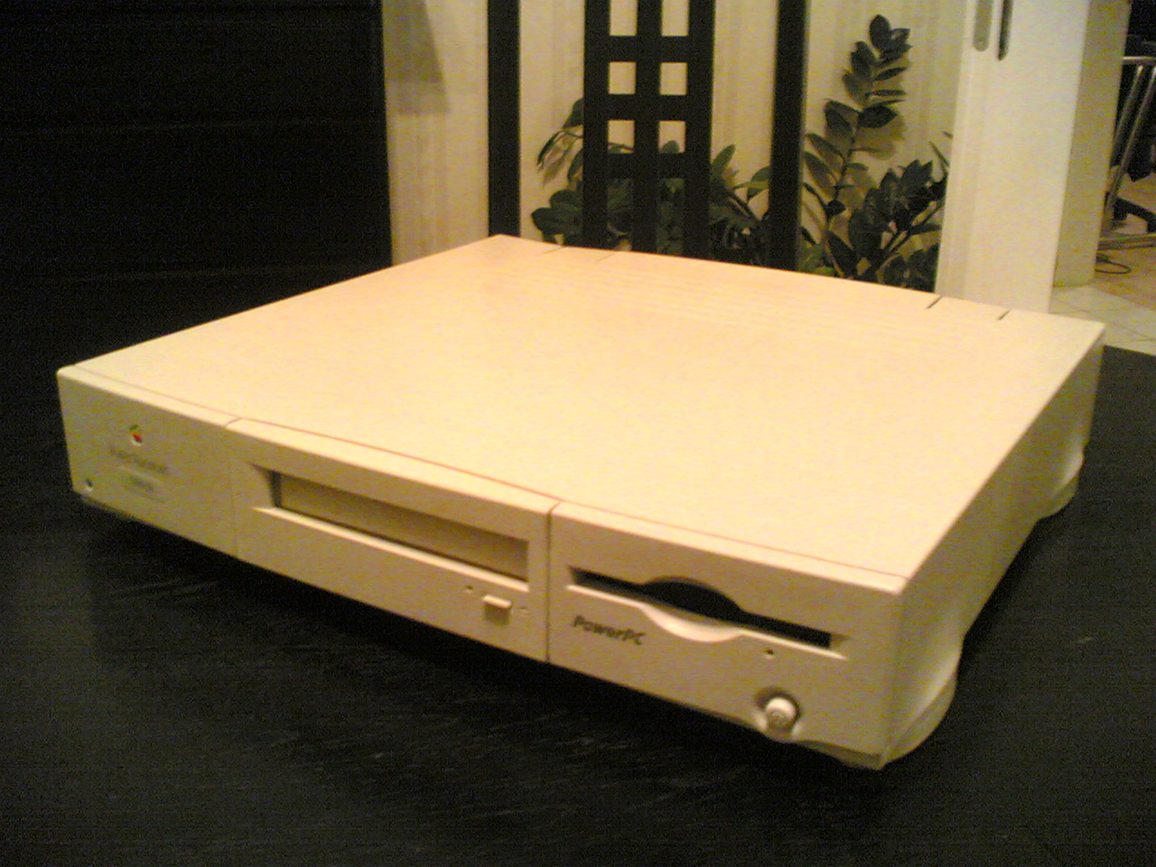
The Performa 630CD was my first Mac and it warmed my heart to see its picture. That feeling went away quickly as I saw it being used as guinea pig for ROM shenanigans. Save that Performa!
well, normally I'd agree, but it doesn't look like there are any irreversible/destructive changes being made? plus this seems like a pretty valuable experiment/project for the retro Mac community.
They also recapped the machine which will do more for its life than anything else. The 90s were infamous in general for the "capacitor plague" and so it's usually an extremely good idea to get all of those 90s era electrolytics out of the machine before they leak all over the place and destroy the board.
The project is amazing. It was just a joke with perhaps a bit of resentment, because the Performas were never quite as nice as the Quadras, but they were cheaper and that's what my family acquired back then. So there's a part of me that dislike seeing it as a mere testing ground for the Quadra.
> By the way, I actually succeeded today at hacking the code of Flasher to erase and program modern flash chips. It required a lot of 68k assembly work, but luckily I had a good reference to start from in my USB SIMM programmer.
And then, jealousy intensified, I close the tab and go back to debugging my MVC webapp.
The grass is always greener. Working on low level things has lots of drawbacks and it's not uncommon to wish for better tools, documentation, libraries, etc like you get in higher level programming. It takes a lot of work to accomplish what externally seems like trivial results.
Why be jealous and only feel bad about it? Let the envy motivate you to create great things! There are a million tiny hobby project ideas out there that you have the power in your hands to actualise.
You never know where such things will lead, either. I did reverse-engineering as a hobby for years because it was a personal interest, then eventually switched careers to information security partly because of that background.
No one is ever likely to make a living reverse-engineering 30-year-old ROM-flashing utilities, just like no one is likely to make a living figuring out how to convert early-2000s console game data to standard formats, but that kind of hobby project builds skills that are uncommon and useful in certain lines of work.
Precisely. I have been told I have a knack for reading other people’s code. Turns out it was years of reverse engineering as a hobby in my youth that gave me the skills to sit down and understand someone else’s code very quickly. A hobby that gives useful real-world skills.
I know there's a rule against posting titles like "How To Do X" in https://news.ycombinator.com/newsguidelines.html, but in this case the title doesn't make sense without the "how" - of course Apple's developers reflashed Mac ROMs in the 90s, they had to do it as part of their job, the article is about how they did it.
here in California there were zero instances of "flashing a ROM" among ordinary developers -- it was obviously illegal (maybe a reason) but also you just buy a Mac and get the rom image.. Macs were everywhere... fifty percent of the Macs in the world were in this area, by some measures at some time.
This was the nightmare of Apple from the early days and they actively pursued it. Also, intelligent people in the creative professions were inventing things.
Hmm. You seem to be railing against something that is not related to the article. The article describes how Apple internal developers reflashed ROMs while developing the firmware for new prototype computers. This is something that Apple's developers had to do on a regular basis.
I think the poster (maybe someone’s AI experiment?) is on a tangent about replacing the standard Apple ROMs with your own versions? That wasn’t really a thing, but it wasn’t illegal either. What was illegal was copying Apple’s ROM code to sell in your own clone machines.
if you take half-a-second, longer than I spent reading that article, you would know this is a personnel account, right? do you need to repeat "AI" rumors here ? It is neither amusing nor adding any substance to the topic IMHO
You’re misreading the rule. Such titles are allowed.
If the title contains a gratuitous number or number + adjective, we'd appreciate it if you'd crop it. E.g. translate "10 Ways To Do X" to "How To Do X," and "14 Amazing Ys" to "Ys." Exception: when the number is meaningful, e.g. "The 5 Platonic Solids."
It's such a dumb rule to even have. If the article shows 10 Ways To Do X, then it is pretty accurate. How To Do X sounds like there is one way to do it, and it's being shown.
What happened to the don't editorialize rule, because that's exactly what's being done in the provided example. You're not just shortening an acceptable length title, but you've changed the meaning.
I see you've never submitted anything. I suggest you try a few times, deal with the automatic title mangling, and then come back and tell us how you feel about this rule ;)
> ”See that thing that suspiciously looks like a CD-ROM drive on the left? It’s not. It’s a blank cover … I pressed the button thinking the CD tray would come out. If you push the button hard enough, it gets stuck back in there.”
Pretty weird and un-Apple-like to have a physical eject button at all. The mid-90s were such a weird time to be alive.
It was in the mid-nineties and I had to hand in my weekly lab report. As my printer at home had decided to go on strike once again (as they used to do in the mid-nineties) I decided to print it in the university's library. So I went, still a quarter to the deadline, with my little 3.5 inch floppy disk. All the PCs were taken so I resorted to the only Mac.
I was a little excited, because these jewels were expensive back then, and usually always taken by someone that seemed to have more important design tasks to do than I had. Now I had the opportunity, for once.
I inserted my floppy, opened the document, sent it to the printer. All went fine until I wanted to get back my disk to rush to the lab session. No button to eject, nowhere to be found, so I asked one of my fellows sitting at a PC. He told me to drag the disk into trash bin. Yeah, right, sure I believe that! So I asked another guy, and sure he said I should throw my disk into the bin.
Now, these lab reports were important, because you needed to pass all of them to be allowed to write the test at the end of the semester and there were only two substitute dates. So I had little choice. I dragged the little disk icon over the little bin icon and let go. I already saw all my work on the disk gone but to my great surprise the disk ejected immediately and completely unharmed.
My lab report was handed over in time, it passed. The two substitute dates at the end of the semester never materialized because the prof was sick, as every year before and after - as I lerned. So, good on me to trust my fellow students but g00daxxit terrible UI!
To be fair to the UI, there's also an 'Eject' option in the menu bar when you've selected the disk. There's also a keyboard shortcut. Dragging it to the trash is just more fun!
Actually, if memory serves, dragging to the trash was a shortcut for ejecting AND... what did they call it... putting it away, I think. Normal eject would leave a ghost of the floppy disk so when you inserted another one, you could copy from one floppy to another. You had to 'put away' to remove the ghost.
The Mac had a distinction between “Eject” and “Put away” mostly as a relic of the days when it had a single 400k floppy drive, so “ghost” disks were used to keep track of however many disks you needed to juggle whatever task you were doing. For example, you’d boot the computer, eject the System and insert your application, start it, then eject the application and insert your document; the system would know about all 3 disks, and whenever it needed something off a different disk it would automatically eject and prompt you to “Please insert the disk: «Name»”.
In this world, the split makes perfect sense: you eject a disk when you want the drive slot to be free, but you don’t put it away until you’re done with it. Once hard disks became standard equipment, the floppy drive was relegated to data transfer and you almost always wanted “Put away”, but renaming the menu items to what new users expected would have confused existing users.
Better than my similar Mac story from the early aughts. I did not frequently use Mac computers but needed to quickly print a document I had burned to CD. For whatever reason, I was in the Mac computer lab which had nothing but what I believe were Power Mac G3s. Inserting when fine, and I knew from using those original black and white Macs in high school that dragging the disk to the trash would eject. When I did so I was rudely informed I lacked permissions to unmount a disk that I had myself just inserted and used.
Fortunately, the lack of an eject button was a farce on this machine. The CD drive was just your garden variety PC drive and if you aren't shy about abusing the facade door Apple placed over top of it you can still get to the eject button.
Decades late, but they could have told you to use Special: Eject Disk if dragging to the trash was too much for you. Then you'd have to grapple with what to do now that the physical disk was in your hand but its icon remained.
There was also...Command+Y, I think?
Modern (as in, the last 20 years or so) versions of macOS still have this feature, except when you start dragging an electable volume, the icon changes to an eject symbol to make it clear that you’re not actually trashing anything…
What happens when you push the eject button on the lower right, below the floppy drive? If you say "Ackshually, it's the power button. Macs don't have floppy eject buttons", feel free to go back in time and tell that to the many, many, many users at my college who pushed that button to eject the floppy and instead turned the computer off. This happened so often that we had to tape paper barriers over the buttons.
I really enjoyed the handful of mid-90s Mac models where the power button was just to the bottom right of the 3.5" floppy slot, very near where you'd find the eject button relative to the floppy slot on pretty much every PC of the era.
It's hard to describe just how cool the soft eject mechanism was. At least to my young impressionable mind. I can still remember the sound it made. It made PCs appear archaic.
2012 Macbook Pro had a physical CD eject button (it was top-right of the keyboard). Control was probably routed through the OS, so that may not be what you meant, but it was definitely physical.
I saw a sales droid demoing a Mac at Comp USA years ago. That model had the manual eject/inject button underneath the CD tray because in normal use you never needed to push the button. To eject you drag it to the trash on screen. To inject, you just push on the tray a bit and it detects that and pulls it in. The sales droid was talking about how stupid it was to have the button there because it was blocked by the tray, never realizing that he just needed to push on the tray a bit. Ugh.
Nah, it's fine. Flash is a long-established verb for programming firmware. "Flashing ROM" is apropos for write-once parts, and often used instead of the mouthful "flashing EEPROM". The real oxymoron is "Erasable Programmable Read Only Memory," but that's just evolution showing and it's fine.
They are called ROMs because that is what the computer called them. The computer uses them to load initial startup code and base functions, and the ROM is in the "ROM" address space (as opposed to RAM, I/O, etc.). It does not matter whether it is EPROM or Mask ROM. It's basically the equivalent of BIOS.
"Floating-gate ROM semiconductor memory in the form of erasable programmable read-only memory (EPROM), electrically erasable programmable read-only memory (EEPROM) and flash memory can be erased and re-programmed."
Again, it is pedantically incorrect. Please at least try to understand my comment before popping off. If you want to show off your wikipedia skills, look up the word pedant.
Well, I guess you could say that a UV eraser applies a "flash" lasting several minutes. Probably not worth steelmanning the point to that extent, though. :-P
The term we always used at a major PC OEM for the erase/reprogram cycle was "burning."
Only downside was that you lost the image on power down, so I can see why EEPROM was more important to Apple in developing their systems.