Honestly, I'm not sure Ubuntu even excels at that anymore.
When I switched my parents over to Linux, I installed Mint, not Ubuntu. This was well before the Unity debacle, but even besides that, I'm glad I did. Mint looked familiar to them (coming from Windows), and while it may be heavily bloated from a software perspective (the stuff that makes Arch users cringe, since they ship everything by default to maximize configuration-free compatibility), it feels very lightweight from a user perspective - like what Windows might be like if they stripped out all of the stuff that people really don't care about.
No need to bash Ubuntu just because it lost the coolness/freshness factor. It's still a great distribution, and the only one I know which serves excellent font rendering out of the box.
I love Arch as much as the next guy, but their default font experience is awful. The biggest headache of using it was constantly fighting/maintaining patched cairo/freetype from AUR (because they'd occasionally conflict with a newer version of some other package). And on top of that you'd have a ton of other packages with baked-in broken fonts like Firefox, xulrunner and Open Office.
When it comes to fonts and text rendering, all users firmly belong into two groups: the 1st group would post a screenshot of their screen where the 'd' and 'p' are rendered with double line thickness at the tip of their curves, and then claim "my fonts are fine". The 2nd group would consider that unusable.
What Ubuntu excelled at (and still does) is to bring Linux to the 2nd group of people, which is a lot larger than the 1st one. All Canonical's questionable achievements like Unity, upstart and Bazaar have been easily eclipsed by them noticing and taking care of the elephant in the room: readability of text on user's screen. They fixed it by patching freetype, providing sensible defaults for fontconfig and by developing an excellent set of default fonts.
Sorry for the long rant, this is Arch birthday after all. Arch rocks! Long live Arch! :)
I install iceweasel from http://mozilla.debian.net/. As part of the dependencies for this iceweasel, the patched fontconfig comes through with the nicer font smoothing.
I have had the best font experience on arch, out of gentoo, debian, Ubuntu, fedora, centos, and FreeBSD. It wasn't straight out of the box, but it was easier to make happen than on any of the others.
That means you belong to the 1st group, i.e. people who prefer pixelated/rough text look from the 90s. No offense, but this "looks fine to me" attitude is what has been historically handicapping the Linux desktop.
Below are two examples of "looks fine":
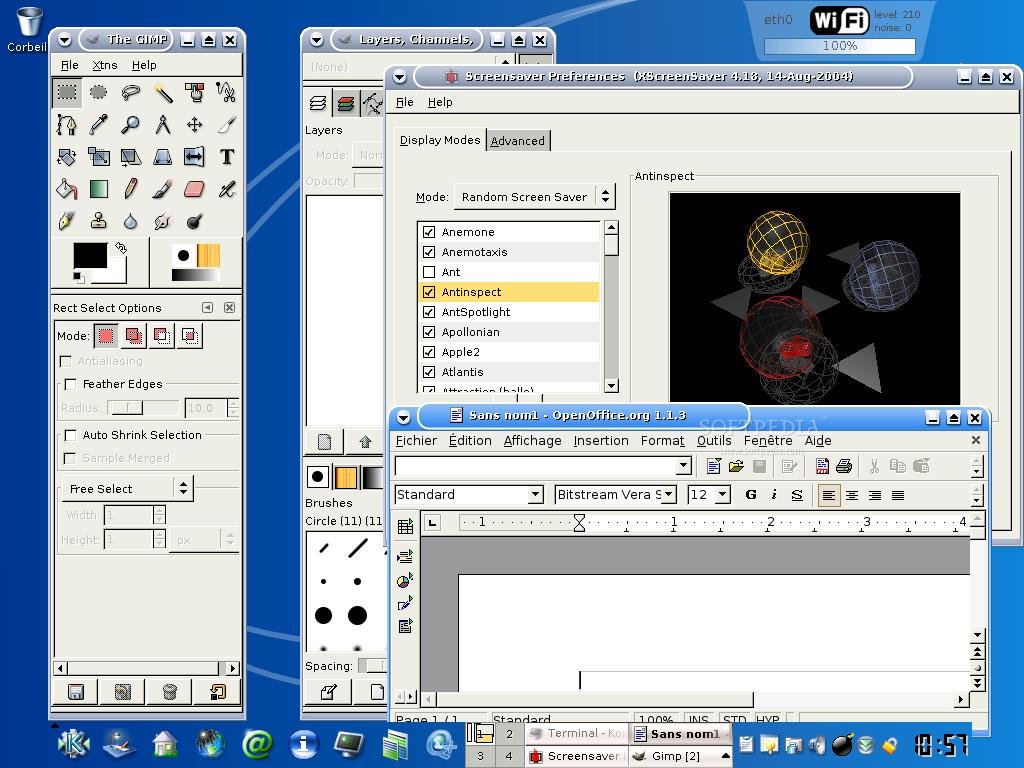
Case #1. Thin non-antialiased fonts sirca Windows 95:
Notice the excellent typeface they developed themselves, consistent and high-quality anti-aliasing, etc. This looks gorgeous on a modern high-DPI screen. Group #1 thinks this "looks blurry" and Arch works fine for them.
Simply put, It is technically impossible for Arch to provide you with the best font experience because their freetype is compiled with, hm... parts of code removed. The parts that are responsible for hinting, bytecode interpretation and subpixel rendering. And the way they ship Open Office and Firefox (well, last time I checked) makes their fonts non-configurable at all, since they ignore system/global version of freetype.
I have probably worked more for my fonts than for anything else about my system, on any linux distro I've tried (on OSX, the rendering's fine but the actual font choices kind of blow...there I have other problems that consume much more of my time than the fonts).
On arch, I install the infinality patched freetype stuff from the AUR, set some preferences in .Xresources, install the fonts I like, and I'm good to go. On any other distro, installing patched freetype and overriding the distro-maintained font configuration invariably leads down the path of madness. I don't run the software you mention, but I have never seen an incompatibility issue.
You mention ubuntu. Honestly, its defaults are fine. That is, as long as you never try to use a different font, or install software that ignores the default, or try to use an alternative program like rxvt-unicode instead of gnome-terminal, or visit a web page that specifies its own font, or have a lowish dpi screen. Ubuntu's great if you stay inside the garden. I just barely don't, but it's enough to piss me off.
Also, I happen to not use openoffice or firefox, so I haven't run into the problems you describe. But I expect that they would look great on my system, because the only version of freetype I have installed has patches that do what I like.
EDIT: here's my screenshot with a 'd' and a 'p'. looks fine to me: http://imgur.com/UZJ17
> I install the infinality patched freetype stuff from the AUR
I proved my point right there. That's what I've been doing too and maintaining AUR-sourced patched core packages like that has been problematic: every once in a while you'll get a part of Gnome or something else demanding a higher version of freetype (which your patched version doesn't provide) and it either halts your update or forces you to get plain vanilla freetype.
And you haven't addressed the case of packages that don't use system cairo/freetype. BTW the rendering on your screenshot is excellent. Also I feel that this discussion is somewhat misplaced. :)
Arch linux by default does not even have X installed by default. So while I install X, gnome, and nvidia drivers, the installation of the fonts of choice is the least of my concerns.
P.S. I am not bashing arch linux, I am just pointing out that the default Arch linux does not even have a ui and you can not compare this to Ubuntu.
Hm, interesting. I think all those examples look terrible. First thing I do on a new ubuntu install is this: http://ubuntuforums.org/showthread.php?t=208396
The result looks exactly as it does on my Windows 7 install (cleartype disabled, it makes my eyes bleed).
When I switched my parents over to Linux, I installed Mint, not Ubuntu. This was well before the Unity debacle, but even besides that, I'm glad I did. Mint looked familiar to them (coming from Windows), and while it may be heavily bloated from a software perspective (the stuff that makes Arch users cringe, since they ship everything by default to maximize configuration-free compatibility), it feels very lightweight from a user perspective - like what Windows might be like if they stripped out all of the stuff that people really don't care about.