I know interactive "one-step-at-a-time" signup forms may not be popular among the HN crowd, but let me tell you, they sure are wonderful in non-tech enterprise. At least in my experience. I guess you could argue that the target audience for Github isn't exactly non-tech enterprise employees, but I can't speak about people outside of that user group as they are the ones I have experience with.
I must admit that I can't remember how it worked when I signed up many years ago, but I'm personally liking this new version.
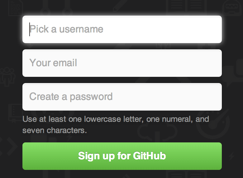
(deleted previous comment... misread and didn't understand that's what it lookED like before).
The new one doesn't seem all that bad to me, either, although I did try it on a desktop machine. I see that some of the complaints have to do with how it looks on a phone.
Why does every website need to look alike? What happened to some whimsical stuff that does something out of the norm? Stop being responsible for draining all of the fun and creativity from the world.
I think this style of UI might suck a little for browsers that try and autofill email/username/password suggestions, but overall I find it a little more clever and interesting than a generic bootstrap form. As a bonus, this probably introduces a bit of friction to bad actors that try and programmatically mass-produce accounts.
What are the chances that an email entered during an incomplete sign-up, where you enter your email but drop out of the process before giving your mother's maiden name or whatever else they're going to ask down the line, still gets spammed with "product updates and announcements" and added to their user database?
asdfkjlhasdfj@asdfkljasdfklh.com just got an 8-digit launch code and is now subscribed to said announcements (sorry if that's a real person), but I'm never going to be able to enter the launch code. Are they still subscribed, even though the launch code will never finish?
I agree that I'd much rather see a single-page form with a half dozen text boxes and a "Submit" button, and I'd hope that nothing gets committed serverside before I click "Submit", at which time all of the \<form> data gets POSTed.
The older form simply asked for a username and a password in addition to the email, so I'd say "you have no idea what else they're going to ask for" is a bit overstated.
Calling it unusable seems like unnecessary hyperbole. That said, it does seem like a step backwards! Do these things get A/B'd with static signup pages? Surely they are going to lose some signups for this. Maybe they don't care!
If the text box loses focus (for example, by clicking anywhere else on the page), there's no indication there even exists a text box. The form becomes completely unusable and you would need to reload the page. Even clicking the disabled-but-cursor-indicated-clickable continue button doesn't refocus or provide any feedback the form is incomplete or does it refocus the text box.
> I visited it on a 4 year old macbook pro and my fan started to go crazy because of the bg animation. UI was sluggish as well.
Come on, it's 2023. It's more than reasonable to expect all your users to have a login-form accelerator in their PC. If you're not keeping up to date, the fault is with you, not the web developer. /s
Maybe it's on purpose and it's an strategy to annoy poor developers, the most likely to pay for premium features are the ones with disposable income, not the poor ones (in the short term at least), just half-joking, it is Microsoft we are talking about here after all.
On my Android mobile the error response label is hidden below the keyboard. So on the first step if I type "test@test.com" and click "Continue" the error of "already taken" is hidden below the fold by the keyboard and the impression I got as a user was that the "Continue" button was broken until I hid my keyboard.
I didn't bother testing other parts but they could probably highlight or border fields with errors in red. Maybe put the response above the field. Just my 2 cents.
I intentionally tested an error path because in my experience that's what separates the joes from the pros in UX.
The user cannot press a wrong button, is not distracted by a whole bunch of fields and there is no ambiguity. Cognitive complexity is low throughout the registration proces.
My only two small points were:
- I miss some some kind of "progress" indication. Normally you see the whole form at a glance, now you don't so you're not sure how far you've progressed.
- The outline of the input field touches the button on the right. There should be a padding between the two.
But these are small points, overall I quite like it tbh. It reminds me of a CLI wizard, which seems fitting for Github.
Looks like they were trying to emulate a command line style interface to reduce the monotony of filling out forms. As with any radical deviation from the norm, some people will hate it, some might love it. Don't assume your own experience, or people you've heard from, is representative of everyone.
Not all publicity is good publicity, especially considering most people seeing this will already know about GitHub, and will just make it look worse in their eyes.
I actually hate this. Microsoft should be ashamed of themselves. It's 2023...Treat people like adults. They don't need a corporate CUNextTuesdaY Hal interface to walk them through a sign-up form.
Is there an A/B test at play? I don't see anything unusual or GPT-ish about the signup form. The only "unusable" aspect of it is the slightly-more-annoying-than-usual captcha.
I'm not even sure we're talking about the same captcha. It was just an image grid with some symbols overlaid each cell and it wanted me to pick out which cell had two identical symbols. I found it annoying because it was different from other captcha's I'd seen before so I had to actually mentally process what it was asking, but I certainly didn't find it difficult or inaccessible.
Recently we are having issues with recaptcha/hcaptcha as bots seem to have broken them or got very cheap services to solve them. Only Cloudflare Turnstile helps us now. No wonder also github tries harder to block bits now
What does OP mean by unusable?
From my side, if I click on the link, I get signed in and logged in straight to my feed. Cookies are working as I would expect.
The new thing is the "onboarding cards" which I dismissed because I'm already familiar with GitHub and have a set of habits when using the platform (managing my own repos).
Definitely, I do not understand the title. Don't see proof of unusability.
I know interactive "one-step-at-a-time" signup forms may not be popular among the HN crowd, but let me tell you, they sure are wonderful in non-tech enterprise. At least in my experience. I guess you could argue that the target audience for Github isn't exactly non-tech enterprise employees, but I can't speak about people outside of that user group as they are the ones I have experience with.
I must admit that I can't remember how it worked when I signed up many years ago, but I'm personally liking this new version.