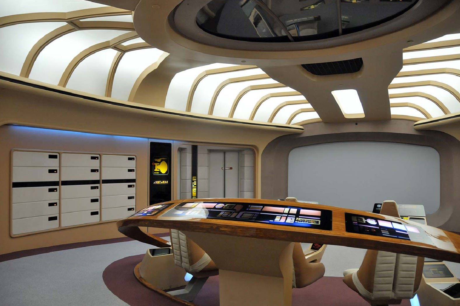
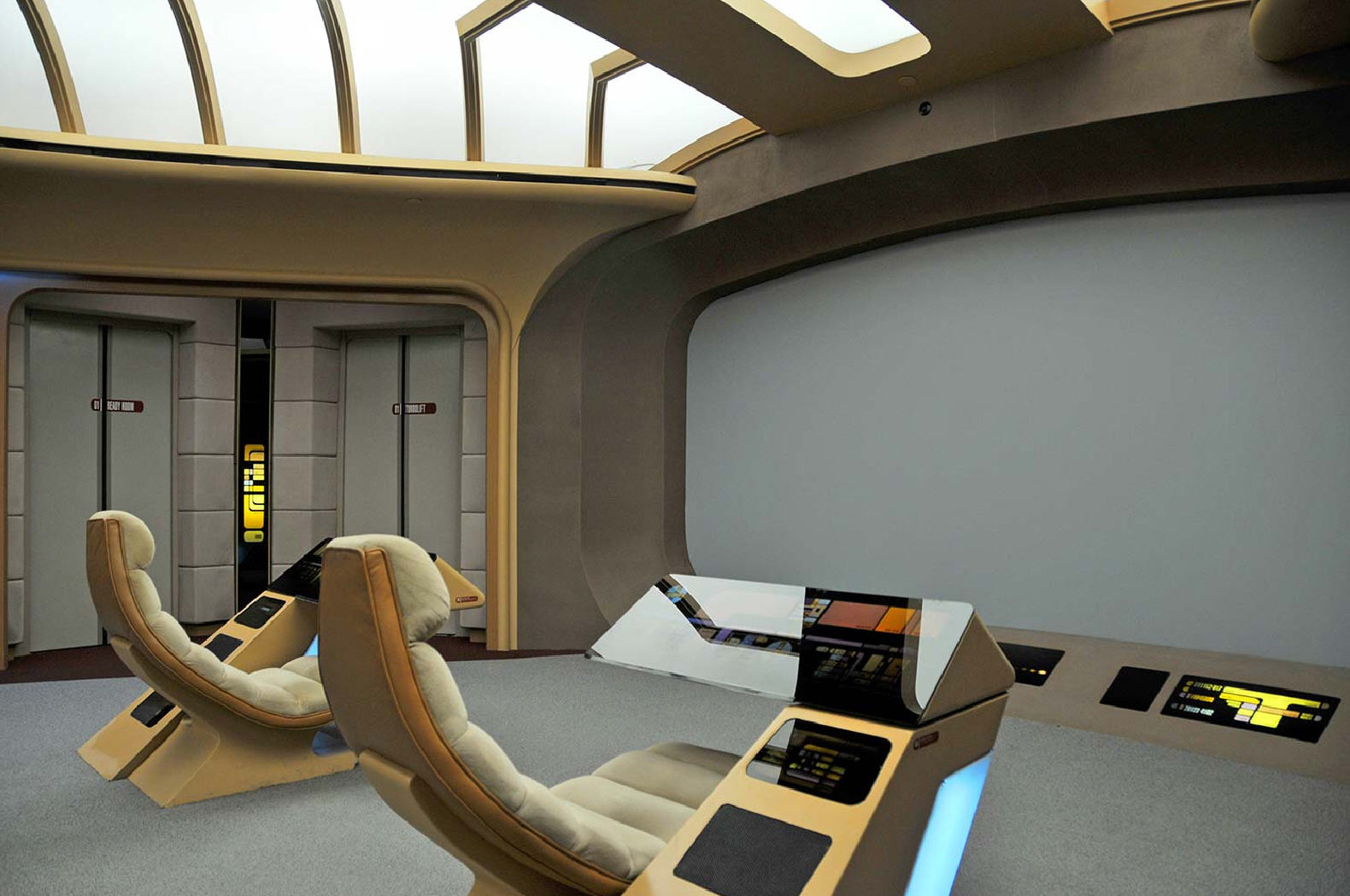
The iPad is clearly derivative of just about every touchscreen UI shown in Star Trek Next Generation. The enterprise is plastered with them. Samsung should just show any episode of the show and count the number of devices that that are shown that look like an iPad.
No, it really isn't. The UI itself is totally different, with the TNG consoles using a fairly static button-based UI. Most of the PADD's had extraneous hardware buttons, and most of the touchscreens on the ship were not mounted on brushed aluminum roundrects, but rather spread across walls or mounted on consoles that certainly did not resemble the iPad. There weren't any obvious bezels, and the UI was completely different.
Well, the PADD designers there had little concern for function and a lot more interest in making the tech distinctive. I mean, you want Cardassian tech to look Cardassian. So minimalism wasn't what they were aiming for most of the time.
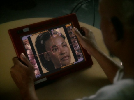
Even so, a few of the PADDs shown were more practical. In particular, take a look at these two PADDs:
Between the two of them, they give you almost every design element except being black, depending on whether you think those things are buttons or that LCARS is clluttered or whatever.
On both of those, the screen is physically depressed from the bezel like an etch-a-sketch, not flush like an iPad. They also have other extraneous design elements.
so we have an Apple supporter argueing that millimeter is enough of a difference to maintain originality, while several comments below another Apple supporter
suggests that the home button was copied even though " They changed white square into a white rectangle and that's about it." So change of shape isn't enough to maintain originality.
In Russian we have a saying for such cases - "one's desire to climb up the pine without getting the one's ass poked/scratched by the needles".
I don't know about Russians, but I don't function in a hive mind with others, even if we both like Apple products. So don't ask me to answer for another individual's arguments.
The difference between flush and inset is qualitative, and even conceding that point there are significant design differences.
I can't see any inset at all, though a better picture might be able to resolve that. I'm not sure what you mean by the casing being "extraneous" either. It seems to be quite plain, actually, at least on the one. That red one, though, is pretty ugly. Frankly, the stylus is the most obvious difference.
I guess, ultimately, I don't know what to say about all of this. Minimalism has been a trend for quite a while now, given how many products (including many of Apple's) that display it. Is Apple one of the trendsetters? Do they make beautiful products? Absolutely.
But all this patent silliness about getting each others' products banned has just got to stop. Every penny spent on it keeps them from hiring engineers to make something even better than what we have now. I don't like seeing Apple's products banned for using a Motorola standard any more than I like seeing the Galaxy Tab banned for being too minimalist. If they had any sense, they'd call off the lawyers and settle with each other before they waste any more money.
ST: Enterprise had a lot of iPad/iPhone-like devices.
I can't find any videos or pictures (the show predates easy sharing of video and images), but I remember some specific examples.
Thre first is the episode where the captain offends some very picky aliens who produce an essential component, so he has to perform a detailed ritual and uses an iPhone-like device for a reference.
The other was the episode where the crew became increasingly obsessed with minor activities due to some weird radiation, and the captain's obsession was a speech he was drafting on what looks like an iPad.
Generic Rectangle Device was also the standard thing for reports given to senior officers.
The physical design of a humanoid robot? No; Asimov's designs would constitute prior art (not to mention the existing real-world humanoid robots, or even humans themselves if you want to get existental). Any novel mechanical workings that make a humanoid robot possible would certainly be patentable, however.
Yes, they certainly shouldn't! They can patent the inner working of the robot that they came up with, but they can't patent all possible humanoid robots, regardless of how they're implemented on the inside.
Yeah, not so much. In fact, the opposite is true. Check the PADD links in one of the other comments on this thread (http://en.memory-alpha.org/wiki/PADD) -- the PADD is chunky and exciting-looking for TV: non-symmetrical, off-center, with visually interesting buttons and do-dads. Looks more like an early Sony Reader or the 2005 Nokia tablet. Not at all minimalist, because that would look lame.
That has a red case, the screen is physically depressed from the bezel, and there are extraneous white rectangular design elements on the bezel. That would actually not violate Apple's claims were it a real product.
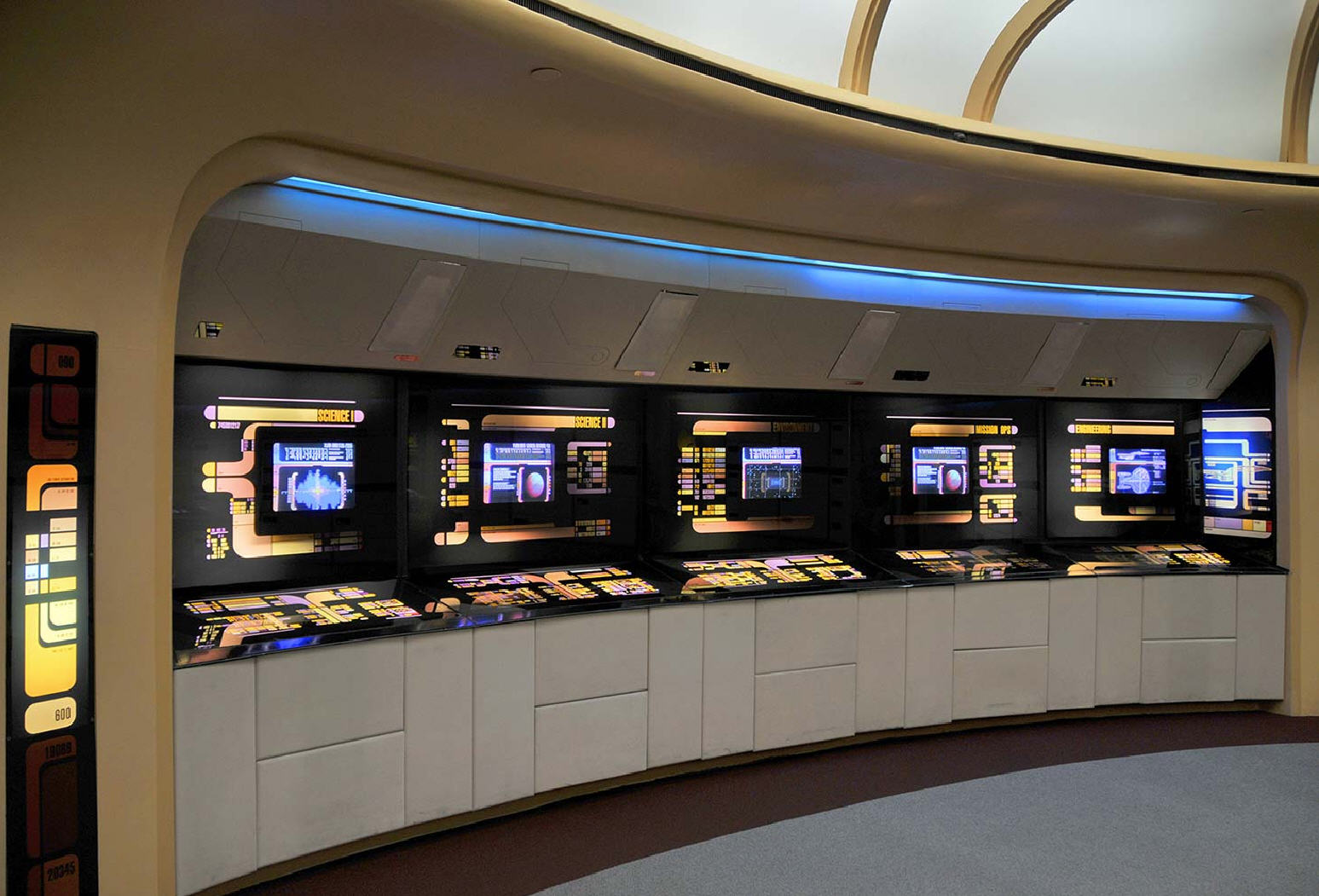
The Okudas: The TNG panel graphics are intended to suggest something well-organized when a viewer sees them in the background of a scene. My advantage, of course, is that they are seldom seen closely, so I rarely have to take the time to figure out a panel in exact detail. As long as it looks credible on camera, I'm okay. This is extremely valuable, because it could easily require ten or fifty times as much time (and therefore labor and money) if I had to have all of the panels done in that kind of detail. The problem with actual software implementations of the style is that it requires far more than simply mimicking the colors and patterns. In order to work well, one has to analyze the tasks and the users' needs in great detail. This is something that the software industry in general does poorly, in my opinion. One also sees the same kinds of issues in things that should be well-understood, like VCR controls and TV remotes. They are all elegantly designed, but the users' needs are seldom adequately anticipated. On the show, I have the advantage that the viewer can assume that I've anticipated the crew's needs, simply because you can see how easy it is for the actors to use the controls.
The users needs are seldom adequately anticipated -- that does, in fact, sound like prior art for the Galaxy Tab.
If we're talking about the UI instead of the hardware, I don't remember any PADD interactions that involved pinching or dragging. They were always "tapping on buttons" from what I remember (but voice was a major UI element). But I don't know that any of that's really relevant to Apple's design patents.
We are getting into a fairly geeky tangent here but I think some of the most memorable interactions involve dragging: the engineer at the transporter room controller and the ensign at flight control on the bridge. Both involve dragging some energy level upwards.
iPad have a single physical home button which those don't have and that's something that several manufactures coped. They could use 2 buttons on the same side or mirror the bottom button on the top or offset it from the center or add some lights or even simply change the edge color or add decorative divots in the outside corners etc. http://en.memory-alpha.org/wiki/File:PADD_2150s.jpg
But instead of picking one of the trillions of other designs they used the iPad design because it sold well.e
Samsung. They changed white square into a white rectangle and that's about it. Design patents are a low hurtle but they they could have at least used a circle/house/drooped the icon or something other than a box for home. I mean outside of the iOS reference what does a box / rectangle even mean?
And again, if they had two buttons and use a square for one of them then that's also fine. Or if it's an arrow that stands for play that's cool. But a white rectangle?
The new Samsung phones have no buttons at all on the front. How's that for simplicity?
Box means box. It's a rectangle. Apple can't patent the rectangle.
Squares are rectangles. However, you will note that they changed the button format which suggests that they are they where treading a little close to Apple's design / long standing trend of having a single button. I still hate the fact that they use a single physical button to simulate more than one button based on how long you hold it down so IMO it's not really a benefit just an aesthetic choice.
Apple does the same sort of thing, but even more so. Tapping, holding, double tapping, triple tapping, tap and hold, etc. The home button is ridiculously overused, a consequence of less hardware holding more and more uses.
>iPad have a single physical home button which those don't have and that's something that several manufactures coped. They could use 2 buttons on the same side or mirror the bottom button
sounds like why 1-click is patentable scheme of thinking.
Yes! Excellent point. We all have to admit that there's only so much you can do to differentiate a tablet but when the thing looks identical to the naked eye then you've got a case. The only problem is having to sell that in a court. There are tons of tablets out there that are very obviously not the iPad but this one from Samsung looks exactly the same on first glance especially to the average person.
The Galaxy Tab has two buttons on the side and no buttons on the front, just a tiny camera lens. One button is power, the other is a volume button (it's a single button that you can push on two different sides).
Maybe you're talking about a different product, but the Samsung tablet does not copy the iPad in that respect. I have one right in front of me right now.
In a discussion about design it doesn't matter, does it? We aren't talking about utility patents where the actual functionality and method to achieve it has to be described.
Why is this relevant? They portray a probable usecase, which 20 years or so later seem to become reality. They also show us that the idea of a user inferface like that is not necessarily something "new", but that, maybe, the technology wasn't there at that time. Now it is.