(disclaimer: lead brand manager, been at the table of a lot of the meetings where these logo changes happen.)
There's a few different reasons (especially depending on the company) why that these happen, but I personally think it boils down to two unintuitive quasi-psychological reasons.
- When suits are fumbling around looking for a new shiny project that'll give them a sense of "legacy" and their fingerpints all over (that won't affect immediate profits), somewhere in marketing and brand is usually the first place they'll grab. If wins, fantastic, they've secured their legacy both in a career-spanning sense and at the company itself with a bonus. If it fails disastrously, easy enough to quietly switch back to the old and to save face by tackling a different project.
- Sort of relatedly, a lot of marketing suits hate feeling "left out" of trends; it's something I loathe about the industry, the hyper-focus and optimization of being at the crest of new trends (when arguably they're usually shittier than the previous ones). Oftentimes their entire salary / sense of purpose of being at the job is tied into with presenting the latest and greatest, and insecure designers will be too happy to be enablers.
(My opinion may be a minority of the industry itself as if it were me, we'd be back to 90's era logos for the sheer zany quality.)
The sad part is, I have literally lost brands. Just entirely been unsure what I used to buy, because I buy based upon look, not just on product name.
EG, I buy battered fish in a blue box, the box disappeared from my main grocery store. When I went to my less visited store, it was gone there too. Literally, I just picked a random replacement brand.
Another thing which gets me, is marketers think everyone buys things weekly. And I once noticed a product I was hunting for with "New look!" on the box, but if was the last of the "New look!" boxes, the ones behind tem were missing the pronouncement.
I'm buying fish sticks here, and I do so once every 6 months, and throw a bunch of boxes in my deep freeze.
I'm not tied into what "exciting change" some yahoo thinks their product is going through, nothing is exciting about the food I buy, I just want fish sticks.
The box could remain the same for 100 years, and I'd buy the same thing, as long as the taste and quality inside didn't diminish.
UI designers ruined Gnome, ruined my fish sticks, ruination upon us all due to UI designers.
Oh, and don't get me started on flavour or product change.
I don't want "new and improved". Stop it! Leave my tasty thing alone. The number of times I've changed brands, and never gone back, because "improved"...
And the worst, I buy frozen pizza. Unlike my fellow shoppers, I buy for the best crust flavour, and only meat.
Why?
Because if you want good frozen pizza, buy great crust, meat only, the put fresh veggies on it! Meat freezes well, not so much veggies.
Lately, one brand has added "croissant crust" and also "cheese in crust", and unless a supermarket is the size of all creation, it doesn't have room for one brand with 8 types, by 3 styles.
The result? The best crust, without extra calories(cheese), is now impossible to find.
I’ve always thought a lot of ‘improvements’ are really cost savings while trying to maintain the quality of the product or change it a little so it isn’t noticed as much; “It’s better, so if you don’t like it that’s on you.”
Coke literally had a small amount of cocaine in it, as a stimulant, prior to new coke being released. It was grandfathered in, still allowed at that point.
New coke was released, because they were being forced to change their formula. Some say they released new coke, knowing they'd have to re-release old coke, but that by that time the average person would not accurately notice the taste change.
A friend of mine, a coke fan, kept a case of old coke. He tried the newer-old coke, side by side...
It didn't taste the same.
Some say new coke was a wild success. Loads of media attention, and they dropped the formula change in without notice...
Coca-Cola hasn't contained serious levels of cocaine since 1903, although it did use some coca leaf extracts up to New Coke, but that is not the same as cocaine just as poppy seeds are not the same as heroin. It's not clear that they were "forced" to remove that.
The New Coke story is quite interesting, but I don't buy in to most "explanations" of it. I think it's far more likely it's a case of "competitor X is more popular! We need to do something! Let's copy competitor X!" This is a classic business mistake, because customers are choosing you instead of X because it's not X, and if you merely copy X you lose your value.
I agree mostly, although as a counter-example, about a year ago Nutella released a new "extra cocoa" variant which was much tastier, and a bit less unhealthy (lower sugar content).
It was so good that I refuse to buy regular Nutella anymore, even though the "extra cocoa" edition seems to be no longer sold.
I'm mad that as an Italian (where Nutella was created) this is the first time I'm hearing about this +Cocoa version. Apparently it's not even marketed/sold in Italy at all! It's for the US market only.
Twiglets - crunchy snacks coated in yeast extract - have been ruined. Yeast extract is quite salty so to meet the government's new healthy food guidelines the manufacturer has removed more than half of it. They are pointless now, bland and a bit greasy.
They've been my favourite snack for years. I'm gutted.
Ingredient prices can vary wildly, even outside of inflationary periods. Customers also prefer prices to change rarely, so the only option left is to change the pack size and/or reformulate. Eg cocoa prices varied from 3,300 USD/T to 2,000 USD/T in 18 months. Sugar nearly doubled in the last 3 years. A product released at one point would not be economical at another.
Of course, if you are not price conscious then you can mostly avoid these issues by buying the most expensive of everything, but you're talking frozen pizza here...
My local grocery store recently redesigned their milk packages. Before the change the two variants were white and blue respectively. Now they are blue and white. They literally switched the colors after (iirc) 15+ years of the same consistent colorscheme. I'm still puzzled by that move.
> The box could remain the same for 100 years, and I'd buy the same thing, as long as the taste and quality inside didn't diminish.
See this comes down to simple maths though. If you can retain enough of the loyal customers and win some news ones with the "exciting change", the net difference is worth it.
This keeps happening so I guess the maths checks out.
I no longer assume rationality on the part of businesses and consider doing so a serious mistake. Businesses often have short term thinking and have shown themselves perfectly willing to shoot themselves in the foot.
The original comment that started this thread listed a bunch of plausible and probable causes of branding changes, and all of them are only rational from the point of view of an individual and orthogonal at best to the improvement of the business they are working for.
It’s also possibly done because people train themselves to like familiar tastes. There might be a small drop in sales, but eventually as more customers buy the product they will get used to the new flavour.
> UI designers ruined Gnome, ruined my fish sticks, ruination upon us all due to UI designers.
Many modern UI "designers" are certainly not worth of that name, in that they change things not according to systematic study and observation, but only due to their own hunches and personal preferences.
Is a designer that bases their designs on numbers, not aesthetics or user experience, really designers?
Usability studies have so many confounding variables that it's not even funny. It's not hard to pick studies to support anything. As if that wasn't enough, they're highly contextual and inevitably used in a completely different context.
None of the well known great designers of the past century relied on A/B studies to do what they did. Granted, they likely delivered a lot of duds too, but at least those designs could be identified as bad.
Designs with statistics behind them can never be bad because the numbers haven't changed, and the numbers was what motivated the change in the first place.
> I'd buy the same thing, as long as the taste and quality inside didn't diminish
This is too much even. Of course it's better if the taste doesn't change. But there is a huge I've already bought this before in my buying patterns. Unless something becomes unserviceable I'll probably keep buying it.
This is the right answer. Empirically, continuity of brand assets actually drives higher brand recognition and awareness/shoppability advantage over time, particularly for consumer goods. Look through the disastrous Tropicana branding change example for how wrong can changing familiar assets go.
However, the marketing teams get bored of their branding and ads way way before consumers do - after
all each consumer see a big brand in a branding context maybe half a dozen to a dozen times a month for a few seconds at a time in advertising or stores. The marketing teams see it every day every hour :-)
So they naturally desire for change - exacerbated by the fact that the "experts" in marketing agencies or relevant in house functions have no incentive to tell them different as they make money off of the change :-)
>However, the marketing teams get bored of their branding and ads way way before consumers do
Maybe the marketing teams from 12 big non-competing companies can "rotate" and do the work for a new company every month, coming back "home" once a year. Keep the eyes fresh.
At this forum some like to ironically refer to things like "frontend framework of the month", meaning novelty that brings no discernible benefits at best.
You aren't a disruptor if you don't disrupt. You can't claim to be a change maker if you don't make change. You aren't a challenger if you don't challenge.
And also they have to fill the cv with something. Somebody wrote about securing their legacy at a company. Stay two years at company X and doing only standard stuff is not a great way to get a better job somewhere else. Of course doing useless stuff should be even worse but it's hard to tell what's useful and what not.
It is absolutely disgusting how much gets done in this world simply because someone needed to stroke their ego. Legacies, bonuses... pah. Pathetic how predictably selfish we humans really are.
What really strikes me is the lack of customer centricity in all this. Do they want the change? Do they think the existing look is outdated? Do they like the old look? Pah. Who cares! I have a legacy to cement and a bonus to secure!
(Besides the usual MBA word-vomit mumbo jumbo like 'modern utility', but we all know those are just made up excuses)
Maybe a brand should just be... a brand. A brand isn't your friend, it isn't human, it isn't alive, and it most certainly only exists to take your money and put it in their account -- and, in tech, more often than not through some rent-seeking subscription model because nobody likes us actually owning anything anymore.
It isn't just the logos that change the same companies have diversity officers as if this will change the tast of the orange juice. As is customary I have to add I am a black male least I am accused of being insensitive.
> As is customary I have to add I am a black male least I am accused of being insensitive.
It's good you clarified that, because I know black males are never insensitive.
I tease. But I do see the value of being mindful of cultural differences in companies that employ a diverse workforce. No, it has nothing to do with the taste of the orange juice, but understanding where your colleagues are coming from is still productive. The typical employee probably is unaware of cultural differences that might come up with colleagues from cultures they're unfamiliar with. I'm thinking mainly here of cultures that have different values or practices from the dominant culture in the company, like a devout Muslim or Orthodox Jew working for a secular American company.
Though, yes, people who build their career on diversity tend to go a bit further than just preventing stuff getting lost in translation across cultural divides, probably for similar reasons to why brands can't just be left alone.
Not only am I a black male I also live and work in Africa. That might explain my dig at diversity because we are mostly black people also changing logos for seemingly silly reasons.
Cynical Geezer Take: It is very consumer-centric. Brand A's management is loudly signaling that Things Have Changed, at what was a familiar & perhaps favored company. So I need to be alert for price hikes, product shrinks, quality & service downgrades, etc., etc. Or, if there is a Brand B that I like almost as well - then this is probably a great time to switch to it. Unless Brand A's product was extremely fungible & competitive (say, gasoline), then switching to B before A's sh*t hits the fan will involve a lot less time & grief than sticking around after A has served notice.
Imho when a company gets penalized by watchdogs, it should also affect the logo, so customers can see that something happened. E.g. a watchdog could take a bite out of a logo or place an ugly watchdog symbol next to it.
It is confusing to me: a brand at its very core is ego and legacy. That ego and legacy happen to be shared among a whole company, but it’s 100% a “we vs the others”, and the history behind the identity.
What you seem to be looking for is not a brand but a label or a certification perhaps ?
Feeling, maybe, but only because it is intentionally cultivated to be so. Large shifts in company branding don't usual signal an equally large shift in the company's culture, though they might say otherwise.
If IKEA or Apple suddenly changed their aesthetic, they are probably going to be pushing out the same products... just with different packaging. The companies themselves remain the same as they were. People will have different feelings, depending on their reaction and how the branding people message this change, but ultimately the move is pointless as everything continues as before.
For an extreme example, look at the Blackwaters or Facebooks of the world.
I’d argue branding and company culture are independent only if branding is weak in the first place.
Apple has a very strong brand, and if tomorrow they switched their logo and brand image to a cursive Ford style blue one it would need a strong justification behind it, a ton of employees would see such a change in a very negative way, and possibility think long and hard about their career path going from there, as the management might have lost their way.
Or the other way: when “Apple Computers” became “Apple” it wasn’t some random surface level change, but a reflection of how the company had deeply changed focus compared to its earlier days.
Branding and culture are rarely decoupled, and if any of those are strong enough they’ll change in lockstep.
PS: on brand and logo “refreshes”, like Peugeot moving to more a stylized lion, while those are arguably cosmetic, there is the same philosophy applied to the worker pool with “new blood” introduced to the company and processes and manufacturing moving along. In a way, the same thing is happening below and above the surface.
Perhaps not the best example. Apple is not just a brand, it also has a near religious following. Apple could change their logo to a high resolution photo of an actual apple with 'Apple Computers' again as their main brand name, and a very vocal fanbase will praise them for their uniqueness, avant-garde thinking (different), and daringness. Others will follow, and in two years time KFC will have a logo with a high resolution photo of (a) Colonel Sanders and 'Kentucky Fried Chicken' below it.
It's probably inevitable. We've reached peak abbreviation and minimization anyway.
I'm not so sure. They wouldn't lose customers immediately but would annoy them.
Apple is defined by negative space. They are not complicated. They are not the same as everyone else. They are not spying on you(Or so some claim).
All the apple fans I know talk about simplicity and privacy more than any specific feature, and a lot of them appreciate simple things in all areas of life.
Changing the logo might really mess with the sense of simple quality.
Take macOS. It moved from "Mac OS X" over "OS X" to "macOS" which was (AFAICT) purely a "random" surface level change (especially with the "remove Mac only to reintroduce it later and remove the X instead" move), even though "Mac OS X" was a rather well established brand.
I can kinda understand the desire to simplify it to "macOS". Through the years it was
- System 1,2,3,4,5,6,7
- Mac OS 8
- Mac OS 9
- Mac OS X
And it remained at "X" for about 16 years, with sometimes substantial releases being distinguished just by a big cat name or a decimal point. Arguably the "X" part stopped being part of the versioning, and simply became part of the brand but it was definitely redundant and "mac oh-ess-ex" is at best a bit clunky to say.
It certainly wasn't necessary, but I can at least understand why they'd want to do it.
IKEA already did, they changed their corporate font from IKEA sans to Verdana in 2009 (you can Google for "verdanagate"), and more recently to Noto (last year I believe).
It's also fun, easy and exceptionally easy to spend a precise budgetary on a branding exercise.
Marketing these days is full of technical details. Digital campaign statistics. CRM. Automation. Tiny optimisations, analytics and such.
Branding lets everyone be involved. Everyone can have a say. A logo change rarely succeeds or fails. You don't have to know anything to make decisions or sound smart. Everyone notices it. Crusty old board members notice, and might comment on the work. Etc.
It's high visibility, low effort, low stress, low bar work.
I'm not implying that great branding doesn't exist. Most of the examples here though... they just changed fonts to whatever is most fashionable now.
The most perfect example of this was when Marissa Meyer took over as CEO of Yahoo and "rolled up her sleeves" and worked with a few designers over a weekend to create a new Yahoo logo. It turned out the new logo was the old one, without serifs and more rounded and uniform.
If the cost of that redesign was a few people for a weekend, that had to be seen as a smashing success. It's the years long process to remove serifs that are bonkers.
The cost of replacing everywhere that uses the logo, and making sure the new logo works well in all those locations is generally orders of magnitude more than coming up with the new logo. Especially if, as is often the case, they want everything to switch over to the new logo at the same time.
Hmm, actually looking it the 1994-1995 in Times Roman would still stand up today. The 1995-2013 look rather date design language... There might be nostalgia, but still. Some times I see point of changing it.
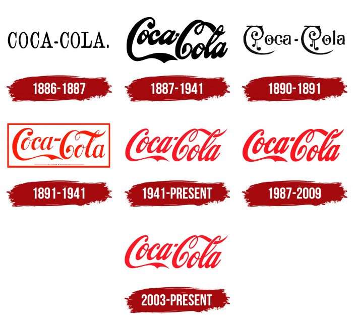
I think Coca-Cola is a funny example here. They have had the same logo for over 100 years now, and people identify Coca-Cola with that serif logo. It seems like things are working great for them financially. So yeah I don't know how meaningful changing logos really is.
Even though it follows the same basic pattern, they’ve redesigned and updated at least once every decade to keep it fresh. Latest redesign was in 2016.
While I totally agree that logos tend to be changed far too early and too often, at some point the logos do start to look outdated, either because the company evolves or because the world is moving.
For example, the quirky eBay logo was a great fit for a startup during the dot com boom, but the way typical websites look changed dramatically since then and the company became much bigger and professional.
At some point, a logo that doesn't get updated does start screaming "this is a company stuck in a time several decades ago".
Ex typographer and logo designer here (I didn't work in that profession since 25years but I know a bit a about it).
> [...] at some point the logos do start to look outdated, either because the company evolves or because the world is moving.
This is simply not true. If your logo looks outdated, 10 years in, it was never a good logo to start with.
Logos need to be timeless.
They also need to to be recognizable though.
These are difficult to align constraints and only a tiny fraction of logo designers manage to produce logos that satisfy both.
Otherwise I agree 100% with parent. Suits meddling in affairs they have no clue of. Been there and seen that at two companies with previously good logos.
This kind of like saying refactoring is about bored programmers stroking egos, because if you need to refactor, original code was not good to begin with.
TLDR; Comparing code reviews to logo redesign is comparing apples to oranges.
Both are about change – as is caring for your newborn when it shat it's diapers.
Or another one: it's like me saying what you said is like saying 'Penne Arrabiata' is a dish "that needs revisiting" because it hasn't been changed since yonx.
If your competitor starts diluting your brand mimicking your package with a cheaper replacement with the same colors, you need to offer some different to keep the brand alive. Had seen that before in milk packages (with a successful defense changing the lid shape)
> (disclaimer: lead brand manager, been at the table of a lot of the meetings where these logo changes happen.)
This is not a disclaimer. This is, in fact, the opposite of a disclaimer. It is a "claimer", if you will, claiming experience and authority on the topic.
A disclaimer is when you state a reason why people might want to discount your opinion, usually due to a conflict of interest. E.g., "I work at Revolut."
> A disclaimer is when you state a reason why people might want to discount your opinion, usually due to a conflict of interest. E.g., "I work at Revolut."
I believe the word you both are looking for is "disclosure":
No, I was not looking for a different word. Yes, disclosures are one reason for a disclaimer, and the example I gave is one. But you might also do a disclaimer like "I have no first hand experience, but many friends have told me..." again, a disclaimer is exactly as I said, reasons to take the information with a grain of salt or to be aware of the limitations (e.g. legal disclaimers like on prescription medicine commercials.)
This probably is the reason for why they go down the path of changing the logos.
But why they look similar is because, in the past logo drafts used to be hand-drawn by artists and now its being done by digital artists who first start with available library of fonts.
Another important point not mentioned yet: Rebrands are rarely done internally.
Companies hire external brand design agencies, and they tend to hire a few of the same well-known ones, which also set the trends for the rest of the industry.
So, I’m guessing that half a dozen people at those design agencies retire and we get to finally go back to some fun, playful, skeuomorphic UI? Perhaps steampunk, with AR glasses giving us notifications by ticker-tape? And 3D modeling tools that look like Bryce used to?
I know people like to say "it was better in the old days" and wax nostalgic, but a lot of the logos in the before section were designed when digital tools were the norm.
Even with digital tools, many designers will still sketch them out.
The logo designs here are simply following what's on trend, rather than a reflection of tooling changes.
Hand drawing could be in effect for logos that haven’t been redesigned in centuries.
But there’s no way the first and subsequent Revolut logos have been influenced by radical tool changes. The same would go for Spotify or Yahoo, or airbnb.
Also a company requesting a whimsical logo would have no difficulty having it hand drawn if it fit the bill. There’s just way less demand for that, we’d need to look at “natural” adjacent businesses to get that vibe (e.g. https://naturalhihoney.com/ ), or restaurants.
I work in the UX space. My team presents new designs and features to customers before building them. We actually sit 1 on 1 with a customer and show them mockups and such of some future idea for the product. One of the questions asked to customers is something to the effect of, "Looking at design A, would you say it looks more or less 'modern' than design B?" This is usually the justification higher ups use for making these changes. I'm not saying this is a good way of product direction (do customers really know what they want?) but this is usually how the justification happens.
Generally there is design language for every decade or more. Not following this unless it is sufficiently old or well established just looks dated in a wrong way.
> Sort of relatedly, a lot of marketing suits hate feeling "left out" of trends;
Oh yeah definitely related, it's an existential crisis for marketing/media to not be producing something new. To be fair to them, software developers are worse I feel.
If these industries were pragmatic, there'd be far less work to do. Instead, we re-brand/re-build every year, lest we all lose our purpose and our jobs.
It’s funny how it’s the “suits” that are the money burners and productivity destroyers. While individual contributors are left to obsess about productivity. A sign that we all can afford to collectively slow down.
This answer agrees with my experience. Business people want to redesign sites, logos, etc. because it gives them something to do, gives them something to report and show to their higher ups, makes them feel useful, allows them to expense field “research” trips, allows them to expense offsite meetings with design consultants, allows them to do something fun instead of focusing on their real, but harder, business priorities, etc.
The article is confused about the difference between a logo and a word mark, which is what they are showing. Big brands are super pedantic about how and where logo marks and word marks are used. You shouldn't be seeing these word marks in contexts that are not already dripping in branding for the company.
Look at the Pinterest Brand guidelines (https://business.pinterest.com/en-au/brand-guidelines/) and you well find them saying: "Only use the Pinterest badge (please don’t use our word mark)". The Pinterest badge is the exact same stylised letter P from the old wordmark. So, almost everywhere you encounter a Pinterest logo it will be the stylised graphic. They can do that because enough people recognise the brand that they can drop the "interest".
The Facebook logo is an even weirder example because they are comparing the old Facebook app word mark with the newer Facebook-the-company word mark. That logo was specifically designed to look different from the app. Now that Facebook is now Meta, that uppercase logo has been retired.
Microsoft, Facebook, Pinterest, Spotify and Airbnb all have stylised logo marks. eBay and Google use word marks, but are brightly coloured and immediately recognisable 99% of the time they are seen.
Also in the age of social media, visual identity is less about the wordmark. For most of these companies, their word mark doesn’t even show up on their social media feeds. Most have guidelines that often include a custom typeface, specific types of photography, editorial layouts, illustrations that define the brand.
100% agree - It's not entirely suprising that when you remove the logos from a logo, along with initially the colour, they look similar.
I bet that those fashion companies have a decent idea of what they are doing in terms of branding and design though, and are making these decisions consciously and intentionally.
These are just the word marks, not the full logos.
I mocked up a comparison of the logos (Microsoft/Airbnb/Spotify/Pinterest rarely use their word marks without the accompanying icon) and they start to retain a _little_ more personality, at least for the tech comparison.
It still seems fair to say they're more bland than past iterations, though. The theme is ”[optional icon] + sans serif word mark”, and it's a good example of “small m minimalism” — a kind of unthinking collective march toward an absence of detail — touched on by The Cultural Tutor in this thread:
Architecture is a wierd one to pick on because it has function and form.
For instance, the gothic cathedral doesn't actually need those two giant pillars out front, it is held up by it's cantilever. So we removed those.
Also... Anyone else think it's very dark in here? How about we change out the engraved walls for windows?
All this thick concrete and engravments don't allow us to build bigger than 8 stories. How about we change it out to a steel internal design and add more windows. It will allow more light, decrease weight and allow us to build higher.
> Absolute neutrality. No detail. No identity.
> What does that say about us?
I disagree entirely with the basis of your argument. The amount of art in TV, Movies, Video games and overall graphic design has been on an incredible trajectory.
What happened is that we started to understand our goals and mission. Adding two $400k gothic style pillars to the facade of a building that do absolutely nothing for thee structural soundness, or spend that 400k to add a bit more elegance to the rooms?
You're right that there are still thousands of examples of objects with identity and personality in all forms of modern art and design.
You're also right that modern design and architecture are shaped by changing missions, goals and standards (as well as changing fashions, material science, economic concerns, and maintenance and energy considerations since the 16th Century).
I don't think that was the twitter author's point, though. (I was quoting the author in the parent — it wasn't “my argument”.) They didn't say, “we should over-engineer structures even though material science has improved to the point that we no longer need to” or, “we should embellish things excessively even if the budget might be better allocated elsewhere”. They simply claimed that detail is linked to identity and personality; when there is less diverse detail in modern design there will be less diverse identity and personality.
This seems fair to me and it's easy to corroborate. Popular logos have converged around inoffensive icon + sans-serif font. New buildings are typically homogeneous unadorned concrete/steel boxes or glass towers or some mix of both. Popular hardware has converged toward a minimal glass slab. Sales websites feel like cookie-cutter versions of each other. These objects can all still be beautiful, but they can also lack personality.
The subtext in the author's thread was that it doesn't need to be this way. It is possible to meet modern goals and standards and also design to a budget, but be braver (the active, big-M Minimalism rather than the more cowardly small-m version). You can build “minimal” things that have details, identities and personalities. For example, Teenage Engineering[1] and Zaha Hadid's architectural firm[2] both inject their designs with detail and personality while following a minimalist/modernist style. This elevates them from the glass slab/box world of some of their peers, and it makes the products and environments more interesting to use and live in.
I don’t think that trade-off is real - can’t think of a single classical, beautiful building I’ve been to where the interior would benefit that much from a flat glass facade. In fact what comes to mind is Penn Station as a counter-example. Do you have any examples?
my point was alot of the 'Design' of Gothic came from it's requirements, not percieved beauty. They put those giant pillars and facade up to hold the building up. They were a very expensive way of building.
Now with modern technology like cantilevers, these 'Gothic Buildings' don't actually require those giant pillars of rock and are there purely for nestolgic purposes. Highly expensive nestolgic purposes.
& obviously me and you have been looking at different skyscrapers. I live in chicago and I think they are all absolutely stunning & unique.
>I don’t think that trade-off is real - can’t think of a single classical, beautiful building I’ve been to where the interior has been downgraded because of the facade. Do you have any examples?
Obviously they had a budget on the building. The more you spend on non-functional, artistic requirements the less you have for functional.
The whole principle of modern architecture literally bases itself around how awful gothic buildings are for this very reason. Functional, unpretensious designs that let in alot of light.
Also, the carved ornamental bits of classical and medieval architecture were mostly designed based on very different aesthetic sensibilities to our appreciation of how the stone looks after the centuries have worn the paint off...
We'd probably consider the original Greek temple decoration in its original state as looking a bit gaudy, and they'd probably consider the undressed stone or white paint of neoclassical architecture of the last couple of centuries to look unfinished.
At least in the US, contemporary design culture (or at least cherry picked, extreme examples of it) is weaponized by the far right as a way of leveraging traditionalism as ideal and progressivism, secularism as nihilistic and degenerative.
It's also a convenient way to say "cities = bad, country = good" which is convenient because minority groups historically congregate in cities and the countryside is predominately white.
Really the problem is rooted in late neoliberal capitalism not our bipartisan politics
Sorry but this didn't really answer my question. Taking popular stances, that even you admit to agreeing with, and calling them dog whistles because some fringe group doesn't agree with it in exactly the same way as you, is really jumping the shark.
It would be one thing if that quote was some "coded" message, but this was your answer? Do you even realize how ridiculous you sound?
IMHO the simplest explanation is that style is cyclical, and we've entered into a minimalist, almost brutalist, period and these brands are simply skating to where the puck is.
Will this design trend last? Probably not but doing a rebrand to freshen things up every few years is cheap enough, while the value in being "current" is very much worth it.
A lot of those logos looked old fashioned and almost early 2000s in comparison, which tech forward folks probably don't care about, but it's subtly picked up by the average consumer.
You'll notice this even for companies that haven't changed their brand in ages like Apple. All of Apple's branding and presentation style has changed in similar ways over the past few years.
The trick is to look quaint without looking old-fashioned. Few can pull it off. Maybe the Ferrari logo has this quality.
Even better it is to look timeless; maybe the Mercedes Benz logo has this quality. These are really really few: say, Apple had to rework their iconic bitten apple logo.
The hard thing to say, though, is "does Coca-cola's logo show timeless design?" or "Is Coca-cola's logo timeless because they just decided to never change it, and coke is such an iconic product that there is no need to?"
I mean, the latter part appears to be pretty much what this article is arguing. Just look at the Pinterest change, from a nice, cursive logo to boring, generic block letters. Coca-cola may have made the same boring transition if somehow minimalist sans serif was all the rage in the late 1800s.
At some point, if yours is the only one left standing from that era, it becomes timeless. Coco-Cola management was very conservative throughout most of the 20th century.
I think McDonald's has the best logo of all time. Coca-Cola's pretty much requires the text -- the stripe alone probably isn't universally recognizable. And Diet Coke, Coke Zero, etc all have variations. Meanwhile the Golden Arches don't need any accompaniment, they are plastered on everything, and, just like I used it above, the logo itself has a name.
Agree. They all look more modern in the new versions. It’s just a natural cycle of design, look at the history of logos for longer lived brands and you see the same thing.
It's the "tyranny of the minimalist" in my opinion. And it's not just fonts - it's app design, housing and architecture, retail, etc. The sterile, uncluttered-to-the-max ethos has simply infected all aspects of design, even to the point of obvious negative impacts on usability. Not sure if I'd say "Apple started it", but they were certainly on the forefront.
I read an article recently (think it was on HN) about how, not too long ago, wealth and status was displayed with impossibly intricate designs - think the Belle Époque or Victorian designs. Now it's all expanses of black and white. I joke if I see another black-and-white "modern farmhouse" go up in my town I may just throw up on their driveway.
Pulling off minimalist design well in the physical realm is surprisingly difficult and expensive and fragile and can be at least as demanding a display of wealth and craftsmanship as more intricate styles. If your materials aren't top quality... you can't just hide them with paint or ornamentation. If your smooth blank white walls aren't perfectly flat or if your product enclosure has some seams that aren't perfectly even or that sleek stainless steel street furniture gets a dent... it will be noticeable. If you need to use a screw or bolt... you can't disguise it with a rosette or something. That floating bathroom sink... needs special care taken to keep the plumbing parts underneath it hidden or looking presentable. The featureless glass cube... is a structural engineering and HVAC nightmare.
Now imagine your family insists the inside also has to look like a model home. So clean it looks like no one even lives in it. Then add young children. Then add rich, child-free friends. Then add shows and magazines about redecorating / 'rennovating' every six months. FML.
Everyone is certainly free to decide what they consider reasonable cleanliness. With a family though one must either compromise together or demand/comply. And with young kids it's unrealistic to maintain a house so clean it appears unlived in. Unless one can afford servants or someone in the household is willing to take on that work.
Aesthetically some of us also prefer a home filled with trinkets and projects, and even with ornate embellishments in the house itself.
I think film and television has had an effect on people’s aesthetics, especially in the home. Set design is cheaper when there’s nothing in the house, nothing ornate. Large, spacious and uncluttered makes for an easier shoot to fit all the people in. Uncluttered also means each shoot of the same scene is consistent, and ensures the eye is focusing on the action rather than unimportant details.
All those fashion brands changed their logos around 2018, with the exception of YSL back in 2012.
In 2012, Hedi Slimane took over the helm of YSL, notorious for the minimalist brand change dropping the Yves from Saint Laurent, but also revitalizing the brand. In 2018, Hedi Slimane became C.D. Of Celine, which has always been touted for minimalism, and made the already minimalist brand even more minimalist by dropping the accented e. There is a mixture of independent fashion brands there, but the majority of the luxury fashion market has been bought up by LVMH and Kering.
Those parent companies create a network and platform where brands cross pollinate, in the same way YC serves as an exchange of ideas between SF style startups. In practice, this means pressuring subsidiaries to follow the model that has worked for other brands, within and outside the family. Checkout dietprada on Instagram where they call out plagiarism commonplace in the fashion industry.
My theory is that brand designers who work in tech are influenced by fashion and general product design, which follows apparel. First, trend-setting luxury brands have expanded ready to wear lines and more generally became more accessible, rather than something reserved for the ultra elite socialites. This means more exposure, familiarity. Second, designers make significantly more money than in decades prior. Following in the footsteps of Google, companies found that better design leads to more money. In prior decades, UI/UX designers didn’t exist. The profession matured relatively fast compared to the head start software engineering had. I remember the HCD ( human centered design ) department used to be really in the weeds about the science of ergonomics, and the role UI/UX barely existed. Then the other class of UI people in the early web were graphic designers. That or engineers with design sensibilities. With higher tech salaries, art and design schools have since pivoted towards these career placements. Meaning, there are now established design departments within tech companies, and these departments are comprised of people whose hobbies revolve around design and fashion. All of this creates a feedback loop where “good design” is based on its similarity to other good design. In the same way engineers didn’t get fired for electing IBM and frontend engineers picking React, designers, at least the ones in a megacorp, designers won’t get fired for electing Sans Serif.
Methinks symptomatic of the “bullshit jobs” scenario. Another poster pointed out about need for low risk legacy, another points out change for something to do. All valid and clatter with what I have observed in my life. Also I have seen brand logo changes as part of a subtle message that company has changed in some way, usually trying to change away from some negative press, and the logo is a cynical attempt to show a new direction yada yada.
For my 2c corporate logos have gone from art to BS as in Boring Shit, over last 20 years.
I never noticed that they'd replaced their distinctive red-white-blue logo (1950-2008) with something that looks more like a basketball than anything else.
It's kind of easy to pick and choose specific examples, ignore counters, and claim to prove a point. Tiffany & Co, Canali, Rolex, Jimmy Choo, Ferragamo, Prada, Hermes, Bally, Dior, etc. all still have serif fonts (or cursive in Ferragamo's case). And I'm not sure Burberry has changed -- I walked by a store this week and it still had the traditional logo above the door.
Since taste is necessarily personal, here's my personal opinion: 100% of the tech logos look (significantly) better in the right column, and maybe ~50% of the fashion ones (though most are close to indifferent there). The only one that I feel will be dearly missed is the Rimowa one, Balmain also feels less special now. Balenciaga and Burberry weren't an improvement, but neither side looks great there imho.
As a company grows, its branding evolves from the founders managing it themselves to eventually being overseen by an excessively large team of marketers. These marketers need something to do. An obvious project from them to undertake is a "rebrand". The marketers' goal is not creativity or innovation, its safety. So they look around and do whatever everyone else is doing, with maybe a few small adjustments. This guarantees they have something to occupy their time for 6-18 months, justifying their role in the company in case someone asks what they've been up to lately.
Personally, I think it is actually the best transformation among the fashion brand logos, because it also had practical benefit of simplifying its name to something more approachable and easier to pronounce. "Eave-sonlawrung." didn't exactly roll off your tongue ;-)
I have a soft spot for the original logo, but at 50 years old, it had a good run compared to most brand logo.
Imho luxury brands should never change their logos. Ferrari is virtually unchanged since 1947, Porsche is still using exactly the same since 1963. Dom Perignom has never touched a pixel in their logo since their begginings in 1921, same as Dior since 1948. Sadly Moet-Chandon changed their perfectly valid logo created in 1743 in 2006, but at least they didn't botch it with sans and minimalism.
Then you have some back-to-beggining like Harley Davidson, which I'm sure YSL would do at some point in the future.
> Ferrari is virtually unchanged since 1947, Porsche is still using exactly the same since 1963. Dom Perignom has never touched a pixel in their logo since their begginings in 1921, same as Dior since 1948.
Porsche didn't update their font (or really not much if they did) but they did update the Porsche crest a few times (the one they slap on the hood / rims / keychains / headrest / etc.) though, but to make it better: at every change they actually made the "Porsche" letters on the crest be closer to the original Porsche font (font which was incredibly modern for the time when it came out: I've got a leaflet from a Porsche 356 from 1955 or so and the font hasn't aged at all).
Only if you know that's what it's meant to sound like already. Yves is not intuitively spoken as eve (which is also incorrect but besides the point) by someone who is not familiar with French
If we're talking in absolutes sure, but if you're taking an average person with a knowledge of only English, then Yves doesn't fit into any of the common word patterns a speaker would encounter.
There are many, MANY versions of images from my article on Twitter, with attribution cropped. I wanted to have a subtle and small contribution and to not be obnoxious. It seems that it's not a good idea. Too easy to crop, post as your own and sound smart.
It's even worse on LinkedIn. There were multiple posts with cropped images, literally tens of thousands of likes, and zero attribution, then not even addressing direct comments and calling them out.
David Perell used one of the cropped images but he didn't know the source. When I commented on it, he added the article to his Twitter thread, with proper attribution.
They mention the OP in passing at the very end of the thread (OP is dated November 18, 2020 [1]; tweet is from July 9, 2022). Indeed, down in that thread, they even include an image from OP with attribution cropped!
Btw, the first image in the thread is also a very widely shared image on Twitter with no attribution. Earliest I found in a quick reverse image search is from Dec 13 2018 [2], but I doubt it's the original.
standing out is not something that established big companies are interested in doing. Generally they’re much more interested in expanding their share of whatever market they’re in than expanding to new markets.
That is much different than being a “new” thing where being unique and different was valued to entice new customers and create/find markets that didn’t previously exist.
The art and branding around corporations will reflect that over time. It’s a small glimpse into what is happening in technology as a whole as it matures and “professionalizes”.
We're in an economic era that mostly selects for safety. What's more safe than a plain sans-serif font? Business owners and C-level execs will believe they won't have to worry that a logo may be turning off a demographic because they think that plain letters will turn away no one or appeal to most.
The day there's a serious economic downturn forcing the losers to close their doors, I would bet the newcomers will have more interesting logos.
As an aside, there's a certain attitude among designer-types on imposing agreed upon "standards" designed to be ultra-inclusive and inoffensive. This is not only a cause for why so many logos have become minimalist, but why so many business websites are using nearly identical illustrations of abstract looking humanoids with atypical skin colors (look up "Alegria" design). It's global-homogenization driven by the politics in vogue.
Related reading:
"Here’s why Alegria is taking over tech world interfaces."
For the same reason that if an open-source project hasn't had any github commits in a fee months, people on HN call it "abandoned". A new logo signals to people that the company is active, their products are being updated and evolved, and they're not stuck in the past. Imagine if a company reverted back to the logo you remember from your childhood. You'd think they were regressing backward also.
Because the scientific arguments for updating the brand are too damn convincing. How else would you improve the gravitational pull in your brand universe?
Seems like some sort of weird referrer thing. I get some sort of placeholder when I first click it, and the same thing when I hit refresh. But if I actually go to the address bar and re-browse to the same URL, then it loads.
Would have been interesting to include Slack as it is just a logo (no typeface) going from a very distinctive logo to a generic one (at first I thought I had a python script running as it is similar to that)
The good news for indie hackers is that temporary logo that is just your name in a san serif font … is probably good enough!
Of the tech companies, I prefer the new versions of Ebay and Spotify. I think the old ones were a bit much. However I think ebay should have kept the darker blue, the new one looks too similar to Google. Pinterest looks better before.
The rest are about as good as before. But if we go into details. Microsoft's new color choice is too boring, like at least make it a more assertive darker shade of gray. I like the chonky, low-center-of-gravity look of the previous facebook. Airbnb is a bit more legible in the new version. Google went from playful to more rigid. I don't like the t in new Revolut (amusingly, because it goes against the grain).
Edit: Less sure about spotify after thinking some more.
> People at the head of these powerful brands know that they are not defined by their logo anymore but by the product or service they provide.
This applies more to the fashion side than the tech side, but I'd like to provide an additional counterpoint here: If I didn't already know about the redesign and just saw these new ones in a store, I'd assume it was some sort of low-quality knockoff.
It should be noted that many of the old logos were already in some sans-serif font: Revolut, Facebook, Microsoft, Airbnb, Pinterest, eBay, Balenciaga, Yves Saint Laurent, Rimowa.
But yes, as the author notes later:
> switched to a bland and very similar version of a sans serif font
> All the quirks, peculiarities, and idiosyncrasies of both tech and fashion logos were dropped and replaced with a simple sans serif font.
Logos end up looking the same, for the same reason (e.g., autos) end up looking the same (i.e., color options).
That said, what gets lost on logos is they are supposed to be an identity, not a badge for joining "the crowd." Instead, unique is abandoned for fashionable and/or trendy.
I’m currently (literally: I just switched apps from kindle to browsing HN moments ago) reading “Why Greatness Cannot Be Planned”, chapter 8, “Unchaining Innovation” and they are currently pointing out how consensus leads to a washed-out, bland sameness.
A corollary that they wrote is that if you want to explore innovative ideas, you could look for something that splits expert opinions sharply.
It is a trend in a trend based space and also for practical reasons—a lot of old logos do not scale particularly well to a tiny profile picture.
I mostly hate this trend, but it is in part a response to the overly playful logos. Look at the trend towards and away from skewmorphism in UX. Very similar here.
Revolut, Facebook, and Pinterest’s new logos look “wrong” to me. The old ones look more natural and recognisable.
The others from the tech group all look like natural evolutions of the logos. But perhaps it’s just that they changed long ago so there’s been plenty of time to get used to the new ones?
I think it's due to human nature: we tend to imitate others to feel we belong to them.
For example in countries where specific "information" or propaganda is repeated over and over, the majority of people tend to comply to that new propaganda.
Even worse is the trend of what I call "lazy logos". Take the name and do a typographical tweak to one letter. Upside-down, different colour, italics, whatever. One slightly different letter and bam! It's a logo. Boooring!
This is wildly speculative, but it could be that the luxury fashion industry has broadened its consumer base significantly in Asia. And Asian consumers aren’t all that comfortable with cursive or serif fonts?
And why should Asia be considered anyway unified in this? Take Korean and Chinese and see that they have entirely different typography, even Japanese Katakana is still separate...
Sure, they are different, but they aren't remotely similar to Latin either.
I can read Cyrillic with some effort, but when I see Cyrillic cursive I immediately give up. I can imagine that it's even more difficult for, say, a Chinese speaker to read Latin cursive.
That doesn't explain the shift towards sans-serif though. All the Chinese and Japanese fonts I accidentally ran into had Latin characters with serifs.
My theory on this "problem" is that we are already data and echo chamber-driven society. If people "en masse" decide that they have had enough, uniformity and sameness will go away:)
This isn't really "changing the look and logo", but I do miss the dessert-themed Android names. I thought they gave each release a bit of their own personality.
Doesn't this mainly have to do with capitalism and a sort of "tragedy of the commons"? Why do supermarkets look so dull, boring and not at all aesthetically pleasing? Because they're super optimized for selling to the majority of customers. And for the majority of costumers probably aesthetics is not that important.
I find this very clear also in European architecture of the ~1600. Some of the buildings all over Italy, Germany and England are these gorgeous pieces of art that would probably never have been built if the formula was "optimize the hell out of this so we can make short term profit".
the point about being readable on mobile or having icons that work at smaller sizes is I think one of the more important reasons.
Personally though I really like the simplified and black/white style. It's clean and functional and it also seems less stressful in age where you're bombarded with logos and brands on every corner.
What are you talking about? To a good first approximation, every laptop computer or phone you can buy today has a 16:9 or 16:10 aspect ratio screen (much to my annoyance).
The fact that people don’t use it is because wide designs are hard to read. This is an established fact in print, for example, which is why newspapers use columns, and why properly typeset books have around 80 characters per line.
> No Fonts
WTF? Almost every page I visit wants to download tens of megabytes of web fonts, none of which I permit.
> No Multi-tasking
I can’t even work out what you mean by this. I’m replying on a iPhone with a Picture in Picture video playing in the top corner, and just received a notification. I’d love to know what your definition of multi-tasking is, frankly, because it has zero basis in operating system reality.
There's a few different reasons (especially depending on the company) why that these happen, but I personally think it boils down to two unintuitive quasi-psychological reasons.
- When suits are fumbling around looking for a new shiny project that'll give them a sense of "legacy" and their fingerpints all over (that won't affect immediate profits), somewhere in marketing and brand is usually the first place they'll grab. If wins, fantastic, they've secured their legacy both in a career-spanning sense and at the company itself with a bonus. If it fails disastrously, easy enough to quietly switch back to the old and to save face by tackling a different project.
- Sort of relatedly, a lot of marketing suits hate feeling "left out" of trends; it's something I loathe about the industry, the hyper-focus and optimization of being at the crest of new trends (when arguably they're usually shittier than the previous ones). Oftentimes their entire salary / sense of purpose of being at the job is tied into with presenting the latest and greatest, and insecure designers will be too happy to be enablers.
(My opinion may be a minority of the industry itself as if it were me, we'd be back to 90's era logos for the sheer zany quality.)