Modern Google/Apple maps are incredibly low contrast and I don't know why. Seems like they want to have streets and land stand back to make room for features such as pin locations, buisness markings (advertising) or dedicated layers such as traffic.
I really don't get it. Here in Germany, in the last century, "road atlases" were a thing, big maps with great overview and detail maps which were basically at maximum contrast. For examples, see for instance https://duckduckgo.com/?t=ffab&q=autokarte+deutschland&iax=i...
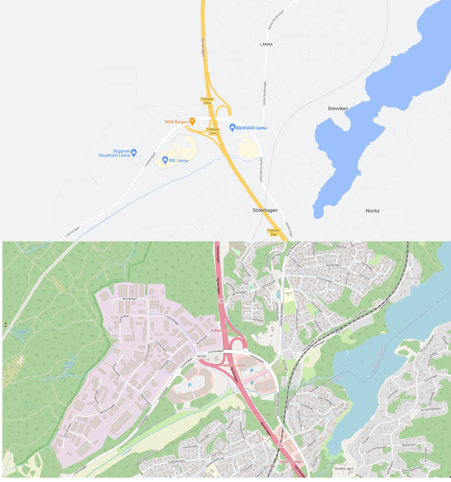
It seems that OSM (OpenStreetMaps) gets this "more right" in some respect, but still it is not the same. Why? Too little confidence of the map makers to highlight the correct things?
The top one is completely unusable if you want to do anything other than drive a car on the highway, in which case it's actually quite good.
(I picked this area specifically because it contains highway, railway, footpaths, water, residential area, industrial area, open fields, forest, and wetland. You wouldn't know, though, if you only looked at the top map. But it's not a location picked to be unfavourable to Google Maps – I sampled a few other places in the world where OSM coverage is likely to be decent, and it's the same story everywhere.)
I really don't get it why Google doesn't show forests at >13 zoom. I've read people claim that this makes the map easier to read. But I can't be the only one who orients himself on a map based on boundaries between forests, residential areas, and fields.
Is there a way to make Goog's turn-by-turn to not be street name based but instead give directions like old timers did using landmark navigation?
At the old farm house, turn left. After going aways down the road, turn right at by the building with the white archways. Take the next left when you get to the statue of the first mayor.
For full flavor, you'd have to include references to landmarks which no longer exist: "if you pass the vacant lot where the old drugstore used to be, turn around, because you've gone too far."
One explanation would be that roads are not the useful information on modern map, you search for you POI or address, and then query an itinerary, and then you have a very contrasty road, the one you need.
I suspect just looking at maps to find your way is a more and more cornered case.
This was indeed a very deliberate choice by Google, and they have been blogging about it since at least 2011[0]. There are quite some blog posts by Google and others discussing the evolution in online maps from the high contrast design focused on roads and cities, to more “fluid” designs where there is a bit more room to show buildings, forests, waterways and other landmarks that are more suited for exploration rather than navigation.
> where there is a bit more room to show buildings, forests, [...]
? What forests and what buildings, though?
The 2009 - 2011 changes are fine, I guess (indeed I don't need the roads that prominently as they were in the 2009 examples), but at some point beyond that they did jump the shark somewhat with their changes.
My personal pet peeve is that at zoom level 14, all distinction between built-up areas and non-built up areas [1] disappears and you're looking at just one indistinct mess of hazy streets on a grey back background and you can't even really tell the shape of a city from looking at that.
Individual buildings only come in at zoom level 17, by which point you're already quite zoomed in, and forests remain stubbornly hidden.
Google has the somewhat better POI integration and traffic information, but when I want to actually look at a map for orienting myself or getting a feel for an area, I much prefer Openstreetmap's style.
[1] At least where I live, the further distinction between forests and non-forested open spaces is rather rudimentary – a few random areas of fields and other open spaces are correctly shown in some sort of ochre at zoom level ≤ 13, but large areas are simply all drawn in green regardless of whether they're actually forests or not.
I find this quite sad and humorous at the same time. Personally, I'm one that loves looking at maps to familiarize myself with street names in an area of interest rather than the specific route the great Map gods of the cloud have decided for me. I tend to not rely on turn by turn navigation, and actually find it quite annoying with its incessant "in 500ft", "in 400ft", "in 300ft" kind of nagging. Being around people that are absolutely dependant on turn-by-turn directions make gives me a laugh though. On a cross country trip where you're on the same major high going West for >1000m doesn't need turn by turn, yet I've been on a trip with someone that had a damn near panic attack because I started driving without the navigation running. Sad they were that stressed about it, but still damn funny
My partner relies completely on navigation assistants, but they didn't exist when I learned to drive, and I never bothered to adopt them. What's funny is that I feel just as stressed out trying to drive with the navigator as my partner does without it! I am so used to having a high-level sense of the route, and knowing the scale of the turns and the roads involved, that I feel confused and disoriented if I try to just blindly follow the directions. I'm not very good at blindly following, either - I can't relate the distances given to a real-world sense of scale, so I frequently miss turns. Really funny how different the mental strategies used to solve the same problem can be.
People being that reliant on turn by turn navigation is not just sad, it's also quite dangerous. Any time the navigation app's instructions are wrong, unclear or simply a bit too late, it is quite likely to cause that kind of driver to make a sudden and unsafe maneuver. Having a general familiarity with your planned route and its surroundings before you put the car in gear goes a long way toward preventing those panicked reactions.
You might enjoy the Mobile Atlas tiles from Thunderforest [0].
I think the low contrast on Google Maps is uniquely ridiculous. You don't have to go all the way to OSM / road atlas. I think Mapbox Streets, Apple Maps (somewhat) and Gaia Topo Lite (my go to) are all perfectly fine maps with roughly the same "feel".
Google Maps contrast is so ridiculous that I have a private app called "Kontrast Maps" that is just the Maps SDK with a high contrast style applied. Me and a friend with a visually impairment get a ton of use out of that. I would love to publish it if it weren't for the insane pricing on Maps iOS SDK.
I'm also disappointed enabling "High Contrast" in Apple operating systems doesn't apply a high contrast maps style. Seems like a super obvious accessibility feature.
My father travelled a lot for business. So much so that he had a massive map covering a wall in our garage. Before heading out he'd put Blu Tack on the various places he intended to visit and planned out the route he'd take. This required a very high contrast representation of roads to assist him in finding routes; especially given he couldn't magnify the map to focus his attention.
Today, people tend use maps differently, they generally use the map to find POIs (with the assistance of search) and then just ask the computer to tell them how to get there (using various prompts). So, it makes sense that the emphasis is no longer on the streets, but the things that happen to be on those streets.
In some respects, the map is an outdated form for data visualisation. It retains usefulness (in part) because automatic routing remains imperfect (especially for walking in urban environments). However, in time these imperfections will be corrected and I suspect maps will be relegated to niche applications and 'advanced' tabs.
Road atlases were the same in Spain. I think the reason is that they are not interactive, that's the all the zoom level you are going to get and so they are extremely dense with information.
I think that for interactive use google maps are way better, they avoid information overload by presenting a very schematic representation. Old road atlases look like versions of Where's Waldo?.
Cartographic generalization is an AI-complete problem. It is doable for a human to decide what to show or not, in order to get a useful map without too much clutter. It is much harder to program a computer to do it. It is very tempting to turn down contrast to make a cluttered map less "loud".
On that note, one thing I've wanted to do for quite some time is an application that would allow you to open an image file or a set of image files with a particular style of map and it would try to replicate that style with OSM data. Ideally emitting that style in a Mapserver mapfile, or a Mapnik style file, or whatever. If you prefer German-style road atlases, you should be able to have them with OSM data. Doing such things by hand seems incredibly tedious, though.
I've noticed on Ordnance Survey's online maps, the contrast seems lower when printing caps of the 1:25K maps (I take custom paper versions of planned routes out with me, in case both my own nav and my tech options fail) from the new version of their online offering (which us hold-outs have recently been force upgraded to). Though it doesn't look noticeably different on-screen.
I really don't get it. Here in Germany, in the last century, "road atlases" were a thing, big maps with great overview and detail maps which were basically at maximum contrast. For examples, see for instance https://duckduckgo.com/?t=ffab&q=autokarte+deutschland&iax=i...
It seems that OSM (OpenStreetMaps) gets this "more right" in some respect, but still it is not the same. Why? Too little confidence of the map makers to highlight the correct things?