Rule #1 of Presentations is this: know thy audience.
When Steve Jobs used pie charts in his keynotes, he was addressing an audience of developers, consumers, and loyalists. These were people he needed to keep impressed, and a great way to impress people is to make the data seem really BIG and compelling and outsized. (Remember that one presentation with the graph that expanded its axes and "zoomed out" in real time? That's serious data showmanship right there).
Pie charts may not be the most accurate way to represent data, but when your goal is to sell a story, they can do the job nicely. That even nontechnical consumers are used to seeing them makes them easily digestible, too; in this sense, pie charts are a form of universally recognizable data language. Pie may be junk food of a sort, but it's comfort food all the same.
You seem to believe that there is a "best" way to represent data, but therein lies the assumption that all audiences are largely homogenous. I disagree. There are certainly universal principles for good presentation design, but data representation is a tough one. The sophistication and expectations of the audience play a huge role in how you should speak to that audience.
I think the more subtle question is what "best" means here. Knowing the sources jgc has probably been influenced by, it's going to be something like a measure of accurate information absorption by the audience.
If you want to lie, which it's quite unmistakeable that Job's chart intends to deceive, then accuracy absorption is not you aim. But if you don't want to lie, I agree with jgc that pie charts are simply inadmissible.
But I'd argue that we can dissect even further -- in this case, into the process of information absorption. Certainly a crucial part of absorbing information is paying attention in the first place. Or understanding what we're seeing. On both of those counts, pie charts do a pretty quick and easy job for many hypothetical audiences.
Some of the graphs and charts offered up in this article as alternatives to pie charts would, quite frankly, confuse the heck out of a lot of audiences. And if your audience doesn't understand what it's seeing, it's not going to absorb the information. Furthermore, if it has to be told what it's seeing, then it's already in an unreceptive psychological state.
I would not advocate lying to an audience, or grossly misrepresenting data. But I certainly would keep two things in mind: 1) the data-sophistication of my audience, and 2) the attention span of my audience. A pie chart may not be terribly precise in its representation of data, but it's clearly, quickly, and almost universally recognized.
Perhaps there's also room for a compromise in any given presentation: a data overview slide, with simple pie charts and other "30,000-foot" graphs, followed by a more detailed breakdown of key measurements in more precise terms. In this case, the first slide captures attention, and the second slide ensures accurate delivery.
I'm not going to source this at the moment, but I'm 80% sure I've read studies that show pie charts increase audience confidence that they understand material but reduce their accuracy.
Pie charts seem simple and easy to understand, which is really the most dangerous flaw. It's difficult for the human visual system to compare areas accurately.
While there is no 'best' way to present data, per se, there are studies that show some are [much] better suited to the purpose than others (Cleveland & McGill).
About the only thing a pie chart is useful for is exposing the idea that the whole is the sum of its parts. If you care at all about those parts specifically then a pie chart fails you. Annotations help this, but at that point it's not the graphic that is conveying the information and you'd be better off removing the noise.
I think the set of purposes you're considering is too limited. If you want an accurate comparison then a pie graph might always be a bad idea. But if the truth doesn't make you look good then the fact that a pie graph is bad at giving an accurate impression of the data actually is your purpose, and the pie chart might be the best graph for the job.
That is a very slippery slope. As presenters of information we have a responsibility to provide the most accurate information possible in a way that is directly digestible. This responsibility exists in the face of uncomfortable data.
"The most dangerous untruths are truths moderately distorted." - Georg Lichtenberg
Any chart or graph, no matter how precise or sophisticated, can be used to distort. Oftentimes, people will intentionally bombard their audience with hyper-sophisticated and complex data readouts in order to prove how sophisticated their thinking has been (and, by association, how trustworthy their conclusions must be). Hedge funders have been doing a brilliant job of this for decades now. "Kill 'em with complexity" is a time-honored sales tactic.
Sure, but when someone's doing something sketchy its important to be able to recognize that, rather than thinking they're stupid or confused or acting randomly.
When you're discussing what is, don't be blinded by considerations of what ought to be.
I'm not convinced at all. It took much longer for me to dissect the information in the example bar chart that it did for me to dissect the information in the example pie chart. The bar chart was confusing; the pie chart was instantly clear.
Furthermore, I disagree with the author's assertion that it is difficult to compare areas and angles, and I personally find it more difficult to compare length. The author provides no references that support his claims - without some clear research behind it, I simply cannot take his statements as anything other than opinion.
I think some of this debate is slightly missing a key point: tables are for showing precise data, but graphics are for showing patterns. If you're expecting your viewer to read accurate values off a chart, you're probably using the wrong tool for the job. If you're trying to use the same chart type to show different kinds of pattern in the same underlying data, you're probably having a "when all you have is a hammer, everything looks like a nail" problem.
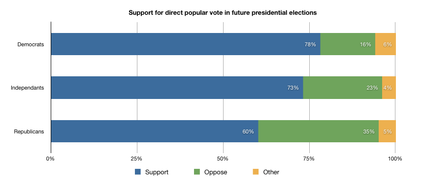
I do agree that pie charts are overused and there is often a better alternative, but do stacked sausage charts really do much better when it comes to showing differences between roughly similar values? Here's an example:
Sure, it's obvious which red bars are longest on the left-hand side, because they have a common edge. But in that case, it's not really the length of the bars that the viewer is comparing, it's the position of the right-hand end, just like a simple bar chart.
As soon as you stack thing up, so you're trying to compare sections that don't align at either end such as the green or orange bars here, it is still difficult to see which ones are longer. Something more drastic, such as reversing the order of the bars completely, throws off any comparison, as with the second and fifth lines.
I don't see how a series of sausage charts like this is much better than a series of pie charts if your goal is to allow your viewer to compare the sizes of each category across the series. You need to get the key values onto the same scale to do that effectively, and I would expect a better choice to be something like a multi-bar chart (with the same zero level for each bar, either grouping all categories for each point in the series or isolating each category in a chart of its own) or perhaps some sort of overlapping line chart if the gradients are interesting.
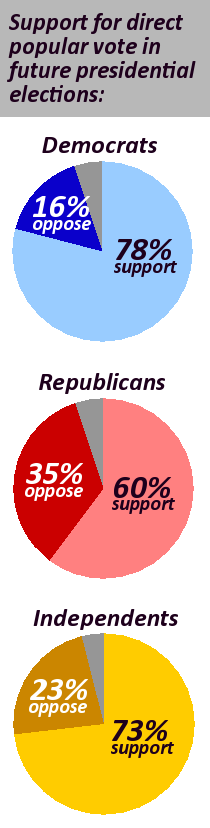
Not only does it indicate how close I am to completion, but also which categories I have completed. Additionally its pie shape makes it easier to use in this setting (where a horizontal chart would be too big)
There are some good arguments both in this thread and in your blog, and both for and against the two types of charts.
One thing that you would have to make absolutely clear to your audience when using the "sausage" chart [1] is that the length represents a whole. Pie charts obviously represent no less and no more than one whole, but that's not so obvious with a bar.
You handle this well in your examples by marking the end point with "100%", but I worry that others would not be as diligent in their labeling if these charts were to take off.
1. Is there really no better name for that? :D How about calling them snake charts or something?
Well mostly people call them stacked bar charts no?
Anyway to your point about labeling: For bar charts the axis scale labels are a requirement. If someone doesn't label scales I'd as kindly as possible suggest that they shouldn't be making charts at all :)
I'd add that the pie charts you converted in this post are actually the sorts of pie charts you were okay with in your first blog post, where you said "pie charts are really only useful when a small number of categories of data are far, far greater than others" (http://blog.jgc.org/2009/08/please-dont-use-pie-charts.html), with "republicans" being, arguably, an exception.
The "sausage" (worst. name. ever. :-) ) solve some of the problems, but not all of them. With enough slices, it's not always clear which is larger than which. Depending on what the viewer wants/needs, often a humble bar or column chart would be more effective. The sausage and the pie both do a decent job with just a few slices (the sausage is definitely an improvement), but both break down with a lot of slices.
I just have to say that the bar chart you show is so small that I can hardly read the numbers, so based on that I would say the pie chart won. As you mentioned in your other article, if you can't read it (aka 3d charts) then it is pretty much useless.
I was looking for this and am not disappointed. I defy JGC to graph that more clearly.
Meanwhile, while I agree pie charts are poor for comparisons of area of slices, or of varying sized pies, but believe the average person understands the slices well as percentages of a whole. As percentages of a whole they are glancable.
Further, n the "sausage" charts, the for and against are NOT readily comparable, as they do not start from opposite ends. The "Other" should have been graphed in the middle, allowing the balance of the two ends to be understood and comparison of both positions against the other two bars to be understood.
> The bar chart with independents, republicans and democrats makes it seem like every group is equally large.
The chart was about relative take on the subject in each constituency. But again bar charts prove their superiority: it's perfectly possible to scale the bar charts according to the size of the charted group (although you're going to lose the comparability of relative constituencies, which again was the point), almost impossible to do so with pie charts.
When Steve Jobs used pie charts in his keynotes, he was addressing an audience of developers, consumers, and loyalists. These were people he needed to keep impressed, and a great way to impress people is to make the data seem really BIG and compelling and outsized. (Remember that one presentation with the graph that expanded its axes and "zoomed out" in real time? That's serious data showmanship right there).
Pie charts may not be the most accurate way to represent data, but when your goal is to sell a story, they can do the job nicely. That even nontechnical consumers are used to seeing them makes them easily digestible, too; in this sense, pie charts are a form of universally recognizable data language. Pie may be junk food of a sort, but it's comfort food all the same.
You seem to believe that there is a "best" way to represent data, but therein lies the assumption that all audiences are largely homogenous. I disagree. There are certainly universal principles for good presentation design, but data representation is a tough one. The sophistication and expectations of the audience play a huge role in how you should speak to that audience.