I am not one who gets worked up over typefaces so my short take is "yet another san-serif font" but the discussion about why he chose to do things in certain ways was useful for me in appreciating how this font differs from other, similar offerings.
I am at once awed by the level of work that goes into a really good typeface, and also astounded that this still seems to be a difficult sort of terrain that people are not just willing, but positively excited to summit. Why go to the trouble when your font is only going to be seen by a small number of people and used by even less? Are you really having any ideas that haven't been had already in plenty of other fonts? Will your extra 0.001% tweak to readability make life easier for 0.001% of people that read something written in it?
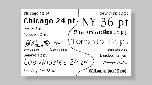
The most it resembles is the San Francisco font (Apple's default system font) which itself was inspired from Helvetica and DIN.
Personally I liked this font much better than the other opensource alternatives, especially with the number of weights it offered. I am glad it's gotten popular.
Am I the only one that wishes the article about the font "made for screens" went into more detail about what makes this specific font better for screens?
Hello, I’m Rasmus. I’d love to dig deeper into these subjects — the details into rasterization and realities of layout engines (or “shapers”) that are out there. Perhaps in another interview or article :–)
Verdana is a great example of a font designed for low-resolution screens[1].
What’s interesting is that Ikea chose to use Verdana for many of their print & in-store display material[2]. To me it looks a bit blocky and unfinished, which actually is a not a bad look for Ikea.
According to a font designer that was commissioned to design a custom font for IKEA, they decided to go with Verdana after all due to bad webfont support at the time. (They wanted to be consistent online and in-store.)
With that said, I share your opinion on Verdana and that can definitely have played a role in their decision.
I'd imagine they didn't because it was more about the timeline and process of creating it? They did touch on briefly about why he wanted to create it.
> We'd used Roboto as our main font, and we were running up against its limitations. It was originally built to work as both a display typeface for things like titles and text typeface for longer blocks of text like paragraphs. But it was difficult to read Roboto when it was small
I share the same sentiment. I’ve got a terrible eye for design and I don’t have the slightest idea about fonts. Articles like this remind me of my gaps and I’d love to pick up some knowledge.
Roboto is installed default on many systems, specially on phones. The speed factor to me is key. That's why I avoid using webfonts. I use both San Francisco for those on Mac and iOS and Roboto for the rest of the mortals, including other san-serifs.
> With a typeface, it's just this black box as to who is using some of the stuff, then you have no way of reaching back. You're completely reliant on whoever makes use of it tells you about it, which probably no one does, right?
I've seen multiple websites (What The Font being one of them) which analyses a picture with text. They then try to guess the font being used. If you could automate this process, you might be able to scrape content and figure out who's using your typeface. I guess that is mostly interesting for a commercial typeface looking for software piracy, though.
What The Font does an amazing job sometimes, but it's not infallible. I'd say it misses more often than it hits.
Web crawling seems like a great idea, but probably not worth it just to get a list of customers. And it will never tell you who's using it in their app, or for signage.
What The Font was an example. I used multiple tools to find an obscure font. It was my first time trying to search for 2 fonts whilst I only had logo where the 2 fonts were used. One was relatively easy, the other one not. It cost me some time because like you say not every tool is as good as you'd expect it to be, but I did succeed.
> How do you define 'core set of glyphs'? There are more than 150 different written scripts in the world — at least those that are well-recognized. Only a small portion of them are Latin-based ... Then, there's the Greek alphabet which is similar to Latin as well as Cyrillic. Then we have Arabic and Hangul
> Within the first year, before making it open source, I had something that covered the 200 most common Latin characters.
Seems like most of the time spent on Inter was the result of the creator not properly limiting his scope. Later he even talks about how the Cyrillic characters in his font seem completely wrong to actual users of Cyrillic because he can't read Cyrillic. As someone who deals with multiple different scripts on my computer, I always hated the fonts that try to set a uniform style for every script when many of the designers clearly had no idea how many of these scripts worked. It really only makes sense to try to support every script for fallback fonts like Unifont. Rarely do typographic concepts translate well between scripts. If you want an example, install the CJK font "Hana Mincho" and type some English text in it: It looks atrocious.
Took me a bit to realize that this is the same font as "Inter UI" (which I installed right at the end of 2018). It was apparently renamed to just Inter in February this year.
The changelog provided on Github gives some interesting insight into development of this font https://github.com/rsms/inter/releases
Not only have I found it rare to see a font with active development like this, but it's also exciting seeing changelogs that are this detailed.
Google's Noto fonts[0][1] will give you good coverage. You should still do some basic smoke testing when launching a new language for your site though.
The usual advice is that you make sure you have plenty of font fallback options that may already be on the user's machine, and why most CSS font-family snippets always end in a wide, generic display class such as "serif" and "sans-serif".
In general, it's hard to break browser fallback to system fonts for languages/glyphs that aren't available. (Though people will sometimes try, or make crazy bad accidents happen.)
But, you mostly only have to worry about languages your webpage is outputting anyway. If you aren't localizing to a particular language and you don't allow user content, you don't have to worry about a web font covering those glyphs. Which is why most web fonts only worry about the top few languages for download speed optimization.
Google Fonts has tools to be smarter about which subsets are downloaded in a browser. It has a subset hint where you can tell it languages you think you will need. Google Fonts also supports the use of the unicode-range CSS feature [0] to tell a browser to download subsets only if the browser encounters characters in the associated Unicode ranges.
This font reminds me a lot of "Rail Alphabet" which is a font designed by British Rail in the 60s which was used to railway signs and also in hospitals. Newer fonts are starting to replace it, but there is still a lot of it around if you know where to look.
It started as a clone of Roboto, which in turn started as a clone of Helvetica (sort of), so that's not really a surprising reaction. Fonts are weird like that.
It’s the slightly condensed Roboto look but I’d say it looks a lot more like San Francisco with fewer things parallel to the baseline (not as bad as Arial vs Helvetica, but noticeable).
It's not just you... I think it reminds us of Helvetica because it borrows some common elements from Helvetica that are frequently changed in other Helvetica-like faces. For example, the ascender on the lowercase "t" is horizontal, unlike Arial. The apertures are also relatively tight, like Helvetica, and the x-heights are similar. I wouldn't say it's a clone though; it manages to look a little more humanist without being whimsical, which IMHO is a real accomplishment for a designer's first typeface.
Well observed. There are a myriad of influences in Inter, some from existing fonts, some from graphic design and shapes I’ve seen in my surroundings and some ideas that grew out of thoughts. For instance, the bend of the “t”, “f” et al just felt right and was not influenced by anything else but their own shapes. In contrast, the “a” was inspired by many existing typefaces like Akzidenz Grotesk, Helvetica, etc. The shapes of the glyphs, spacing and angles of Inter have gone through a long evolution during the past three years. For instance, “e”, “1”, “s”, “g”, “n”, “m”, “d” (and several others) changed a lot early on.
I am not one who gets worked up over typefaces so my short take is "yet another san-serif font" but the discussion about why he chose to do things in certain ways was useful for me in appreciating how this font differs from other, similar offerings.