Hmmm...When it comes to simplicity in design, I may be an outlier, but just a few of my daily struggles...
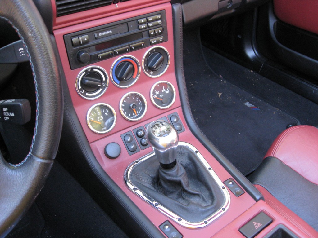
- I have to subtract 23 minutes (or add 37 minutes depending on daylight savings time) from the clock in my car because I lost the manual. What ever happened to a dial with 2 hands?
- I have to stand beside the microwave and open the door when the popcorn stops popping because I have no idea how to get good popcorn any other way.
- I never put anything in the dishwasher because I have no idea whether it's clean or dirty. How hard would it be to put a large green/yellow/red light on the front panel? (I am not the main user.)
- Why does almost every web page or Windows screen have buttons that do totally different functions right next to each other in the same color? (Yesterday, I meant to click on my only unread email and accidently sorted by Subject Name instead. It took me 5 minutes to realize what I had done.
- I gave up on our 4 TV remotes (124 total buttons) long ago. If it's on Channel 6, I'll watch it without sound.
- What do those other 2 buttons on the garage door opener do? I hit them so often, some days I wonder if I'll hear dogs barking.
- Need ice or water from the refrigerator door? Make sure you're in the right "mode" first. Why not just have 2 openings?
- Cell phone is ringing. Where is it?!?!? Why can't I just answer the land line? It's always in the same place.
- Stereo in living room is unplugged until we need it. I don't know how to stop the constant light show on the front panel.
Just when was it that things got so complicated that they created more problems than they solved?
These are valid complaints, but they actually back up the author's point -
You still bought the complex-looking item. That it annoys you now is irrelevant (in the author's view). He posits that even though you know you only need 2 buttons for your garage door opener, you'd still buy one with 5 buttons before you bought one with 2.
No, I didn't buy any of these things because I wanted to. Consumers don't have much choice any more. I defy you to go out and find any of these things:
  - a microwave with a single dial
  - a cell phone that rings on your land line when you're home
  - a garage door opener with one button
  - a dishwasher with a status display
  - a car with an analog clock
  - a TV with an on/off switch and a channel dial
OP jumped to an unsubstantiated conclusion when we could have been writing about the elephant in the room: that functional design, like journalism and sensible politics, is a lost art.
All the TVs I own have an on/off switch, albeit typically hidden where you cannot see it (behind or on the side of the screen bezel).
You got me on the dial, however. On the other hand, my TVs also have up/down channel switches which are a practical solution to having a dial than needs 200 detents.
P.S. I do agree with your summary, but I couldn't resist the challenge. :-)
Unsubstantiated? The OP is Don Norman (http://en.wikipedia.org/wiki/Donald_Norman) and he's speaking from experience. The fact that he has more experience in this branch of design than pretty much anybody else should give his argument some weight.
we could have been writing about the elephant in the room: that functional design, like journalism and sensible politics, is a lost art.
I think he was addressing this point directly, but he happens to disagree with you. Take the following as an example:
Hurrah, I said, now the entire wash can be automatic, so there need be only two controls: one to chose between “hot and colored wash” and “easy-to-clean fabrics,” the other to start the machine. Nope, this washer had even more controls and buttons than the non-automatic one. “Why even more controls? I asked my contact at Siemens, “when you could make this machines with only one or two?”.
“Are you one of those people who wants to give up control, who thinks less is better?” asked this usability expert. “Don’t you want to be in control?”
Strange answer. Why the automation if it isn’t to be trusted? And, yes, actually I am one of those bizarre people who think that less is better.
It appears that marketing won the day. And I suspect marketing was right. Would you pay more money for a washing machine with less controls? In the abstract, maybe. At the store? Probably not.
Both Norman and his friend at Siemens understood that the interface to the washing machine could have been as simple as two switches. The problem is that they need to sell washing machines when they're sitting in a row of competitive products. In their experience, people in the market for a washer tend to buy on features. And Norman never claimed that everybody buys this way, just that most people do.
To blindly give your faith to someone because of who they are?
Which well known products is he credited with helping designing? There's none listed on his wiki page. Wiki does say 'The Norman Group's list of clients spans from Hertz all the way to Microsoft'.
Microsoft? Those well know UX masters? Oh dear. They are a damn sight better than some, but still way behind in true usability.
And of course there's the elephant in the room, the iPod. Which does exactly the opposite of what he claims.
And there are some howlers in the article. Like when he 'bets' the $250 toaster sells well.
Bets? Does he not know marketing 101? It's there to make the overpriced medium range toasters look cheap. It's not there to sell.
The sad fact is that UX design is still a new field and as such it's in its quackery stage. That means there's a lot of people saying things they think is true because of raindance/cargocult effects. And people will say they are amazing when they're not because they occasionally hit home runs.
Consider what the real reasons the expensive ones are more desirable than the cheap ones may be. Maybe it's because they look cheap and shit in the first place.
It's very easy to mix everything up. The iPod and iPhone have very few buttons but they look expensive. They exude status. And they sell well with simplicity. And unfortuantely for our stress levels the Apples and 37signals of this world are few and far between.
Now Don Norman, I don't know. He may be amazing, he may be not. But I can't agree with this article, but mainly because I'm now tired of badly designed tech gear. Perhaps when he was writing this in 2006 that overcomplication fatigue hadn't started sinking into society.
But note the legions of adoring fans the Apples and 37signals have created. That's worth its weight in gold.
To blindly give your faith to someone because of who they are?
Read my comment again. I never blindly gave him faith. I was pointing out that he's a well-known expert in this field, which is relevant when evaluating the substance of his argument.
Garage door opener with one button: http://amzn.to/bQBbFm The Infiniti FX35 has an analog clock. My dishwasher has a green light which indicates that the dishes are clean (though it turns off the first time you open the door, so you better be in the mood to put away dishes). Google voice rings all if your phones, landline or otherwise.
I've recently seen microwaves with a spring loaded timer dial, I'm sure you could still get one (if used).
Television setups on the other hand are needlessly complicated.
I used to love the "Clean" light until I realized what you pointed out: you'd better want to put away all the dishes right then, which is a problem when you just need a spoon to stir the soup, etc.
Most modern dishwashers have a "clean" light that lets you know when the dishwasher is clean. My old Kenmore even does.
My wife's Audi A4 had an analog clock, although her new car has digital. I STRONGLY prefer digital. Setting the analog one was always a pain, and it didn't auto adjust for daylight savings time, like the new digital one does.
My Samsung TV has an on-off button and channel up and down buttons on the front. A dial doesn't make a lot of sense when you have 100s of channels.
My wife's Audi A4 had an analog clock, although her new car has digital. I STRONGLY prefer digital. Setting the analog one was always a pain, and it didn't auto adjust for daylight savings time, like the new digital one does.
I prefer digital clocks as well, but a car adjusting for DST? That seems like a recipe for more complexity, not less. What happens when the DST rules change? Then, instead of manually adjusting the clock twice a year, you have to adjust it four times - once each time the automatic DST change occurs on the wrong date, and again each time to adjust it on the correct date.
I'm sure this can be patched after manufacture--the logic is probably on a flash prom. I would hope the dealership takes care of this during a regular service.
The author ignores a key component of the problem - "complex" interfaces make it easy to accomplish your goals.
From the Zen of Python:
    Simple is better than complex.
    Complex is better than complicated.
    Flat is better than nested.
Applying these three principles to user interfaces, the best user interfaces present lots of features at once, with each button (or small section) of the interface performing a specific, orthogonal task. Indeed, this is how consumer electronics are designed. My microwave allows me to select any mode I want, and manipulate the screen with a keypad in a separate rounded rectangle. The stereo, AC, wipers and headlight controls all manipulate unique parts of my car. My washing machine has a different rectangular selection pad for each "feature" of the wash - temperature? color? size? presoak?.
Flattening an interface helps the learning curve. If you need to set the time on your microwave, bet on the "time" button. On the other hand, I still need to ask my girlfriend how to set her iPod to "shuffle," or shut it off, or reset it when it freezes.
Flat is better than nested only when you're dealing with limited space. You can put as many buttons on a washing machine as you want, but an iPod needs to maximize its real-estate. Therefore, nesting becomes the optimal choice, but it has to be intelligent nesting. Features need to present themselves when it makes the most sense based on the current context. On your GF's iPod, shuffle is very easy to access when you're currently listening to a song. Otherwise, it's hidden away.
I just disagree with this. I think complexity is laziness on the part of the designer, the marketing team and the management team that probably demands their products appear complex.
For instance, the washing machine that needs two buttons but has 20. Two buttons on a washing machine, if designed well, is a great marketing opportunity. BUT you would have to design it with a way to SHOW the user all of the things that the machine is actually doing, like how the prius shows you what it's doing. Give it a sleek, standout design, and you've got a high-end, high-dollar washing machine.
Thing is, that means someone has to step outside the box and do something different than their competitors. Slapping lots of 'features' on a machine is cheap and gives the sales guys lots of fodder for B.S., no extra training required.
Look at Apple's products, look at the Toyota Prius. Complex machines that simplify the tasks they do. And they're selling very well.
Ultimately, design and marketing have to make simple mean more, not less, to middle America. And someday, probably soon, when every washing machine has 20 knobs and I need to push 10 buttons to toast a piece of bread, simplicity will be the new selling point.
Complexity is also laziness on the part of the customer. The story about the customer who thought a product wasn't up to par because it was simple, tried it, and then found that it did everything needed is illustrative of this.
Marketing rules in business, but that's really too bad. It's too bad because marketing is pandering to the lowest common denominator. If someone wants something stupid, marketing means indulging their stupidity. Marketing never, ever uplifts anything.
I don't disagree with this, but I think that customer 'laziness' is really just people relying on what they know, and is something that can be shifted. Marketing may never uplift anything, nor can it. However, it can influence how people perceive something new.
Marketing, if done well, can transform a radical design or idea into a positive, must-have device. I hate to keep using apple, but I can't think of another company that does this as well as they do.
Marketing on the product development end of things, however, is another story. On this side it is certainly true that marketing, unfortunately, seems to rule and often produces lack-luster, pedestrian results.
I love Apple as much as any other programmer, but we have to remember that they lost the Mac vs PC wars.
There is a still popular perception that Macs are for frivolous hippies and PCs is what real people use to do real work. Obviously it's different for programmers and many other people, but we're talking about mainstream marketing here.
They did great in the mobile segment because of extremely weak competition and revolutionary new products. If Blackberry had a non-ass touchscreen device out before the iPhone I doubt Apple's simplicity would've had been effective counter-marketing.
There is a still popular perception that Macs are for frivolous hippies and PCs is what real people use to do real work.
I'd tend to disagree. That might have been the attitude a decade ago, but today I think it goes more like "Sure, Macs are nice, but I can't afford one". At least that's what I hear most frequently from people I know.
I agree with the author, but there is one point he seems to have overlooked; brand. If you create a brand identity consisting of easy to use and, actually, useful products. Then this issue becomes your selling point. It's all about perception and designing your products for something as fluid as human perception is like trying to wrestle with water. Instead, if you hire just the right PR then you can put that water into a nice, little container.
However, consumer products aside there are some cases where a complex, but not complicated, solution is better than the simple solution. For example, city planners have this eternal tendency to build flyovers whenever and wherever they can, but the flyovers themselves can't handle the increasing loads after a certain period of time. So, then what?
A more complex, but uncomplicated solution would be to make the traffic lights respond dynamically at a city wide scale with traffic. If you can figure out the volume of cars on a given stretch of road vs. other roads you can then use a routing algorithm to predict the best timing and path to guide the cars. It's more complex than the flyover, but it's cheaper and the leftover money can be then put into making better mass transportation in order to cut down car growth.
Further, you can figure out the volume of traffic by using accelerometers embedded in the road. Any vibration propagating through a solid medium has certain characteristics, which can be accurately predicted by studying solid acoustics. Hence, if you have an array of sensors (they are cheap) you can track the vibrations down to their respective sources. In this scenario accuracy is not an issue, a roundabout number should be good enough.
Powering the sensors isn't much of an issue either and we can put wire them to micro-controllers that crunch some of the data and sends it higher up the chain.
So, at the end we have an entire city that behaves and responds like an organism to the traffic flowing in its veins. It will be just beautiful.
The irony is that its inherent complexity ensures that people won't buy it. After all, who would want to trust solid math?
"I agree with the author, but there is one point he seems to have overlooked; brand."
That's exactly what I was thinking. Users have to learn, through repeated use, to trust automation. They might take a chance and buy an intelligent sensor-equipped washing machine, but only if they can control it manually if the intelligence turns out to suck. This is one reason why they appear to prefer complex products.
But there's a way around that: get a reputation for really good automation. (Yes, it's a chicken-and-egg problem, but I'm sure it's doable for consumer electronics.) Where users are confident that automation will work well, I predict we'll find that "users prefer complex products" is less true.
I think before the advent of personal computing, a bit of extra complexity was ok. Life was pretty simple. You had a car, a stereo, a tv with a button for each channel, a stove/oven, and a calculator. You actually had room in your mind and time in your weekend to read the manual and figure out your new VCR. It was fun!
Making complex things was actually expensive to do, so a microwave with lots of functions cost more than one with a single button that said "heat up my food". This made it a bit of a status symbol. It was also the start of everything becoming digital, so it was cool for everything to have lots of buttons and a fancy readout.
Now we have several TVs, all with several boxes, incorporating our audio system, and connected to several services. We have smartphones, computers, tablets, printers and routers. Then there's all the software on and off the web to figure out, configure, and get working together. And you have to deal with all that at work, too. It's tough just to stay afloat.
So, the last thing you want is a digital toaster. They can make it look as complex as they want, but it won't make it look any more expensive. Today something looks expensive if it is simple, heavy, and looks like it was handcrafted by a German man. People still lapse into 1980s thinking and make the association that complicated means better, but that will wear off.
I'm not saying that extra features aren't sometimes important, but features are so easy to add to things today. You just have to type a few lines of code. Making someting look complex is easy and inexpensive. Making something complex look simple takes much for time, effort, money, and talent. Increasingly, people will pay for that.
I see limited use for a digital toaster, there are some perks you /could/ see like having personalized settings which somehow just know which person is using them ( RFID? ) and sets the appropriate toast setting for that person.
Possibly detection on what it is toasting ( ie: hash-browns, muffin-splits ) and "smarter" toasting ( ie: using an optical sensor to measure surface browning, and using a laser thermometer to measure core temperature ( which is required for hash browns because they're often still cold in the middle :( ) ), but these are all purely practical features and I'd want the toaster still 100% practical with no knowledge of these features.
But I'm guessing these sorts of features are not the ones they implement, and probably add silly things like an LCD screen with a countdown timer, and a blingy screensaver, and a robotic toast loader ( ok, on the other side I can see how that would be useful, I do get annoyed every time the toaster is a little too eager and throws my toast in the air and into the sink ..... ) , and they probably add useless features like bread-decorating toasting with high powered lasers or something equally stupid.
Plain old mechanical toaster trivia: The thermostatic element is placed in such a way that it is receiving reflected energy from the toast. As the bread dries and the Maillard reaction browns the toast it reflects more energy from the elements to the thermostat.
Viola! Toast browning detection in one bent piece of metal!
Darker things absorbed heat, rather than reflecting it - ? But then raw black bread will behave differently to raw white. Sounds interesting but I'm unconvinced.
This is an old article.When reading this article i thought the author was right till i saw this article by zedshaw.
zedshaw's is very fun to read yet highly informative.!
I found an interesting culture full of contradictions and struggling to combine its past with its future and desperately wanted to learn about them. Don saw an SUV and thought he knew some shit.
True, considering' Zed's experience (1.5 years as soldier stationed there, spending lots of time integrating and studying the culture.
OTOH, I have lived for more than 6 years in Japan, which also have a culture of having things which look complex, and I think the OP is closer to what I have seen than Zed Shaw on that particular aspect.
I still don't understand why, but Japanese in general love that everything is written on magazines and advertisements, that UI are mind-blowing complex. In general, slides with as much stuff crammed into it are well regarded as well - academic conferences in Japan were scary in that aspect, compared to more internal ones. That's where Zed has a point I think, that is it is not that the culture value complexity as much as valuing a lot of data and information.
If you want to get scared, look into the big EC shops in Japan (e.g. rakuten: http://www.rakuten.co.jp/). I find it almost offensive. The main page also gives a good feeling of what it is like to be inside the subway in a big Japanese city during rush hours - you have advertisements in every location which is not occupied by human flesh.
On a side note, while the snarky comment of Zed Shaw is well, snarky, I would note than Don Norman used to teach 2 months/year in Korea, so he most likely did more than buy a SUV from there.
Your new toaster might have too many buttons and displays for you to use effectively, but it will surely impress the heck out of the next visitor. In fact, it's arguable that conspicuous consumption is the _only_ reason why you'd buy a $250 toaster with a dozen buttons instead of of a $20 toaster with a knob.
I'm not sure what the standard warranty is on toasters, but for this $17 model you can buy a 2-year warranty for an additional $6 (total: $23 for 2 years of guaranteed toasting):
I disagree to a point, I think you need to appreciate that the term simple is not at all simple in itself and is totally relative to the observer.
For example, my parents bought all the gadgets and gizmos a kid could ever want, and I though growing up with them and pressing and getting myself out of awkward situations (like trying to figure out what "change language" would be in mandarin after changing the languate on the DVD player just to see what would happen) I would consider something like a Sky box, a pre-amp or a DVD player simple no matter what the interface (tactile and digital) looked like a simple tool to use.
My parents, who bought all these things and used them a little are consistently lost whenever they have to replace their digital radio, or DVD player. All the functions are the same, but the experience is different, and for them that means everything is different and unknown. Their understanding of simple is from way before we even had our fist microwave.
Simplicity is not a myth, it's just not a constant. This is pretty much addressed, but not argued, explicitly in the article: the measure if simple you use for your product must be appropriate to your target demographic and not the definition of the engineering team or a think-tank.
> Haven’t you ever compared two products side by side, comparing the features of each, preferring the one that did more? Why shame on you, you are behaving, well, behaving like a normal person.
i'ma geek I like complex programmable stuff. But this is still BS. I buy the $19.99 toaster oven cause after a year or two they're all nasty inside and It's nice to chuck it an buy new one. $20/yr is worth it to have toasty things. $250 is not.
If I made $200k I'd proly buy the $250 toaster and never use it cause I ate out all the time.
I recently was absolutely shocked shopping for vacuums. they went from $60 to over $500. WTF! The $200+ ones were filled with retarded, do nothing "features". I went to thrift store and bought a $30 one.
My points are 2
1) purchasing decisions have many more factors than simplity or complex.
2) the biggest factor is manipulating the buyers psychology, simple/complex is a symptom of that. Apple has made it a cool/hip lifestyle choice to own "sealed", low-featured, slick and overpriced electronics. Complex == status for Koreans. Do nothing technical sounding features == I don't know what? but something to convince people to pay $500 for $200 vacuum. Monster Cables.
Uggh. I have a microwave that must be designed by the Koreans in this article.
If I want to heat something up for thirty seconds, I have to wade through four menus and sub-menus:
Express cook (ha ha)->
30 seconds->
OK->
Start
People who designed consumer microwaves have obviously never used one.
I have NEVER cooked anything in the microwave that should have involved more than a single button press. If the cooking is going to take fewer than 30 seconds, I'm not going to need a timer; it's not like I'm going to go walk the dog with the rest of my time.
I never want to type in an amount of time and then have the microwave not begin cooking until I hit a Start button. I always want full power. I don't want to adjust the fan speed. Nobody has tried to cook actual meals in the microwave since 1985 so I don't need a chicken-pot-pie setting. I don't want the keys to beep loudly when I press them and I don't want the microwave to beep loudly when it's done because I don't want the kids to wake up.
Wow. Every microwave I've used in years has had a "add 30 seconds" button that works regardless of whether it's adding to an existing countdown or starting for 30 seconds from zero.
However, it also doesn't take long for me to learn the microwave settings for my preferred popcorn brand/type for a new microwave: the one built-in at my apartment requires 2:40, and the new one at my work 2:30. I usually put those in directly rather than hitting "add 30 seconds" five times.
I also use the microwave for thawing beef, at significantly less than full power. I use it to heat frozen pot pies, since they come out at least as well as in the oven, and it's 13:30 instead of 45 minutes in the oven. But 7:30 of that is at half power.
I want to go back to my room and watch my show until the microwave beeps to let me know it's done. It's never occurred to me that I might want to mute or quiet it.
I guess microwave manufacturers make devices for me, and not you. :/
I guess so. I'm not really opposed to features; they're cheap and they add value for some people.
My beef is that the most common operation (heating something up quickly) should be really simple to do. I thought this was a fundamental idea in UI design, but it's broken on appliances everywhere.
Here's how it should work: numbers 1-10 represent commonly used cook times. 15, 30, 45, 60, 75, 90, 120 seconds...I hit one of those and the microwaves waits two seconds and then goes.
If I hit multiple numbers in rapid succession, I can enter an exact time.
The only other buttons on there should allow the functions you want too. A power level button, add 30 seconds, and the more advanced scheduling option that lets you set multiple times and power levels.
All options, which are almost always set-and-forget, should be accessible through a single button. My car does this well; I can change what I want displayed on the dashboard and what color it's in using two buttons. It's not a quick interface, but I only have to use it when I change the car battery, which is hardly ever.
My GE microwave has lots of features I never use. However, I can start nuking for 30 seconds or 1-6 minutes by pressing a single button. That "+30 seconds" button is probably be the best feature in the microwave. I won't deny, though, that a laundry list of features may have driven my purchase of this particular model. And since I didn't "test drive" it to see if it has any of the annoying crap like needing to set the date (really?) and time after a power outage just to cook anything like the last one I had -- I just got lucky.
Some people prefer simplicity, some prefer complexity. I'm not sure where the median is, it might be on either side. Preference can be a function of many things, including culture.
You can make money from either. Just know your customer.
I agree. Simplicity sells, but only when needs are met.
I only ever use 1 heat setting on my toaster. All the others are useless. If you sold me a toaster that only heated on that setting, I'd be perfectly happy. But how many other people are happy with my taste in toast? The product simply would not sell well enough.
It's the same with all the other products listed. Sure, maybe a few 'features' are unused, but without extensive market testing, you can't know which ones they are.
Digg recently removed some features... Apparently they were useful features to the community, and there were a lot of complaints about that. (Among other things.)
Facebook recently added some features... These features didn't have enough features on them, and there was a revolt. Facebook would have been fine without more features, or by adding enough new features, but they stopped somewhere in-between and paid for it.
The whole article seems to be more of a style argument then a complexity argument. It presents the false dichotomy that things that are simple to operate, must have less controls. There is no reason why you can't have all the controls and a button that does everything very simply. First page of the manual should say, use the "auto" button, if that doesn't work for you, keep reading.
We've also been trained to want a manual override switch. When I think of simplicity in UI, I think of Apple. I remember when Apple stopped putting eject buttons on their Mac disk drives. A also remember constantly having to find a paper clip when the machine refused to eject the disc(often).
Secondly, there are always special cases where you need some extra control. It's hard to believe that the manufacturers software has accounted for everything. When I find a "bug" it's very frustrating to not be able to manually override the behavior.
Another case for complexity is if some sensor breaks, the appliance becomes useless. I remember shopping for a car in the early 90s (with my parents), and wanting manual windows because everyone I knew with electric windows had broken motors with windows that didn't work anymore. The situation is drastically improved now, but then, manual ruled. Sooner or later your "automatic" appliance won't work the way it did when it was first purchased. Having manual controls should extend the life of the appliance.
So he has a marketing message: "we purchase on features", and we "equate apparent [...] complexity with power'. His solution is spot on: give the appearance of power (for purchase), but make it actually simple-to-use (for use.)
He also mentions users' "favorite features" (it's well known that we don't like having to change our behaviour, even for the better); and "“critical” features" (sometimes they aren't actually necessary; and sometimes, as Joel says, "everyone uses a different 20%" - Linus has also said this). An example of the latter, and as people have said here, is when really do need to customize a default behaviour.
Love Joel's linked comment on bootstrapping:
So you sell "simple" as if it were this wonderful thing, when, coincidentally, it's the only thing you have the resources to produce.http://www.joelonsoftware.com/items/2006/12/09.html
I suppose a counter-argument to this would be... anything Apple makes? Their non-computer products generally have fewer buttons on them than comparable phones/mp3 players.
The MiFi that was just being raved about earlier today also only has an on/off button.
Perhaps those are exceptions, rather than the rule. What makes those exceptional, though?
The MiFi doesn't only have an on/off button: it also has an internal webserver that you use to configure it.
But it comes securely preconfigured, so most people can ignore the webserver --- easy, since it's invisible unless you go looking for it --- without suffering any ill effects. It's an example of progressive disclosure, I suppose.
Obviously, the VCR your ${parent} keeps asking you to program for them was purchased because it was more complicated, and that silly microwave they have with a big sign on the power socket not to turn it off at the wall, or you'll have to re-set the clock before you can microwave anything, and you need to type in the exact number of minutes and seconds for every single cook time, because you needed to cook for 20 minutes and 7 seconds!
( Sorry, poor and overcomplicated Microwave UI design is one of my Pet Peeves, I don't see many people doing it right, and lots of crap organizations doing it the wrong way yielding horrible nightmare contraptions even intelligent people can't get to do anything practical because somebody lost the manual at some stage )
It's as though there's a sort of threshold of computer-ness, above which the general public become blithering idiots. Apple's removal of as many controls as possible make these items friendlier; but when they have been around as long as washing machines and toasters, I bet we'll find that this article applies to them as well.
Apple Mac's aren't a success considering their market share.
[Personal opinions are irrelevant]
Your argument is fallacious:
iPod evolved to address the feature issue: so from a single Classic iPod you now have shuffle, nano and touch.
even within each type say iPod nano there has been considerable change. Check out the latest nano and the earlier one, adding touchscreen is same as adding complexity.
It's probably your Apple bias which seems to be at play here.
> Apple Mac's aren't a success considering their market share.
Some companies prefer market share. Some companies prefer profit.
Your definition of success is your personal opinion, which you admit is irrelevant.
"While Apple only commands 7 percent of overall revenues in the PC market, its products account for 35 percent of the operating profits. None of the other manufacturers—which includes such giants as Dell, Hewlett-Packard, and Lenovo—comes even close to matching Apple’s five-to-one ratio between revenue and profit share."
But wasn't the point about popularity, not about corporate success? Because the argument was about simplicity leading to sales. Not that simplicity leads to higher margins.
Your definition of success is your personal opinion, which you admit is irrelevant.
If you have read the article,you will realize the criteria used is market share or selling more than your competitors.
The method used in the info graphic mentioned in your article does not differentiates between profits from different divisions within Apple or even HP and Dell.
The App Store is replacing the web search engine for mobile device users, at least for some searches. This should scare Google, because search is its core business, and it's being supplanted.
Anyway this thread is now being flooded by Apple iFanboi's, thus no point in making logical arguments.
>>>Anyway this thread is now being flooded by Apple iFanboi's, thus no point in making logical arguments.<<<
Look it's of no use whatsoever being a rude asshole over here i.e. HN. You called me an idiot not too long ago (see: http://news.ycombinator.com/item?id=1651363 ), and it appears that you like to insult people willy nilly if they don't conform to the mold of your expectations. That isn't the point of HN.
The sad bit is that you're missing out on the things that make HN beautiful; having your beliefs questioned and learning new things from amazing people. So, open up your mind a bit and you might love what you see. :)
"It's probably your Apple bias which seems to be at play here."
Yes, because obviously Apple is not considered by their dominating market share of both the MP3[1] and Phone[2] sectors. Apple is also obviously a company that puts tons of knobs, dials and switches on their products to sell them like the toaster in the article and my pointing them out had nothing to do with this.
1: you disregard my statement about evolution of ipod from a simple to a complex interface. Your link shows 3 different types of iPod, which shows that simplicity didn't work and design had to evolve, to incorporate different needs.
2: In regards to iPhone, Blackberry dominates the market share and guess why? Because they provide a much needed functionality "QWERTY keypad", which proves the point of the linked article.
1: You can take not getting a response as me not having a response either because I agree with you, don't care, or don't care to disagree.
2: Splitting a >60% market share with the next best being %9 below is considered a success. Which is in direct disagreement with your original statement, "success considering their market share." Additionally, if you were aiming that at Apple Mac Computers alone, they have 91% of the share of computers sold priced over $1,000[1].
2a: Your point on QWERTY keyboards on phones is complete and total conjecture and you know it. Personally, I like a keyboard on my phone, which is why I have a droid. If I had no need to ssh from my phone, there is absolutely no reason I would avoid a purely touchscreen phone.
I totally had an awesome picture to link to here to prove my point but I can't find it.
Suffice to say that Apple pricing their bog-standard SATA hard disks at 39 cents a gigabyte (a high market price being 19 cents), and a similar attitude to the rest of their perfectly average hardware, explains the "overpriced toy" reaction to their products.
I think it is possible to have a complicated product that is made easy to use and has extra features that get 'exposed' over time for your power users to find, preferably just when they need them the first time.
Complexity per-se has nothing to do with it, (over) complex problems fail just as fast as overly simplified products.
The trick is to match what your application is offering to the user in such a way that the context determines what face the application puts on it's capabilities.
Mobile phones fail spectacularly in this respect, often used features are stacked 6 down in unnavigable menu trees, never used (but commercially interesting stuff for the carriers) sits near the top.
There are many examples like that.
But there are (fortunately) also examples to the contrary.
this was my first thought too (and there are plenty of washing machines with a couple of buttons and the rest hidden behind a panel to prove it, I thought).
But this is also addressed in the article, in the addendum part:
"""
One person truly misunderstood because he advocated hiding the extra controls, thus preserving the apparent simplicity. Sorry: it is the apparent complexity that drives the sale.
"""
> Sorry: it is the apparent complexity that drives the sale.
Maybe that holds true for some applications, but for the most part (in my experience at least) 'hiding' is not synonymous with 'having the right stuff at the right time'.
To make your application appear complex is just going to increase the barrier to entry.
I'm fairly sure the only reason I'm in business and have been for a long time is because the first contact with our application is as simple as you could possibly make it.
That it can do a lot of other stuff is assumed until needed. People sometimes send support mail about very advanced features indicating that the 'power users' are definitely able to find their way. But for 99% of the audience the first level is all they'll ever get to and they're happy there.
If you sell a luxury car, apparently it has to have buttons.
But when you look at those buttons on a 10 year old car you'll see which ones are the ones that got used (because they wore!). As a rules, it's the same buttons that you'll find on a Lada.
But cars are 'conspicuous consumption' for some, so they are not to be compared with a web-app.
Something like 'mint' has enormous functionality but they've made it relatively (as easy as you can make it I guess) easy to get on board because of this exposure trick.
Good software uses context. Over-complex design does not drive sales unless you're trying to send all your competitors down a dead end street.
Microsoft word, that pinnacle of design, is only where it is today because of lock-in, if not for that (users emailing each other word documents) and some pretty ruthless marketing it wouldn't stand a chance.
Text editing is - as someone quoted here - a solved problem, but it seems that there still isn't an easy way to get what you want. Possibly there will never be (because text editing is inherently complex), but that should not discourage those that seek to enhance the user experience with minimalist approaches.
To me the apple audio line of products is a great example of how minimal + gradual exposure is the way to enormous sales, don't forget they weren't the first company to produce an audio player (or a smartphone either).
To make your application appear complex is just going to increase the barrier to entry.
That depends on the customer segment you are targeting.
Over-complex design does not drive sales unless you're trying to send all your competitors down a dead end street.
Or, if you're selling "Enterprise Software". I've had to re-design things to be less simple, in order to make them more attractive to customers, and had my staff spend countless hours developing bells and whistles that impressed purchasing VPs in demos, but then were never used by the actual users.
Some customers will take "more features, and a busier looking interface" over "a simple, elegant design that actually does everything you need it to" every time. In my experience, these tend to be the customers who are not users themselves-- but, they often have the purchasing power over thousands of users.
That's kind of the point right? When end users do not drive sales you are likely right, as your experience indicates. But when end users do drive sales (and for most of us here that's day to day life) then a clean interface is key.
B2B is different in this respect than B2C, and conspicuous consumption is different from both of those still.
That's fine, The last thing VP's or management want is an employees coming to them and telling how they "can't" do something due to lack of a feature.
Cost of not getting a job done due to lack of a feature is very high compared to cost of adding that feature. And cost of adding a new feature only when a need arises is even higher.
It is hard to predict which feature you will actually need over course of time, thus the safest bet is to have as many reasonable features as possible.
I think the OP misunderstands what drives the sale in these cases. It's not apparent complexity, its apparent functionality.
The problem is that the way to make functionality apparent at the point of sale is to expose it, hence the complexity. But I think as people begin to realize that functionality can lie beneath the surface, as Zed points out, you'll see simplicity with high functionality become more popular.
I think you're side stepping the point of the article which wasn't that he was arguing for complexity in design but that the general public has a tendency to "worship false images" as Don would put it. That is the impulse when comparing two products side by side in a department store setting is to go with the one with more knobbies and twiddlies. Sure there may be one with simpler interface but the purchaser may equate that to "less capable".
It's all related to marketing.
A way that sellers of products that do have simpler interfaces get around this is either with lots of literature or very thorough product demos. People here may want to use the Apple brand as counter examples but that's wrong. Instead of complexity in the design of the product the complexity is in use. Demonstrated with lavish expos and advertisements. They're still selling you on capability.
But not every product manufacturer has accessibility to that kind of marketing prowess. The best you can hope for your widget in the department store is built into your product. And that means the product has to sell itself. In that case, as a designer for that widget, it would be good to know that simplicity is overrated.
- By the way. You should really pick up "The Design of Everyday Things" by Don.
Apple's "There's an App for that" marketing is certainly demonstrating the features and capability of the iPhone, but if you think back to the iPod it had far fewer features than a lot of other players (no fm radio, no recording, fewer buttons) and still tremendously outsold everything else on the market. The ads showed people dancing around listening to music, which could have just as easily been used as a product demo for any other music player.
I wonder if it was that they got the few features they chose to implement so right that all the other players seemed broken (most notably integrating with the biggest online music store on the planet). It could also have something to do with the feature of being stylish.
I think people want products that are simple to use, not just simple. There's a big difference.
There are many products that have a lot of features, but employ concepts like progressive disclosure to make them easier for a wide range of people to use.
Back when a food company was coming out with cake mixes, it discovered that cooks felt bad about just adding water & stirring. They redid the recipe so that it was necessary to add an egg, and everyone was happier.
I'm going to argue about something else: clarity. As a consumer I look objects whose use is clear to me, and prefer to buy from brands with reputations for quality.
My Capresso kettle has only one button. I fill it to two cups, the minimum, boil the water and make my tea. Now, what if I wanted green tea instead of black? They say that green tea ought to be brewed at 200°F for best taste. Do I have less control because it has one button? No, I have the same amount of control as before: I just have less automation. So to get my ~200°F I pour the water into my mug, wait 30-60 seconds and add my tea bag.
But really, do features sell to all consumers equally well, or just to the inattentive or uneducated?
My dishwasher has only 8 settings, 4 of which are the type of wash. Nothing is unclear in the design. If I've got a light load I press "Light". If I don't want it to do a heated dry I press "Heated Dry" to turn it off. The design and intended use of the dishwasher is clear.
I'll be the first to admit that I like a little too much automation. But really, is the $250 toaster worth it? I don't find myself needing the features, and I would not buy such a thing unless tricked into it.
I think the author makes a valid point, but it's important not to confuse feature-rich and complex. A customer's purchase decision may be driven by the abundance of features, but the review they post later that week will be driven by the experience using your product.
Highlight features to sell, but keep those features well-organized and intuitive to create a positive experience after the sale.
I am a big fan of simplicity, but I recently realized that I was going too far. It is hard to make money by just concentrating on simplicity. Most cash-cows are really complex beasts. See Microsoft Windows, Microsoft Office, Adobe Photoshop, Oracle.
If the emphasis of your product is simplicity, chances are you have to compete with free software.
Joel had a presentation on this: there are dozens of simple bug trackers out there, lots of them are free, but still only a few companies make big money in the field, and their products are not the simplest ones.
I still value simplicity, it is just risky if that is the main value proposition of a product.
Also there is simplicity on the user's side and there is simplicity on the engineering side. Sometimes it implies incredibly complex and hard engineering work to enable simplicity on the user's side. Although UX is the king, I've realized that sometimes you have to make compromises even in UX to keep the underlying technology not extremely complex.
> Most cash-cows are really complex beasts. See Microsoft Windows, Microsoft Office, Adobe Photoshop, Oracle
I would argue that these products are cash cows not because they're complex, but because they were created and marketed at the right time and place. In fact, I would argue that these products became complex after having become cash cows, after which adding features was no longer constrained by time or budget. Microsoft Office is amazingly bloated, for instance. I would argue that 95% of its users only ever use 5% of the features.
What I wonder is, what is the coverage of features used by Every User? It seems unlikely that every user uses the same 5% of features. Thus the question is, does there exist some set of equivalence classes of feature usage across Office users that is bijective with the set of Office Features? And if not to which degree does it fail to be surjective.
This would be a (silly) measure of how much users drive Office's evolution and how much its just a bunch of people thinking up nonsense to fatten up the feature list.
I certainly agree with article that complex looking appliances subconsciously make us think that the said appliance is more powerful and has more features. I also agree that this would be a selling point to many people. OTH I also know many people (i would say less technical inclined people), that see a complex looking appliance and think "omg i will never figure out how to use that. It probably does all sorts of advanced stuff, but all I want do is make toast".
Now, whether you can convince these people that they also should pay more for their simple looking appliance, or even convince them that the simple looking one can actually do all that 'advanced stuff' as well, is another question. I would guess it depends on how sleek and high-quality you manage to make it look. There is a thin line between "looks simple because it probably is very cheap and basic" and "looks simple but also seems to be high quality and professional"
They went from being a computer company struggling to survive to one of the world's largest and most profitable consumer electronics companies based on an obsession with simplicity and elegance.
Simplicity is hard, but get it right and the world will beat a path to your door.
A good way to think about it is via Occam's Razor:
Which states that "Multiplicity should not be posited without necessity"
Thus the pioneering products in any new segment are simple, however as time passes new "necessities" emerge, which means the product "must" be modified to fit those needs. This also assumes a well regulated market with rational buyers (no fanboi's).
Note that this does not means that Simplicity should always be favored or The simplest solution is usually the correct answer, even if there is a single legitimate need which a simple solution cannot address, then the solution must be made complex to address that need effectively.
Evolution of Personal Computer or any non monopoly product is a good example.
I would argue that it is a good thing for people to be able to take apart and fiddle with the things they buy. The ability to do this had diminished as goods have become increasingly complicated and automated.
The real solution is to offer simple as a feature. Have a default mode which makes everything really easy, and a "complicated" mode which allows people to change everything.
By breaking things up into two usability modes, most people get the benefits of simplicity, while the ones that care get the benefit of control.
Simple:
A product which will be understood in the long term.
Try to use a very simple product and then switch to a complex one, you'll hate the complex one.
Complex:
A product which will attract the buyer on the paper. When you compare features it'll be always on the top.
So if there is a product with WOM involved simple will won in the long term otherwise end user will choose features over simplicity as they don't know whether it's stupidly simple of awesomely simple.
The problem with complexity as a feature is that it becomes a positive feedback loop. Marketers will always try to one-up the competition and this will ultimately lead to a backlash against complexity.
edit: I'm too tired to make a strong case for why this will happen, however as a user who recently switched to Win7, I can assure you it will.
Augh. A colleague had a Civic type-R (2008 model). Man, this dashboard was unfathomable. I risked my life driving this and trying to switch radio station! Not only this dashboard has more buttons than a spaceship console, but most buttons carry different modal functions at different times! Atrocious and unusable.
If we were to consider any coffee shop chain - the complexity in some of the coffee that is displayed is extremely apparent.
We can go from £1.50 for an espresso all the way up to £3.60 for something that may resemble a coffee but probably only costs a few pence more to produce!
"The complex expensive toaster? I bet it sells well."
His whole argument basically comes down to this comment. Instead of guessing whether complexity sells well, he should continue his research and find out for sure.
- I have to subtract 23 minutes (or add 37 minutes depending on daylight savings time) from the clock in my car because I lost the manual. What ever happened to a dial with 2 hands?
- I have to stand beside the microwave and open the door when the popcorn stops popping because I have no idea how to get good popcorn any other way.
- I never put anything in the dishwasher because I have no idea whether it's clean or dirty. How hard would it be to put a large green/yellow/red light on the front panel? (I am not the main user.)
- Why does almost every web page or Windows screen have buttons that do totally different functions right next to each other in the same color? (Yesterday, I meant to click on my only unread email and accidently sorted by Subject Name instead. It took me 5 minutes to realize what I had done.
- I gave up on our 4 TV remotes (124 total buttons) long ago. If it's on Channel 6, I'll watch it without sound.
- What do those other 2 buttons on the garage door opener do? I hit them so often, some days I wonder if I'll hear dogs barking.
- Need ice or water from the refrigerator door? Make sure you're in the right "mode" first. Why not just have 2 openings?
- Cell phone is ringing. Where is it?!?!? Why can't I just answer the land line? It's always in the same place.
- Stereo in living room is unplugged until we need it. I don't know how to stop the constant light show on the front panel.
Just when was it that things got so complicated that they created more problems than they solved?