There's actually more PD PKD than that, but some of it's only available as scans rather than text. And some of his works has disputed PD status, eg. there was some kind of tussle between the Dick estate and the makers of The Adjustment Bureau over its PD status.
If you want something that reads like a Markov chain output, try reading his Exegesis (basically written after/about his mental breakdown - it's fascinating, but makes his novels look like like reading)
There isn't actually many results at all for that exact phrase, as far as I can see. It looks likely that it's a modification of "he stared through the window at the stars", which doesn't occur much more often, but did appear in A Voyage to Arcturus by David Lindsay.
"Your browser is not currently supported. Google Fonts works best on Chrome, Firefox, or Safari."
Google still treating Edge users like trash, I see[0]. Microsoft Edge works fine for the vast majority of websites, and a block like this telling you to get a different browser is incredibly painful. If you tell me I need a different browser, I'm going to find a different company or website to do business with.
[0]Gmail pesters Edge users weekly to switch to Chrome. Unlike other browsers, where pressing 'not interested' causes it to go away permanently, it returns weekly like a bad rash.
At my work we just decided this week that we will no longer support IE or Edge. We won't actively block them (or show a message) and if the site works in those browser then great. But, we won't test in IE or Edge and we won't make any bug fixes just for those browsers. Frankly the number of users using those browsers (low for our site) versus the number of hours required to fix problems with those browsers (high in our experience) makes it a poor business decision to continue to support them. Though, lets face it, some of the decision also come down to a sense of Schadenfreude after all the pain MS gave to web developers for so long. I started as a web developer in 1996 and I'd be delighted if both IE and Edge went away forever.
> I'd be delighted if both IE and Edge went away forever.
To be fair Edge is a pretty solid browser these days, I don't think you can put them on the same league. I've been using it for some time now and other than a slightly different font rendering engine I have yet to find a fault on it; everything works like you would expect in a modern browser. Development wise, we test for Edge ocasionally and so far we haven't come across Edge-specific quirks like the good ol' days of IE.
Not bad [0]; although still a bit of catching up to do, it's nowhere near as far behind as IE traditionally was. Apparently, Edge is the first desktop browser to support columns properly, which I give it massive props for.
I recently ran into this. I was putting an SVG into an <img> tag and sized it with CSS. In every other browser, it worked as expected. The SVG filled the space and stretched to the set dimensions. In EDGE, the SVG appeared tiny at the top-left of the space the <img> took up. I could not figure out a way around it. Had to convert it to a PNG. It seems that it handles SVGs as background images just fine.
I use SVGs all the time in Edge, styled appropriately. Edge however considers (as the spec says) that the bounds of the image are at the bounds of the "page" (as Inkscape sees it, in my experience)
I do The Bad Thing™ with inline styling on occasion, but I've had no problems:
>Development wise, we test for Edge ocasionally and so far we haven't come across Edge-specific quirks like the good ol' days of IE.
Edge is simply expansive to test for, because at the places where i worked the only windows laptops (that are locked down like Azkaban for obvious reasons) around were those of the sales people. Majority of the developers on linux, where the designers are on macs.
Unless it is actively formalized, Edge ends up not getting a lot of testing with anything we make.
I mean, that's fair for you to make that business decision, but if I'm a customer of yours and having issues, and I find out you're not supporting me, I'm just going to do business with someone else. And if that's fine with you, it's fine with me too.
Where I work, we need to use IE for many things, and we have exactly one piece of software that requires a different browser. If in the future, I have the opportunity to replace that product with something that also works in IE, I will, without hesitation. Because the frustration caused by the one IE-incompatible software outweighs the benefit it could possibly provide over a competitor.
I have seen plenty of corporate software that was supposed to work with exactly that version of IE.
When you were automatically forced to upgrade to a newer version usually nothing worked anymore.
In some cases even forcing the compatibility layer.
I would rather see that kind of software, developers that produced it and users disappear.
In my experience few things are more annoying than an IE specific website.
If you are happy with it, then great for you.
But I believe that you are the first person that is actually happy to use IE given the aforementioned quirks.
Yes. Obviously, I'm going to need to use the browser best supported by most of our infrastructure. If that rewards Microsoft's earlier behavior, so be it. I need things to 'just work' for non-technical coworkers.
Firefox is a pain to support. Its box model is slightly different than other browser, like shadows take up space and an outline is rendered around the shadow instead of aroubd the border. There are other minor things especially on the drag&drop events (in same window, not from outside) but I can't recall the specific.
Chrome does not obey cache headers on refresh, I think they assume something is wrong if you are hitting the refresh button and fetch all files from the server.
I can't really blame firefox for obeying the headers that the server sent them.
This problem hit me very hard, chrome ignores most headers if a server sends a 304 response for a resource.
For a site I was working on, we issued a change to our CSP headers only to attempt to fix a CSP issue that made it to production, and chrome would not accept the new CSP changes since the HTML body and scripts were unchanged.
Had to include the hash of our headers as an HTML comment to allow this dynamic change to be picked up by chrome.
Sorry, does anyone downvoting want to actually explain to me what "bloatware" is "bundled into" Chrome? Or just more errant bullshit that's tacitly accepted because it's anti-Google rhetoric fired from the hip without substance?
I'm thinking about the profile features, Google Cloud Print, the Google Now thing that I think is now gone (not actually sure if I'm not being listed to)... I'm upset with Google because they keep imposing their services/design in an otherwise good browser.
There isn't Chrome for FreeBSD. When I access google.com/chrome from Firefox under it, it says I needn't download it because my Chromebook does it by own means :)
Shall I retry later on?
Which Google services are you talking about? I've been running Chromium for about 6 years as my main browser and I don't remember a site even detecting that it wasn't Chrome, let alone pestering me.
My Version 6 (OS X 10.8), Safari is rejected as well, I should be using 'Chrome, Firefox, or Safari' apparently.
By incrementing the useragent I discovered that it loads and all works just fine when I pretend I'm using Safari 8, there's no 'proceed at your own risk' link so I can only chalk it up to google being dicks.
Particularly since if you spoof the UA in F12 the site works perfectly fine as far as I can tell, although I haven't exercised the entire site. (Disclaimer - on latest public Win 10 build, 14361)
Is it? The complaint at the time was the number of websites that outright blocked non-IE browsers rather than just letting the non-IE browsers try their best to render the pages, closing the web. Just because the tables are now turned it's appropriate for Google to break the open web? It seems evil from the standpoint of trying to support an open web (the arguments are the same now as they were back then), and it seems peculiarly childish and immature for a company as big as Google.
Not to mention if you were going to do it based on standards support and caniuse.com statistics, it's Safari now that is the one that lags behind. Shouldn't Google also start blocking Safari now? Isn't that closer to "fair play"?
works on Firefox and Safari as well as Chrome. There's a difference between the old-school Microsoft efforts to break competitors and current efforts to support a (popular) subset of browsers.
But the point is that with current standards, things that work on Firefox, Safari, and Chrome just work on Edge. It's extra effort on Google's part to throw up "not supported" banners and pretend like Edge is the worst scum and villainy on the planet. It's a terrible marketing effort disguised as "building a better web" and it's doing a disservice to the open web, modern standards, and basic common sense "do the right thing".
Because an open web means the freedom to choose which browser you want to use. Even if that choice happens to be proprietary. Please remember that with the Internet of things, more and more devices will be running closed or non-upgradable browsers, from games consoles and smart TVs through to portable gadgets.
How much time would they have to spend with support requests if they don't spend the small amount of time required to tell people to use something else? I understand your point, but I personally don't care about proprietary software not working with certain websites -- they chose to make it their problem alone. It sucks that Google isn't choosing to not support them because of _that_, it's because they've had bad experiences with old IE implementations of standards.
1) Google generally doesn't answer support requests, they let a random Google Group handle it for "community support". (Unless you are an Apps customer in which case you might expect a reply somewhere between a week and a two years later, and it's still recommended you try the "community support" first.)
2) This isn't a "We won't support you, use at your own risk" banner, this is a Chrome ad. It's a Chrome ad disguised as a support banner. It's a Chrome ad that is designed to get ignorant users to install Chrome out of some fear. This is no better than those "Your computer is unprotected, install this fake anti-virus to fix your computer" malware ads you see everywhere! Sure, maybe Chrome isn't malware to you, but it's unneeded confusion to, say, my grandmother, to have her browser suddenly change because she installed a thing Google told she had to to stay "supported"...
3) This is a case of "Proprietary" versus "Proprietary" on Windows: Chromium is open, Chrome is not and especially on Windows has adware and custom extensions that are fairly opaque and proprietary. On the other side of the fence: Edge's JS engine (Chakra) is open source and community developed, and Edge's WebGL renderer just became open source. Edge is already more open and standards compliant than IE ever was. Blaming Edge for IE's old problems is like kicking your new puppy for things your recently deceased dog did.
4) Yes, as a web developer, I remember bad experiences with IE's implementations of standards, but unlike some I also remember some of the good experiences. I also am aware enough as a web developer to know that IE's "bad" implementations helped make the standards better. Plenty of people can talk about how IE contributed XHR and AJAX. Another example is that "box-sizing: border-box" you see littered throughout CSS these days is "Hey, use the modern version of the classic IE way because it is easier to math." The point of the "Open Web" is not that "mistakes shouldn't happen and standards should be implemented in lockstep", it's that anyone can and should implement the standards and when the implementations don't agree we use that to make the standards better! Chrome owes a legacy to IE, and "bad experiences in the past" don't outweigh the benefit to the Open Web today by not interfering with users that choose to use Edge regardless of whether or not that's simply because it is Windows' default browser.
More specifically, I meant iOS Safari, which seems to lag wildly behind Desktop Safari. Plus, iOS Safari has a much bigger userbase than Desktop Safari, which you see in the "Usage Relative" views on caniuse.com.
That said, it was also a dumb joke. :) I do not recommend adding banners saying "This site is not supported on iOS Safari". Imagine how many users you would anger doing that.
That was the old IE. Edge is a whole new browser and management has changed since ballmer era. It's like punishing current generation of Germans because of hitler.
Someone trots out Hitler analogy #879274032890, and it's the poster who at least turns it into a laugh who gets downvoted?
Edit: And this post downvoted within seconds. What a fucking joke this place is thanks to assholes abusing their karma. (If I'm going to be downvoted, it may as well be for something real.)
Indeed, in 2016 requiring IE can be forgiven as a symptom of Microsoft captivity and/or being behind the times, while requiring Chrome is a proud proclamation of some mixture of not caring about standards, not caring about UX, not caring about users, not caring about proper web design (in order to avoid proprietary features), and being an ignorant and arrogant Google fanboy.
It's strange too, because if you are building a production-ready (i.e., not a proof-of-concept demo using bleeding edge technologies supported in only one browser) website or webapplication, the bare minimum level of browser support that grants you a very modern set of features you can depend on is to only support up-to-date evergreen browsers. That means Chrome/Chromium, Edge, and Firefox.
I can get dropping Edge if you are an individual developer and simply don't have any Windows machines around (testing websites from a VM really sucks), but going Chrome-only pushes us back to the monopoly position that harmed our field so much in the first place.
Actively moving towards a webkit-monoculture ultimately harms our profession.
This is a gorgeous redesign that really lets the typography shine, as well as deftly addressing numerous usability issues with the old site. The family size filter in particular makes finding a usable set of weights much easier, and the featured section adds a welcome new layer of curation.
Two minor observations:
- It would be a great addition to the family size slider to be able to filter for "contains italics." Some font families have a broad set of stroke weights, but aren't usable for certain content because they lack italics.
- A nitpick, but "Handwriting" has always seemed a somewhat suboptimal filter label. Many of the fonts contained therein might be better described as "script" or "calligraphic", while "handwriting" connotes something more strictly vernacular.
All said, this is an excellent update that brings the Google Fonts experience into the realm of subscription services like Typekit.
Confirmed, Firefox on Ubuntu. There are no errors in the console. I wonder if it's some add on playing bad with that site. It's not the fonts because all the web will be like that.
Whoever downvoted you is apparently thinking that it not being broken on his Linux Chrome means you're wrong. Well, I also run Linux, and on Chrome it's just as broken for me as well:
I don't get the point of this. I really don't. While far from perfect, web fonts have largely been a solved problem for a while now, so why are Google reinventing this wheel? This seems to happen all the time with the web; people taking old ideas and reinventing them again and again, in yet more bloated ways, breaking things for millions.
They've changed their "typeface rendering engine" (for want a better description). Hence why many people are now unable to see their typefaces in full when once they could.
Heya. Other people have already replied with versions it fails on, but for completeness, I'm on Firefox 47.0 (package version: 47.0+build3-0ubuntu0.16.04.1) on Ubuntu 16.04.
Arch Linux user reporting in. Works fine in… uh… latest chromium (51.0.2704.84-1) and there are blocks in ff (47.0-1). Epiphany (3.20.2-1) horribly crashes, so bad even dev tools stop working.
However, they are replacing what they think is a missing glyph with an image. For example, if I type the letter "r" while keeping the DOM inspector open, I see the text node containing the letter for a moment before it is replaced with an image element:
This is a Google-specific problem. YouTube Gaming launched only working on Chrome as well. One of Google's web UI frameworks wrapped text by breaking words of any size mid-letter, if you weren't on Chrome for a while. (It would cut "the" if it felt like it during a word wrap.)
My browser, Edge, is simply blocked on Google Fonts.
It seems like Google is more and more dependent on automated testing for all if it's deployments, perhaps since everyone internally uses Chrome, nobody notices when those tests are lacking on other browsers. Google would do well to reintroduce "humans" into their development process, and maybe open their new websites once in each major browser before they push a release.
In my department every developer uses a different browser as their primary browser. I only use Firefox, another only uses Chrome and another only uses Safari.
That's a very smart way to enforce ad-hoc testing in every browser. Probably prevents a lot of "works on my machine" issues.
I've worked for companies with no defined browser support, and other clients which required us to test in IE6-9, FF, Chrome, Safari, Mac FF, Mac Chrome, Mac Safari. It took FOREVER, so we ended up automating a lot of it.
From my experience with front-end dev's it's not that they don't test in Firefox but rather they only test in Chrome. I've worked with FE devs who insisted it was unreasonable to expect them to test in all the major browsers.
Thank you, Sir, for letting me in on qutebrowser. Being a VIM and I3 user myself, I'll give it a try and look forward to the enjoyment of a simple, yet modern browser.
I disagree. If the team knows for sure that this will look terrible on less popular browsers, then it's probably not worth the PR blow of running a faulty product. This way, 'it works as intended'.
If you must, put a warning page in place that tells users they proceed at their own risk. Completely locking them out based on their user agent is a crappy thing to do.
I'd love to see a search interface for all webfonts, powered by an open database of data from across all the major webfont providers.
If this interface is independent of Google fonts, then you can apply it to any set of font data.
That's a good idea. I'd have to look into how to get copies of licensed fonts to analyze. Actually paying for a license would make this project completely unfeasible.
If you get the basic product up and running, I'm guessing the foundries might give you a license just because you might be able to drive some business to them. There may even be an affiliate angle that could be worked.
This is nice and all (apart from an astonishing—even for Google—degree of browser compatibility regression), but what I really want is for the actual fonts to be updated. Crimson Text, for example, is an outdated version of the font, which it breaks a little further too. Upstream (https://github.com/skosch/Crimson) has seen substantial improvements, but Google has never updated it, ignoring the author’s pleas.
> …Google has never updated it, ignoring the author’s pleas.
It looks like the source repo is at https://github.com/google/fonts — has he tried a pull request? If not, maybe we can help with updates until they make it friendlier for less-technical creators.
Same for many others, e.g. Montserrat or many of Vernon Adam's designs. That being said, I find the redesign wonderful and long overdue. Maybe now they'll find the time to update their collection.
Any suggestions on finding the latest, greatest versions of these fonts?
For example, I found what appears to be the home page of Monsterrat (http://montserrat.zkysky.com.ar/en) but it directs me to Google Fonts. Similarly, I searched for "vernon adams fonts" and I don't see what looks like a canonical page for them.
Brick.im[1] hosts free fonts on Fastly's CDN. Fonts are directly converted from their sources to .woff only; doesn't support other font formats. No subsetting means the fonts can be very large, especially those with full OpenType features.
Most of the fonts are of the latest version though. Fonts not included in Google Fonts, like Linux Libertine/Biolinum, Aileron, and Heuristica are included.
If you don't mind the performance hit, you can use it.
I kept looking at the fonts to see what changes they made. Then I realized that the website was redesigned, not the fonts. Perhaps the title should be changed to reflect this?
sounded correct to me. You just misunderstood, undrstandable. "Google Font" is the name of the product. If the title was "Google's fonts redesigned", then I'd agree.
I'm not sure how I feel about all these different phrases. I think it's easier to pick out which font I like when all the phrases are the same. The phrase "the quick brown fox jumps over the lazy dog" had been a great one because it contains every character in the alphabet so you can see how every letter will look at once.
I still have the same problem I had with the old UI: The only reason I come to this site to get the copy/paste one liner to put a certain font on my site, but every time it takes me a few minutes to find it
Once you know what to do, it's easy, but it's not immediately obvious that you need to "Select" a font in order to use it (as opposed to, say, clicking through to its page), or that clicking on the notification would do anything.
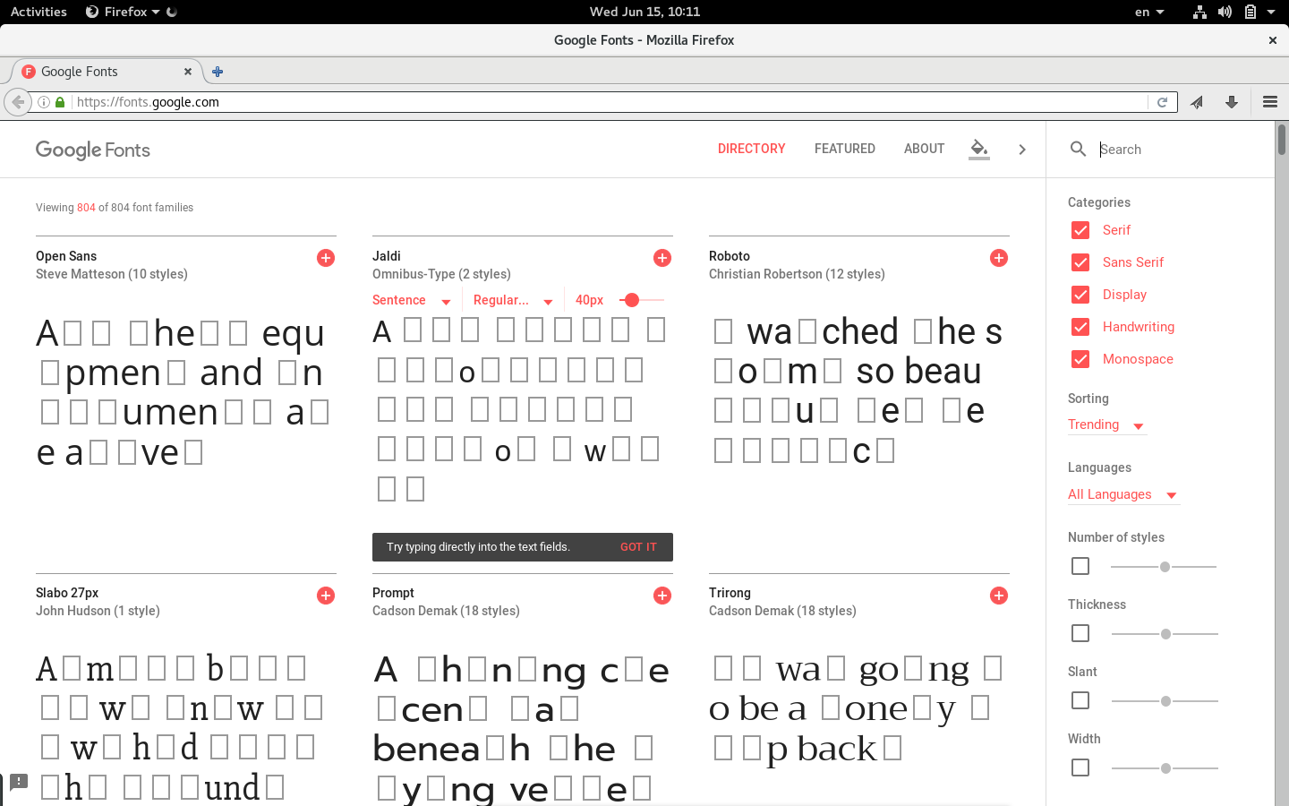
It looks like mad libs to me with all these little boxes in place of some of the letters. This appear to be little input boxes. You can grab and resize the box but it snaps back, you can also type in the box but it is quickly erased.
Minor criticism: the characters preview is a bit of a mess. Two issues:
1) You're missing important non-ASCII characters which I know are in some of these fonts (such as Open Sans). These include German and Scandinavian characters like ü ä ö æ ø å ß (maybe more).
2) The ordering is non-standard and makes it hard to see what is actually there and not.
They do provide proper cache headers. They cache the CSS for 1 day. The actual font files are cached for a lot longer than that.
The reason for shorter cache periods for CSS is that Google are continually making improvements. The font files are different e.g. for Mac vs Windows because they are optimized for platforms.
In general you will find that all URLs that are directly called from millions of websites (e.g. facebook SDK, Google Analytics snippet) have short TTLs. Makes sense when you think about it -- 3rd parties providing these resources need a way to stay agile and ship new versions without forcing millions of websites to upgrade their code.
Expires is a HTTP/1.0 header, Cache-Control is HTTP/1.1 and used by anything created in the last 10-15 years. Most sites set the Expires header similar to their Cache-Control max-age, but I guess Google just doesn't care and it doesn't really matter anyway.
Really dislike the ng-click navigation for opening individual font pages. Those clickable elements should be anchors, to allow opening the pages in new tabs.
There doesn't seem to be any usability case for breaking a basic browsing convention here.
this is an update i didn't know i wanted. so many great little UX improvements to my workflow.
an interesting aside, they now have the ability to toggle the background (and font color). the presets are (black on white, white on black) interestingly, one of the presets is black on yellow. i didn't realize this was such a a popular of a text/bg combination.
It's popular for display fonts and large headlines, there's been an influence of Swedish graphic design into the web lately and that's a common combination. Pretty effective for titles and headers with bold fonts.
Lovely redesign that addresses usability complaints I had with the old version. In fact I built my own search tool for Google Fonts a few months back because of these issues:
Isn't it counterintuitive that there are two scroll next to each other for smaller screens? And also that the one on the right is to scroll the content on the left, while the one on the left is to scroll the content on the right.
I congratulate the Google Fonts team The redesign job looks gorgeous and elegant in terms of UI and UX too but can I make a few suggestions if possible?
1- Can you please add a double view button at the top to toggle between «List» and «Grid» views for maximum convenience?
2- At the risk of sounding a bit pedantic but some example sentences for the Arabic fonts don't look perfect.
For example, for the «Amiri» font, it's الظلال أخفت القمر or more naturally أخفت الظلال القمر and not الظلال أخفى القمر
[1]. For «Lateef» and without going over a lot of MSA grammatical rules, this is the more correct version of the example sentence انطلق صوتُ مسجّل عبر مكبِّر الصوت المنصوب أعلى الباب.
[2]
[1] The shades hid the moon.
[2] A recorded voice went off through a megaphone/speaker mounted above the door.
Very good, but needs a option for resizing. I've tried looking at monospaced fonts and couldn't see them at a size that a monospaced font would actually be used (default is huge).
You can select a size for a given font by hovering over it to reveal the size slider and other options (desktop version at least), and then applying the size to all.
The font size slider is incredibly annoying. There should at least be a field to manually input a size as well. Having fonts jump from 8px - 22px with no space between is useless.
2. Different font files depending on... useragent?
I'd prefer to self-host so that I could user http/2 server push for new sessions, and so that I could extend the caching.
The same origin via http/2 would accelerate all of the connections, and removing the need for the additional TLS connection to 2 Google properties will speed it up too.
These are about my only criticisms of Google fonts, that the little bit to make it really useful for those who want webfonts and performance is the bit that's hidden.
The page has an interesting bug with some special characters... it will initially accept it, showing it in a different font, and then it will change to an empty box. I tried a few, such as ™ (trademark) or ∞ (infinity) and they don't show up on the initial overview page, but if you click on the see specimen link you can type the same characters and see that the font does have them defined.
fonts.google*.com is similar to the Facebook "Like" button.
Google effort to inject themselves into websites that may have nothing to do with Google, read by users who may not even use Google.
Users may be far from Google search engine page or any Google controlled subsidiary Blogger, etc., yet their Google-authored? browser is still connecting to Google.
These Google font domains are among the many useless and annoying domains I block.
I remember the days when another large company was pushing "Web fonts". They asked the user to "install" the fonts; there was no "font server" and incessant phoning home.
Today that company forces 10GB+ downloads of their "updated" OS on users without unequivocal consent. The stories of systems crashing in Africa under the load and network admins puzzling over the effects of massive Windows Update traffic in Australia have been amusing.
Keep up the great work guys. Those "web fonts" are really amazing!
These all look really bad on my Win 10 + Chrome machine. It's like the clear type settings aren't working right? Every font has a very fuzzy/blurry edge. Really weird. It's almost like it's rendering small and blowing up. Rather than rendering large and anti-aliasing.
> All the fonts in our catalog are free and open source, making beautiful type accessible to anyone for any project. This means you can share favorites and collaborate easily with friends and colleagues. Google Fonts takes care of all the licensing and hosting, ensuring that the latest and greatest version of any font is available to everyone.
Beautiful redesign! Very cool functionality with the inline editor and contextually revealed selectors.
...but they prevent you from right-clicking to open fonts in a new tab. I can already click into a font by regularly clicking, did they need to override right-click functionality as well?
Very impressive performance loading considering the number of fonts. Curious if they are just loading an incredibly stripped down version of each font for the preview and then lazy loading in the full font if you click to edit the text. Either way thumbs up.
First one always comes up in search results, and is nothing but a link to real page. What gives? This is terrible user experience, if I search for Google fonts, there shouldn't be multiple pages for same font.
I’m not sure why but interfaces that consist only of red and black text look very unpleasant to me. I felt the same way when Apple started using red and black for things like iOS calendar highlights.
I suspect the reason is that they are both strong colors that compete for attention: black-on-white is high contrast and red is a color that generally “jumps out” from the page due to the eye’s perception of red. To keep the colors from competing, one of the text colors should be softer (and if they must have “red”, they should soften it to something that is closer to pastel or pink).
Still they don't offer any font+css download opportunity in the way that font squirrel does. You have to do it by hand or be stuck with their CDN. How bad.
It's smaller than the big embed info screen, but there's a download button that gives you a zip of your selected fonts in the top right of the "selected fonts" dialog.
It's definitely an upgrade compared to the old version, but the fact that it needs a "Try typing directly into the... " hint shows the shortcoming of their UX. I didn't know what it meant, took me a few tries. I think it could be better. The hover of the fields should be more obvious that it's editable at least.
The original story I heard was that it encouraged people to stop using images of text on the web (which used to be a common way to get custom typography in pages). The images of text are hard to index and search because they would require OCR and would lose other possible semantic information that might be present in a textual page. So Google hoped that people would choose to use these fonts and then represent textual information as text rather than as an image. It seems to have worked!
I can't select 10 px font sizes with the slider on some fonts like "Space Mono." I can with others, and then can click the "Apply to all specimens" to update even the fonts I can't adjust with the slider control.
I wish you could filter fonts based on writing style; take the letter a for instance; there can be so many was to represent the lowercase; to get complementary fonts; it would be nice to filter on those characteristics.
1. I hate the lowercase L ("l") looking partly uppercase.
2. Dollar signs need two bars. (single means Mexican peso)
3. Half way up the at sign ("@") must have 4 lines, not 3.
4. The asterisk must be 6-point, with a vertical.
5. The tilde ("~") must be high.
6. The pipe ("|") must have a center break.
7. The zero ("0") must be more narrow/pointy than the O.
A "+" icon that has a hover state and an interaction, yet do different things? Good work.
Nice quotes are irrelevant if you can't get the basics of user experience right.
My bad, for anyone wondering the same, I just read the source and it's Roboto (which google uses a lot so I should thought of that in the first place).
This is very frustrating; can't middle click to open a specimen in another window. I really hate this sort of website. They also seem to disable subpixel antialiasing on some of the transient buttons. I also don't like transient buttons to begin with.
Overall really not happy with most of this redesign. The specimen page is probably more informative though.
I get that OS X has bad subpixel rendering which shows painful fringing on coloured text, but FreeType handles it flawlessly, and I'm pretty sure ClearType does as well. There's no reason to disable subpixel rendering on these platforms.
I found the non-paginated version to be very responsive and quick. Personally, I prefer non paginated results as long as they're quick, and some user testing studies indicate this as well[1]. UX folks seem to prefer not to paginate[2]. Who loves pagination? Usually advertisers.
Links from half a decade ago are irrelevant here. The claim that pagination only benefits advertisers is ironic, given we are discussing a Google page.
The point of pagination in this case is to reduce the client-side processing load and up-front bandwidth consumption to view the page. This isn't a news article. It's a set of nontrivial binary files being downloaded and rendered using javascript.
The OP of this thread complained that infinite scrolling plus lazy loading put his browser under heavy load. The first respondent accused him of wanting everything loading up front. I merely suggest a middle ground.
My only complaint with infinite scrolling is that it breaks the scroll bar. It looks like Google accounted for that here by pre-rendering placeholders so the scroll bar doesn't keep resizing and jumping around. (But this wouldn't work so well if they had, say, 10,000 fonts.) Waiting for dynamic content to fill in the placeholders is no worse than waiting for a new page to load.
I just wish we had a standard "lever" widget to replace the scroll bar in lazily loaded pages - similar to the middle-click scrolling on at least some systems that have middle mouse buttons.
* "All their equipment and instruments are alive." (Mr. Spaceship, by Philip K. Dick)
* "A red flair silhouetted the jagged edge of a wing." (The Jewels of Aptor, by Samuel R. Delany)
* "I watched the storm, so beautiful yet terrific." (Frankenstein, by Mary Shelley)
* "Almost before we knew it, we had left the ground." (A Trip to Venus, by John Munro)
* "A shining crescent far beneath the flying vessel." (Triplanetary, by E. E. Smith)
* "It was going to be a lonely trip back." (Youth by Isaac Asimov)
* "Mist enveloped the ship three hours out from port." (The Jewels of Aptor, by Samuel R. Delany)
* "My two natures had memory in common." (Strange Case of Dr Jekyll and Mr Hyde, by Robert Louis Stevenson)
* "Silver mist suffused the deck of the ship." (The Jewels of Aptor, by Samuel R. Delany)
* "The face of the moon was in shadow." (Mr. Spaceship, by Philip K. Dick)
* "She stared through the window at the stars." (The Millionaire's Convenient Bride, by Catherine George) ????
* "The recorded voice scratched in the speaker." (Deathworld, by Harry Harrison)
* "The sky was cloudless and of a deep dark blue." (A Trip to Venus, by John Munro)
* "The spectacle before us was indeed sublime." (A Trip to Venus, by John Munro)
* "Then came the night of the first falling star." (The War of the Worlds, H. G. Wells)
* "Waves flung themselves at the blue evening." (The Jewels of Aptor, by Samuel R. Delany)