In it, Dustin Curtis criticizes Google (rather rightly, in my hindsight-enhanced opinion) for a Marissa-Mayeresque design process of "Make 300 logo variants with pseudorandom permutations, and then pick your favorite." Looking at those permutations now (http://2.bp.blogspot.com/_7ZYqYi4xigk/SEnK37orPGI/AAAAAAAAAp...) it's obvious (again, with the benefit of hindsight) that they were all very inside-the-box. Apparently nobody even considered trying a different font.
The reason they did that was so that they could build up data on the effect of each factor independently. That way, when the bigwigs get into a meeting and discuss alternative designs, they can predict "Ok, this will have $X effect on revenue but will decrease search latency by Y ms, which itself will have +$X effect on revenue."
I was the first engineer on the first visual redesign that tried to change everything about the page [1]. One of our biggest problems was that since we tried to change everything at once, the metrics went haywire, and we couldn't know if a change was because we introduced a left-nav (okay, actually we kinda could, because we'd experimented with a left-nav on its own beforehand) or because we changed the line spacing or because we cleaned up the logo or because we added icons. There was effectively no way of "debugging" the user; when user behavior varied from expected, we didn't know why.
I've got plenty of other stories from that era, but they aren't really fit for a public forum. Happy to discuss privately. (Kinda ironic when the non-Googler says that to the Googler...)
I'm surprised no one on the team was familiar with multivariate analysis. That's the wrong way to say it. Let me rephrase more carefully...
I'm surprised no one used more sophisticated analysis techniques to allow an experiment that changes many explanatory factors simultaneously and estimates the effects of not only each factor independently but also their interactions. It's relatively straightforward statistics and would have been taught to clever undergrads or first-year grad students who specialized in math, economics, machine learning, industrial engineering, etc.
There were stats Ph.Ds on the team that were certainly familiar with it, and I knew at least one former Amazonian manager that held that we were too afraid of having multiple experiments running at once and too afraid of confounding factors. (Amazon's A/B testing is much more traditional split-testing, where they show one variant to half the population and one to another half and then pick the best one.)
The biggest problem is that many of the folks involved had encountered very surprising and counter-intuitive interactions between features, and because of that, they didn't trust the textbook models. For example, at one point we had a very convenient embedded-Python experimentation framework that let us rapidly try things out. Our main data-scientist on the project decreed that we were not to use it, because a number of the externalities that framework introduced - higher latency, and potential error conditions - could confound the metrics in ways that were not well-understood at the time. Data is useless unless you can trust that it actually represents reality.
Stats textbooks all make certain assumptions about reality when they present the models, and if reality doesn't conform to the assumptions, the models won't conform to reality. Certain factors were well-studied enough that we could build useful models from them - that was the point of all the experimentation around color, after all. (I wonder if those conclusions still hold, anyway: data has an expiration date, and I recall personally running an experiment that directly contradicted an experiment Marissa Mayer had run 6-8 years previously.) But that requires a lot of hypothesis testing and verification: it's never a matter of "well, the model says so, therefore it must be", but rather "well, the model says so, let's run an experiment to see if the model's predictions line up with reality, and if they do, we have a pretty strong - but not ironclad - indication that we can use it for future calculations."
tl;dr: Largest and best-funded social science program I've ever seen.
> tl;dr: Largest and best-funded social science program I've ever seen.
I don't want to sound like a hater and I'm very well aware of the fact that some design choices might have affected the company's revenues, but all this discussion involving very smart people discussing what, from a very "outsider-ish" perspective, seem like trivial issues (the color of the letter G, for example) reminds me of Herman Hesse's "Glass Bead Game". (https://en.wikipedia.org/wiki/The_Glass_Bead_Game#Plot)
>Largest and best-funded social science program I've ever seen.
You should check out Facebook. There emotional manipulation studies are horrifying, but they certainly have access to many more person hours of time and collected data than Google does on end users.
I understand the urge to try to maximize on stuff like this, but in the end it loses sight of what's most important: the quality of the results. And sometimes I feel that a lot of valuable engineering time and effort is wasted on making things prettier and better monetizing in the short term when in the longer term the better search results are what would really move the needle.
And most A/B testing focuses on the very short time effects of the change (and change all by itself, even change for the worse can have a short term positive effect just because something is new). On another note: A/B testing has another limitation, which is that you're optimizing for the bulk, please one person more and you more or less automatically annoy another.
There are plenty of talented people working on ranking and webspam too.
There's a limit to how parallelizable those problems are. At some point, more people working on an algorithm doesn't make it faster or better, it just makes it more confusing and worse. Mythical Man Month applies as much to Google as it did to IBM. And so you might as well put people onto optimizing the rest of the page as well, because they'll do more good there than having yet another cook in the ranking algorithm kitchen. (I'd argue that there are too many people working at Google in general...I left, so I'm no longer contributing to that problem. But then, there were probably too many people when I joined, so I contributed to it for 5 years.)
The worst limitation of A/B testing is that it's not producing anything better than a local maxima. Nature does indeed work like that, but it took millions of years along with random mutations and we don't have that much time. And if in our thinking process we would have relied on optimization algorithms favoring the local maxima, then Jazz wouldn't have been produced, amongst others.
Can you offer any perspective on the whole sometimes-named "mystery meat" UI that's been rolled particularly but not only into mobile design over the past half decade?
Further, more and more of this seems to have been "backported" into traditional desktop presentation design.
While I will experiment around until I more or less "get it" (although I may miss finding some useful features for months), it particularly frustrates people like my parents. Mom is somewhat spatially challenged (although plenty bright in other ways), and I've had numerous calls with her where the controls for what she wants to accomplish have changed and simply bewilder her. AND, given her spatial orientation problems, sometimes we will have to have the same conversation several times -- because the rather arbitrary-appearing icons and patterns don't immediately "sink in".
P.S. I mean this as a legitimate question, if it fits the parent's -- or others' -- field of experience. It seems that a lot of this design is expected to simply permeate and be picked up by osmosis. Is that really the case?
I'm curious what you mean by "mystery meat"? I assume it's the use of icons and drawers to trigger functionality rather than labels and links?
That's driven by screen size - there's simply not enough screen real estate on a phone to label every button with words. It does have a legit discoverability problem, which most folks in UX acknowledge but don't know how to fix, given other constraints of the media. I've seen a bunch of mobile apps with help overlays or tour videos the first time you run them, which can help a lot. It gets back-ported to desktop apps because once people do learn the functionality, it leads to a cleaner, less cluttered UI.
I'll also point out that early PCs had the same problem. A typical PC from the early 1980s had 320x200 resolution, a little less than a smartwatch does today. For most of the 80s and early 90s, the standard was VGA (640x480), slightly smaller than most smartphones today. Icons were really common back then as well, they weren't all that discoverable, but at least people read manuals occasionally. Most folks don't bother now. Menus were another response to that problem, but they don't really work on mobile because the tap target is too small to efficiently hit it (the navigation drawer & hamburger menu is the modern-day equivalent of the menu).
The web - with its inherent discoverability and all of its space for explanatory text - didn't really become popular until 1280x1024 displays became widespread. I remember designing webapps for 800x600 screens; it was painful, and they had discoverability problems too.
Well, a, um, "literal" example was the initial occurrence of what I've just learned is called the "hamburger" icon/menu. Which was "backported" to Google's desktop designs.
A particular instance I recall was changes to the Calendar web page presentation. Mom initially struggled a fair amount with the controls in the left bar for selecting which calendars were displayed. This was in a Google Apps environment with 20-ish people participating.
I remember when screen presentations could be somewhat cryptic -- per your description as well as other instances. But, as you point out, there was usually a manual. Now? Often it seems to be down to guessing and poking around. Or asking friends. But if you are a bit older and not constantly talking over such things with your friends, that means of edification is somewhat starved.
P.S. Thanks for the response. And as I said, I'm curious about the perspective of someone on "the other side". I'm not trying to be unduly critical, here; just, this is an issue I've consistently bumped up against, from my own perspective.
> That's driven by screen size - there's simply not enough screen real estate on a phone to label every button with words. It does have a legit discoverability problem, which most folks in UX acknowledge but don't know how to fix, given other constraints of the media.
Some of the most effective solutions to this I've seen require solutions beyond visual representation. They address the problem through dimensions independent of viewport size and space.
For example, LukeW's "Don't Divert the Train" http://www.lukew.com/ff/entry.asp?1798 moves content from behind navigation and into the user's already-occurring action stream. The button is removed entirely, as is the designer's need to consider how communicative icons are for representing actions.
This requires a broader view of how features relate to each other through a design process that discovers other paths to successful behavior. Approaches like the hamburger menu, in addition to the usability issues you note, solve functional goals but have fallen out of vogue for their ineffectiveness at encouraging specific actions. Label-less icons, while attractive and convenient, suffer similar problems. As getting users successful quickly is generally an important goal (before they've internalized your app's unique visual language), the current trend of putting core functionality behind opaque symbols seems counterproductive.
Another thing I'm now reminded of is, on Android, the... functionalization/clickification of text.
Some text is active, other is not. I don't see any visual cues that distinguish the two. I end up just poking at text, or thinking, "If I were designing this, I'd want more detail or a link to further controls." In the latter case, sometimes I find I was thinking the way the designer/programmer was, and that text does indeed lead somewhere.
For someone who doesn't "think that way", this is more of a challenge.
This also seems to have become more prevalent in desktop / full screen design. Stuff that doesn't look "clicky" is.
I think that was one of my mother's problems with changes to the Google Calendar web page UI.
I worked at a major tech company where every decision needed to be justified by AB testing. Our design was a series of haphazard guesses made on data that depended on a very brittle data pipeline. Needless to say, nobody thought it was a very good product, but the incredible bureaucracy and people behind the approach made it hard to fight against.
It shouldn't be a problem. In science, everything must be tested and proved if you want to know the truth or the effectiveness of an theory. Design is a science, so it can be measured and developed by tests of all kinds, even emotionals.
Whereas a design studio with sufficient resources should fare better with a data-driven approach, a sole designer or small team with time and feedback constraints will probably do better with traditional methodology. Traditional methodologies might have certain quack dogmatic rules and processes, but it offers a battle-tested baseline.
> One of our biggest problems was that since we tried to change everything at once, the metrics went haywire
Isn't that the problem with empirical methods in general? They are great for measuring the effect of small simple things (like small changes to a web page), but are much less effective in measuring bigger things (like say, programming language A vs. programming language B).
Absolutely. Business is an interesting field because you derive a fairly large advantage from being correct about reality, but that advantage counts for nothing if you're so slow that somebody else changes the reality while you're figuring it out.
I'm not sure how it works at Google, but adding a random query string usually helps because of how proxy servers handle caching. Proxy servers usually treat an URL with different query string as different resource and cache them separately (e.g. /posts?page=2 is definitely not the same as /posts?page=1).
This is not only applies to caching by ISP, but also includes caching by the website itself as well (some websites put proxy in front of their server to cache rarely changed portion of the site, or even using CDN.).
Anything after "?" is a query parameter that the server can read and then apply additional logic to for a response. In this case, they have code that responds to new logo and returns the new logo instead of the previous one.
It's actually not querying anything, since it works for any query you pass. What happens is that you're bypassing cache because you're loading a different page, as explained by sirn above.
But all three logos were designed and introduced at the same time as their corresponding favicon. Your claim was that the favicon was just a copy of an existing part of the logo.
Your claim was that a favicon could be a different font than in the logo. But these examples are all a part of the logos. Google would have needed to rebrand their logo to do the same.
I think you're mistaking their symbol for "a different font". Each one of those has a logotype and a symbol, which make up their visual identity (the word 'logo' is used interchangeably for those, or their combination). They are merely using the existing symbol as favicon - the stylized N/B/B. Google's symbol at the time was the uppercase G in the same font, so creating a new one for the favicon would be considered a rebranding.
But it's just an image right? Does the browser decide to treat the image different because of the format or the extension? I'm pretty sure you can use png files as favicons if you want.
Anyways I tried it in IE, including restarting it and it still showed the old lowercase g.
I've never understood that criticism. Business decisions should be data driven. You test new signup flows to see which one onboards users better. You test advertising changes to see which one converts better. Why should a logo design or a title bar color be any different? Without testing each iteration, how do you know which one has the best effect on whatever success metrics you're using? I can understand if you're worried about optimizing to a local maxima, but that's not a criticism of A/B testing, it's a criticism of the diversity of the available inputs.
User testing is great, and very useful for so many people.
BUT, when you're the size of Google, or Facebook, or Microsoft, Things look a bit different.
Most people are far more conservative than they realise, but also, perversely, adapt quite quickly to change if they experience it day-to-day. This means that if an interface has enough inertia, then a change that performs badly in user testing, can actually quite quickly be accepted by people. (PROVIDED it's actually better).
In the first example, every change to the Facebook UI is met by a barrage of criticism and hatred, but they seem to actually make good decisions, so the changes get absorbed by users, and things continue.
Having said that, Microsoft struggle, because they often make changes that are fundamentally bad decisions, and have to back-down. For example, the Office ribbon took a while to be accepted, but is /generally/ liked nowadays by people, because it was functionally a good change (yes, some people will disagree, but the majority wins on this front). Taking broad user testing results on the ribbon would probably have stopped microsoft from progressing with it. On the other hand, the 'Metro'/Tile UI in windows 8 was an actual usability disaster, and has forced them to revert to a more common pattern until someone can design new metaphors that actually improve usability in windows.
Finding test subjects that aren't used to, and comfortable with, the google font/design styles, to give objective feedback on a change, is really hard.
[ I didn't mention first time round, but I /really/ don't like the new logo, that lowercase g makes me cringe inside every time I see it. ]
The evolutionary, data-driven approach will never yield a Nest thermostat, iPhone, Helvetica, or flag of New Mexico. We have no idea how to even begin to write a fitness function for good design.
I'm not sure where you think taste comes from besides evolution of ideas and data analysis done by black-box functions inside people's heads.
Formalizing that process and using externally-collected data is just de-black-boxing something that happens in a black-box form in the professional's mind.
Also, making decisions based on wishy-washy difficult-to-quantify human traits like "genius" and "sense of taste" seems unnecessarily risky, compared to making them based on measurements from repeatable tests.
I'm not advocating design by committee. I'm advocating justification with data. The designers should propose candidate designs. But the decision about which one to go with (or whether to redesign at all) should be supported by whether going with it furthers the business's goals.
You point out the need to pick the right measurement, and I agree, but it could be as simple as "What's the effect on conversion?" It has to be something! You can't just say "We're re-designing because I'm a HMI genius."
When a company is capable of replicating those black-box functions as an algorithm or business process, then it will be ready to launch the era of automated design.
Until then, the best known way to design something nice is to hire a talented designer and trust their instincts.
> The evolutionary, data-driven approach will never yield a Nest thermostat, iPhone, Helvetica, or flag of New Mexico
...for now, given today's technology, but I wouldn't bet on it long term. History is full of examples of things we once thought only humans could do.
But once many candidate designs are available to choose from, what better a way is there to unambiguously decide on the best besides testing and measuring?
As I said, the problem is writing the tests and knowing what to measure. How do you discern between a bunch of tests and measurements that are poorly-designed, and a bunch that are well-designed? You gather a bunch of people with good taste, and trust their gut.
But at that point, why not just cut out the middleman, forget the tests, and let the artists be artists?
signup flows to see which one onboards users better.
The trick is: there is no global "better" — only 'better', given a specific group of users.
Which users though? Running a million 40 year olds from Iowa through your website flow will generate a widely different result from running a million 13 year olds in Atlanta through the same process.
Google is still stuck in the "one design for everybody in the world" mindset, so they have to be appealing to everybody, which naturally makes them bland.
success metrics you're using
Success metrics! The paradox of these hyper-optimization methods is they largely apply in hyper-trivial situations. Once you are big enough, you just tell people how things will be. They don't get to have a say anymore.
And you can't rely on past data to create new trends because that data doesn't even exist.
Data said that children's books don't sell. But then Harry Potter happened. Data also said that people loved phones with keyboards. Then the iPhone happened.
I love it. Quite often logo redesign processes gets completely out of hand, but this was a significant improvement over the older version: Cleaner, more modern and beautiful in all its simplicity. Bravo!
I don't like it. It seems more juvenile in the same way comic sans gets criticized for. The loss of character on the lower case g is especially unfortunate.
I really like this new look, but really hated Facebook's move away from Klavika earlier this year. This to me feels more friendly, fun, and still has personality whereas I feel Facebook's new logo is dull and lifeless.
It is because the terminal cut of the g attempts to geometrically bisect the bar of the e, whilst simultaneously trying to resemble a smile. Those are irreconcilable design objectives. The capital G is still wasting vast quantities of space. I agree, overall, this new typography has a kindergarten aesthetic. It's not for me, certainly.
However I think the colour blocking and letter shaping on the new favicon is superb.
It seems off-putting right now, but even the Airbnb logo redesign has become less offensive looking over time looking so I think people will adjust to Google's new logo and look back and see the old version as outdated.
The smaller version of the logo looks just like comic sans to me and if I'm not directly looking at the bigger version I also see comic sans. I am really not liking it.
I agree. Material design to me seemed like a great step as well. The different looks between Google products didn't seem so bad till they started to move everything over to material design and I realized how fragmented the previous designs were. Didn't even see the problem till it was fixed. slow clap
That seems like what they're aiming for? Seems to go against the seriousness that they seem to be pulling into android's mechanisms, but it's in line with historic google as a "fun place".
The sloped crossbar on ‘e’ is characteristic of early Roman typefaces of the so-called Venetian or Humanist class¹, which were inspired by Carolingian script².
Catull³, the font on which the former Google wordmark was based (it's not exactly Catull — some details are simplified, like the serif edges being snapped to 45°), is actually closer to the script than to typical Venetian typefaces — which, once you've seen the whole thing, blows the idea of the old logo looking ‘more professional’ out of the water, unless your profession is ‘medieval scribe’.
I think these things might make a small difference but overall it's not important.
I view Heineken as a boring lager which has little character, probably due to being produced in industrial quantities. A jaunty 'e' isn't going to fix that.
Same for google. So long as they continue to bang out appropriate search results I'm with them. Right until they don't.
Logo design and typography are intended to affect you subconsciously, not consciously.
That tilted 'e' is meant to advertise the brand in the middle of dozens of other logos in the store, and draw consumers in from that myriad of choices based on psychological cues and associations they may not even be aware of. The effect is important in aggregate - some large number of potential customers conditioned over a lifetime of advertising to associate different typographic styles with emotional states and narratives being slightly more conducive to pick your beer over others than they otherwise might have been, because now it's 'nicer.'
Objective support for this hypothesis is thin on the ground.
In reality logos are nowhere near the top of the list of factors that drive a buying decision. Whatever bounce effect businesses get from a new logo can usually be explained just as much by novelty as by implied psychological voodoo.
Generally, I'm suspicious of management-by-logo. When I see logos being updated at vast expense for no good reason, I worry about the direction a company is heading in.
> In reality logos are nowhere near the top of the list of factors that drive a buying decision.
Great. Then replace the Chanel or Louis Vuitton logos with a bright primary colored Google logo, and see what their purse sales are like a year from now. I'm sure millionaire socialite women would love to have their bright red-blue-green-yellow logos on their Saint Laurent jacket (although it would be perfect for Moschino...)
Sorry dude, but you're over thinking this. Logos are part and parcel to brand identity, and everything about branding determines sales.
If you don't have a good logo, you don't have a good business.
> This is a false comparison. Logos for clothes sit on the clothes which are themselves judged entirely on their appearance.
Some do. The vast majority of designer clothes don't.
People buy the brand, not the product.
> Google's search engine has a separate function that stands on it's own two feet irrespective of a change to an 'e'.
People bought into the Google brand identity. They were the first to eliminate all the crap around their web search engine, so it would just be a single text box. This made sure people know what Google was - the simple search interface. All of this is part of the brand's visual identity.
Do you think they do an empirical study on this when they first made it?
It is your brand that sells your product.
The shape of the letter 'e' is part of that marketing that sells your product.
In fact, EVERYTHING you do is fundamentally related to sales. You are always closing.
This is backwards - the product sells the brand. Brands do not just come out of nowhere; people have to like the product first before they can establish loyalty.
Their brand is having a very good search engine. Ever think that the marketing guy is good at persuading you that the marketing guy is the most important thing?
I agree. In fact, I half expected them to write alphabet (name of the company). I wasn't aware of the new logo and had browsed to Google.com to search for something.
I agree ... but this is just the price for showing up at this level of the game. It is of course a major effort for those professionals who executed on it, and is beyond my capabilities - but it's not strategic level stuff - just like stealth fighters are not strategic level stuff anymore.
(My previous and clearly downvote-magnet post that is a little more detailed):
An updated, simple look and feel is not a matter for congratulations. Look at stealth airplanes. If you don't have a stealth warplane, the modern SAMs can take you out no problem, with stealth the odds are much more in your favour. Stealth tech is the table stakes, the price any superpower or superpower-to-be must pay just to show up.
If Google had not done this, or had done it badly, then we would worry. Behind the scenes many many professionals worked hard to make sure it went well - as expected.
This is something I personally would never achieve - I could not steer a multi-national rebranding. But Google has to - it's the price just for staying in the game.
So kudos to those involved, it took years of your experience and effort. But for Google, it's just what needed to be done to keep up. And if we should not be distracted, internally they really must not be distracted.
Google's userinterface, in gmail.com, at least, has gotten progressively worse, and worse, and worse, and worse since its inception in my experience and everyone I've asked about this.
... don't know what else to say. I question if their designers use their own products.
Latest bugs worth mentioning: Chrome still has an issue that can cause microphone to not work in Hangouts. Gmail.com has added a "Your plug-in google talk will no longer be supported soon" ...
In their bid to keep things clean and automatic, they really made everything more confusing. I know people who have gotten lost because they didn't realize Google maps was hiding directions. They always try to do things instantly instead of letting the user press enter. (This is especially annoying on Google Express.) There's something to be said for the old web when you clicked and then got results...
I hate that feeling of having to type as fast as possible, so the instant fetching won't waste bandwidth or distract me before I've finished giving it all the information it will need. Multi-step processes like getting directions can be annoying this way, as it reloads every time you change a parameter (like entering an address, swapping source and dest. addresses, or changing transportation mode), so if you have to do all three to get what you actually want you're really going to be waiting. Am I just a weird user? I mean, I know my frustration isn't very rational, but is user frustration ever rational? It hurts the product either way.
Sometimes I just do a general Google search (from Chrome's omnibar with Instant searching disabled) for the directions I need. It usually auto-detects it's a maps query and has a card ready to go with options. Then I don't have to wait for suggestions to load or for the map to pan around.
What changes would you make to Google Maps, with a basic set of assumptions? (let's say, you can't dramatically increase the cost, you can't hurt Google revenue sources, and you have a team of ~20 engineers to work on the changes).
I'd change it back to the way it was prior to the redesigns.
It used to work fine. The big problem with the current version is the almost complete absence of legible affordances.
There are all kinds of buttons with logos on them that do stuff. But until you learn what they do, their functions are mysterious.
Basic things like Traffic used to be obvious, one-click features. Now they're hidden in the burger menu, so at best they're two clicks away, and at worst a non-trivial percentage of users has no idea they exist. (Etc.)
I second all of the above. For me, though, the major regression is the priorities of the search field. Prior to the redesign Maps seemed to know the exact location I needed regardless of the amount of detail I included in the query (i.e. tossing in the name of an intersection without street/ave/blvd info). Now, I seem to need to almost always include exact details (zip, precise USPS-blessed street address) for it to find what I'm looking for.
Not all the time, but enough of a difference that it feels seriously hindered post redesign.
Sticking the UI over top of the map really is silly. The 10 pixels of map I can still see between the search box and the border of the screen are completely useless, but make the page considerably noisier (more edges/transitions).
I too enjoyed the side bar. It's mysterious but it made me feel like there was more real estate. The map wasn't covered with boxes, whereas in the new design the 40% left handside of the map is unusable. Also, when searching a place, it resets the zoom, it zooms until I see the inside of that place (such as, the city center), whereas I generally want to see where the city is located with a bit more context. Same for a path: it puts the origin and destination on the viewport edges, whereas I generally want to locate the route, therefore see slightly more context. Slightly enough that it's painful.
I have no idea how to switch between satellite and map view. I have no idea where to look for that option - or if that option exists. There's a burger menu, so I tap that. There's a list of options. Satellite is in that list, and is highlighted. The option I want, and I don't know what it's called, doesn't appear to be in that list of menu items. I tap the map to collapse the burger menu. I hold the screen then release. A pin is dropped. I don't think I want a pin, but I have no idea how I dismiss the pin. When the pin is placed a small thing pops up at the bottom of the window. None of that looks relevant. I, completely accidentally, pull it, and a bit more appears. None of that is relevant either (but now I've accidentally discovered how to get street view). I pull it again because something happened the first time and yet more stuff appears, but nothing relevant. I realise that it can't be this hard, so I go back to the burger menu and unintuitively click "satellite". I don't want satellite, and this menu item is already highlighted, and it never occurs to me that someone would put a toggleable item in a list of menu entries without any indication that it's a toggle. But bamn there it is.
So, how would I change Maps? Just put a few more affordances in there. Maybe watch how people unfamiliar with the app try to do stuff.
There are lots of things I like about maps. There's some churn in businesses on my street and maps always seems happy to change info.
In the past there was a ton of research into user interaction with UI. Obviously loads of that fails on mobile, but Google is a smart data driven company that could create a new body of work for mobile.
I know you're making a bigger point, but just in case you are still wondering: have you tried to touch the highlighted satellite option again to unhighlight it? Some of the items in that menu enable and disable layers. Satellite is one such layer. Keep in mind that some of the layers are mutually exclusive, so you can't have public transport layer and traffic layer, which probably makes sense as it avoids cluttering by layers which are rarely needed simultaneously. This was confusing to me until I got a hang of it. This has been the case on Android for a while, but I have never tried the iOS app, so its behavior may be different. Besides that, I get your pain about pins being dropped whenever the map is touched (or clicked on desktop) to get rid of drop-downs and menus.
I hate the dynamic dialog underneath the map search box that automatically shrinks and expands in and out with various location information on it. It seems to always close when I want to look at it, and expand to cover the area of interest when I don't care about the info. A user has to spend some time trying to figure out the rules when the dialog expands or contracts or fight the logic... I would much rather prefer maps take a dedicated portion of screen for that info, and let me show or hide it explicitly.
This is a huge pet peeve. Things growing and shrinking as you click on them. The link is in one place when my brain tells my finger to click but by the time the mouse button is depressed the link has moved somewhere else.
I guess it's just the sacrifice we make for a cool looking web page.
1. Ensure you can enter two addresses into the search delimited by " to " and it be able to correctly split into directions, as you would expect. I tend to expect this to work and it took maps messing this up several times on different occasions to burn it into my head to put the destination address in the search, then click on directions, then enter my starting address.
2. If I type in "from (address)" and search it should show my address in the top of the directions from/to and focus on the "to" field. This is really broken currently, because it always seems to think I want directions to somewhere instead of from. Similarly, if I type in "to (address)" it should open directions and place the address in the correct field.
3. Sometimes the "near me" feature doesn't work. Try it with all sorts of things like "bathroom near me" and see how well it works.
Speaking of mass transportation, it'd be great if Alphabet could spend some money and effort on that. It makes much more sense from a business point-of-view than Google cars do- how much more R&D money is going to be sunk on that before all is said and done? Will it be worth it? Electric cars have to get their energy from somewhere, and everyone having their own car takes a toll on the environment. I understand it's a big place, but if you have the money to roll out fiber and wifi everywhere, you can buy buses, which are much cheaper.
Does GMaps use WebGL? I remember a brief moment in time during some WebGL beta when everything worked incredibly smoothly: scrolling, zooming, you name it. Personally, my main frustration with GMaps is the lagginess, as well as the fact that it looks interactive while it's loading the initial tiles, but is in fact just a series of still images.
- Stop forcing users to sign into google maps mobile just to save their home/work directions. They took that option away and it's infuriating to old farts like me that I will _deliberately have a worse experience_ just so I don't have to sign in
- Stop hijacking basic user interactions like the mouse click. On desktop, if you click the map it will reverse geocode where you clicked (and show you the nearest road to it.) Although I understand the utility of such a feature, I have never ever wanted that. I live in NYC and no one has a car. I just want to change focus off of the constantly expanding and moving navigation window thing. I search for something, then click the background, and now my search is gone. Then I click the location area to get my search back, and nothing happens. I click the background to get rid of the stupid useless direction window, and now everything is gone. Oh, except the thing I clicked is now reverse geocoded for me. Infuriating.
- I challenge people to do the following on desktop: share a location in the middle of a park (hint: drop a pin first)
I (and all my friends) switched to here.com maps after Google has horribly old (2005) data, has a horrible UI, and is generally unusable. In many cities in my region whole districts are completely missing from the maps[1], MapMaker is not available, and in general it’s just a huge mess.
Even worse: It loads so slowly (compared to here.com or bing.com or openstreetmap.org) that sometimes it takes several minutes to load an area while competitors load instantly.
And then there are cities where Google tried to add the new 3D buildings, but the result is so horrible that the satellite view is not usable anymore, for example Vienna [2]
- Allow the user to turn of 3D buildings. They are annoying, kill loading times, and are buggy and just a mess of polygons that looks more like abstract art than buildings.
- Use recent satellite imagery. When Bing and Here maps have images that are 10 (!) years newer than what Google uses, it’s just inacceptable
- Stop having a UI where everything changes while people click on it – Google’s own guidelines say that you should keep stuff predictable. Especially due to the slow loading times people often try to click somewhere, while they try to click some box moves, and they click something completely different. This is extremely frustrating, I’d even begin to call it clickjacking.
See? That’s one of the largest issues. Totally useless UI, no one finds any option. Thanks, btw, but that still doesn’t fix the satellite imagery from 2005 or the obscenely slow loading times (and extreme performance issues, Google maps is just soooo slow).
I, and everyone I know now switched to here, and we’ll probably stick with that for the next years.
It's mostly functionality that was available in earlier versions, but I cannot find it anymore (or is it gone?):
- goo.gl-Link to this map
- Terrain-mode
- collapse white search box w/o loosing all entered data
- enter 'from:xxx to:yyy' for navigation
- extra stops (routing)
The best thing about maps that I really love (and why I am willing to fight with the UI) is the address recognition: I can put almost anything into the search box and it will find the address I had in mind. No street/city separation, no extra box for businesses, no strict order of name, address, zip code, city. And if it's unclear to maps, the suggestions almost always include what I had in mind.
- goo.gl-Link to this map: burger menu, share, short link
- extra stops: once you've set up a basic route, a little plus appears under neath the red target marker in the dialog box, however, this does not seem to work with public transport routing
No idea about the other ones. Personally, I'm slightly miffed about the fact at some point the keywords "home" and "work" stopped working, or that Gmaps sometimes accepts English words in the search query (as in 'X to Y'), but sometimes only German words ('X nach Y'), despite my OS and browser language set to English.
"Home" seems to be ok but "home" just gives me Home Depot results. Though if it's a Thursday or for some reason cloudier than normal "Home" will also give me Home Depot results.
* Disable that "feature" which rotates the map to show directions based on which way I'm facing. Why? Because a) I know my directions and b) GPS is frequently OFF and it rotates all screwy.
* Remember which city I'm in and index search results FIRST against my historical results and SECOND against local results and LASTLY against the world database at large. It's very frustrating re-opening google maps app, tying in something I queried for 10 minutes before and it starts auto-completing to somewhere across an ocean or two.
No more attempting to make things 3D when you zoom in. Way way too slow.
Scroll wheel should zoom in instantly (go to maps.bing.com for how to do this a little better, though to be fair to everyone Bing did take a step towards Google in the last ~month with their maps update and it is much slower. It used to be open as soon as you hit enter in the address bar)
Generally the maps could label streets more frequently. Far too often I'm confused about what street I'm looking at because the label is somewhere off screen.
b. On Android, add a menu option to download maps - "OK MAPS" is not obvious, easy to remember or in any way sensible in the slightest.
c. Make 3D mode work smoothly on an Android tablet. I have the LTE version of the Samsung Galaxy Note 10.1 2014 edition and it is jerky, stuttery and slow in 3D mode. Compared to Apple maps on the base model iPad3 next to it, it is poor indeed.
I've never, ever used Google maps on a computer and had it work well. It's always at least a little laggy/slow even on a 60Mbps connection on a nice laptop.
Honestly, I have an ~110Mb cable connection (From a fast CDN I can acheive downloads in excess of 13MB/sec) and new Google Maps is still a dumpster fire that is inferior to old Google Maps in every way I can imagine.
Ditto and I have a gigabit connection. Slooooow. I just profiled the maps start page and it transferred 2.5MB in 182 requests and took 2.56s to load. This compared to 544ms for the Google homepage. It's like their optimization team never got invited to Google Maps.
Google Maps on the iPhone really is awful. Sometimes you swipe to close something, sometimes you click a teeny tiny little x, sometimes you click a left arrow as in going back.
I (and all my friends) switched to here.com maps after Google has horribly old (2005) data, has a horrible UI, and is generally unusable. In many cities in my region whole districts are completely missing from the maps[1], MapMaker is not available, and in general it’s just a huge mess.
Even worse: It loads so slowly (compared to here.com or bing.com or openstreetmap.org) that sometimes it takes several minutes to load an area while competitors load instantly.
And then there are cities where Google tried to add the new 3D buildings, but the result is so horrible that the satellite view is not usable anymore, for example Vienna [2]
Apropros of the other Google thread today, the here.com link completely fails: it shows an full screen ad for the mobile app, with no way to get to the map.
I agree and I wish I had insight into what exactly is going on inside Google. A couple of hypotheses:
1. Someone (or a group of people) within mistakenly believes this design aesthetic[1] is good and have gained a lot of political power. I guess they like things that look pretty in screenshots instead of things that are actually useful or intuitive?
2. They're heavily optimizing for some metric (engagement, user growth, whatever) that is orthogonal to (or has a small component along) the usability vector.
[1] Simplistic defaults, not easily configurable, flat, tons of whitespace, etc...
Well, you didn't ask me, but I think it's gotten progressively better, and better, and better. Different, sure, and if your definition of worse is "different than before", well, you aren't going to like it.
The nine dot menu instead of a small header row was a terrible change. First because it is an extra click every time for a commonly used task and second because no one had any clue what the hell nine dots were supposed to mean. A friend of mine that worked at google told me the official name is "app drawer". I have no idea how that's supposed to look like a drawer.
More generally the entire move from words to pictograms looks to me like a regression to a technology that was superseded by a superior one 5000 years ago.
Really? That seems smart to me. How often do you use the links in that drawer? Seems better to remove all that text up top and replace with a small icon for something that is rarely used.
Every time I want to look at my calendar I need to re-remember where the hell they hid it at.
I expect it to be in the drop down on the left, since Gmail and Google Calendar are otherwise so well integrate, but nope, it is hidden in the little square.
The first couple times I had to actually Google how to access my calendar from within Gmail (I can always go to calendar.google.com of course)
Ugh, you definitely do not use more multiple google services if you think that.
Even today, years afterwards, I was on the phone checking my calendar and I totally lost the train of the conversation as I was hunting in that dumbass thing for the calendar.
The worst part is that, yes, the top was getting stuffed, but instead of letting you choose what you wanted in your menu, they added that navigation monstrosity instead.
I just find it bizarre the number of people that do this. For me, I open a new tab, and start typing "calendar.google.com", but I don't even get past c or ca on most computers before it autocompletes.
And can't you customize that menu? Just make it work for you.
Wow, this menu is so useful! I got annoyed when they removed the links to the different apps and just assumed this 9 dot thing was a part of their new account switcher design and never tried clicking on it.
It requires three clicks to edit the subject line and I still sometimes click in the wrong place trying to find it and I've edited subjects dozens of times. It also requires it to open in a different editor. The default reply window is a tiny piece of shit by default. They added the stupid tabbed system that I turn off every time I have to make a new gmail account. It's not always clear whether I want Google or Gmail settings to change some preference, and the buttons for them are right next to eachother. Hangout chats blink until you click within that specific hangout box. I can't even find the option to link GMail accounts but I know I've done it before. If you hit reply and make no changes then close it, it saves it as a draft. Spam and Trash folders and all labels are hidden by default (have to expand). I could go on.
When you say gmail.com has gotten worse, do you mean the overall quality of the application or the user interface design? You say the first but the examples you mention sound like bugs.
The priority inbox thankfully can be turned off. It was trying to solve a problem that didn't exist - the ability to sort messages. The tagging of incoming mail with tags sorted that problem, and search made finding mail a moot point too.
I disabled priority inbox on browser and mobile devices and it's very usable again, so thanks to whoever kept that as an option.
Also they recently removed the ability to save images directly from Google Image Search in Chrome on Android. In what world does removing functionality make life better for anyone?
This appears to be an irritating trend. Look at the gedit redesign on GNOME3 and see how the removal of all buttons and features is heralded as a GOOD thing?!?!?!
I understand the "let's not confuse the user" approach but simplifying everything down to have zero features reduces the computer to a useless tool, as all the features have gone. It's like a Swiss army knife where they decided that all the blades and options were too fiddly and confusing so they just give you a spork instead.
Why? This is one of the most cacheable resources. Also, it's displayed reasonably often, so I'd expect it to be rarely evicted from the device-local cache.
Even if it isn't evicted very often, the first time it is loaded, it will be ~3 times faster, it will take up less storage thus better for others and (probably) easier to render.
Here, the sad response to slow web page load times on mobile is normally "just get a modern internet connection!" or "use 4G" etc. but if we had desktop apps that took forever to load, you'd hear complaints pretty soon. A response of "get a faster computer" isn't accepted there, and accepting all this boatload of javascript isn't good either.
I can't remember the link but the average page size has been skyrocketing the past few years, which I think is sad. All that network traffic, electricity usage and CPU processing just for the same jQuery code to be flung across the Internet a billion times.
What's most interesting to me is not so much the logotype itself (which is nice; the tilted 'e' is the perfect sans reference to the angled stroke in Catull), but that one of the top-tier identity components is a unified loading spinner.
While Apple, Facebook, and Microsoft all have their own branded spinners, Google has probably had both the most visually adventuresome and the most inconsistent spinners across all its products. Beyond unifying these, though, one can see this as a step past mere unification, and an attempt to take ownership of an unavoidable part of the cloud paradigm, latency. It's a pretty interesting move in terms of branding-UX coordination.
They actually give a reason why they changed it in the blog post. Saying that the old one was designed for desktops and the new one is meant to scale better (for things like watches and phones I'd guess).
Edit: to add from their design blog[0], the new logo can be sent to a client in 305 bytes of compressed SVG (vs 14,000 bytes for the old logo). So it helps with lower bandwidth. The design post also mentions scaling of the logo.
Yes, anytime there is a logo change there is a bunch of marketing talk about why. It's all bullshit. At the end of the day it was because someone wanted to make their mark and got a chance to do it. A tweaked logo won't affect Google's outcome one iota.
And it will be slightly changed in another couple of years by some new VP who wants to shake things up and get that next promotion.
No, MBAs do a lot of important things and I have no idea if anyone involved in the post has an MBA. The language used in this post uses a lot of words to explain nothing. It's basic corporate bullshit. MBAs are good at it, but by no means are they the only shovelers.
> Yes, anytime there is a logo change there is a bunch of marketing talk about why. It's all bullshit.
You refute that the old logo didn't scale down to smaller screens well? Getting the logo visible across mobile devices was a major part of the redesign. If your job is logos and branding, that seems like a real problem. And branding does affect a company's outcome, certainly more than "one iota". You are acting like a terrible cynic and troll.
> A tweaked logo won't affect Google's outcome one iota.
Ah, but it will. When you're a company like Google, with hundreds of millions of users a day, it's only a matter of time that something like an outdated logo will start to lose you customers. People make sub-conscious inferences about your product based on appearance. If you start looking like that thing everyone used to use, they'll start looking for alternatives.
I could, but it's more of a force of habit- but if I did that would further prove my point that the choice of logo doesn't make any difference to people using the site for search.
Yes, I always think it's the designer equivalent of the programmers who always blame pre-existing codebases no matter what, until they refactor it the way they like.
I'm not sure if you're using the same definition of "dated." Of course, once the logo has been changed, the old one is objectively dated, in the sense that it has been discontinued as of some previous date. I think the other commenter was claiming that, on its own, the previous logo did not look like it was an old logo only appropriate for a previous era.
(b) The new one looks overly simplistic – and too geometric. It ignores the lessons typographs have learnt in centuries. Usually, you want glyphs that look balanced – the new logo does not look balanced.
Actual honest question: what does it mean to "use a logo for a week"? I don't understand what I would do to "give it a day," unless you just mean wait and see how I feel tomorrow.
Uncharitably, I'd say the old logo looked much more professional, and so didn't jive with Google's corporate ethos of "seem as much like a preschool as humanly possible". The new one definitely fits better in that respect.
> There was literally nothing wrong with it, it did not look dated at all.
It definitely didn't look dated. That's because no other tech company in the world imitated Google's choice to use a font inspired by 15th century typography that literally looks like it was created with a calligraphy brush.
Wow, that's an uncharitable opinion of design and designers. They're highly-trained professionals too, and redesigns like this aren't done just for the heck of it -- according to the blog post, this measurably increases performance on small screens and in low-bandwidth contexts.
Being able to do everything with SVGs is admittedly nice. But if Google was worried about performance on small screens and in low-bandwidth contexts, we wouldn't have Material design, as it's animations have quite a bloated effect on performance. Particularly on devices with low power/low processing. Page loads on desktops for some Google sites are up to ten seconds now.
But yes, most redesigns are done just for the heck of it. I have a pretty uncharitable opinion of design and designers too, if only because very few Silicon Valley designers seem to have any idea how the users experience (and hate) their work. (I remember back when I heard about Google doing heavy testing with normal users before making changes, and it's very clear that that stopped when Duarte stepped in.)
> But if Google was worried about performance on small screens and in low-bandwidth contexts, we wouldn't have Material design, as it's animations have quite a bloated effect on performance. Particularly on devices with low power/low processing. Page loads on desktops for some Google sites are up to ten seconds now.
Poorly performing animations do not work that way.
Oddly, I prefer the "crayon-grained" version of it that appears at the end of their home page's scribbling animation just before it turns into solid colors.
The solid colors seem too "loud" to me; they should probably be pastel. I think they are more noticeable now because the letters are so thick.
Also, the capital "G" looks wrong; I think the part that looks most strange is the upper curl, which doesn't seem to go far enough.
This makes me sad, much like how Microsoft's logo change made me sad.
Microsoft's italic bold lettering was iconic. It was the logo the company had used for the longest time, the logo that adorned their best (and their worst) products. It was a logo that everyone had seen, everyone knew, that was incredibly recognisable.
And then they threw that all away, and created intentional brand confusion by swapping their logo for the Windows logo, then completely replacing Windows' logo with a grayscale tilted pane of glass.
Why? Why fix what's not broken? Why replace the well-known with the unrecognisable?
Google's logo, the one they used from 1999-2010, was also iconic. It was easily readable: it had a typeface made for legibility and style, not made to be mathematically simple. It contrasted well with any background. It was the logo that everyone knew.
And while this particular change isn't quite so drastic as Microsoft's was, it's still strange to me. Why is it necessary? People surely won't think less of Google for sticking with the one they've used for so long. It doesn't make them look dated: they had already tweaked the hues and the drop-shadow slightly so it fits in. And the company's not headed in some radical new direction that they need to symbolically gesture about.
I don't understand marketing either, but I doubt a company like Google makes a change like this until it's been focus-grouped and A/B tested ad nauseam.
That's exactly the problem with these sort of changes. They lack heart. They're not made because of intuition or legitimate business value, they're made to generate publicity and done in the interests of a small subset of people who use the product (in this case, focus groups, etc.).
It's largely arbitrary what a company's logo looks like to me, but aesthetically this change seems largely unnecessary.
I strongly suspect that the timing of this change is not random.
Android Marshmallow will probably feature it. Their design article even show how google now and voice search are supposed to look on mobile with the new logo.
The change has gone very smoothly on the web, but yes I am pretty sure that in some dark corners of their least used properties, there are some forgotten logos.
I think they just don't worry about it. Some Google sites still look like they did six years ago. They just make sure their big sellers that they're currently marketing look new.
EDIT: Can someone tell me how this comment is somehow objectionable? It's not like every app they publish on the Play Store or every site they have at *.google.com is using Material.
I visited Google Dublin last year and found that they still used the old beveled Google-logo for e.g. letters and papers. Not the slightly beveled logo from 2010-2013, but the old one from 1999-2010.
I used to work for a company that was acquired by a larger company it took us a good year before all the instances of the logo were found and replaced.
Just when I thought we might be starting to pivot away from flat design - does anyone know of a different design paradigm that is being used by smaller/fringe designers who are tired of flat/minimal UX/UI?
Flat design is easy to accomplish for designers who never learned how to draw, or do computer modeling.
Unfortunately, most design programs don't actually teach these foundational skills. That means there are a lot of designers out there who are forced to work in an oversimplified print-design style to hide their incompetence.
As someone who hires for this stuff, finding skilled designers is unimaginably hard.
I hear designers constantly complaining about the lack of jobs. They're full of it. The problem is the lack of skilled applicants. Design has become filled with lazy people, while being arguably one of the hardest fields to be good at. I've had ads out in a major US city for months for a very good paying design job, and have yet to see a portfolio that looked even moderately professional.
That's really where this all comes from, flat design hides designer incompetence.
While flat design can certainly help cover up incompetence, I don't know if I'd agree with "that's where this all comes from." A lot of it is driven by functionality: flat designs generally scale better visually across devices, and generally produce smaller file sizes so downloading images is faster.
Agree strongly that good designers are very hard to come by - it takes years of experience combined with some level of innate talent to be a top level designer.
The level and breadth of skill you're describing sounds more in tune with someone who isn't calling themselves "just a designer". They'd have a broader digital arts background and advertise themselves as illustrators too.
We've offered a salary twice the median for our city, plus benefits, paid transportation, 401k matching and 3-year enrollment to our profit sharing plan.
Twice the median for "the city" overall? Including waitresses, garbage men, bank tellers, etc?
If a skilled surgeon (or someone 5+ years into their career at Goldman, etc) makes 4 times the median of your city, what does the median have to do with what they're worth?
Sorry, not trying to be rude, but whenever I hear people saying they "can't find anyone", they still counter that they're offering enough...and yet they still can't fill the position. It doesn't make any sense.
Twice the median total would still be $70,000 so I'm not sure what you're getting at. You don't think $70k seems like a reasonable salary for a skilled graphic designer?
Like you said, skilled graphic designers are in high demand. As a software engineer, I made over 70k base my first job out of school in 2006, with similar perks. And this wasn't even at Google/Microsoft/etc.
So I don't think if I were a good graphic designer now, I'd be stoked on 70k a year in most locales.
Didn't you just say you haven't been able to find one with the money you're offering? I'm not sure where you're located, but it's certainly possible that you're not paying enough.
Relatively flat design is here to stay for a while. The trend though is getting away from purely flat, to flat with subtle edges, gradiens, shadows, etc. - generally flat design with better UI cues.
Huh, I never thought of that, how they're all so different. Microsoft uses flat, very contrasting rectangles, versus google uses rounded shapes and pastel colors.
I've always avoided the term "flat design" as I would call it an oversimplification of several different concepts and tools designers use. You might find this thing I wrote back in 2013, just before iOS 7 was unveiled, interesting: http://interuserface.net/2013/05/flat-is-not-the-opposite-of...
There are many, but my vote goes for flat 3d [0]. It is a natural progression from purely flat. It adds more context, and gives the designer more room (an extra dimension!) to be innovative without being intrusive.
Flat animated is sort of where it is at now. Google's material would fall under flat animated as well as much of iOS 8/9, but drop shadows and gradients are better replaced with subtle tones and accenting along the lines of posterized Anime art [1].
As a designer if you can make Google and Apple's latest efforts look dated, you've done an excellent job. Flat 3d sort of does that.
Yes. Check out adaptive design. Instead of responsive, start talking in a way that specific user wants. No one-for-all design, which has to cater to both the power user and grandma, but a design that adapts itself to your (or similar) behavior. For example: count the times that users use 2-3 steps to perform the same task, then automatically make it a one-click process for them. Being able to change the top bar color on HN is also a form of adaptive design, just one requiring manual action.
In my experience "flat design" seems to have become synonymous with hidden and undiscoverable. Metro and Material were/are horrible in this respect (I don't use iOS so I don't know how Apple's version fares in that regard).
My experience is that it seems to be based on the philosophy of "just touch things to learn what they do" but then you're constantly punished with "oh, you touched something so things changed". It's a minefield.
It's not particularly the "flat" design that's at fault here, but it's lumped with this simultaneous trend of feature deletion and cryptoUI.
Perhaps in theory, but not in practice. One thing about material is that you can't even see the edges of widgets. Sometimes you have to touch exactly on top of some letter because the sensitive area doesn't have any padding. Often when you think you're touching one thing, you end up touching another. Sometimes you have really tiny sensitive areas surrounded by vast wastelands of insensitive negative space with no visual separation of the two. Material also doesn't work well with pointing devices, IMHO. ModernUI seems to have evolved a little better in that aspect. I sense my Chromebook experience devolving with each update.
I would be cool if everything was done with SVGs and styles that could be efficiently accomplished with SVGs. But I do kinda miss the more... Windows XP-style design.
I understand why Google needed to update their identity, but it feels like this logo has gone through endless committee after committee.
It doesn't actually convey any brand to me, just a very safe interpretation of Material Design. That seems short-sighted to me, since an identity typically lasts much longer than a design language.
The animation on google.com even implies it was designed by committee, as apparently separate hands reach up to place each letter. I thought that was funny.
And not for the first time! I remember when the buttons and search field had your OS's default button height and styling. Those days are sadly long-gone.
This reminds me of how Microsoft, when they changed their logo to a squared off Windows flag, didn't even try to hint it and it was a blurry mess everywhere.
Great design, but it's funny how you can infer what a company actually is by contrast to what it's trying too hard to be. Google has a very childish logo (the doodle even emphasis that) to have the company look like a fun and happy company, whereas people fear it's going to become the next big brother.
When you see it that way, it's almost an admission of guilt. No company would put so much emphasis on child imageries if it weren't fearing so much. Google is accused of controlling your life, so it's using the symbol of the exact opposite of "in control", aka small children.
They went from "lively and fun" with bright colors to "childish" with the font on this latest iteration ( once again, the doodle says it all). Given the company's bank account, and the fact that we're talking about the company's main logo, i don't think this kind of evolution is only due to one designer's decision.
Wait, what. At roughly the 1:34 mark, the voice pulls up photos of her kid with a pumpkin. Do you have to tag your photos with "pumpkin" first or is the recent "Choose the picture of waffles" in Recaptcha fueling that?
No, they are automatically classifying photos. If you have photos in Google Photos, you can try it out with words such as "forest", or "dog", or "grill". It's pretty cool and scary at the same time :-)
I did not know they were doing anything other than identifying faces that you've already tagged. Grabbing the pumpkin, whatever out of the photo is just wonderful.
It's even better than that. It can recognize landmarks. I can ask it "Show me pictures of myself in Paris" and it finds 25-year-old scans that I uploaded that haven't got any kind of geographic data in the EXIF.
It's pretty terrific. You can search for things like "wedding" or "beach" or "birthday" or "christmas", people's names, "march 2008", "kyoto", etc, and it uses everything at its disposal: the image itself, the EXIF data, geotagging, the date it was taken, the filename, the album name...
From the video: "Think about how far Google has evolved from the ten blue links."
I do, and it's not always a good thing.
Also, I don't think I'm a fan of that new typeface. The cutesiness with the rotated 'e' on the end is sort of teeth-grating to me: it breaks up the rhythm of the rest of the wordmark.
It looks a bit like Circular, which has also been adopted by Alphabet (see the page source for abc.xyz), Google's parent company. Circular has been quite popular of late with many companies adapting and adopting it for their identity.
I think the Alphabet logo is based on Product Sans mentioned here https://design.google.com/articles/evolving-the-google-ident... (The lower-case ‘a’ is distinctive.) I wonder whether abc.xyz will switch the body text now that the new Google style is public.
Not an improvement in the multicolor "G" icon - the weakest color (yellow) effectively bisects the G vertically at a hot point along the horizontal axis - hot because it's the very leftmost spot that most eyes will encounter first.
I'm really glad they have finally left the serif font behind. No matter how much I read about the benefits of serifs, I can't fight the immediate association: serif = old, sans-serif = modern.
Many tech companies seem to be rolling out new designs at an increasing rate rate.
A bit of a side note, but I've recently been pondering for how long material design will stay with us. I'd guess when the developer for that last Jelly Beanish app in my phone has finally made the switch, Google releases their new design guidelines and the process begins again...
Material Design is more of a living standard. It's constantly being updated, clarified and expanded. They even have changelogs. I'd guess that it's extremely likely to be replaced anytime soon, but will evolve over time.
Holo was supposed to be the unified Android design for all time, and it barely lasted two years. Even after the "Material" thing, Google has inconsistently applied it's supposed golden standard, and some Material elements, like the FAB, have actually been REMOVED from Google Keep in favor of the more Holo-esque bottom action bar, for example.
Material Design will probably be suddenly replaced by something with an equally trendy name when Google needs more PR.
I'm using an original Google Nexus 7 (2012 with latest Android) and try to view this page using an original Google browser (Chrome) and this is one of the few pages that make chrome crash. Same on my motorola razr i.
I love it when pages that talk about “cross platform“ behave this way.
I love Atari, and I can see some small similarities (the capital 'G' and the lowercase 'e'). But overall, I can't say that I agree. For what it's worth, I like the Bauhaus font a bit more.
The logo they used from 1999 - 2010 [1] was the best. It was clear, distinctive, and pleasing to the eye. The one they used after that until 2013 was a step backwards, but not too much worse. Those two are better than the rest by a huge margin.
This latest logo is... I don't have the right words. Looks daycare copy. Welcome to Google. We're not useful, we're safe.
None of Google's logos seem particularly good or interesting to me. From a business standpoint, pre-school style design is probably the image they want to portray; that Google is very simple and easy to use. If you're going to criticize the logo, criticize it on it's merits as a logo: giving the first impression you want to foster in it's users. Not just whether or not you think it looks prettier.
It also does not work with the country subtitle. These are touching the letter "e", perhaps showing they forgot to test this with different country names and x-height.
I don't usually find their interfaces ugly per se; if anything I find they've made sacrifices in the user experience for the sake of making things prettier.
I can't count the times Google Maps inexplicably zooms out to show me my directions to a coffee shop 10 minutes from me at the level of the entire state. Or when I type in "home" (which I have set), it suggesting I travel to a place in London called "Home Sweet Home" (I'm from the US). Or sometimes just zooming all the way out to show me my location at the global scale when I want to know what's near me.
I didn't think they could make it look any more as if it were aimed at 5-year-olds, but they've done it.
Seriously, though, it's probably a better logo. It's simpler and has a more weight while the old one was kind of overly light and spindly. I wouldn't be surprised if the next step in the logo's evolution would ditch the candy colors and go with a single color, in which the new logo would look just fine. That might strike some as sacrilege but it would work much better as a logo and look less like a set of plastic toys for preschoolers.
I first noticed the new logo in Google Mail, where I use the light grey theme, so the logo is grey as well, and small. My first impression was: bad, very bad. Too bold, and unbalanced. It's better on Google Search, but still somewhat unbalanced. I'll get used to it, I'm sure.
The link you provide is interesting. However, any technical explanation doesn't solve the optical illusion that the last three letters appear to be closer together than the first three letters.
That's really a problem with the word "Google", which has round open shapes in the first half, and then a tighter second half. Perhaps "Googol" would have been better?
I don't know why "news" like that are always considered so important. That logo is ugly, but so was the previous one. It doesn't seem like it terribly hurt their business. Not that I don't care about style — I admire good style. But it is secondary, at least for google. They do well with whatever logo there is.
Interesting to me is that in the video they use "you can Google it" and "let's Google it". In the past they - apparently - have made pains to avoid using Google as a verb as that's a type of genericisation of the trademark in to a term for internet searching in general.
They've always been fine with people using it as a verb, as long as it's only used to mean searching with Google, not searching in general. That's what would risk genericisation.
Well, in German dictionaries are already listing "to google, searching in the internet for something, more specific, searching in the internet with a search engine, usually Google™."
That pretty much means the trademark is essentially gone.
I feel like we-don't-care-about-design is kind of Googles thing. The new logo seems terrible, but that's appropriate. It could be a picture of pretty much anything, or there could be no logo. Regardless, I plan to continue using Google to search the WWW.
> "Google has changed a lot over the past 17 years—from the range of our products to the evolution of their look and feel. And today we’re changing things up once again"
ignoring all mandatory marketing gobbledygook, this change makes most sense to me in the light of google's recent involvement in the NSA scandal, and their general shift from being a search only service, to being a true conglomerate, especially spanning the futuristic fields of robotics and AI research. They don't want to be like the dystopian AI from the recent movie Ex Machina, they don't want to be seen as the omnipresent creepy spy company. Therefore this naive, happy and care free logo. Vulgar in my eyes. Most people in this thread seem to miss this?
"Content marketing’s purpose is to attract and retain customers by consistently creating and curating relevant and valuable content with the intention of changing or enhancing consumer behavior. Basically, content marketing is the art of communicating with your customers and prospects without selling. It is non-interruption marketing. Instead of pitching your products or services, you are delivering information that makes your buyer more intelligent"
Lets enhance make our buyers more intelligent. Intelligent in this context meaning, the customer buys our product. Lets give the user privacy. Privacy meaning a thin veneer of privacy on top of complete data mining.
A turning point in a company's history has to come with rebranding. Otherwise the message won't be as strong. The emotional attachment will fade away with time I am sure. I will miss the logo as well.
It took me a bit to find the word I wanted to use to describe what Google's old logo had vs. the new one. I think the old logo was classier. This new one is sort of uninspiring.
I can almost feel the awkward vibe that went into not directly comparing search results over the years. It would have made the demise of real organic search too obvious.
Have they used polymer for buttons in google main page? It is interesting, it kinda shows polymer will become one of google's main project's.(If i am correct)
Im almost sure that they are trying to eventually, replace the G with the E as their primary brand identifier. Its a longer strategy and probably smarter.
The new Web UI for Google Play Music is horrendous. Sure, it looks nice, but the older interface was much simpler and easier to use (not to mention more responsive).
On the new logo... just went to google.com for the first time today. Ugh, no. I winced when I saw it.
Who ever actually goes directly to google.com? The only way I noticed this insignificant change was in my interactions with the results page. Why does this non-news have 375 points?
As you point out yourself, the Google logo exists in many places besides their homepage. (Plus many people still visit the homepage, even if you and I don't.)
I don't know why someone changing the font in their logo should ever be HN's top news item. There is definitely more interesting stuff going on in tech this week.
Wow, this is an very bold and risky move. The familiarity with the Google search prompt plays a significant role in user retention. Is this a sign of Google worrying about their current situation?
If they are worrying about this, they may have just alienated their old users. I think it is simply the result of a more design-oriented culture at Google. After Google+ tool unification, now a design unification.
I myself do not like this redesign, but I also did not like the old one. I am basically very averse to changes like this (probably a mental issue). I also do not like how Chrome hijacks the window style, or how Android automatically updates to a new Youtube app with a drastically new UI. I am probably a minority though, and still capable to use custom styles to change the logo back to the old "Backrub" logo, but I wonder if there are more who see these major redesigns as an invasion of sorts into their daily routines. Just as you created a mental map of the application, they change the location of the buttons, or show a different favicon.
If it is not too much to ask (or risky to maintain), think of keeping an "old.*.com" domain. There are users who will gladly make use of that. Being able to use your own design, or turn off "with this new logo we save 9999 bytes on mobile" distractions is also UX. And it would be good UX for me.
With this new logo, for me, the counter now starts at zero for Google. A clean slate. For all I care they may be the Facebook they so desperately desire to mimic.
I don't know about the logo, but I'll do know about Google's voice recognition. Yesterday, on my commute home I came across an accident that blocked the road. I pulled out my iPhone, loaded the Google app, and asked "give me directions home" and Google gave me directions home. Siri wouldn't have been able to do that. Siri can schedule my timers... and not much else, I don't trust it to take me home. I followed the Google directions and came across a road that had a lot of traffic. I glanced at my phone and saw another road (Google Maps) and followed it and enjoyed a lovely drive down a dirt road and saved myself some time (and other waiting for me on a backed up road). I got home only a few minutes later than normal.
Blah blah... I don't care about Google's logo, but I use my iPhone like a commodity and use Google's apps and services for the most important things. There are iPhone only apps I like, but when it comes to my mobile needs it's all about making calls (phone, a commodity), getting on the web (Chrome), and directions (Google Maps) dominates 2 of those 3.
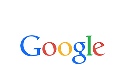
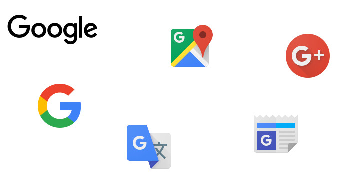
In it, Dustin Curtis criticizes Google (rather rightly, in my hindsight-enhanced opinion) for a Marissa-Mayeresque design process of "Make 300 logo variants with pseudorandom permutations, and then pick your favorite." Looking at those permutations now (http://2.bp.blogspot.com/_7ZYqYi4xigk/SEnK37orPGI/AAAAAAAAAp...) it's obvious (again, with the benefit of hindsight) that they were all very inside-the-box. Apparently nobody even considered trying a different font.
This pg comment from that thread turned out to be particularly insightful, given today's news: https://news.ycombinator.com/item?id=211649