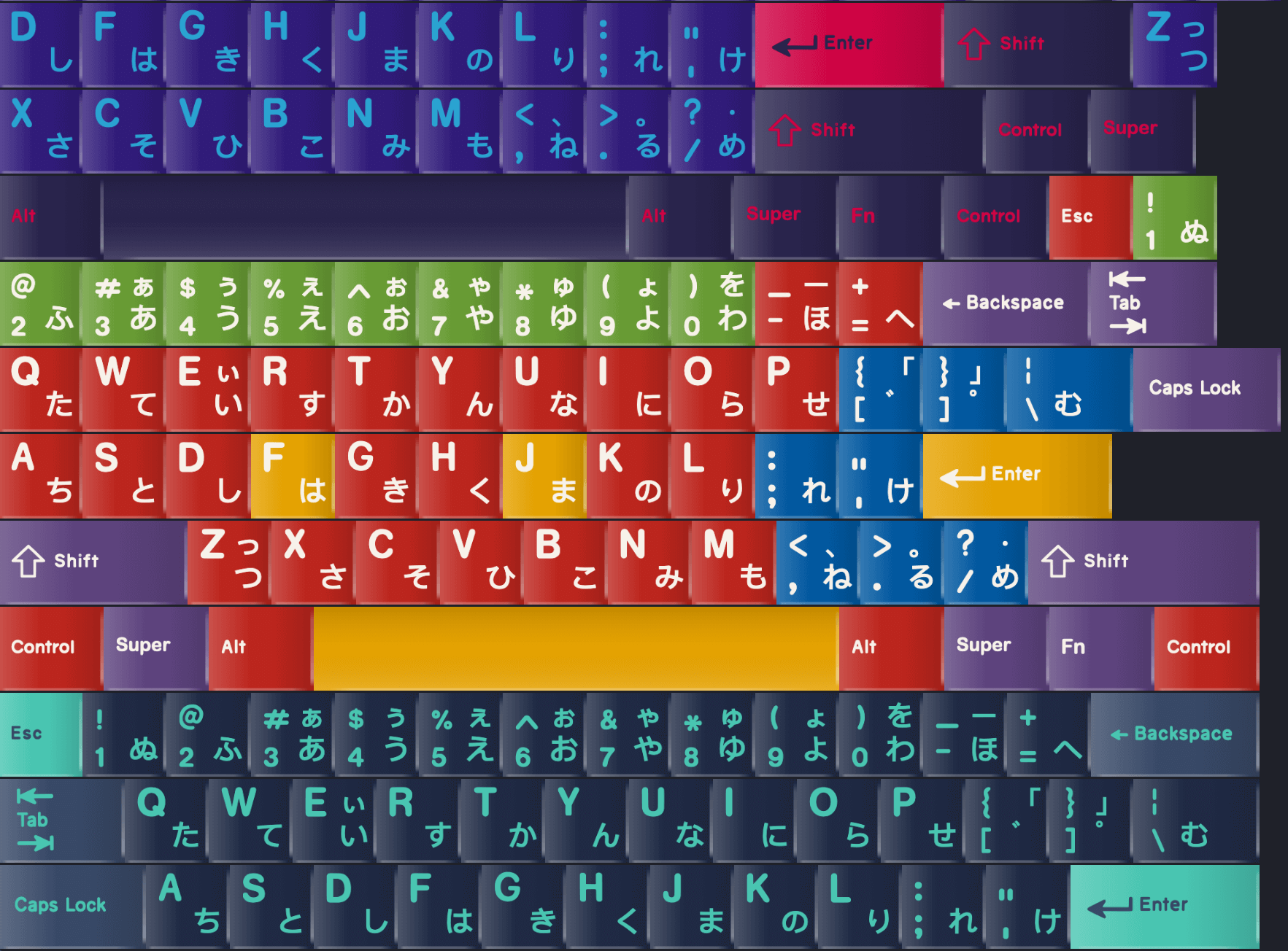
thanks for the feedback, I probably need to separate the background from the ui accent color. Any colorway with a dark accent will increase the "brightness" to for a more accessible contrast ratio.
Thanks, you're right it could use a few more layouts, 75% is probably the biggest omission. I didn't want it to be too overwhelming with too many variations as I see this as more of a tool to get a vibe for what a board could look like (possibly to help with interest checks) rather than a tool to recreate all possible layouts.
I'd also like to explore adding different audio options for switches types but that seemed like a projects unto itself haha.
Did you design it yourself or come across the design somewhere? I follow mechanical keyboards on and off but never seen this design before. I guess it's missing multiply/divide but generally it makes a lot of sense, especially for how compact it is.
I've been keeping my eye out on the subreddit for a long time for something like your 50% - except with a function row. Really wish it were more popular